Summary
The theme this week is "stock prices only go up" (sarcasm alert).
The charts showed higher valuations and increasingly extreme levels of bullish sentiment across the various indicators.
Yet, also referenced was the point that picking market tops is hard, and high valuations and extreme sentiment is not enough by itself.
Those who follow my personal account on Twitter will be familiar with my weekly S&P 500 #ChartStorm, in which I pick out 10 charts on the S&P 500 to tweet. Typically, I'll pick a couple of themes and hammer them home with the charts, but sometimes it's just a selection of charts that will add to your perspective and help inform your own view—whether it's bearish, bullish, or something else!
The purpose of this note is to add some extra context beyond the 140 characters of Twitter. It's worth noting that the aim of the #ChartStorm isn't necessarily to arrive at a certain view, but to highlight charts and themes worth paying attention to.
So here's another S&P 500 #ChartStorm write-up:
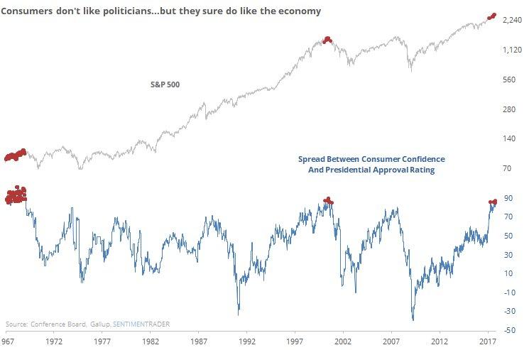
1. S&P 500 Valuation Views: First up is a look at 3 key measures of S&P 500 valuations: the forward P/E (price to consensus next 12 months' earnings), the trailing P/E (price to last 12 months' actual earnings), and the PE10 (price to average actual earnings across the last 10 years). All three indicators show a picture of rising valuations, but the question is, "Are high valuations enough to be worried/bearish?" We talked about this in the weekly report - the main takeaway is that economics need to deteriorate and/or monetary policy needs to tighten much more in order to affect a drop in the fundamentals. Until then, valuation is a background feature.
Bottom line: Valuations are high, but this alone is not enough to be bearish.
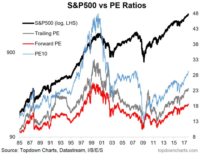
2. Rydex bullish funds: This graph shows the ratio of bullish to bearish funds from the Rydex suite of funds. On this lens, investors (at least this subset of investors) are the most bullish they've been on record. Again, it's almost a question of whether investors are too bullish, but as a rule of thumb, you tend to look at sentiment indicators like this in a contrarian fashion, so at the margin such extreme bullishness equals a bearish signal!
Bottom line: Rydex bullishness is at a record high.
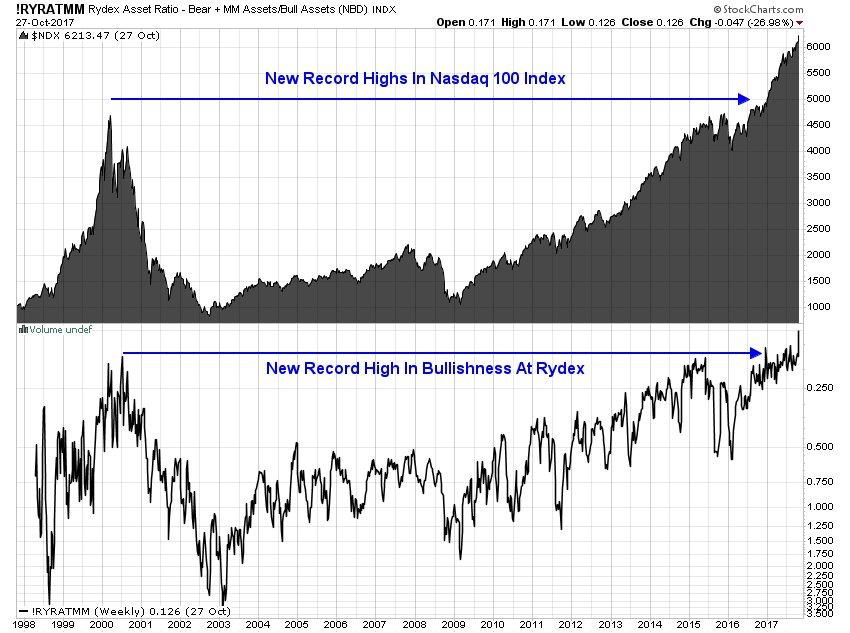
3. Stock price expectations: This chart from DB which was shared on Twitter shows a sub-index of the Michigan Consumer Survey: "probability of increase in stock prices in 1 year" - it shows the average respondent overwhelmingly expects stock prices to go up (2/3 people), and is at the highest reading ever. It brings to mind the old saying "real estate will always go up"... So is the new wisdom now "stocks will always go up"?
Bottom line: Stock market expectations are at a record high.
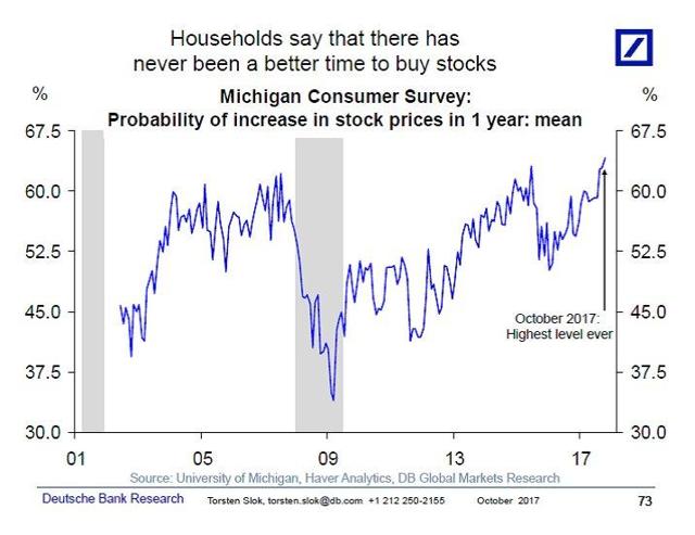
4. Consumer Confidence vs. Presidential Approval: This is an interesting one - it shows the spread of consumer confidence versus the presidential approval rating, and for me it brings to mind the old slogan, "It's the economy, stupid"... but in the sense that what really matters is often not what's going on in government. While governments can have a big impact on the economy in a good or bad way through reforms, regulations, and economic policy, for the most part the economy - people in general - will just get on with life. And at a time where you have almost peak dysfunctionality in the government while also having solid economic data, it nails this point home.
Bottom line: Consumers feel confident, despite the government.
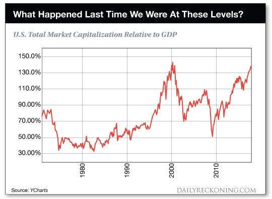
5. Stock Market Capitalization vs. GDP: Sometimes referred to as the "Warren Buffett Indicator", this chart shows the ratio of total stock market capitalization versus GDP. My view is that this is not an indicator of market valuation, and for the US there's a lot of important caveats, such as the rise of offshore earnings (about a third of S&P 500 EPS are from ex-US sources), but still it persists as something which gets attention from market commentators. For the record, my view is that this is more an indicator of market development (there are quite a few countries where this indicator is around 50% or lower - more as a reflection of a lower proportion of listed companies, etc). Anyway, I will concede that, like valuations and sentiment, it has moved to extreme highs and that the probabilities tend to skew at this point.
Bottom line: The "Buffett Indicator" is at dot.com boom levels.
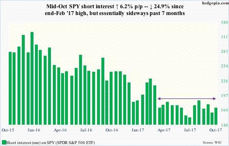
6. SPY Short Interest: This one shows the quantum of shares sold short on the SPDR S&P 500 (NYSE:SPY) the major S&P 500 ETF. The main point is that it is barely stirring, down substantially versus previous years, and really reflecting the fact that it's hard to short a calm market that "only goes up". No doubt this one will perk up if the prevailing market and economic winds start to change, but for now this one is indeed a sign of the times.
Bottom line: Short interest is slumbering.
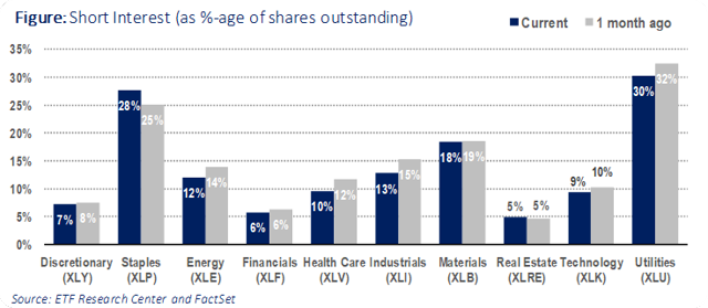
7. Shorts by Sector: Following on from the aggregate view of shorts, here's a look across sectors. Probably not too many surprises here... the least number of shorts are in the hot sectors, e.g., financials and tech. On the other hand, there's a greater proportion of shorts in sectors like staples and utilities (traditionally more defensive sectors) - this makes some sense at a high level. I would imagine there's an element of using the lagging defensive sectors as a funding source for longs in the more dynamic tech and financial sectors - shun defense, chase growth. As a side note, this metric is different from the previous chart - it shows short interest as a percentage of the total float.
Bottom line: There's a couple of standouts across sectors in short interest.
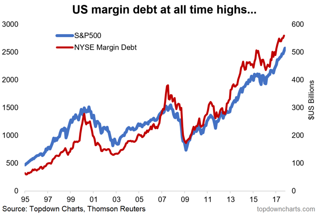
8. NYSE Margin Debt Levels: The latest data (note, it comes out monthly with a 1-month lag) showed NYSE margin debt at a fresh all-time high in September. This reflects rising confidence (and gearing) in the market. But more on this topic in the next chart.
Bottom line: US margin debt levels are at all-time highs.
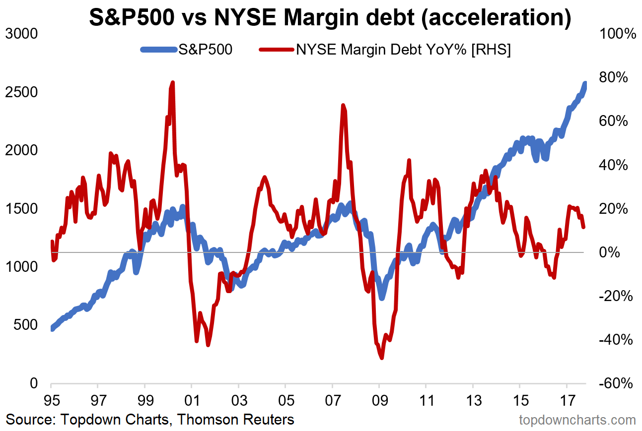
9. Margin Debt Acceleration: The more important view of margin debt, in my view, is the acceleration or rate of change. I use the term acceleration with purpose, because the true red flags come when margin debt acceleration screeches ahead, e.g., the dot.com top and the 2007 top. But it's also worth noting that red flags are also raised when margin debt growth decelerates - this shows less willingness to use leverage, and when it goes negative, it shows active deleveraging... both important and ominous signs from a market timing point of view. At this point, there is no strong signal, but it is rolling over.
Bottom line: Margin debt acceleration is rolling over, but no red flags yet.
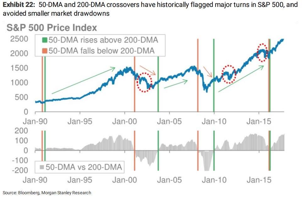
10. Moving Average Crossovers: The final chart focuses on the signals generated from "moving average crossovers", i.e., when one moving average (usually a shorter time period, e.g., 50 days) crosses above or below another moving average (usually a longer time period, e.g., 200 days). In this specific example, the 50-DMA going above the 200-DMA is referred to a "golden cross" and the 50-DMA going below the 200-DMA a "death cross" - the implications are probably obvious. The analysis, referenced in the chart below, shows that these signals help in avoiding major bear markets and staying invested during big bull markets.
Bottom line: Pay attention to those moving average crossovers.
So where does all this leave us?
This week, there are probably 3 categories of interest:
1. Sentiment
On sentiment, there was extreme bullishness in the Rydex indicator, a sense that "stock prices always go up" in the consumer confidence survey, an interesting spread of consumer confidence versus presidential approval, low amounts of short interest (and where there was, it was tilted to defensives versus cyclicals), and I suppose also high levels of margin debt.
2. Valuation
On valuation, there was the chart of the various P/Es which showed valuation levels steadily marching higher, but not yet at the lofty highs of the dot.com boom... the "Buffett indicator", on the other hand, was pretty much there.
3. Signals
On signals, there was the point about margin debt acceleration, but also the seemingly very effective moving average crossover strategy.
Summary
Taking it together, it remains a situation of higher valuations and more bullish sentiment. While you often see these conditions around a market top, history shows that picking a top is not easy, but there are clues in identifying the start of a bear market. For those who wish not to preempt it and miss out on - who knows how long and how much - upside, the final chart showed a compromise... i.e., beware of the valuation and sentiment picture, but wait for a reliable signal or set of signals before stepping aside.
Disclosure:I/we have no positions in any stocks mentioned, and no plans to initiate any positions within the next 72 hours.
