Summary- This week, we took in some longer-term perspective on the market and the state of the current bull market.
- We also added to the growing list of bearish signals and warning signs.
- The longer-term history shows the market will do what it wants, but (again) the risk of a sell-off or correction is elevated.
Those who follow my personal account on Twitter will be familiar with my weekly S&P 500 #ChartStorm in which I pick out 10 charts on the S&P 500 to tweet. Typically, I'll pick a couple of themes and hammer them home with the charts, but sometimes it's just a selection of charts that will add to your perspective and help inform your own view - whether it's bearish, bullish, or something else!
The purpose of this note is to add some extra context beyond the 140 characters of Twitter. It's worth noting that the aim of the #ChartStorm isn't necessarily to arrive at a certain view but to highlight charts and themes worth paying attention to.
So here's another write-up:
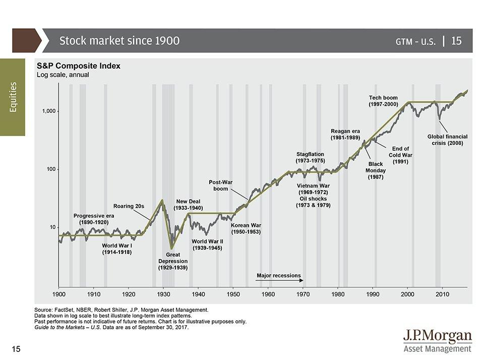
1. Long-Term Picture: This chart provides the long-term picture of the S&P 500: an important piece of perspective and context. There are a few comments to make on this one. For example, notice all the major and very significant events along the way. Notice the varying gap between recessions. And finally, also notice how there has been a tendency to go through this type of market that ranges for a decade or so and then breaks out e.g. 1920, 1950,1980, and now... one to discuss!
Bottom line: The current multi-year breakout looks familiar.
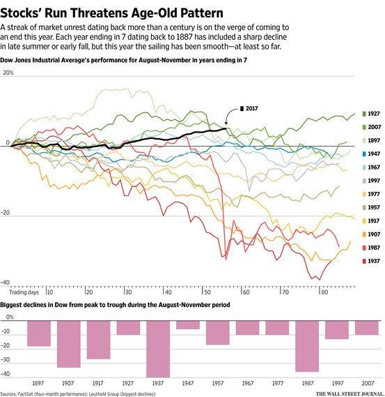
2. The Number 7? The decennial cycle or the curse of the number 7 - years ending in xxx7 have a poor record of performance, with a couple of notable standouts, e.g., 1987, 1937 and, to a lesser extent, 2007 (came a little later!). There are always exceptions to these sorts of "rules", and you tend to discount this sort of information. However, the one thing I would note is that there could be some legitimacy to it in that business cycles and financial cycles are often quite long, and it could be just a coincidence that this curious observation is just a re-discovering of the business cycle!
Bottom line: Years ending in the number 7 have a poor history of performance.
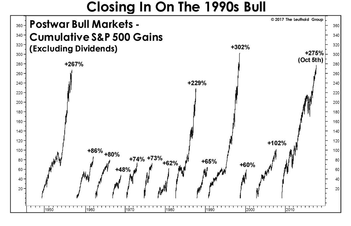
3. Post-war Bull Markets: As the Leuthold Group point out in this very interesting chart, the current bull market (if you count since the 2009 bottom) is on the cusp of becoming the GOAT (Greatest Of All Time). All that needs to happen at this point is for the S&P 500 to close above 2717.
Bottom line: The current bull market is close to becoming the GOAT.
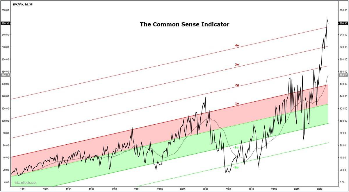
4. The Common Sense Indicator: This curious chart from Kai Pflughaupt shows the S&P 500 divided by the CBOE VIX or volatility index. Kai also showed charts from the dot com and subprime eras, and it seems the danger zone for this signal is when it gets 4 standard deviations stretched to the upside... like it is now. Reminds me of the old cliché "Common sense is not that common", and certainly provides a novel take on the matter.
Bottom line: The common sense indicator is in the danger zone.
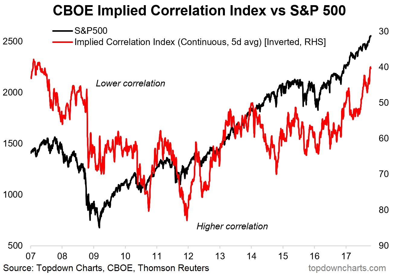
5. The Implied Correlation Index: Similar line of thinking to the previous chart, this one shows our chart of the CBOE Implied Correlation Index (a sister index to the VIX, which shows implied correlations for S&P 500 stocks based on option pricing). The key point in this one is that there appears to be a contrarian signal in the level of implied correlations versus the market tops/bottoms (note, the indicator is shown inverted). So it might make some nervous, then, to see that the index has crunched down to levels last seen around the 2007 market top.
Bottom line: Implied correlations imply a risk of a market top.
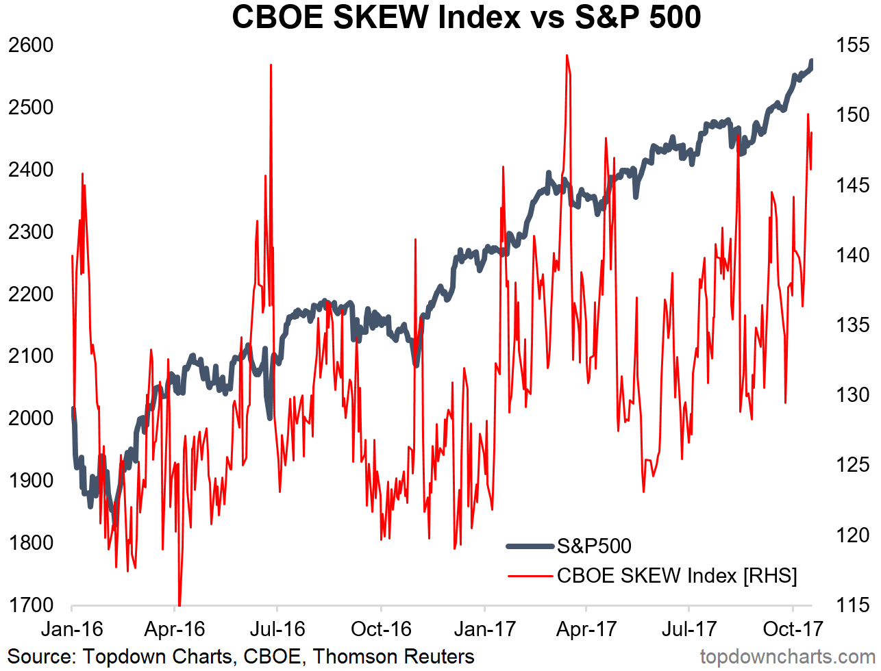
6. The SKEW: Another VIX sister index, the CBOE SKEW, also presents an obscure piece of extra context and information on market sentiment. The SKEW essentially presents a look at the implied probability of a black swan event or a non-normal distribution - again, based on option pricing. Another way I tend to think about it is as an indication of the demand for tail risk hedging strategies. In that sense, the spikes in this indicator make a bit of sense, e.g., the spike around Brexit, the US election, and market corrections. So it is interesting, then, to note that firstly it seems to be trending up with the market, and second, it looks particularly elevated recently.
Bottom line: Tail risk hedging demand seems "skewed" to the upside.
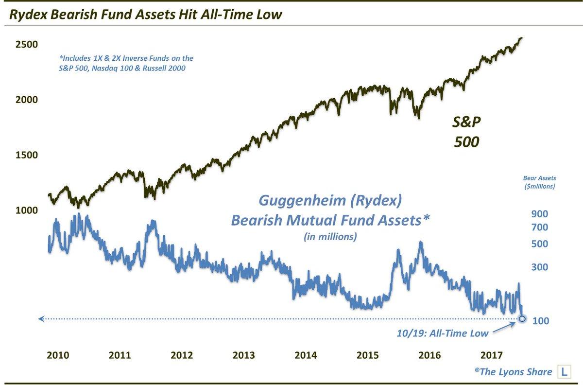
7. Bearish Fund Assets: The Rydex Bearish Fund Assets indicator has fallen to an all-time low. Frankly, I'm not sure if this is a strong bearish signal or just a reflection of how awfully a bearish strategy would have done in this market environment. Certainly, though, if you look through the downtrend (that you would expect just from market losses), it has reached low levels - similar to 2015. So put this chart in the steadily filling bucket of bearish warning indicators, as the bears seem to have gone into hibernation.
Bottom line: Rydex bearish fund assets have reached an all-time low.
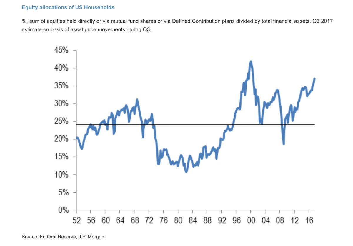
8. Household Equity Allocations: This chart shows the equity allocations of US households (based on direct and indirect holdings as a percentage of financial assets). The chart does ignore other assets such as real estate, but is still very interesting. The punchline is, it is at the highest point since 2000. So is this a new paradigm?
Bottom line: US household equity allocations are at a 17-year high.
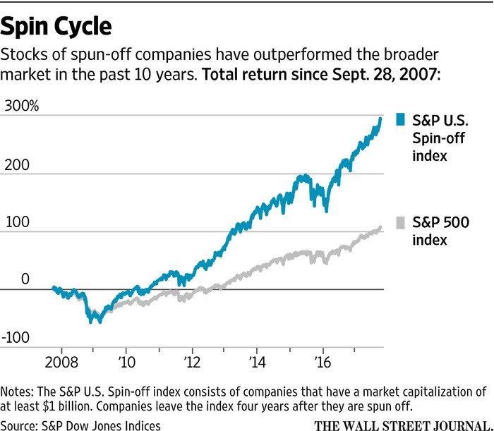
9. The Spin Cycle: This innovative index shows the performance of stocks of spun off companies, and the "spin cycle" appears to be in full force in terms of relative performance. Certainly one trend that benefits investment bankers, who get to clip the ticket on the wave of spin-offs and then come back later pitching them as M&A targets. It all goes in cycles.
Bottom line: Spin-off companies have comfortably outperformed the index.
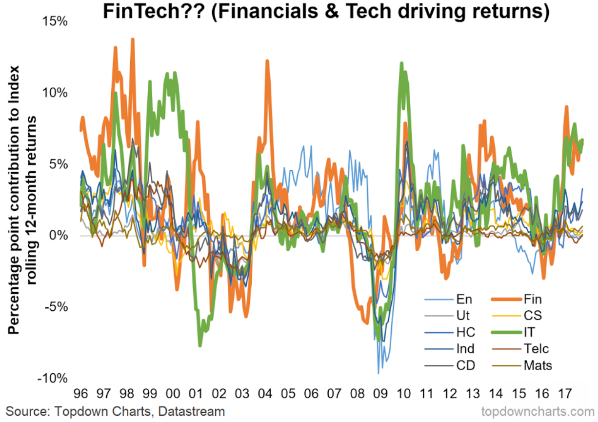
10. The FinTech Bull Market? If you are getting sick of the buzzword "FinTech", then you might just want to skip this last one. I'm musing here that you could call this "The Fin Tech Bull Market", or maybe the FinTech bubble, the reason is the chart below. It shows the percentage point contribution of each sector to overall S&P 500 index returns. It is based on the market cap representation of each sector and each of the major GICS sector returns. Probably unsurprising given that IT and financials are the largest sectors (which combined equal just over 40% of total market cap), but they have been driving the bulk of rolling 12-month returns.
Bottom line: Financials and Tech stocks have driven the bulk of S&P 500 returns, so maybe this is the FinTech bull market.
So where does all this leave us?
This week, there are probably 3 categories of interest:
1. Market Regimes
On market regimes, the first chart provided some useful long-term context, with one interpretation being that the current market looks somewhat familiar to other major breakouts. We also had the chart of major bull markets and the curse of the number 7 chart.
2. Signals and Triggers
On signals and triggers, there were some further bearish signals to add to the list, such as the "common sense indicator", the SKEW, implied correlations, bearish fund assets, and household equity allocations.
3. "Other"
On other, the final two charts were quite interesting, with the "spin cycle" chart of spin-off stock performance and the observation that financials and tech stocks have driven the bulk of returns lately.
Summary
Overall, we add further context and perspective, and maybe even a few new indicators to the tool set this week. Without sounding like a broken record, the list of bearish warning signs is steadily expanding, and these are mostly objective signals. At a minimum, the risk of a selloff or correction is elevated, but as the longer-term history shows, the market will do what it wants.
Disclosure:I/we have no positions in any stocks mentioned, and no plans to initiate any positions within the next 72 hours.
I wrote this article myself, and it expresses my own opinions. I am not receiving compensation for it (other than from Seeking Alpha). I have no business relationship with any company whose stock is mentioned in this article.
