As investors’ bullish sentiment moves up to euphoric levels, the markets are reaching extreme leverage. This is terrible news because a lot of people are going to lose one heck of a lot of money. According to CNN Money’s Fear & Greed Index, the market is now at the “extreme greed” level and if we go by Yardeni Research on “Investor Intelligence Bull-Bear Ratio,” it’s also at the highest ratio in 30 years.
But, of course… this time is different. Or is it? I continue to receive emails and comments on my blog that the Fed will continue to prop up the markets forever. Unfortunately, there is only so much the Fed can do to rig the markets. Furthermore, the Fed can’t do much to mitigate investor insanity in record NYSE margin debt or the massive $2 trillion in the global short volatility trade.
The $600 billion in NYSE margin debt suggests traders have racked up a record amount of margin debt (33% more since 2007) and the largest short volatility trade in history. By shorting volatility, investors are betting that the VIX Index (Volatility Index) will continue to move lower. A falling volatility index suggests more calm and complacency in the markets.
So, the market will likely continue higher and higher, until it finally POPS. And when it does, watch out.
I’ve put together some charts showing the extreme amount of leverage in the markets. While this leverage may increase for a while, at some point the insanity will end in one hell of a market correction-crash.
The Commercial Banks Are Betting On Much Lower Oil Prices
As I mentioned in previous articles and my Youtube video, Coming Big Oil Price Drop & Market Crash, the Commercial banks have the highest net short positions in the oil market in over 20 years. In the video, I explained how the Commercial net short position in oil increased from 648,000 to 678,000 contracts in just one week. Well, according to the most recent COT Report (Commitment of Traders), the Commercials outdid themselves this week by adding an even larger amount of short contracts.
The Commercial net short position in the oil increased by a stunning 58,0000 contracts to another record high of 732,000:
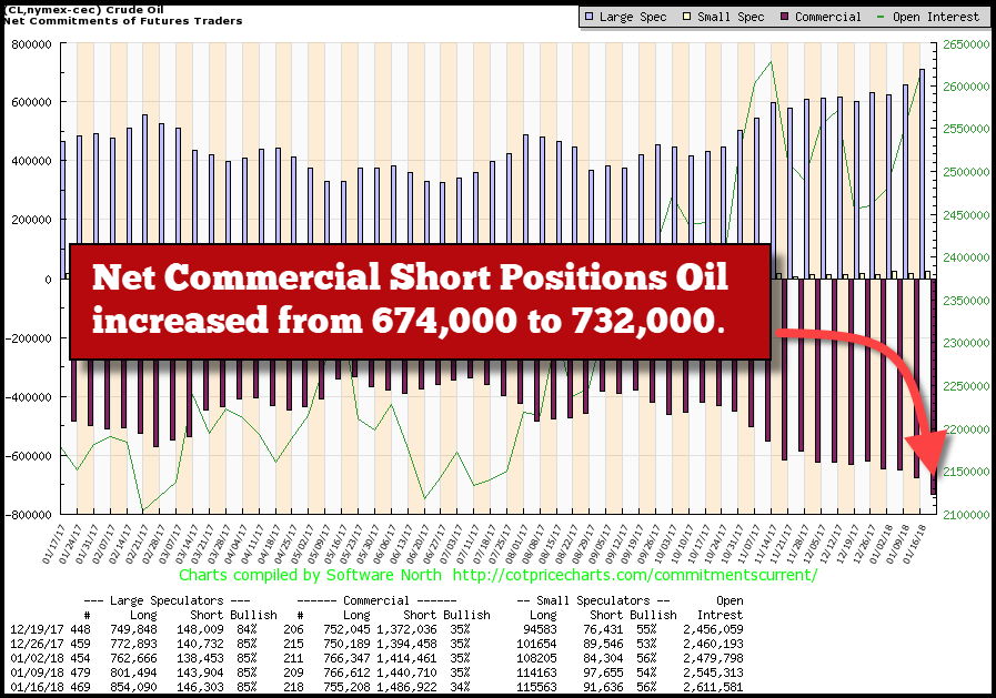
If we look at the “Commercial” long and short positions at the bottom of the chart, we can see that the total short contracts increased to 1,486,922 while their longs fell to 755,208. So, the Commercials added a 46,000 more shorts and reduced their longs by roughly 12,000 contracts. Furthermore, the Commercials are only 34% Bullish about the current oil price while the Large Speculators are 85% Bullish.
When the Commercials hold a very large net short position in commodity, metal or asset, that normally indicates a correction will shortly take place. Especially, when the Commercials hold the largest short position in oil, going back for more than 20 years:
The BLACK line represents the oil price, and the BLUE line is the Commercial net short positions. Right before the oil price fell from $105 in mid-2014 to a low of $30 at the beginning of 2016, the Commercials held nearly 500,000 net short positions. However, as the oil price increased from $42 at the end of September to $64 currently, the Commercials net short position increased from 350,000 to a massive 732,000 contracts:
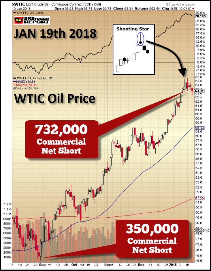
In my video linked above, I mentioned that the technical analysis indicator of a shooting star suggested that the oil price may have peaked. Well, it looks as if this may be true, but time will tell. However, we can clearly see that the Commercials record net short positions provide us with evidence of extreme leverage against the oil price. I would not be surprised to see a $20+ decline in the oil price as the Commercials liquidate their short positions back toward more normal levels.
A $40 oil price is not good for the U.S. Shale Oil Industry. I will be publishing a new video shortly on the ongoing U.S. Shale Energy Ponzi Scheme and the financial disaster taking place in the U.S. shale oil and gas industry.
Regardless, if the leverage in the oil market is reaching record levels, you should see what is taking place in some of the Dow Jones Industrial stocks.
WARNING: EXTREME MARKET LEVERAGE, Dow Jones Stocks Are Well Beyond Bubble Territory
I get a laugh when I receive emails from individuals who write me stating, “This time is different” in the stock market. They let me know that my calls for a bubble market and a crash have been overblown, severely overdue or simply, not true. While I am quite surprised at the longevity of this present bull market, my warning remains the same… THE HIGHER IT GOES, THE BIGGER THE CRASH.
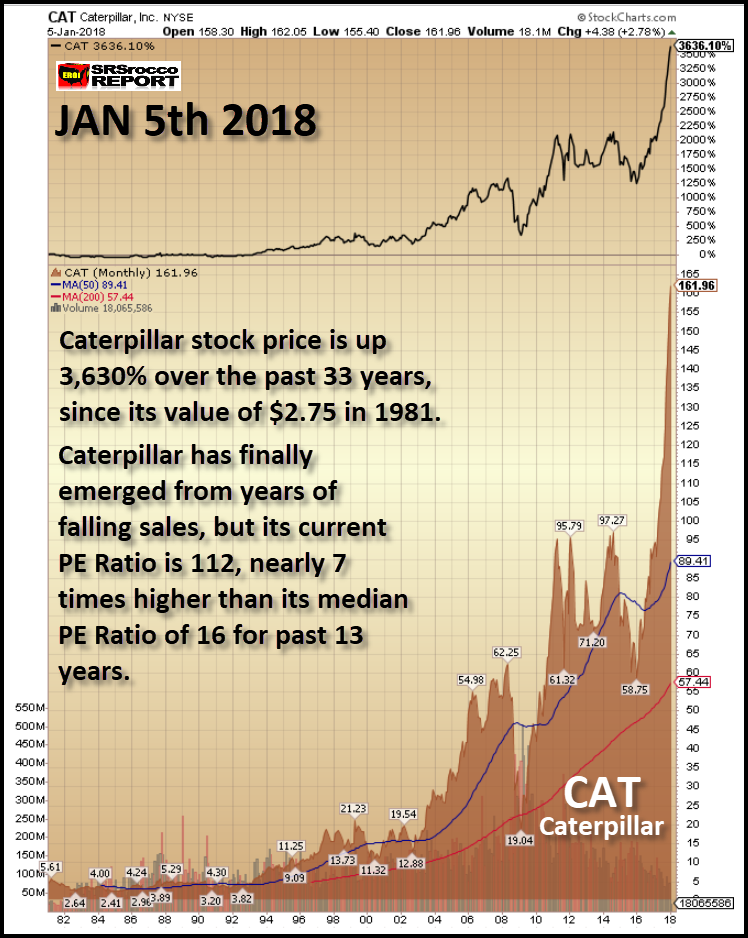
Let’s take a look at some of the Dow Jones Industrial stocks and their price changes in just the past two weeks. As the overall market increased significantly since the beginning of the year, Caterpillar’s stock price increased from $161 to $170:
And if we remember my chart on Caterpillar (NYSE:CAT) from my first video, Stock Market Bubble vs. Gold & Silver, Caterpillar’s price was $137 on Nov 5th. So, in just two and a half months, Caterpillar’s stock price is up a staggering 24%:
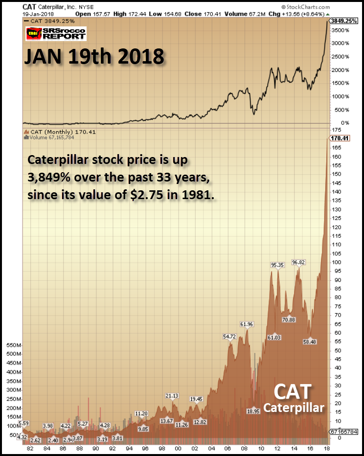
You will notice that Caterpillar’s stock price experienced several short-term peaks, but nothing quite like what is taking place now. Another impressive mover in the Dow Jones Index is Home Depot (NYSE:HD). While Home Depot’s stock price chart isn’t as remarkable as Caterpillar, it is also moving beyond bubble territory:
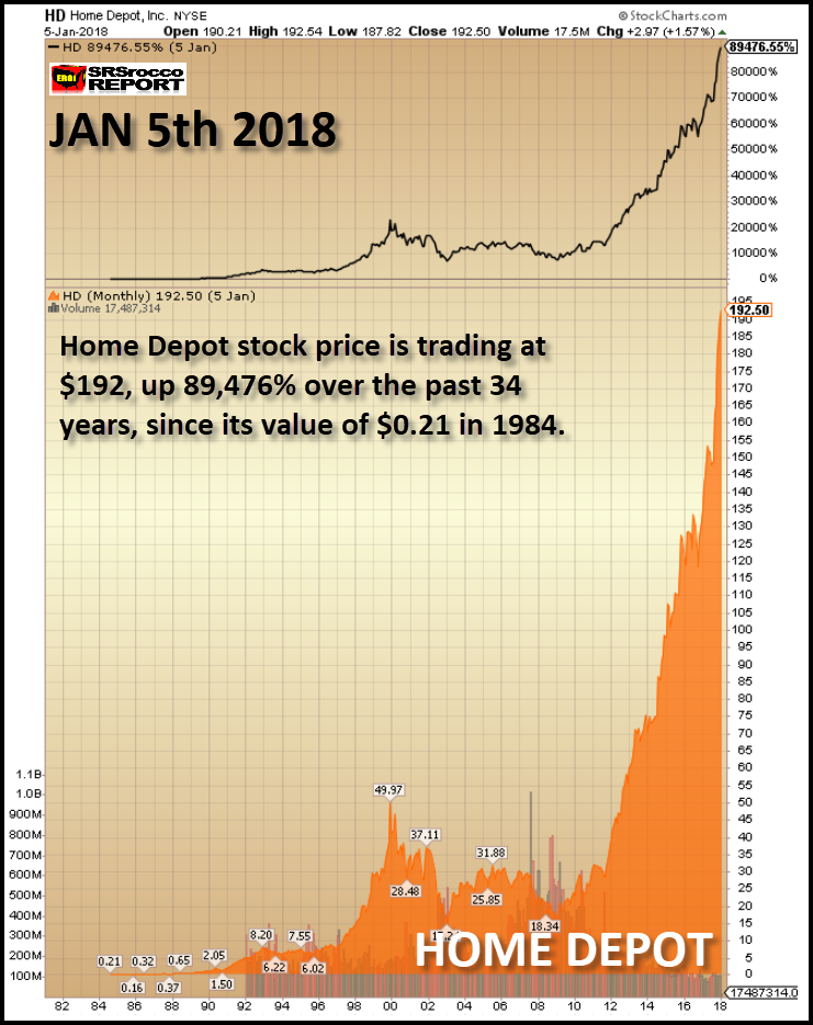
From 2000 to 2012, Home Depot’s share price averaged approximately $25 a share. However, on Jan 5th it was trading nearly eight times higher at $192. But, if we look at its current price, it is NOW trading more than eight times higher at $201:
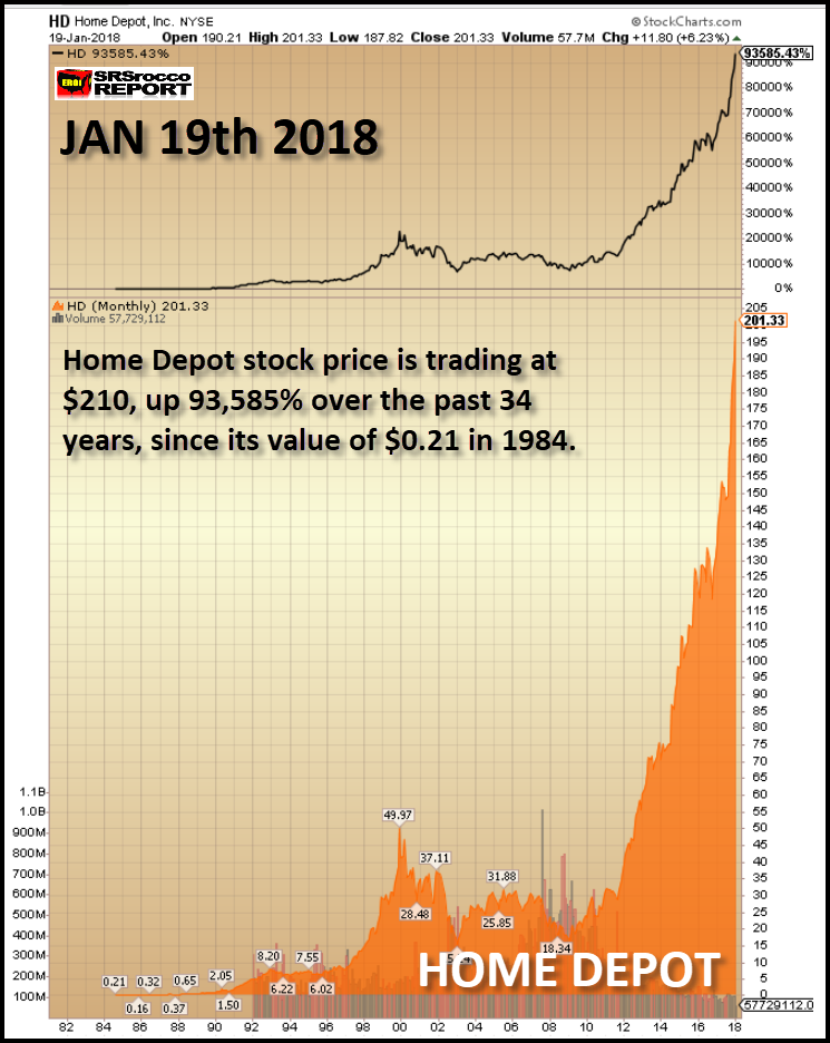
Now, could have Home Depot’s revenues and profits increased tremendously since 2012 to suggest a price of $201? According to Home Depot’s financial reports, their revenues grew from $70 billion in 2012 to over $100 billion in 2017. Furthermore, Home Depot’s net income has increased from $3.8 billion in 2012 to $6.8 billion in the first three quarters of 2017. But does a $30 billion increase in revenues and $6 billion increase in profits translate to a 700% increase in Home Depot’s stock price over the past five years?
Okay, let’s look at Boeing (NYSE:BA) Airlines. What’s going on with Boeing’s share price? On Jan 5th, Boeing was trading at $308… nearly three times higher than what it was trading at $112 at the beginning of 2016:
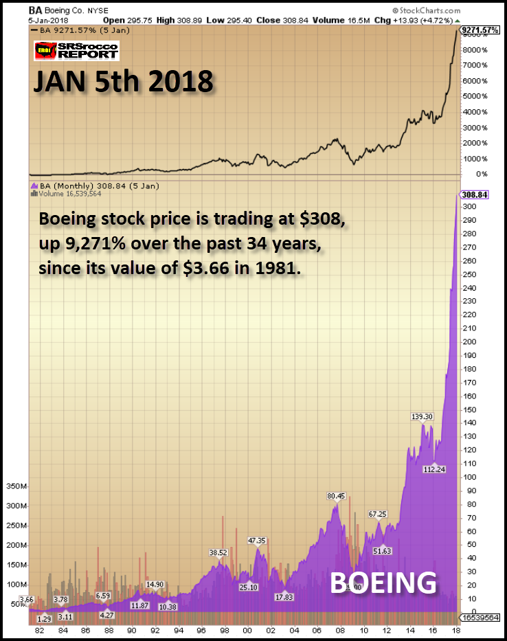
As we can see, Boeing’s share price is up 9,200+% over the past 34 years. If we go by Boeing’s 2007 peak of $80, it’s up nearly four times. However, if we check the trading activity over the past two weeks, Boeing’s stock price is moving well beyond bubble territory to a new record high of $337:
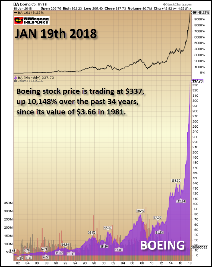
Gosh, Boeing’s severely pointy price chart resembles the antenna on the Empire State Building in New York City. Good heavens, Boeing’s stock has gone up 10% in just two weeks. If investors don’t see anything wrong with this chart, you probably have been hanging around too many “Cryptocurrency Aficionados.” People, if you think the only direction is UP with stocks or cryptocurrencies, you need to get your head examined.
Here’s another chart worthy to compete with the tremendous gains in Bitcoin, Ethereum, and Ripple. However, this is one those industries that should NOT BEHAVE like a high-flying tech stock or cryptocurrency. Why, because it’s a healthcare stock. UnitedHealth Group’s (NYSE:UNH) stock has surged from $53 in 2012 to $223 on Jan 5th:
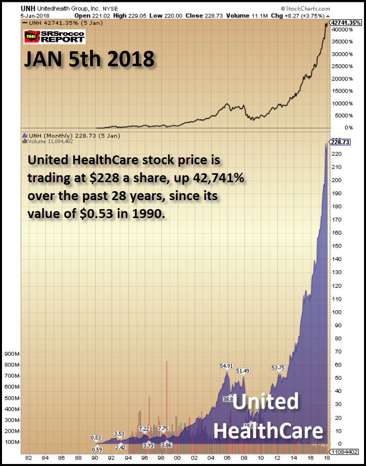
If you were clever and started buying United HealthCare’s stock in 1990, you would be enjoying cryptocurrency type gains of nearly 43,000%. But that is all history now. United HealthCare’s price is up another 6% to $243 in just the past two weeks. If you look at the chart below carefully, you will see that its current two-week trend is virtually a STRAIGHT LINE higher:
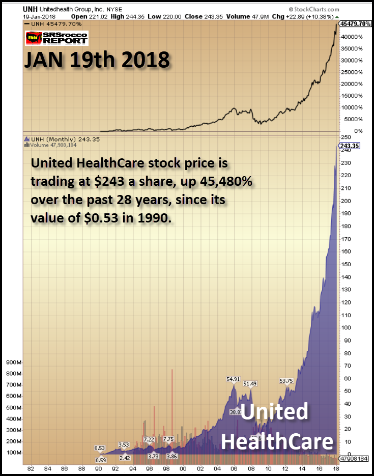
United HealthCare and Boeing’s stocks represent a market that has gone completely insane. Unfortunately, the leverage in the market will likely increase from the current extreme levels to “outrageously” extreme… if there is such a term… LOL.
Investors need to understand that the Fed and Central Banks realize by rigging the market higher, it can only go in that direction. Ever since the 2008 U.S. Housing and Banking Market collapse, the world has been living on borrowed time, money and a massive amount of debt. By increasing the value of Stocks, Bonds, and Real Estate, the Fed and Central Banks not only give investors the impression that they are wealthier, so they spend more, it also allows governments to collect more taxes.
While inflated asset values allow governments to collect more taxes, they still aren’t enough to keep the economic and financial systems from collapsing. Yes, I know I am a broken record, but the FUNDAMENTALS DON’T LIE…. only humans do. So, a lie or a Ponzi Scheme can continue for quite a while. A perfect example is the Bernie Madoff 20-year Ponzi Scheme that defrauded investors by $65 billion.
If the Fed and Central Banks lose control over the markets (Yes, they will), then the ensuing collapse will make 1930’s Depression and the 2008 economic meltdown look quite tame indeed. As I have mentioned in several interviews, when the markets were crashing in 2008, the U.S. Oil Industry was still in relatively good shape. However, today the shale energy industry has debt up to its eyeballs and two-thirds to three-quarters of the shale energy companies are losing money:
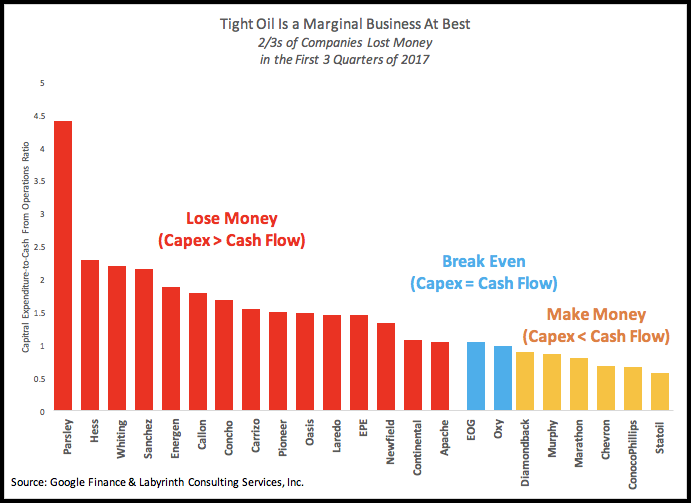
The chart above by energy analyst, Art Berman, shows that the majority of U.S. shale energy companies lost money in the first three quarters of 2017. While Chevron (NYSE:CVX), ConocoPhillips (NYSE:COP), and Statoil (OL:STL) made money, they are not heavily invested in shale oil or gas as are the companies are shown in the RED.
Lastly, the oil price is getting ready to experience one hell of a correction-crash as the Commercials hold the largest number of net short positions in history. Furthermore, the NYSE margin debt and the Volatility Index are at extreme levels. This has allowed the stock prices of many companies to surge to completely insane prices.
While the leverage in the market will move from extreme to outrageously extreme before it crashes, the timing of this event is not years or decades away as some more WISHFULL thinking investors have deluded themselves into believing. Huge market corrections are normal, and stock market crashes have occurred many times in the past.
However, the present leverage in the market is now beyond bubble territory. When the markets finally crack, if you own some physical gold and silver, you will be one of the few 1% that will have protected your wealth as most individuals watch their investment bubbles pop.
