Gold and silver have taken their seats inside the ivy-covered brick building, Professor Marché distributing to them "blue books" and No. 2 yellow wooden pencils with their wee red rubber-tip erasers. Then disinterestingly lighting his pipe, he utters the word "Begin".
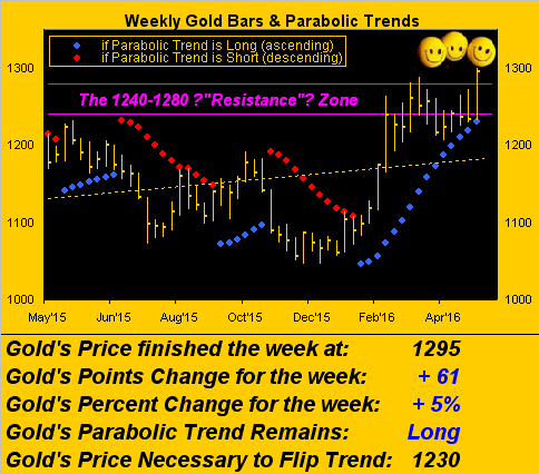
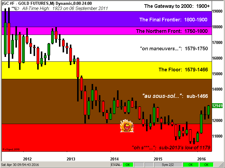
For gold, 'tis to unravel a good news/bad news scenario. The good news is that having settled the first four months of 2016 (Friday) at 1295, gold is up 22.1% year-to-date, a first trimester rise only bettered this millennium by a 27.2% increase 10 years ago over the like period in 2006. Moreover, gold not only finished the week above the 1240-1280 resistance zone for the first time since January 2015, but now has furthered traveled up into the 1290s. Which is where we've the bad news. On the one hand, 'tis great to have come so far across the aforementioned, ever-repelling resistance zone; but on the other hand we hate being here. Not that you need be reminded, however The Whiny 1290s are where gold became completely stuck ad nausea, the centerpiece over some 16 months of trading in oscillation between the lower 1300s and upper 1200s from June 2013 through September 2014. Back then, so unconscionable was it for gold to have fallen that far from its All-Time High of 1923 on 06 September 2011, that we also dubbed The Whiny 1290s as "Neverland". Never should price have come so low; and worse, the ensuing discouragement then put gold on the road further South to as low as 1046 by last December. So is it great to have now returned up to the price we hate? That's gold's test.
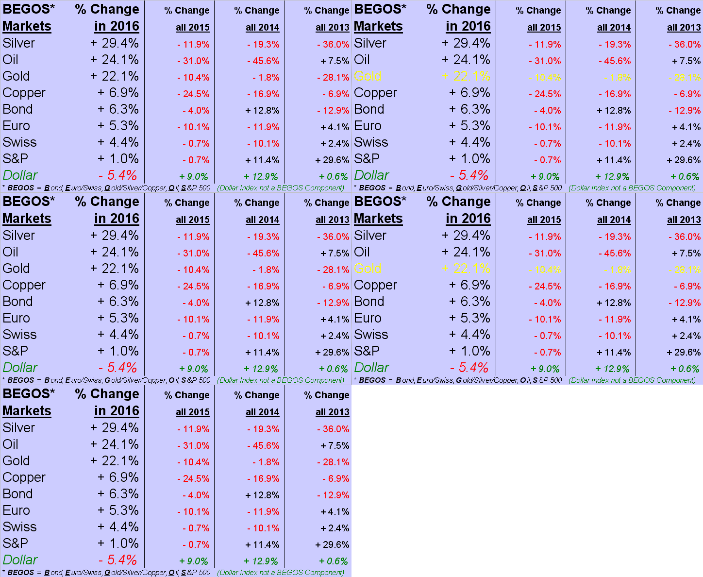
For silver, 'tis similarly a good news/bad news scenario. The good news as we'll below see for the first trimester, Sister Silver has come shining through, racing past gold to now rest atop the 2016 BEGOS Markets Standings at Number One, +29.4% in settling yesterday at 17.890. A terrific run to be sure, albeit one far overshadowed by first trimester performances of +52.7% in 2006 and +55.1% in 2011. The bad news -- ironically -- is that in just the last 19 trading days alone, silver has risen a full 20%. Since her All-Time High of 49.820 on 25 April 2011, silver thrice has risen 20% over 19 days, only to end in tears all three times. Is it different this time, especially should gold get stuck in The Whiny 1290s? That's silver's test.
All that said, we shan't further argue with 2016's first trimester performances for the Precious Metals:
Now: why the impressive strength for gold and silver so far in 2016? From a bevy of fundamental and technical rationale, we've selected three influences.
First, it may just finally be that The Charade is Ending. As you regular readers know, The Gold Update opens each week with the scoreboard depicting what continues to be an outrageous dislocation of gold's low price relative to where it ought mathematically be as a result of the increased StateSide money supply by the measurement of "M2" . As shown at the open, even accounting for gold's own increase in supply, we've got price today pegged at 2565. Talk about the greatest arbitrage opportunity in the history of mankind: you're looking at it. So are the "big buyers".
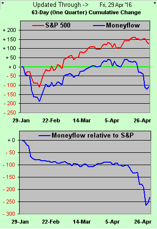
Second is what has become the horribly unsupportive state by our measure of The Moneyflow for the S&P 500. We think some folks are starting to take notice, as in just the past two days, the S&P futures contract has had intra-session plunges of 28 points, followed both times by feeble recovery into the closes. As for Q1 Earnings season, with results in for some 1,000 of the 2,000 companies that'll we'll ultimately collect, 65% may have bettered estimates ... but only 54% have actually bettered their year-over-year Q1 earnings ... which specific to the S&P is reason for our "live" price/earnings ratio to presently be 39.2x. Why even just a week back, the public financial oracle CNBC ran a piece suggesting that, relative to the level of our Gross Domestic Product, the S&P is overvalued by 72%. Here's our view of the cumulative moneyflow change as regressed into S&P points from three months ago-to-date. And yes, per the lower panel, that present difference of -232 points alone is massive:
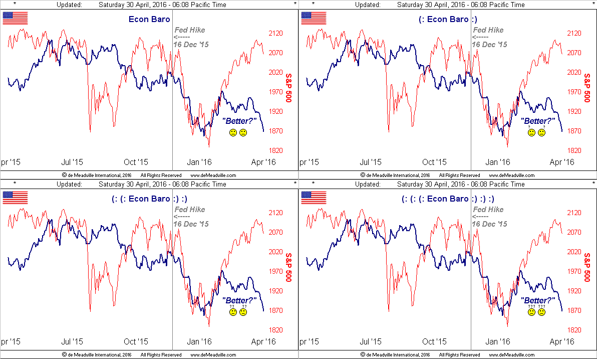
Third is The Declining State of the Economic Barometer. And if you didn't read, let alone parse, the convoluted opening sentence of the FOMC's Policy Statement issued last Wednesday, here 'tis: "Information received since the Federal Open Market Committee met in March indicates that labor market conditions have improved further even as growth in economic activity appears to have slowed." Parsed: "We're doing better, but we're not doing better". You don't say. Here's the Econ Baro:
Therefore: the monetary charade + negative S&P moneyflow + declining economy = Gold Rush.
Meanwhile the euro Yo-Yo is in full fluctuation. On Monday we read that German business morale "unexpectedly" dipped in April, but come two days later on Wednesday, the country's consumer confidence was said to be on the rise amidst strong domestic demand. Kinda like that flippy-floppy opening FOMC statement we just cited. But what we found really amazing was the French and Spanish economies having grown faster than "expected" in Q1, and thus there is upside momentum for the EuroZone ... except that its prices are deflating. And in the United Kingdom, again 'tis one British bank after another getting its bottom line boffed. Better with Brexit? Blimey.
Then across the Pacific, we saw the Bank of Japan ... for the present ... make no stimulus changes in its policy statement, despite that nation's prices deflating as well. The "no move" reversed the ¥en's losses from the prior week, sending the currency to its best two-day points gain since 05-06 May 2010, inversely going from ¥111.2/$ to ¥106.6/$. (And yes, as referenced in a recent missive, we've begun the very involved task of bringing the ¥en into the BEGOS Markets mix: lots of worksheet and macro coding to be very carefully written and infused there, but one's patience shall hopefully be rewarded).
Locally, but with global impact, an hour's drive down the road from here finds Apple (NASDAQ:AAPL)'s revenues on the decline for the first time since the introduction of its iconic iPhone, whilst a hop, skip and jump from there finds Intel (NASDAQ:INTC) en route to cutting 12,000 employees. One wonders how another Valley Tech Wreck will affect the techie-intended occupancy in the endless array of skyscrapers being built up here in The City.
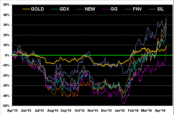
So indeed, the rush to gold, be it for the metal itself and/or into that of its equities brethren, has year-to-date been powerful. 'Twill be an even more superlative adjective up with which we'll have to come should the public ever wake up to buying Precious Metals. Here is gold's percentage track from a year ago-to-date along with the far more accelerative ones for the exchange-traded fund of the gold miners "GDX (NYSE:GDX)", the stocks of Newmont Mining (NYSE:NEM), Goldcorp "NYSE:GG" and Franco-Nevada "TO:FNV", plus the exchange-traded fund of the silver miners "NYSE:SIL":
Specific to gold's weekly bars, 'tis a stunning view seeing the week having closed above the 1240-1280 resistance zone. Still, as to "how we'll know when the bottom is in", we want to see gold stay atop that zone for at least one entire week; and with the renewed onset of The Whiny 1290s, trading sub-1280 near-term is hardly out of the question:
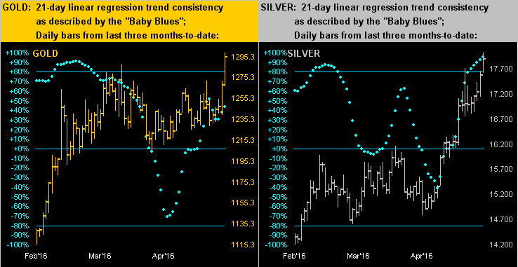
Next for both gold and silver, here are the three-months of daily bars, their inherit 21-day linear regression trend consistencies as depicted by the "Baby Blues". Note that those for gold on the left are lately less consistent than are those on the right for silver:
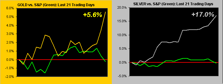
Further zooming in, specifically from one month ago-to-date, here are the percentage tracks for both gold vs. the S&P, and silver vs. same. Given the vast majority of the invested populous is represented by the green S&P line in each panel, one wonders if for the Precious Metals this is ![]() "...only the beginning ... only just the start..."
"...only the beginning ... only just the start..."![]() --(The Chicago Transit Authority, '69):
--(The Chicago Transit Authority, '69):
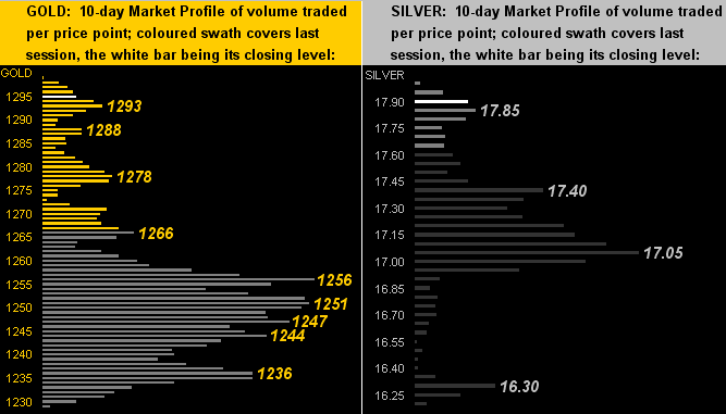
Now let's get out the microscope for the 10-day Market Profiles. And for gold (left) the fresh supporters are as denoted, briefer in length than their older apices to the South; should The Whiny 1290s yet again apply angst, we ought expect churn between here and that 1256 level. As for Sister silver (right), failing the 17.40 supporter, we'd look for 17.05 to hold the line:
Finally, as 'tis month's end, we again bring up gold's structurally-defined chart with its monthly bars since the All-Time High. Might the little fellow therein be smiling for much longer? We hope not:
"Time!" exclaims Professor Marché. "Close your blue books, leave them up front here on my desk, and the pencils as well. Expect to have your results in a week's time. Good-bye."