The market may be looking at a significant intermediate silver low of that sort which precedes a major run-up, or it has hit a low that is followed by continued consolidation above $20, on the basis of the iShares Silver Trust (NYSE:SLV).
Taken together, the 5 indicators that follow speak to both possibilities contemplated above. With everything that has been written about silver, the vast majority of it being very intelligent and accurate in my view, I offer this technical perspective as an embellishment to those analyses.
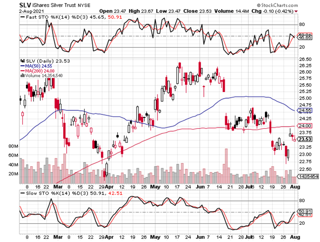
The 6-month daily SLV chart below includes clear and undeniable bullish divergences in the stochastic, seen beneath the price chart. One divergence is intra-month in July, while there is yet another versus the June low. My only concern on this score is the speed with which the stochastic is rising versus the price action.
Will it be overbought too soon, or would that condition merely indicate that a very brief breather would be needed to resume the more meaningful rise? So, let us look at the weight of broader technical evidence.
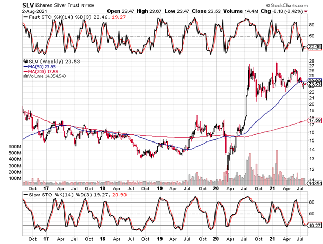
The 3-year weekly SLV chart below offers a few notable considerations.
Daily charts are particularly useful for the divergences that their stochastic can show, while the weeklies’ slow stochastic (beneath price chart) merely shows the relationship to oversold levels.
Indeed, when the SLV’s 200-week stochastic gets to yesterday’s levels, a 1 - 3 month rally tends to ensue; this supports the notion of yesterday’s price being a good entry point.
More important for one considering whether or not silver needs more time to consolidate is the fact that the 200-week moving average sits all the way down at $17.59. Therefore, more consolidation would continue to refresh the market’s available buying power by relieving itself of long term profit-takers. This is how I interpret the value of a 200-week moving average.
For Elliot Wave analysts, however, the news is better from an intermediate term perspective.
From last summer’s peak, the SLV declined in an a-b-c fashion over a 4-week period. The b-wave correction, within the broader correction, took 2 weeks to complete. Since then, 6 weeks have passed in what a bull would like to believe is a conclusive c-wave.
The explanation for why wave-c would have required more time to complete than wave-a is simply because the c-wave has been more time-oriented, when compared to the a-wave to engender a similar sentiment of bearishness (disappointment). Put another way, wave-c used time to create bearishness, while wave-a mostly “used” price to create a like loss of patience among the silver bulls.
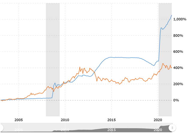
The next chart looks at a 20-year comparison of the Fed balance sheet versus gold.
We can see that they move together. We also see that for this to continue to be the case, gold would have a lot of catching up to do!
Plainly, with the Fed having no intention of stopping the printing presses, gold not only has a lot of catching up to do, but it will have even more catching up to do in the future! It smells like the closest thing one will ever see to a guaranteed continuation of a secular bull market that, in this case, started in 2001–2002 (gold and silver, respectively).
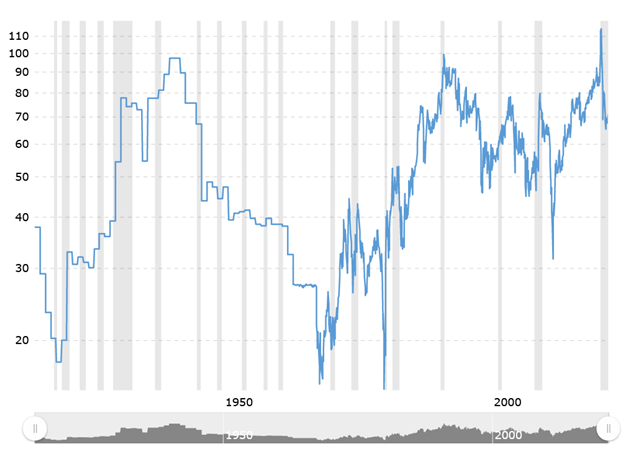
Below, we revisit the 100-year gold:silver ratio chart.
Last year, I wrote that betting against a continued bull market in the gold versus silver ratio made sense due to the lofty 100-year level to which it had attained.
Noting that the previous multi-decade high had only slightly surpassed the century’s summit, the market could create the same phenomenon to chase away the silver players. Indeed, as expected, another and only-slightly higher multi-decade high was made and the ratio subsequently fell by about 40%!
Depending on the strategy that one employed, the result was stunning, but our concern now is to determine where the best values lie. Longer term, my view is silver, but we must always remember that gold is the leader.
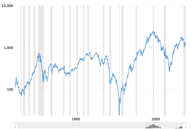
The 100-year Dow:silver ratio chart that follows shows what might be the conclusion of a countertrend rally to a lower high. For many years my view has been that the economy and the Dow’s joint real inflation-adjusted peak was in 2000, and this chart lends some evidence to that analysis.
In any event, the indicator is yet another look into where the best values may be found, and where the greatest risks lie. The market’s efficiency will correct this particular mispricing to the great benefit of the holders of precious metals, and the life-changing dismay of common stock investors.
CONCLUSION
I believe that the SLV could achieve the $44 area by November. A longer consolidation above $20 would allow buying power to be wholly refreshed, as measured by the 200-week moving average; the latter is presently at $17.59 (see weekly chart above).
Mine is the more bullish view but, either way, one should be 100% long silver.
For speculators, the January 20, 2023 $28-strike calls closed yesterday with a bid-ask of $2.43 – $2.48. In the event of a longer consolidation period, I would advise a more aggressive stance at the next entry point.
