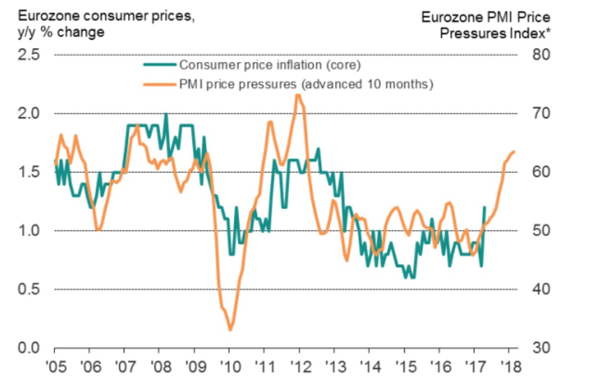
Long-Term S&P 500 Trend
There are many ways to slice and dice a trend chart. To get a general sense of the overall trend of the equity market I like to look at weekly and monthly charts along w/ one or two moving averages. Below is a weekly chart of the S&P 500 with the 20-day and 50-day Exponential Moving Averages. With the major indices continuing to hit fresh highs, the trend is clearly positive.
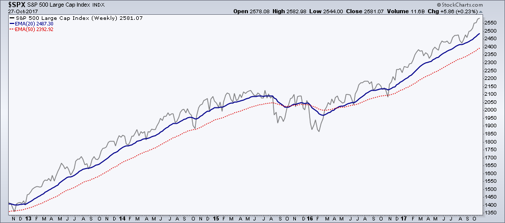
Sector Performance
This chart comes from Zacks, which shows the best performing sectors year-to-date. Aerospace, Tech, retail, and industrial products all are currently up over 20% so far this year. Retail being the third best performing sector would surprise many people but this include online commerce and computer electronics which has held buoy the sector as a while.
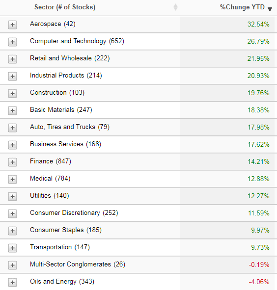
Industry Performance
Drilling a bit further into market performance, below is a list of the top ten best performing industries YTD. Not a big surprise that semiconductors make up the top two spots with many tech-related fields rounding out several of the top ten.
Sector Correlation
First we have the correlation for the S&P ten sectors over the last 20 days. I like to know not only what sectors are performing well but how the broad sectors are acting in relation the market as a whole. Over the lat 20 days we can see three sectors showing a negative correlation to the S&P 500, REITs, Consumer Staples, and Energy.

Next we have sector correlation over the past six months. Comparing the six month and 20-day correlation can help show pot’l trends in correlation. We can see that Consumer Staples negative correlation is nothing new, but it is improving going from -0.37 over six months to -0.28 over the last 20 days – although not a huge improvement.

Relative Rotation Graph (RRG)
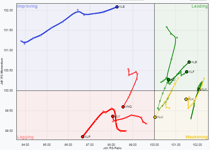
RRG charts help show the trends in relative performance to an index of various assets. Below are the ten S&P sectors. Quite a few of the sectors have begun to congregate near the bottom of the ‘Leading’ and ‘Weakening’ categories while Energy has been steadily working its way through the ‘Improving’ category after its last few weeks of solid gains off its August low.
Best- And Worst-Performing Stocks
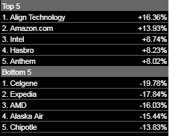
Below are the best and worst performing five stocks in the S&P 500 over the last five days.
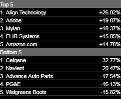
And the best and worst performers over the the last 20 days.
VIX Term Structure
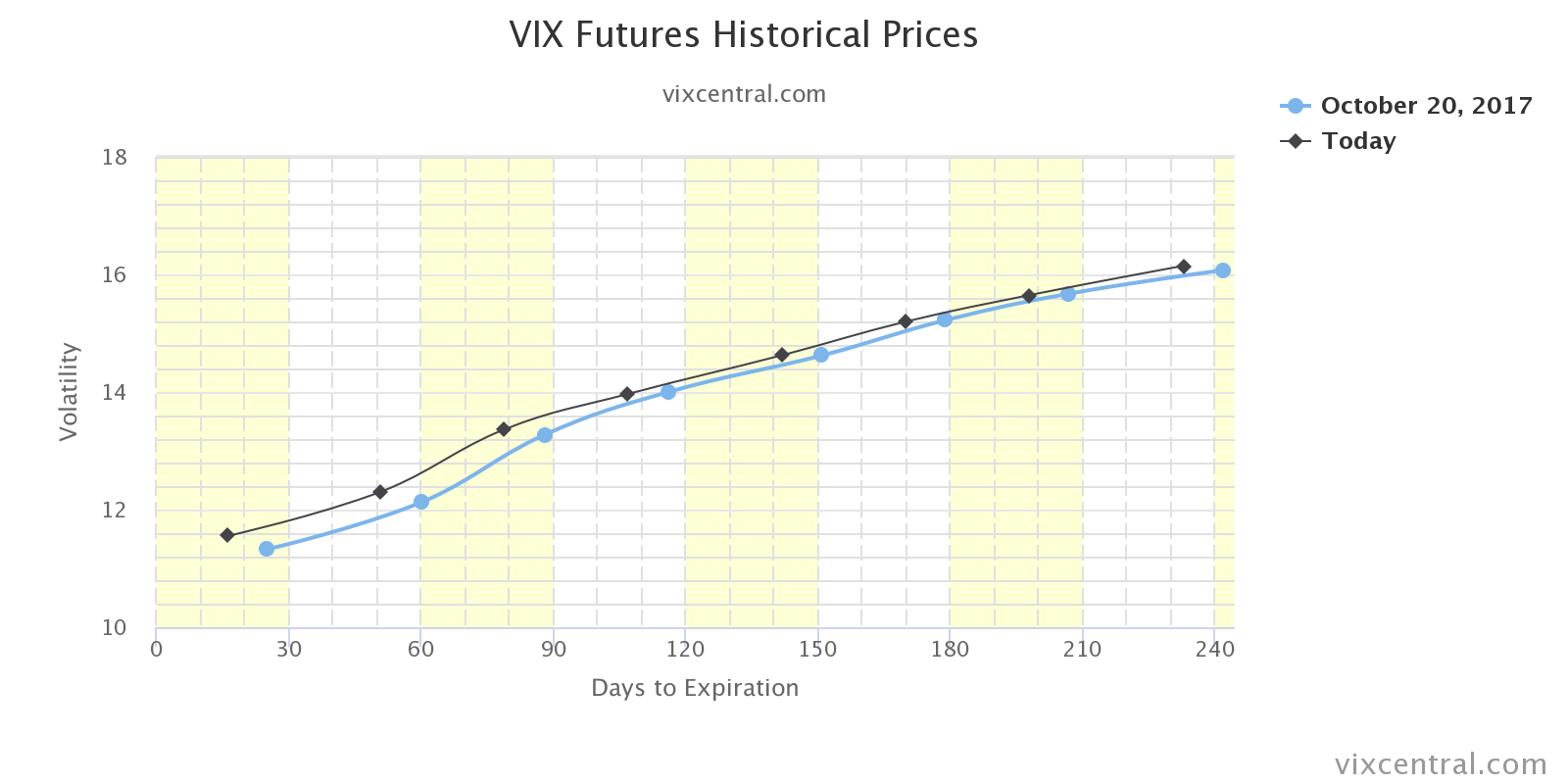
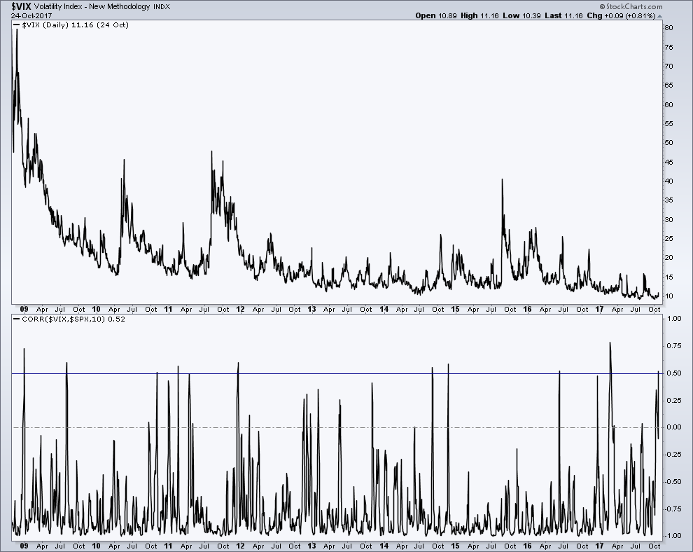
Last week we saw a little bit of volatility reintroduce itself to the market. From the prior Friday’s close to the intraday high on Oct. 25th, spot VIX rose a little over 30% before retreating back under 10. While week finished with the VIX lower by a little less than 2%, the term structure for volatility did see a slight uptick.
Volatility’s Correlation to Equities
Before we saw the intraday rise and eventual decline in the VIX, a build up in correlation had begun to occur between the Volatility Index and the S&P 500. The 10-day Correlation broke above 0.5, which had only happened nine times since 2009. Many of the past instances led to higher volatility, and we sort-of saw that with that quick move in the VIX rising a few hairs above 13, but that’s much calmer than what followed several of the other periods of high correlation. 2017 will surely be marked as one of the calmest volatility years in recent market history.
Traders Exit Their VIX Shorts
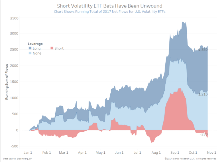
One topic that gained quite a bit of exposure over the last few weeks/months has been the threat of a ‘bubble’ developing in the volatility market on the short side. While there had been a build up in short positions in the VIX futures/options market, based on net 2017 flows in this chart from Bianco Research, that build up has largely been unwound.
Narrowing Breadth in the Dow
This next chart comes from SentimenTrader, showing past examples of the Dow being near a new high but with less than net four of its components advancing last Tuesday. As the chart shows, this has only occurred a few times in the last 20 years. Half of the past instances were just before the market put in an intermediate high in ’98 and the other three where during the up trend in 1999. One theme of 2017 has been ignoring anything bearish, whether it breadth, sentiment, or threats of nuclear war. The resiliency has been quite impressive

Equal Weight vs. Cap Weight Performance
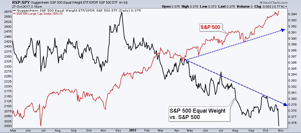
Another trend this year has been the lack of strength outside of the largest companies when it comes to the S&P. I tweeted out this chart last week, showing the relative performance of the S&P equal weight vs. the S&P cap weight indices. Typically in rising equity trends, a sign of risk taking is smaller cap stocks showing more relative strength than their larger brethren. That hasn’t been the case this year though. For example look at the black line last November, equal weight’s relative performance shot higher as traders pushed stocks to fresh highs following the election, largely on the back of the smaller equity components. This growing divergence has gotten quite dramatic, and only intensified last week.
Commitment of Traders Data
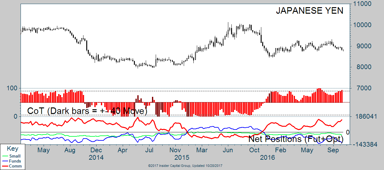
At the end of August as Gold got to $1,320/oz. I wrote post calling for it to pull back due to the lack of confirmation in the Yen. Since then, we have in fact seen Gold move lower, back to $1,270/oz. As the Yen has retreated there’s been an increase in ownership by Commercial Traders, who have taken their net-position back to recent highs. If Gold bugs are looking for something to hang on to as a reason why the metal may have a chance to rebound, it’s this bullish flow into the Yen by Commercials. The most recent instance of their net-position being at its current level was back in July before both Gold and the Yen went higher.
Yield Curve
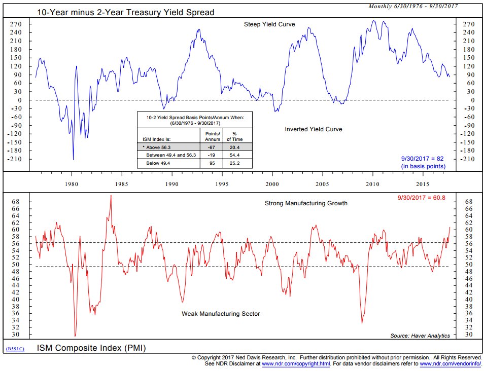
Tony Welch, CFA, CMT, ETF Strategist at Ned Davis Research. shared this chart on Twitter, which shows the relationship between the U.S. yield curve and manufacturing growth/contraction. I found this interesting since we often look at the relationship the financial sector has on the yield curve (and visa versa). Tony notes that when the ISM Manufacturing Index is high (above 56.3) as it is right now, the curve flattens on average 67 basis points.
Consumer Spending & Investing
Several c-suite executives noted trends in consumer spending during their earnings call for Q3 as shared by Scott Krisiloff on his blog. Including Bank of America (NYSE:BAC) CEO Brian Moynihan noted spending to be up 5% YoY in the first nine months of ’17. Morgan Stanley (NYSE:MS) CEO James Gorman discussed the low-level of cash in brokerage accounts, “we saw more cash go into the markets, particularly the equity markets as those markets rose around the world. And we’ve seen cash in our clients’ accounts at its lowest level.”
Bitcoin
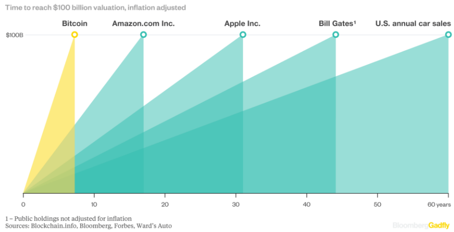
The more and more I read about bitcoin the more I become interested. Many have attempted to create a valuation for BTC but still many argue about the correct methodology. This chart from a Bloomberg story stood out, showing Bitcoins rise to a $100 billion valuation compared to Amazon (NASDAQ:AMZN), Apple (NASDAQ:AAPL), Bill Gates, and U.S. car sales.
Name Change Sends Stock Soaring
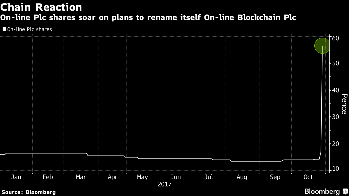
Speaking of Bitcoin, one company added ‘blockchain‘ to their name and traders jumped all over it, sending shares up 394%.
When Excessive Bullishness Isn’t Always Contrarian
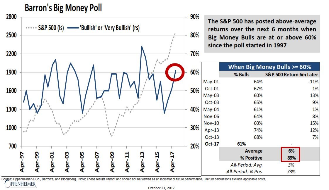
This chart comes from Ari Ward, CMT, Head of Technical Analysis at Oppenheimer & Co., and was shared on Twitter by Babak. Whenever a sentiment survey or fund flows hit historic levels, pundits and traders alike jump to call for excessive optimism or pessimism and that it will lead to the market tanking or rallying. Ari notes that that’s not always the case, as it pertains to the Barron’s survey of money managers. When over 60% are bullish the market has continued higher 89% of the time.
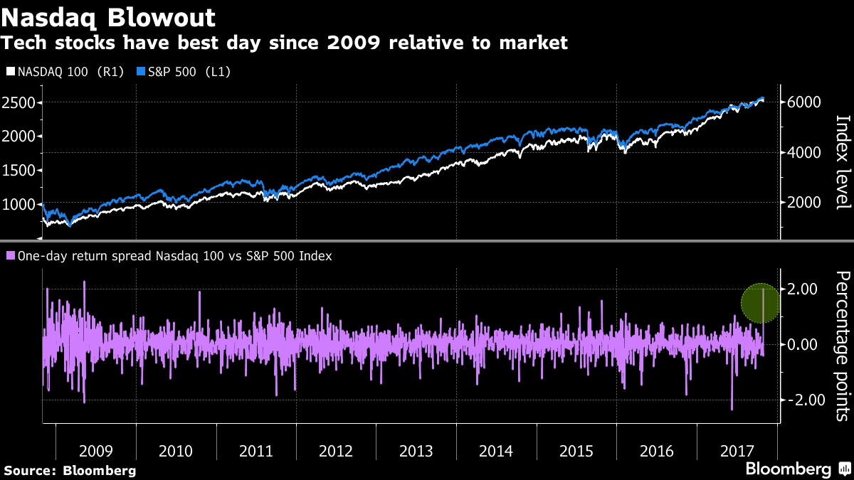
Record Day for the Nasdaq
With many tech names reporting strong Q3 earnings results, the Nasdaq set its best one-day return relative to the S&P 500 since 2009, according to Bloomberg. The advance came as “about $200 billion were added to the market value of Nasdaq 100 companies as the gauge jumped 2.8 percent.”
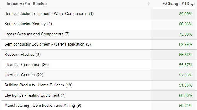
Rising Inflation Expectations in Europe
Apparently shifting the Producers Manufacturing Index ahead by 10 months has given a good idea of where European inflation is headed. This chart, shared by Jonathan Tepper, suggest that the Core CPI may be headed north of 1.5 in the coming ten months.
