Since mid-2010, the gold price consolidates sideways predominately within the boundaries of the blue-green triangle. In January 2012, the resistive blue triangle leg was broken successfully at approx. $1,700 giving the starting signal for the so-called “breakout“ reaching nearly $1,800 a few weeks later. Thereafter, a so-called “classical pullback“ occurred – typically bringing the price to the apex of the triangle, whereafter the final movement of a triangular price formation begins: the so-called “thrust“ – either a strong and longer-termed up- or downward-trend.
A few days ago, a correction to the 260-day EMA at $1,620 occurred – as it was breached shortly, it must be taken into (risk-) account that another pullback may occur (currently at $1,623.90). A sell-signal à la thrust to the downside is not generated until falling below the price level of the triangle apex at approx. $1,625 and reinforced when breaching the (extension of the) blue triangle leg currently at approx. $1,590. As the price rose above the level of the apex recently, a strong buy-signal à la thrust to the upside is active.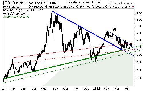
Principally, the goal of a thrust (to the upside) is to transform the resistive high of the breakout ($1,793) and the triangle ($1,923) into new support – in order for a new and longer-termed upward-trend to begin thereafter.
Thus, we are quite bullish for the gold price at the very moment as – apparently – another thrust to the upside has just started.
In comparison with the 5 thrusts during the last 2.5 years (highlighted in light-green), the current thrust is anticipated to be much stronger and enduring much longer, because the triangle is much larger this time.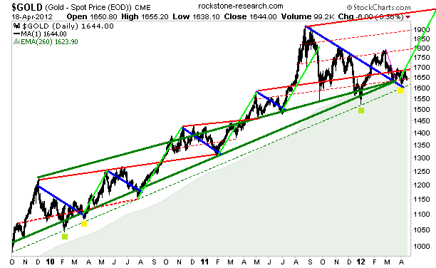
Another reason why we anticipate that the most recently started upward-trend will be one of the strongest moves in the 11 year history of the bull market is that the current triangle has been forming above the “long-term” upward-trend (green channel) – in order to transform it into new support.
Technically, it is valued as a very bullish sign if the resistive top of a trend-channel is broken and acting supportive.
The current triangle had the task to test and potentially confirm this trend-channel as new support – if successful, a strong and longer-termed upward-trend is typical.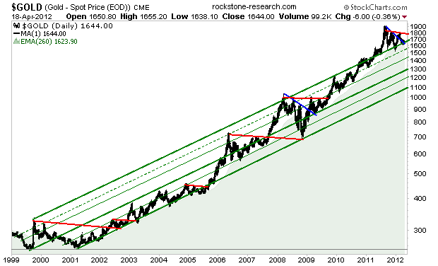
The reason why the gold price prefers to form triangles in the short-, medium- and long-term is that the price fluctuated within the boundaries of a 20 year long (red-green) triangle since the “old alltime-high” ($852 on 21st January 1980) – and that the new (green) upward-trend-channel, which started in 1999-2001, represents the thrust of this triangle. 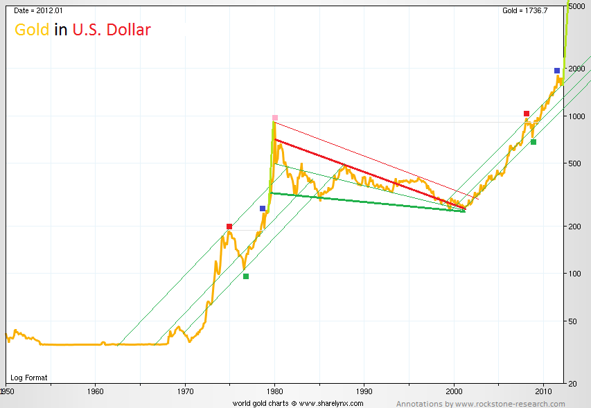
As the above chart shows the nominal gold price in U.S. dollars, it may be valuable to price gold not only in dollars, but additionally against inflation as the dollar lost purchasing power over the recent past. Being a millionaire in the 1980s had more value than being a millionaire today (under the assumption of equal “opportunity costs”), because the purchasing power of a dollar has not increased proportionately. The quantity of all above-ground gold has also not become proportionately valuable.
“Economists commonly use the real price measure when they are trying to account for the impact of inflation.The real price today is computed by multiplying the value in the past by the increase in the consumer price index (CPI). The result compares that past value to a ratio of the cost of a fixed bundle of goods and services the average consumer buys in each of the two years. In the construction of the CPI bundle, an effort is made to compensate for quality changes in the mix of the bundle over time. Still, the longer the time span, the less consistent the comparison... Using the real price is not the correct index to use for measuring the value of [gold]… in todays prices. It does, however, give an idea of what the cost of purchasing [gold]… was in [todays]… dollars.” (Samuel Williamson, University of Illinois at Chicago, measuringworth.com)
If I held an investment, such as government bonds, with a fixed (“nominal”) interest rate of 3% p.A. and inflation ran at 4% during that year, the real interest rate of this investment is minus 1% – net I really lost. If I bought gold at $852 on January 21, 1980, I look pretty stupid today – but not (only) because I bought at the very top of the last gold bull, but (mainly) because my investment didn’t make me any money yet (even if gold today trades way above $852), because there (still) is a negative prefix affixed on my investment (and me). My investment is really yielding negatively, because the Dollar lost purchasing power (via inflation) and it would need to trade at more than $2,000 today in order to get me out (more or less) even. Adjusting the gold price (in dollars) by inflation shows us the price of gold (we would have to pay on any selected day in the past) measured in todays / “real” dollars. Back then, at the high of the 1970/80s bull market, how many dollars would I had to put on the counter to buy 1 ounce of gold considering (for whatever reasons) wanting to pay at around the same level of purchasing power the dollar enjoys today? More than 2,000.
In nominal terms, the gold price climbed over “the old” 1970/80s bullmarket alltime-high ($852 in 1980) in 2008 and now trades around twice that much. This may look “expensive“ or “overvalued“ to some or many. As the below chart shows the “real“gold price with the dollar being inflation-adjusted, it strikes the eye that the “real“ high of the 1970s gold bullmarket was above $2,000 (in todays terms).
In “real” terms, the gold price in dollar still has to catch up – only to get to the “real“ level of “the old” high. Yet the top of the below chart shows that the (not inflation-adjusted) gold price still has even more to make up until reaching the (black) CPI-curve again, namely >$5,000; yet not unlikely that real dynamic supply & demand factors lift the gold price way above the CPI-curve (as being the typical case for silver as we will see later).
The below CPI-Inflation-adjusted gold price since 1800 shows a 200 year long sideways consolidation in form of a (red-green) triangle. The gold price suffered 2 short but severe breachings of its (green) triangle leg in the “Golden 1920s“ and the era of the “Worldwide Wirtschafts-Wunder“ after the World Wars.
During the 1970s, the “Oil Crisis“ had the effect that gold rose strongly which price appreciation period (“bull market“) is considered as the result of a shorter-termed “external shock“ – in contrast (and addition) to longer-termed “dynamic supply and demand mega-trends" that started to become market-reality in 2000. Inflation in the 1970s was classified as “imported inflation” as most industrial nations were net importers of oil – thus, increased import prices resulted in increased inflation.
Today, more than ever (respectively since August 15, 1971), inflation is on the way up as the result of increased unbacked money creation, additionally. (1) 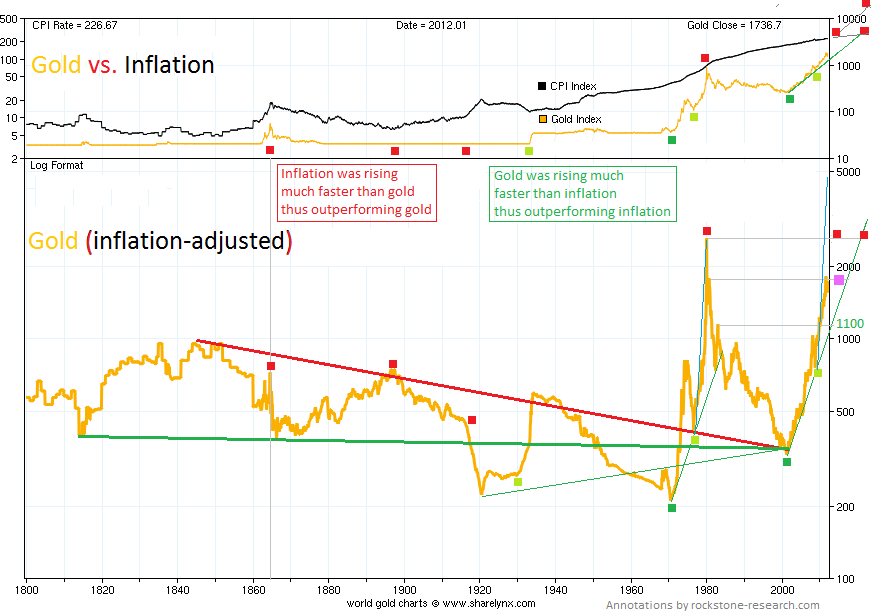
In nominal and real terms, the number of market participants is increasing who believe that the official inflation-rate (CPI) is not “real“, but “fixed/doctored“ by (more or less) legal statistics tricks as “real” inflation is thought/felt to be calculated correctly much higher than the official “real“ CPI-rate (currently 3% p.A.).
John Williams created a “different” inflation-index (currently 6% p.A.), called SGS (Shadow Government Statistics), arguably with more realistic measures, yet for our purposes absolutely sufficient: because it uses the exact same calculation method for inflation as the government statistic agencies used in 1980 – and that’s all we need as just wanting to find out the gold price in 1980 priced in today`s dollar terms (thus inflation-adjusted) while past inflation is to be considered as per “the old” calculation method of 1980, which is even/also a more realistic measure for real inflation today.
“Same same but different”: The below chart shows the same (red-green) triangle as above with the difference that in “SGS-real“ terms, the gold price currently trades solely near the apex of the (red-green) triangle at $1,500 – and that the “real“ thrust to the upside has just started recently with the goal of transforming the “old high“ of the previous breakout, namely >$9,000, into new support – in order for a new and longer-termed upward-trend to begin thereafter.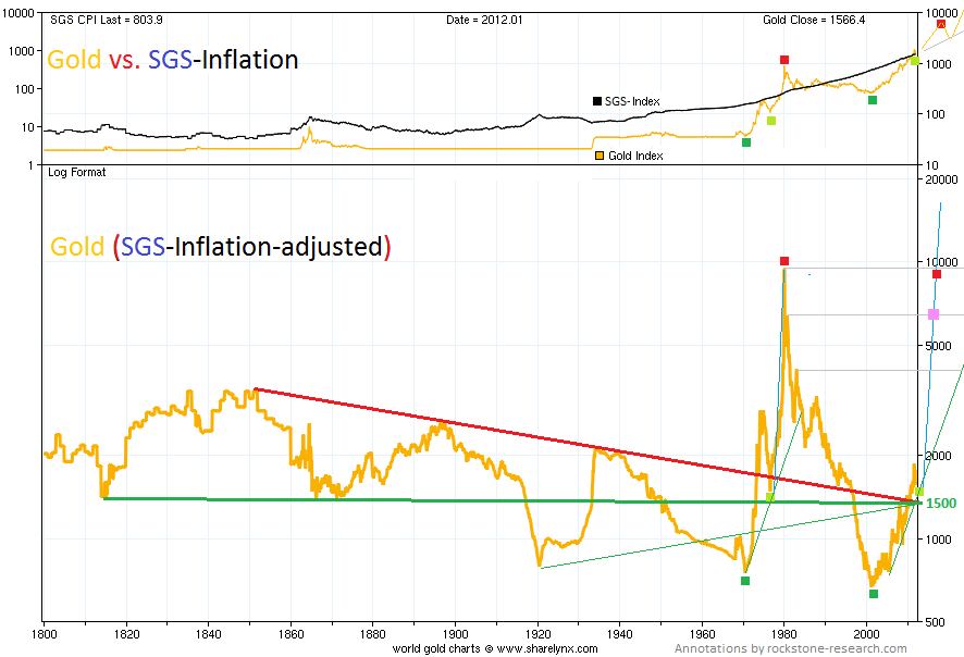
Between 1970 and 2001, the gold price increased by +674% from $35 to $271 (average price in 2001). During the same time, the CPI-inflation cumulated +370%, whereas the SGS-inflation is calculated with +688%. Which “inflation calculator” fits better to gold? SGS. The average gold price during 1980 was $615 – since then, gold has increased by +155%. Since 1980, the CPI-inflation cumulated +185%, whereas the SGS-inflation is calculated with +789%. Which inflation calculator fits better to gold? CPI – or does gold has to catch up towards the +789% SGS-figure, namely rise to $5,467?
Keeping in mind the real question there should be: Will there ever be a “final” sell-signal for gold? Historically, there never is a real solution to the lion`s share of future woes – but the Real (pure, classy) Gold-Standard priceless at a highly valued, fair and realistic level of appreciation. There is no other solution, only gold.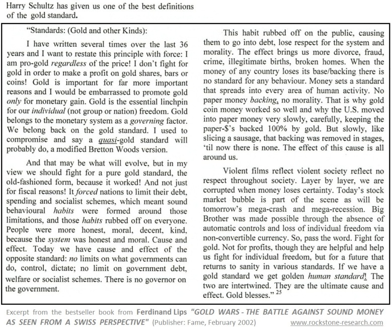
- English (UK)
- English (India)
- English (Canada)
- English (Australia)
- English (South Africa)
- English (Philippines)
- English (Nigeria)
- Deutsch
- Español (España)
- Español (México)
- Français
- Italiano
- Nederlands
- Português (Portugal)
- Polski
- Português (Brasil)
- Русский
- Türkçe
- العربية
- Ελληνικά
- Svenska
- Suomi
- עברית
- 日本語
- 한국어
- 简体中文
- 繁體中文
- Bahasa Indonesia
- Bahasa Melayu
- ไทย
- Tiếng Việt
- हिंदी
Charting The Gold Megathrust
Published 04/23/2012, 12:06 AM
Updated 07/09/2023, 06:31 AM
Charting The Gold Megathrust
3rd party Ad. Not an offer or recommendation by Investing.com. See disclosure here or
remove ads
.
Latest comments
Install Our App
Risk Disclosure: Trading in financial instruments and/or cryptocurrencies involves high risks including the risk of losing some, or all, of your investment amount, and may not be suitable for all investors. Prices of cryptocurrencies are extremely volatile and may be affected by external factors such as financial, regulatory or political events. Trading on margin increases the financial risks.
Before deciding to trade in financial instrument or cryptocurrencies you should be fully informed of the risks and costs associated with trading the financial markets, carefully consider your investment objectives, level of experience, and risk appetite, and seek professional advice where needed.
Fusion Media would like to remind you that the data contained in this website is not necessarily real-time nor accurate. The data and prices on the website are not necessarily provided by any market or exchange, but may be provided by market makers, and so prices may not be accurate and may differ from the actual price at any given market, meaning prices are indicative and not appropriate for trading purposes. Fusion Media and any provider of the data contained in this website will not accept liability for any loss or damage as a result of your trading, or your reliance on the information contained within this website.
It is prohibited to use, store, reproduce, display, modify, transmit or distribute the data contained in this website without the explicit prior written permission of Fusion Media and/or the data provider. All intellectual property rights are reserved by the providers and/or the exchange providing the data contained in this website.
Fusion Media may be compensated by the advertisers that appear on the website, based on your interaction with the advertisements or advertisers.
© 2007-2024 - Fusion Media Limited. All Rights Reserved.
