Precious metals investors should be prepared that the next large market correction will likely cause record gold demand with much higher prices. Once the Great Hyped Trump Rally runs its course and the lousy fundamentals are allowed to kick in, the broader stock markets are going to experience one hell of a correction.
And with that correction, we will experience another big surge in Retail Gold ETF (NYSE:GLD) demand, just as we did back in Q1 2016. Even though gold ETF demand is paper driven market, it is instrumental in pushing the gold price considerably higher.
This is exactly what took place last year when the Dow Jones Index corrected by more than 2,000 points during the first quarter of 2016:
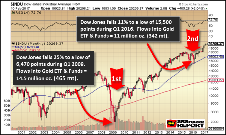
This chart shows the difference in gold ETF flows during Q1 2009 when the Dow Jones fell 25% to a low of 6,470 points. Investors who thought the world was coming to an end as Jim Cramer on CNBC was telling his viewers that “no end to the crash was in sight” were flocking into gold ETF’s in a big way. During the Q1 2009, a record 465 metric tons of gold (supposedly) flowed into gold ETF and funds.
NOTE: During the article, I will be describing gold ETF and funds just as gold ETF flows. However, the figures should include all gold ETF’s and funds.
Now, compare what seemed like a really scary market crash of 2009, to what took place during Q1 2016. The Dow Jones only fell 11% during the first quarter of 2016, but 342 metric tons flowing into gold ETF’s pushed the gold price up $200. This was the highest amount of flows into gold ETF’s since the record high in Q1 2009. But, what made retail investors so fearful to move into gold ETF’s on just a mere 11% correction? And we must remember, this correction took place from a Dow Jones top of 18,000 points.
The chart above was an updated version of a chart that was included in The Gold Report: Investment Flows, published early last year. I decided to write that report because I noticed some interesting trends that were occurring in the gold market. Below is a description of the report.
Something has seriously changed in the gold market this year and I believe that most investors are unaware of how explosive this shift could impact the price of the yellow metal going forward.
The Gold Report: Investment Flows is a digital report that provides up-to-date information on the gold market that is invaluable for analysts and investors to presently understand.
While many precious metals analysts publish articles that focus on individual aspects of the gold industry, this report combines all of the relevant investment flows to show how significant trend changes are now putting serious strain on global gold supply, elevating gold’s average global value.
Again, something really spooked investors to flock into gold ETF’s on a small 11% correction in the Dow Jones Index. What happens when we see Dow Jones Index suffers double or triple that 11% correction??
This next chart shows the quarterly net gold ETF flows since 2010:
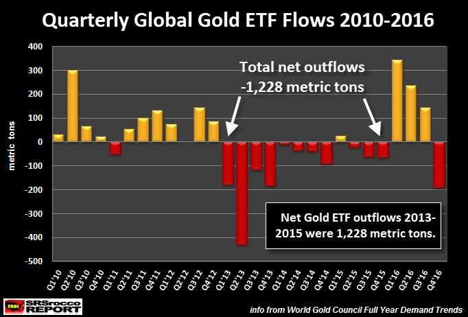
There are several important factors to see in this chart. First, from 2013 to 2016, the net gold flows out of gold ETF’s were 1,228 metric tons. This was due to the gold price falling from $1,700 in the beginning of 2013 to a low of $1,070 at the end of 2015. I am one of the analysts that believe the gold price during this time-period was deliberately smacked down on purpose.
Proof of this, was shown in a chart sent to me by one of my readers which I published in my recent article, The Great Precious Metals Disconnect: A Ticking Time Bomb, which stated the following:
The chart is a silver-gold ratio (RED LINE) compared to the S&P 500 Index (BLACK LINE). Take note, this is not a gold-silver ratio, but the opposite. As we can see, the silver-gold ratio line has paralleled the S&P 500 from 1997 to 2012… very closely. However, when the Fed announced QE3 at the end of 2012, something quite interesting took place. The silver-gold ratio continued lower towards its bottom level, but the S&P 500 Index surged upward to a new record high.
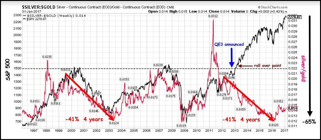
If a portion of the QE3 funds found its way into gold and silver, well… that could have been really ugly. We would have likely seen more record-breaking prices due to surging physical and retail demand. Thus, the smack down of gold, allowed much-needed physical gold to enter the market. Unfortunately, this Fed trick is not one that they can repeat again.
Okay, let’s get back to the Quarterly Gold Flows chart above. Secondly, we can see that in Q1 2016, when the Dow Jones Index corrected lower by 11%, flows into gold ETF’s surged to 342 metric tons (mt). Now, over the following quarters, flows into gold ETF’s were strong, but continued lower. This was due to the market realizing the market was not going to crash yet. Furthermore, as the market realized that Trump was going to be President, the stock market head back towards the moon which caused net gold ETF outflows during Q4 2016.
So, if we look at what has taken place in annual Global Gold ETF flows since 2010, this would be the result:
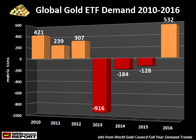
As the gold price continued higher from 2010 to 2012, flows into gold ETF’s remained positive. However, during the gold price take-down, there were net gold ETF outflows. The interesting thing to notice in this chart is the huge spike up in gold ETF demand to 532 mt in 2016. Again, more than half of that 532 mt figure came just in the first quarter of 2016 when the Dow Jones fell 2,000+ points.
The Dow Jones is now trading at 20,270, another 2,200 points higher than its level at the beginning of 2016. According to the article by WolfStreet.com, Dow Companies Report Worst Revenues Since 2010, Dow Rises To 20,000 (LOL):
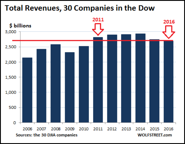
What a ride it has been. From the beginning of 2011 through January 27, 2017, so a little more than six years, the DJIA has soared 73%, from 11,577 to 20,094. Glorious!!
But when it comes to revenues of the 30 Dow component companies – a reality that is harder to doctor than ex-bad-items adjusted earnings-per-share hyped by Wall Street – the picture turns morose.
This means the broader stock markets, being held up by a lot of hot air, are being primed for one mother of a crash. If investors flocked into gold ETF’s during Q1 2016 on a mere 11% Dow Jones correction, what is it going to be like when we finally experience a gut wrenching correction?
It looks like 2017 will turn out to be one tumultuous year. The more President Trump stirs up the government pot, the more likely the duct tap, bailing wire and gum holding everything together will start to unravel.
Lastly, I would like to remind all the “intellectual” retail investors who believe gold is nothing more than a worthless 13th century “Barbarous Relic”, God hath a sense of humor…
