
The Unemployment Insurance Weekly Claims Report was released this morning for last week. The 360,000 new claims number was a 16,000 increase from the previous week's 344,000 (an upward revision from 343,000). The less volatile and closely watched four-week moving average, which is usually a better indicator of the recent trend, rose by 6,000 to 351,750. Here is the official statement from the Department of Labor:
In the week ending July 6, the advance figure for seasonally adjusted initial claims was 360,000, an increase of 16,000 from the previous week's revised figure of 344,000. The 4-week moving average was 351,750, an increase of 6,000 from the previous week's revised average of 345,750.
The advance seasonally adjusted insured unemployment rate was 2.3 percent for the week ending June 29, unchanged from the prior week's unrevised rate. The advance number for seasonally adjusted insured unemployment during the week ending June 29 was 2,977,000, an increase of 24,000 from the preceding week's revised level of 2,953,000. The 4-week moving average was 2,970,750, a decrease of 3,500 from the preceding week's revised average of 2,974,250.
Today's seasonally adjusted number was well above the Investing.com forecast of 340K and Briefing.com's 345K.
Here is a close look at the data over the past few years (with a callout for the several months), which gives a clearer sense of the overall trend in relation to the last recession and the trend in recent weeks.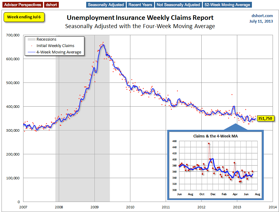
As we can see, there's a good bit of volatility in this indicator, which is why the four-week moving average (the highlighted number) is a more useful number than the weekly data. Here is the complete data series.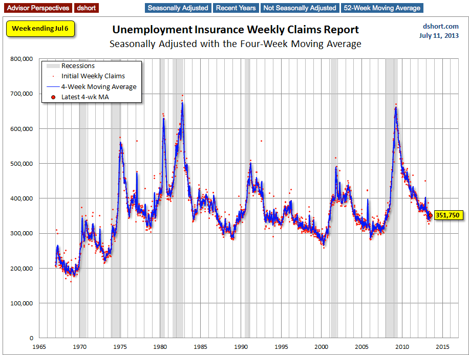
Occasionally I see articles critical of seasonal adjustment, especially when the non-adjusted number better suits the author's bias. But a comparison of these two charts clearly shows extreme volatility of the non-adjusted data, and the four-week MA gives an indication of the recurring pattern of seasonal change in the second chart (note, for example, those regular January spikes).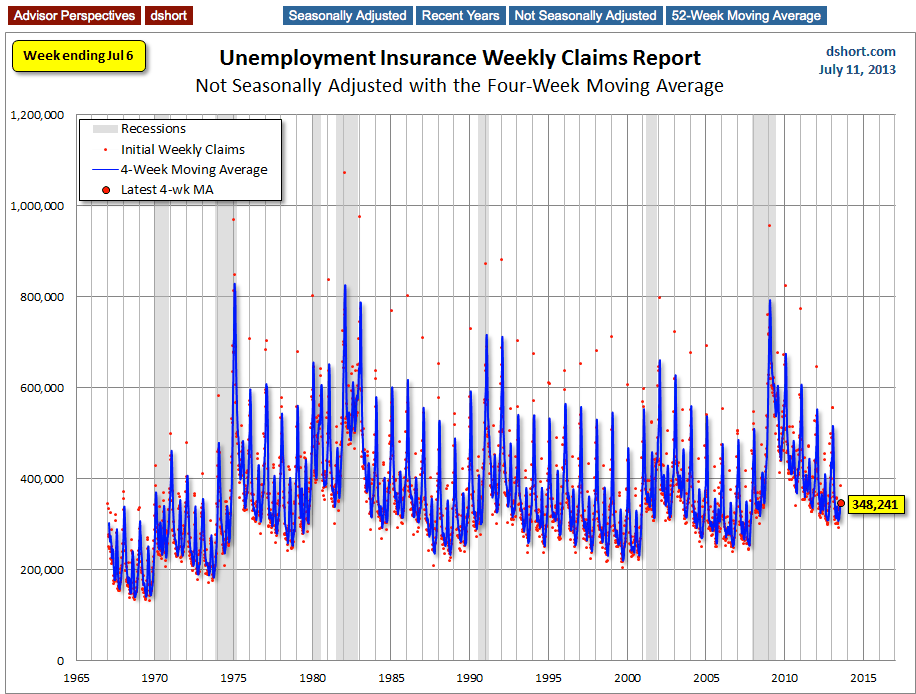
Because of the extreme volatility of the non-adjusted weekly data, a 52-week moving average gives a better sense of the long-term trends. I've now added a linear regression through the data. We can see that this metric continues to fall below the long-term trend stretching back to 1968.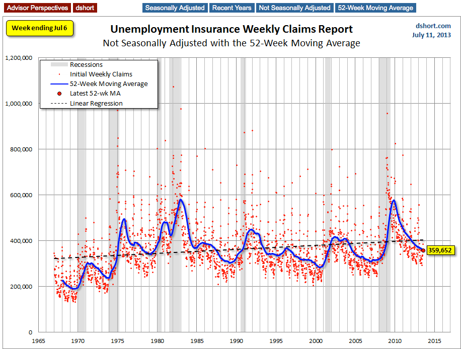
A Four-Year Comparison
Here is an overlay of the past three calendar years and the beginning of 2013 using the four-week moving average. The purpose is to show the relative slope of improvement since the peak in the spring of 2009. The latest year was off to an excellent start. It then oscillated a bit, but the latest seven weeks have stalled in a farily narrow range.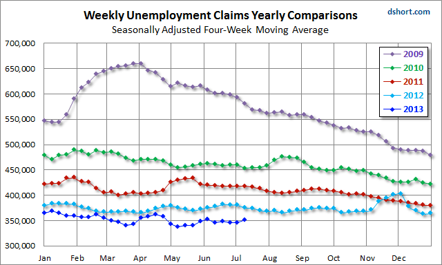
For an analysis of unemployment claims as a percent of the labor force, see my recent commentary, What Do Weekly Unemployment Claims Tell us About Recession Risk?.
Here is a snapshot from that analysis.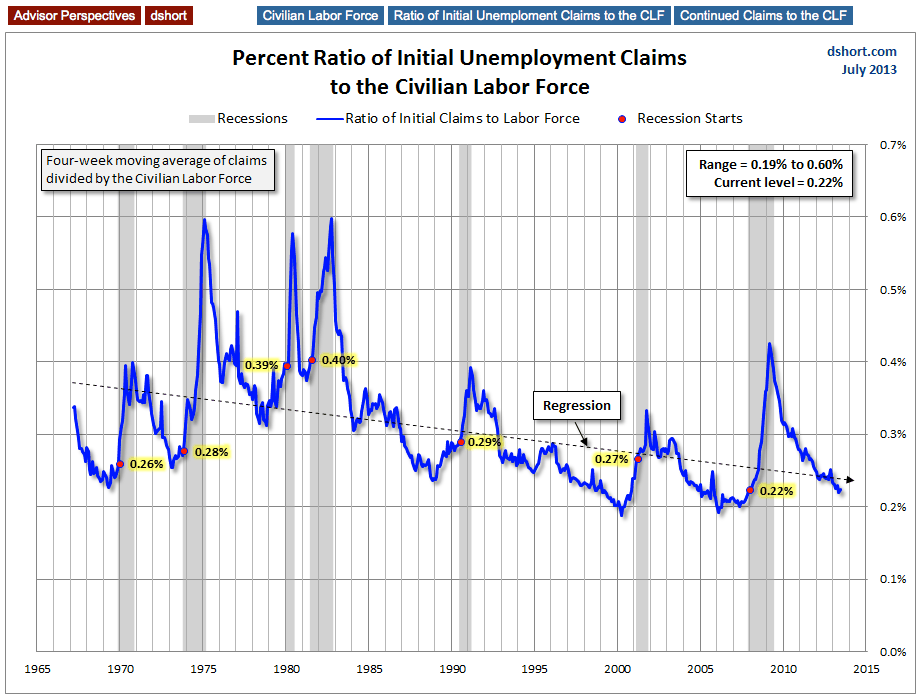
or a broader view of unemployment, see the latest update in my monthly series, Unemployment and the Market Since 1948.
- English (UK)
- English (India)
- English (Canada)
- English (Australia)
- English (South Africa)
- English (Philippines)
- English (Nigeria)
- Deutsch
- Español (España)
- Español (México)
- Français
- Italiano
- Nederlands
- Português (Portugal)
- Polski
- Português (Brasil)
- Русский
- Türkçe
- العربية
- Ελληνικά
- Svenska
- Suomi
- עברית
- 日本語
- 한국어
- 简体中文
- 繁體中文
- Bahasa Indonesia
- Bahasa Melayu
- ไทย
- Tiếng Việt
- हिंदी
U.S. Jobless Claims Much Higher Than Forecast
Published 07/11/2013, 11:04 AM
Updated 07/09/2023, 06:31 AM
U.S. Jobless Claims Much Higher Than Forecast
3rd party Ad. Not an offer or recommendation by Investing.com. See disclosure here or
remove ads
.
Latest comments
Install Our App
Risk Disclosure: Trading in financial instruments and/or cryptocurrencies involves high risks including the risk of losing some, or all, of your investment amount, and may not be suitable for all investors. Prices of cryptocurrencies are extremely volatile and may be affected by external factors such as financial, regulatory or political events. Trading on margin increases the financial risks.
Before deciding to trade in financial instrument or cryptocurrencies you should be fully informed of the risks and costs associated with trading the financial markets, carefully consider your investment objectives, level of experience, and risk appetite, and seek professional advice where needed.
Fusion Media would like to remind you that the data contained in this website is not necessarily real-time nor accurate. The data and prices on the website are not necessarily provided by any market or exchange, but may be provided by market makers, and so prices may not be accurate and may differ from the actual price at any given market, meaning prices are indicative and not appropriate for trading purposes. Fusion Media and any provider of the data contained in this website will not accept liability for any loss or damage as a result of your trading, or your reliance on the information contained within this website.
It is prohibited to use, store, reproduce, display, modify, transmit or distribute the data contained in this website without the explicit prior written permission of Fusion Media and/or the data provider. All intellectual property rights are reserved by the providers and/or the exchange providing the data contained in this website.
Fusion Media may be compensated by the advertisers that appear on the website, based on your interaction with the advertisements or advertisers.
© 2007-2024 - Fusion Media Limited. All Rights Reserved.