Recently, a Spanish group called “Ecologist in Action” asked me to give them a presentation on what kind of financial crisis we should expect. They wanted to know when it would be and how it would take place.
The answer I had for the group is that we should expect financial collapse quite soon–perhaps as soon as the next few months. Our problem is energy related, but not in the way that most Peak Oil groups describe the problem. It is much more related to the election of President Trump and to the Brexit vote.
I have talked about this subject in various forms before, but not since 2016 energy production and consumption data became available. Most of the slides in this presentation use new BP (LON:BP) data, through 2016.
Most people don’t understand how interconnected the world economy is. All they understand is the simple connections that economists make in their models. 
Energy is essential to the economy, because energy is what makes objects move, and what provides heat for cooking food and for industrial processes. Energy comes in many forms, including sunlight, human energy, animal energy, and fossil fuels. In today’s world, energy in the form of electricity or petroleum makes possible the many things we think of as technology.
I illustrate the economy as hollow because we keep adding new layers of the economy on top of the old layers. As new layers (including new products, laws, and consumers) are added, old ones are removed. This is why we can’t necessarily use a prior energy approach. For example, if cars can no longer be used, it would be difficult to transition back to horses. This happens partly because there are few horses today. Also, we do not have the facilities in cities to “park” the horses and to handle the manure, if everyone were to commute using horses. We would have a stinky mess!
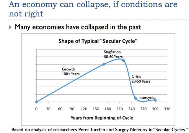
In the past, many local civilizations have grown for a while, and then collapsed. In general, after a group finds a way to produce more food (for example, cuts down trees so that citizens have more area to farm) or finds another way to otherwise increase productivity (such as adding irrigation), growth at first continues for a number of generations–until the population reaches the new carrying capacity of the land. Often resources start to degrade as well–for example, soil erosion may become a problem.
At this point, growth flattens out, and wage disparity and growing debt become greater problems. Eventually, unless the group can find a way of increasing the amount of food and other needed goods produced each year (such as finding a way to get food and other materials from territories in other parts of the world, or conquering another local civilization and taking their land), the civilization is headed for collapse. We recently have tried globalization, with exports from China, India, and other Asian nations fueling world economic growth.
At some point, the efforts to keep growing the economy to match rising population become unsuccessful, and collapse sets in. One of the reasons for collapse is that the government cannot collect enough taxes. This happens because with growing wage disparity, many of the workers cannot afford to pay much in taxes. Another problem is greater susceptibility to epidemics, because after-tax income of many workers is not sufficient to afford an adequate diet.
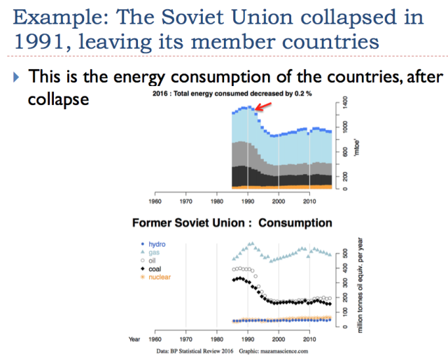
A recent partial collapse of a local civilization was the collapse of the Soviet Union in 1991. When this happened, the government of the Soviet Union disappeared, but the governments of the individual states within the Soviet Union remained. The reason I call this a partial collapse is because the rest of the world was still functioning, so nearly all of the population remained, and the cutback in fuel consumption was just partial. Eventually, the individual member countries were able to function on their own.
Notice that after the Soviet Union collapsed, the consumption of coal, oil and gas collapsed at the same time, over a period of years. Oil and coal use have not come back to anywhere near their earlier level. While the Soviet Union had been a major manufacturer and a leader in space technology, it lost those roles and never regained them. Many types of relatively high-paying jobs have been lost, leading to lower energy consumption.
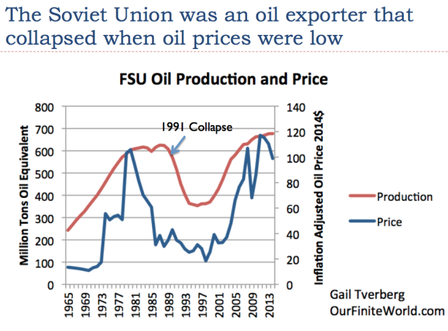
As nearly as I can tell, one of the major contributing factors to the collapse of the Soviet Union was low oil prices. The Soviet Union was an oil exporter. As oil prices fell, the government could not collect sufficient taxes. This was a major contributing factor to collapse. The collapse from low oil prices did not happen immediately–it took several years after the drop in oil prices. There was a 10-year gap between the highest oil price (1981) and collapse (1991), and a 5-year gap after oil prices dropped to the low 1986 price level.
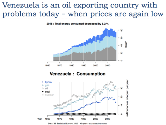
Venezuela is often in the news because of its inability to afford to import enough food for its population. The slide shows that on an inflation-adjusted basis, world oil prices hit a high point first in 2008, and again in 2011. Since 2011, oil prices slid slowly for a while, then began to slide more quickly in 2014. It is now nine years since the 2008 peak. It is six years since the 2011 peak, and about three years since the big drop in prices began.
One of the reasons for Venezuela’s problems is that with low oil prices, the country has been unable to collect sufficient tax revenue. Also, the value of the currency has dropped, making it difficult for Venezuela to afford food and other products on international markets.
Note that in both slides, I am showing the amount of energy consumed in the countries shown. The amount consumed represents the amount of energy products that individual citizens, plus businesses, plus the government, can afford. This is why, in both Slides 4 and 6, the quantity of all types of energy products tends to decline at the same time. Affordability affects many types of energy products at once.
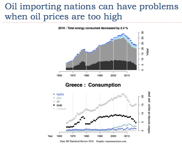
Oil importing countries can have troubles when oil prices rise, similar to the problems that oil exporting countries have when oil prices fall. Greece’s energy consumption peaked in 2007. One of Greece’s major products is tourism, and the cost of tourism depends on the price of oil. When the price of oil was high, it adversely affected tourism. Exported goods also became expensive in the world market. Once oil prices dropped (as they have done, especially since 2014), tourism tended to rebound and the financial situation became less dire. But total energy consumption still has still tended to decline (top “stacked” chart on Slide 7), indicating that the country is not yet doing well.
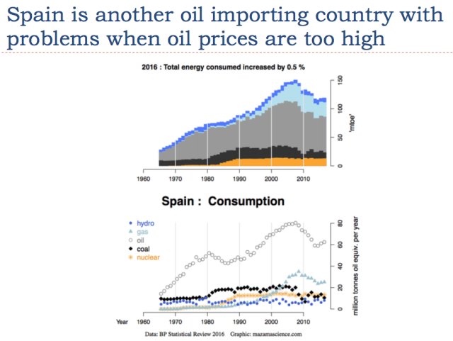
Spain follows a pattern similar to Greece’s. By the mid-2000s, high oil prices made Spain less competitive in the world market, leading to falling job opportunities and less energy consumption. Since 2014, very low oil prices have allowed tourism to rebound. Oil consumption has also rebounded a bit. But Spain is still far below its peak in energy consumption in 2007 (top chart on Slide 8), indicating that job opportunities and spending by its citizens are still low.
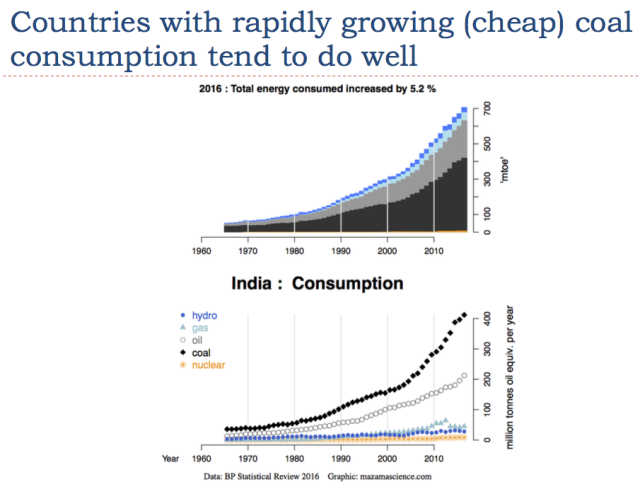
We hear much about rising manufacturing in the Far East. This has been made possible by the availability of both inexpensive coal supplies and inexpensive labor. India is an example of a country where manufacturing has risen in recent years. Slide 9 shows how rapidly energy consumption–especially coal–has risen in India.
China’s energy consumption grew very rapidly after it joined the World Trade Organization in 2001. In 2013, however, China’s coal consumption hit a peak and began to decline. One major contributor was the fact that the cheap-to-consume coal that was available nearby had already been extracted. The severe problems that China has had with pollution from coal may also have played a role.
It might be noted that the charts I am showing (from Mazamascience) do not include renewable energy (including wind and solar, plus burned garbage and other “renewables”) used to produce electricity. (The charts do include ethanol and other biofuels within the “oil” category, however.) The omission of wind and solar does not appear to make a material difference, however. Figure 1 shows a chart I made for China, comparing three totals:
(1) Opt. total (Optimistic total) – Totals on the basis BP computes wind and solar. Intermittent wind and solar electricity is assumed to be equivalent to high quality electricity, available 24/7/365, produced by fossil fuel electricity-generating stations.
(2) Likely totals – Wind and solar are assumed to replace only the fuel that creates high quality electricity. The amount of backup generating capacity required is virtually unchanged. More long distance transmission is needed; other enhancements are also needed to bring the electricity up to grid-quality. The credits given for wind and solar are only 38% as much as those given in the BP methodology.
(3) From chart – Mazamascience totals, omitting renewable sources of electricity, other than hydroelectric.
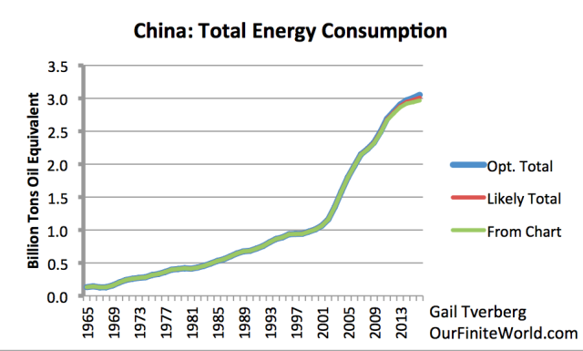
Figure 1. China energy consumption based on BP Statistical Review of World Energy 2017.
It is clear from Figure 1 that adding electricity from renewables (primarily wind and solar) does not make much difference for China, no matter how wind and solar are counted. If they are counted in a realistic manner, they truly add little to China’s energy use. This is also true for the world in total.
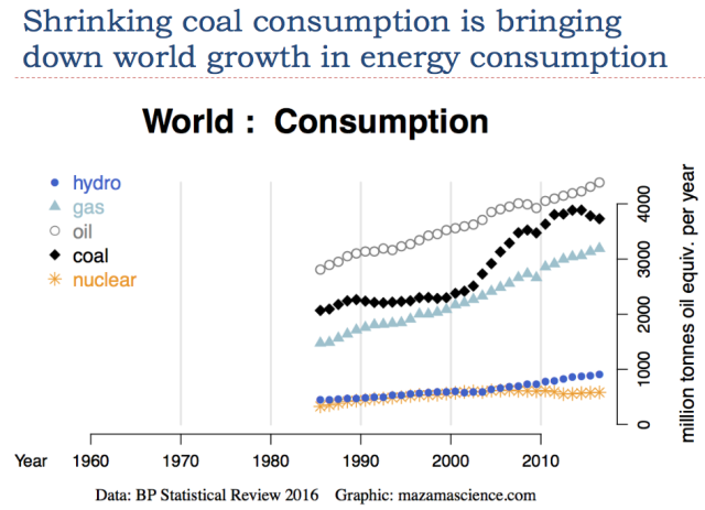
If we look at the major parts of world energy consumption, we see that oil (including biofuels) is the largest. Recently, it seems to be growing slightly more quickly than other energy consumption, perhaps because of the low oil price. World coal consumption has been declining since 2014. If coal is historically the least expensive fuel, this is likely a problem. I have not shown a chart with total world energy consumption. It is still growing, but it is growing less rapidly than world population.
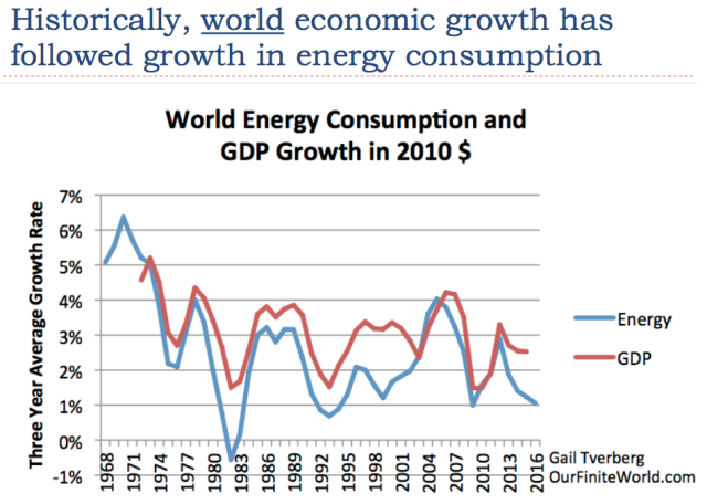
Note: Energy growth includes all types of energy. This includes wind and solar, using wind and solar counted using the optimistic BP approach.
Economists have given the false idea that amount of energy consumption is unimportant. It is true that individual countries can experience lower consumption of energy products, if they begin outsourcing major manufacturing to other countries as they did after the Kyoto Protocol was signed in 1997. But it doesn’t change the world’s need for growing energy consumption, if the world economy is to grow. The growth in world energy consumption (blue line) tends to be a little lower than the growth in GDP (red line), because of efficiency gains over time.
If we look closely at the above slide, we can see that drops in energy consumption tend to precede drops in world GDP; rises in energy consumption tend to precede rises in world GDP. This order of events strongly suggests that rising energy consumption is a major cause of world GDP growth.
We don’t have very good evaluations of GDP amounts for 2015 and 2016. For example, recent world GDP estimates seem to accept without question the very high estimates of economic growth given by China, even though their growth in energy consumption is very much lower in 2014 through 2017. Thus, world economic growth may already be lower than reported amounts.
Most people are not aware of the extreme “power” given by energy products. For example, it is possible for a human to deliver a package, by walking and carrying the package in his hands. Another approach would be to deliver the package using a truck, operated by some form of petroleum. One estimate is that a single gallon of gasoline is equivalent to 500 hours of human labor.
“Energy consumption per capita” is calculated as world energy consumption divided by world population. If this amount is growing, an economy is in some sense becoming more capable of producing goods and services, and thus is becoming wealthier. Workers are likely becoming more productive, because the additional energy per capita allows the use of more and larger machines (including computers) to leverage human labor. The additional productivity allows wages to rise.
With higher incomes, workers can afford to buy an increasing amount of goods and services. Businesses can expand to serve the growing population, and the increasingly wealthy customers. Taxes can rise, so it is possible for governments to provide the services that citizens desire, such as healthcare and pensions. When energy consumption per capita turns negative–even slightly so–these abilities start to disappear. This is the problem we are starting to encounter.
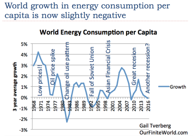
Note: Energy percentage increases include all energy sources shown by BP. Wind and solar are included using BP’s optimistic approach for counting intermittent renewables, so growth rates for recent years are slightly overstated.
We can look back over the years and see when energy consumption rose and fell. The earliest period shown, 1968 to 1972, had the highest annual growth in energy consumption–over 3% per year–back when oil prices were under $20 per barrel, and thus were quite affordable. (See Slide 5 for a history of inflation-adjusted price levels.) Once prices spiked in the 1973-1974 period, much of the world entered recession, and energy consumption per capita barely rose.
A second drop in consumption (and recession) occurred in the late 1970s and early 1980s, when easy-to-adopt changes were made to cut oil usage and increase efficiency. These included
- (a) Closing many electricity-generating plants using oil, and replacing them with other generation.
- (b) Replacing many home heating systems operating with oil with systems using other fuels, often more efficiently.
- (c) Changing many industrial processes to be powered by electricity instead of burning oil.
- (d) Making cars smaller and more fuel-efficient.
Another big drop in world per capita energy consumption occurred with the partial collapse of the Soviet Union in 1991. This was a somewhat local drop in energy consumption, allowing the rest of the world to continue to grow in its use of energy.
The Asian Financial Crisis in 1997 was, in some sense, another localized crisis that allowed energy consumption to continue to grow in the rest of the world.
Most people remember the Great Recession in the 2007-2009 period, when world per capita growth in energy consumption briefly became negative. Recent data suggests that we are almost in the same adverse situation now, in terms of growth in world per capita energy consumption, as we were then.
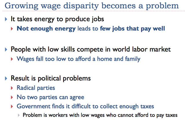
What happens when growth in world per capita energy consumption slows and starts to fall? I have listed some of the problems in Slide 15. We start seeing problems with low wages, particularly for people with low-skilled jobs, and the type of political problems we have been experiencing recently.
Part of the problem is that countries with a high-priced mix of energy products start to find their goods and services uncompetitive in the world marketplace. Thus, demand for goods and services from these countries starts to fall. Greece and Spain are examples of countries using a lot of oil in their energy mix. As a result, they became less competitive in the world market when oil prices rose. China and India were favored because they had a less-expensive energy mix, favoring coal.
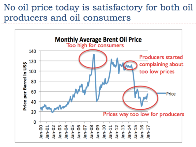
The above shows the kinds of comments we have been hearing in recent years, as prices have recently bounced up and down. It is becoming increasingly clear that no price of oil is now satisfactory for all participants in the economy. Prices are either too high for consumers, or too low for the producers. In fact, prices can be unsatisfactory for both consumers and producers at the same time.
The slide shows oil prices show considerable volatility. This happens because it is difficult to keep supply and demand exactly balanced; there are many factors determining needed price level, including both the amount consumers can afford and the costs of producers. The bouncing of prices up and down on Slide 16 is to a significant extent in response to interest rate changes, and resulting changes in currency relativities and debt growth.
We are now reaching a point where no interest rate works for all members of the economy. If interest rates are low, pension plans cannot meet their obligations. If interest rates are high, monthly payments for homes and cars become unaffordable for customers. Also, high interest rates tend to raise needed tax levels for governments.
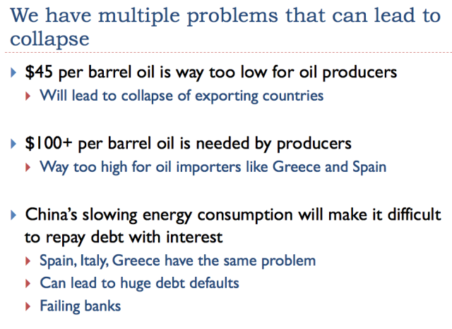
All of these problems are fairly evident already.
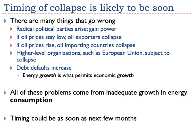
The low level of energy consumption growth is of considerable concern. It is this low growth in energy consumption that we would expect to lead to low wage growth worldwide, especially for the non-elite workers. Our economy needs more rapid growth in energy consumption to provide enough tax revenue for all of our governments and intergovernmental organizations, and to keep the world economy growing quickly enough to prevent large debt defaults.
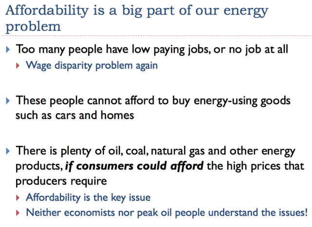
Economists have confused matters for a long time by their belief that energy prices can and will rise arbitrarily high in inflation-adjusted terms–for example $300 per barrel for oil. If such high prices were really possible, we could extract all of the oil that we have the technical capacity to extract. High-cost renewables would become economically feasible as well.
In fact, affordability is the key issue. When the world economy is stimulated by more debt, only a small part of this additional debt makes its way back to the wages of non-elite workers. With greater global competition in wages, the wages of these workers tend to stay low. The limited demand of these workers tends to keep commodity prices, especially oil prices, from rising very high, for very long.
It is affordability that limits our ability to grow endlessly. While it is possible to argue that more debt might help raise the wages of non-elite workers in a particular country, if one country adds more debt, other currencies around the world can be expected to rebalance. As a result, there would be no real benefit, unless all countries together could add more debt. Even this would be of questionable value, because the whole effort relates to getting oil and other commodity prices to rise to an adequate level for producers; we have already seen that there is no price level that is satisfactory for both producers and consumers.
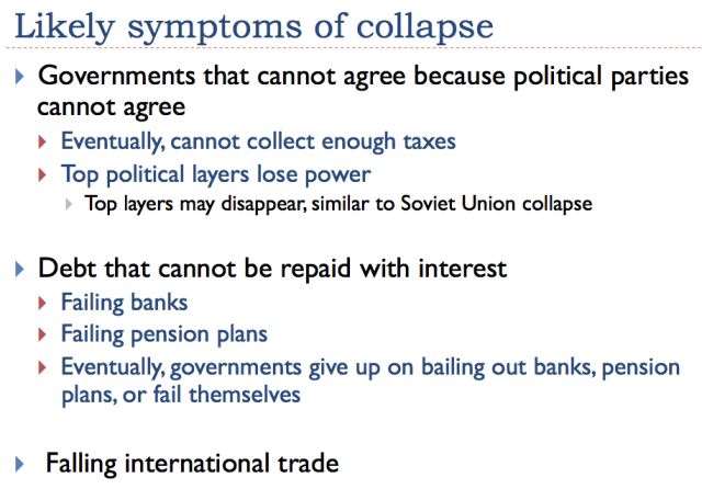
These symptoms seem to be already beginning to happen.
Note:
[1] This presentation is a little different from the original. The presentation I am showing here is entirely in English. The original presentation included some charts in Spanish from Energy Export Data Browser by Mazama Science. With this database, a person can quickly prepare energy charts for any country in a choice of seven languages. I encourage readers to “look up” their own country, in their preferred language.
In this write-up, I include more discussion than in my original talk.


