Over the last few years, I’ve pointed out exhaustively how the current operating approach at the Fed towards monetary policy is distinctly different from past tightening cycles. In fact, it is basically a humongous experiment, and if the Fed succeeds in bringing inflation gently back down to target it will be either a monumental accomplishment or, more likely, monumentally lucky.
My goal in this blog post is to explain the difference, and illustrate the challenge, in just a few straightforward charts. There are doubtless other people who have a far more complex way of illustrating this, but these charts capture the essence of the dynamic.
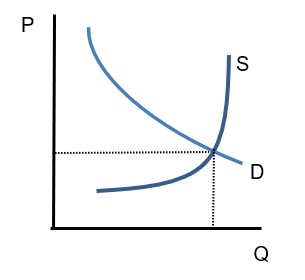
Let me start first with the basic ‘free market’ interest rate chart. Here, I am showing the quantity of bank lending on the x-axis, and the ‘price’ of the loan – the interest rate – on the y-axis. If we assume for the moment that inflation is stable (don’t worry, the fact that it isn’t will come into play later) then whether the y-axis is in nominal or real terms is irrelevant. So we have a basic supply and demand chart. Demand for loans slopes downward: as the interest rate declines, borrowers want to borrow more. The supply curve slopes upward: banks want to lend more money as the interest rate increases.
An important realization here is that the supply curve at some point turns vertical. There is some quantity of loans, more than which banks cannot lend. There are two main limits on the quantity of bank lending: the quantity of reserves, since a bank needs to hold reserves against its lending, and the amount of capital. These are both particular to a bank and to the banking sector as a whole, especially reserves because they are easily traded.
Anyway, once aggregate lending is high enough that there are no more reserves available for a bank to acquire to support the lending, then the bank (and banks in aggregate) cannot lend any more at any interest rate – at least, in principle, and ignoring the non-bank lenders/loan sharks. We’re talking about the Fed’s actions here and the Fed does not directly control the leverage available to loan sharks.
Now, traditionally when the Fed tightened policy, it did so by reducing the aggregate quantity of reserves in the system. This had the effect of making the supply curve go vertical further to the left than it had. In this chart, the tightening shows as a movement from S to S’.
Note that the equilibrium point involves fewer total loans (we moved left on the x axis), which is the intent of the policy: reduce the supply of money (or, in the dynamic case, its growth) by restraining reserves. Purely as a byproduct, and not very important at that, the interest rate rises. How much it rises depends on the shape of the demand curve – how elastic demand for loans is.

As an aside, we are assuming here that the secondary constraint – bank capital – is not binding. That is, if reserves were plentiful, the S curve would go vertical much farther to the right. In the Global Financial Crisis, that is part of what happened and was the reason that vastly increase reserves did not lead to massive inflation, nor to a powerful recovery: banks were capital-constrained, so that the Fed’s addition of more reserves did not help. Banks were lending all that they could, given their capital.
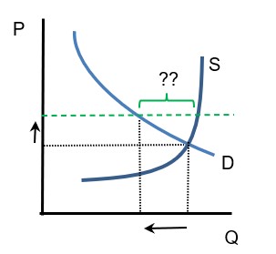
Manipulating the aggregate quantity of reserves was the way the Fed used to conduct monetary policy. No longer. Now, the Fed merely moves interest rates. Let’s see what effect that would have. Let’s assume for now that the interest rate is a hard floor, and that banks cannot lend at less than the floor rate. This isn’t true, but for ease of illustration. If the Fed institutes a higher floor on interest rates, then what happens to the quantity of loans?

This looks like we have achieved the same result, more simply! We merely define the quantity of loans we want, pick the interest rate that will generate the demand for those loans, and voila, we can add as many reserves as we want and still get the loan production we need.
The arrows in this third chart show the same movements as the arrows in the prior chart. The quantity of loans is really determined entirely by the demand curve – at the prescribed interest rate, there is a demand for “X” loans, and since banks are not reserve-constrained they are able to supply those loans.
However, it’s really important to notice a few things. The prior statement is true if and only if we know what the demand curve looks like, and if the floor is enforced. Then, a given interest rate maps perfectly into Q. But:
- D is not known with precision. And it moves. What is more, it moves for reasons that have nothing to do with interest rates: for example, general expectations about business opportunities or the availability of work.
- Moreover, D is really mapped against real rates, while the Fed is setting nominal rates. So, for a given level of a nominal floor, in real space it bucks up and down based on the expected inflation rate.
- Also, the floor is not a hard floor. At any given interest rate where the floor would be binding, the desire of banks to lend (the location of the S curve) exceeds the demand for loans (by the amount of the ?? segment in the chart above). The short-term interest rate still affects the cost to banks of that lending, but we would still expect competition among lenders. This should manifest in more aggressive lending practices – tighter credit spreads, for example, or non-rate competition such as looser documentary requirements.
In the second chart I showed, the Fed directly controlled the quantity of reserves and therefore loans. So these little problems didn’t manifest.
Now, there is one advantage to setting interest rates rather than setting the available quantity of reserves as a way of reducing lending activity. Only the banking sector is reserve-constrained. If there is an adequate non-bank lending network, then the setting of interest rates to control the demand for loans will affect the non-bank lenders as well while reserve constraint would not. So this is somewhat “fairer” for banks. But this only means that non-bank lenders will also be competing to fill the reduced demand for loans, and the non-bank lending sector is less-vigorously regulated than the banking sector. More-aggressive lending practices from unregulated lenders is not, it seems to me, something we should be encouraging but what do I know? The banks aren’t lobbying me to help level the playing field against the unregulated.
Hopefully this helps illuminate what I have been saying. I think the final chart above would be a lovely final exam question for an economics class, but a bad way to run a central bank. Reality is not so easily charted.

