
: This commentary has been revised to include Real Retail Sales for May. The Sales data was released last Thursday, but we needed this morning's Consumer Price Index to make an accurate inflation adjustment.
Official recession calls are the responsibility of the NBER Business Cycle Dating Committee, which is understandably vague about the specific indicators on which they base their decisions. This committee statement is about as close as they get to identifying their method.
There is, however, a general belief that there are four big indicators that the committee weighs heavily in their cycle identification process. They are:
- Industrial Production
- Real Personal Income (excluding transfer payments)
- Nonfarm Employment
- Real Retail Sales (a more timely substitute for Real Manufacturing and Trade Sales)
I've now updated this commentary to include the Real Retail Sales data for May. As the adjacent thumbnail illustrates, this indicator has generally risen since June of last year. The October dip is the fingerprint of superstorm Sandy, which curtailed sales near the end of the month, and we saw a bit of weakness in March.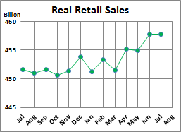
May Nominal Retail Sales rose a robust 0.55% (rounded to 0.6%) from April, while Real Retail Sales rose an even 0.4%. The April year-over-year real growth rate is 2.88% (rounded to 2.9%). If we study this YoY chart in the Appendix below, we can plot this indicator level for the beginning months of the 11 recessions over this time frame. The May reading of 2.5% is a higher level than nine of the eleven. Only the two recessions back in the 1950s started when the YoY reading was higher than at present.
The chart and table below illustrate the performance of the Big Four and simple average of the four since the end of the Great Recession. The data points show the percent cumulative percent change from a zero starting point for June 2009. The latest data point is for the 47th month. In addition to the four indicators, I've included an average of the four, which, as we can see, was influenced by the anomaly in the Personal Income data points, which reflect 2012 year-end income increases, at the expense of early 2013, as a tax management strategy.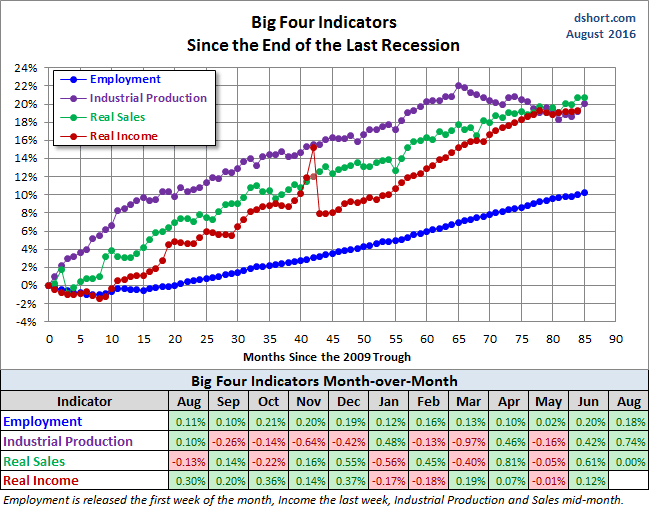
Current Assessment and Outlook
The back-to-back improvement in Real Retail Sales is encouraging, although it would be considerably more encouraging if were seeing commensurate increases in Real Personal Incomes and also household incomes, which I report on elsewhere (see this commentary). The overall picture of the US economy remains one of exasperatingly slow recovery from the Great Recession. And, as we can see in the illustration of the average of the Big Four since 2000, growth has been even slower in recent months.
My next update will be on June 27th when the latest Personal Income and Outlays report is available from the Bureau of Economic Analysis.
Background Analysis: The Big Four Indicators and Recessions
The charts above don't show us the individual behavior of the Big Four leading up to the 2007 recession. To achieve that goal, I've plotted the same data using a "percent off high" technique. In other words, I show successive new highs as zero and the cumulative percent declines of months that aren't new highs. The advantage of this approach is that it helps us visualize declines more clearly and to compare the depth of declines for each indicator and across time (e.g., the short 2001 recession versus the Great Recession). Here is my own four-pack showing the indicators with this technique.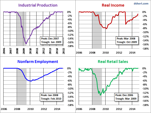
Now let's examine the behavior of these indicators across time. The first chart below graphs the period from 2000 to the present, thereby showing us the behavior of the four indicators before and after the two most recent recessions. Rather than having four separate charts, I've created an overlay to help us evaluate the relative behavior of the indicators at the cycle peaks and troughs. (See my note below on recession boundaries).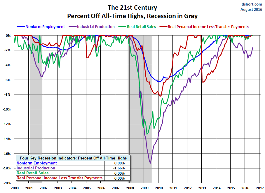
The chart above is an excellent starting point for evaluating the relevance of the four indicators in the context of two very different recessions. In both cases, the bounce in Industrial Production matches the NBER trough while Employment and Personal Incomes lagged in their respective reversals.
As for the start of these two 21st century recessions, the indicator declines are less uniform in their behavior. We can see, however, that Employment and Personal Income were laggards in the declines.
Now let's look at the 1972-1985 period, which included three recessions -- the savage 16-month Oil Embargo recession of 1973-1975 and the double dip of 1980 and 1981-1982 (6-months and 16-months, respectively).
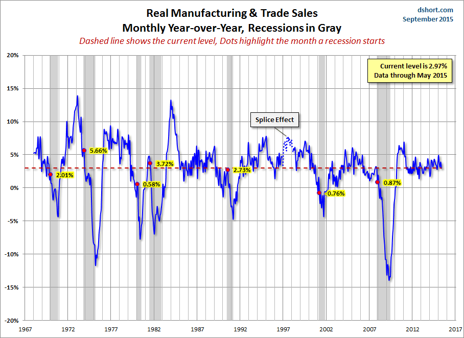
And finally, for sharp-eyed readers who can don't mind squinting at a lot of data, here's a cluttered chart from 1959 to the present. That is the earliest date for which all four indicators are available. The main lesson of this chart is the diverse patterns and volatility across time for these indicators. For example, retail sales and industrial production are far more volatile than employment and income.
History tells us the brief periods of contraction are not uncommon, as we can see in this big picture since 1959, the same chart as the one above, but showing the average of the four rather than the individual indicators.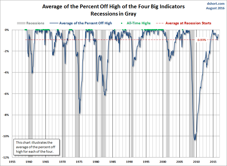
The chart clearly illustrates the savagery of the last recession. It was much deeper than the closest contender in this timeframe, the 1973-1975 Oil Embargo recession. While we've yet to set new highs, the trend has collectively been upward, although we have that strange anomaly caused by the late 2012 tax-planning strategy that impacted the Personal Income.
Here is a close-up of the average since 2000.
Appendix: Chart Gallery with Notes
Each of the four major indicators discussed in this article are illustrated below in three different data manipulations:
- A log scale plotting of the data series to ensure that distances on the vertical axis reflect true relative growth. This adjustment is particularly important for data series that have changed significantly over time.
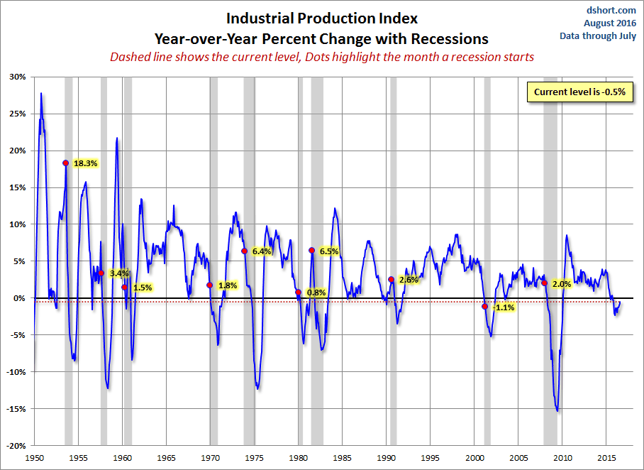
- A year-over-year representation to help, among other things, identify broader trends over the years.
- A percent-off-high manipulation, which is particularly useful for identifying trend behavior and secular volatility.
Industrial Production
The US Industrial Production Index (INDPRO) is the oldest of the four indicators, stretching back to 1919. The log scale of the first chart is particularly useful in showing the correlation between this indicator and early 20th century recessions.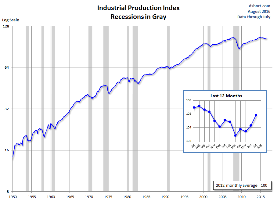

Real Personal Income Less Transfer Payments
This data series is computed as by taking Personal Income (PI) less Personal Current Transfer Receipts (PCTR) and deflated using the Personal Consumption Expenditure Price Index (PCEPI). I've chained the data to the latest price index value.
The "Tax Planning Strategies" annotation refers to shifting income into the current year to avoid a real or expected tax increase.


Total Nonfarm Employees
There are many ways to plot employment. The one referenced by the Federal Reserve researchers as one of the NBER indicators is Total Nonfarm Employees (PAYEMS).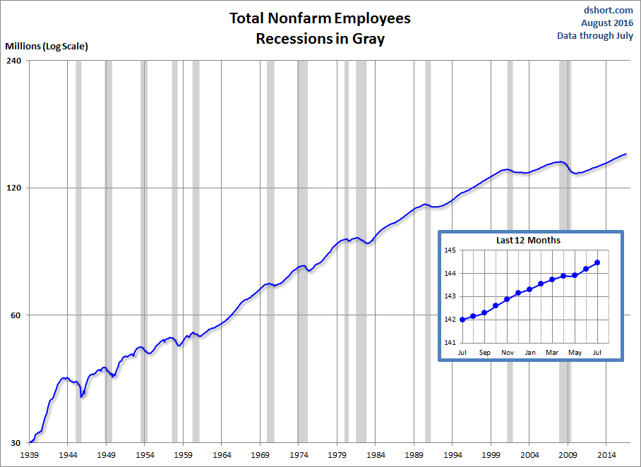


Real Retail Sales
This indicator is a splicing of the discontinued retail sales series (RETAIL, discontinued in April 2001) spliced with the Retail and Food Services Sales (RSAFS) and deflated by the Consumer Price Index (CPIAUCSL). I used a splice point of January 1995 because that was date mentioned in the FRED notes. My experiments with other splice techniques (e.g., 1992, 2001 or using an average of the overlapping years) didn't make a meaningful difference in the behavior of the indicator in proximity to recessions. I've chained the data to the latest CPI value.


Real Manufacturing and Trade Sales
This indicator is a splice of two seasonally adjusted series tracked by the BEA. The 1967-1996 component is SIC (Standard Industrial Classification) based and the 1997-present is NAICS (North American Industry Classification System) based. The data are available from the BEA website. See Section 0 - Real Inventories and Sales and look for Tables 2AU and 2BU. The FRED economists use the Real Retail Sales above for their four-pack. However, ECRI appears to use this series as their key indicator for sales. Note that the Manufacturing and Trade Sales data is updated monthly with the BEA's Personal Consumption and Expenditures release, but the numbers lag by one month from the other PCE data.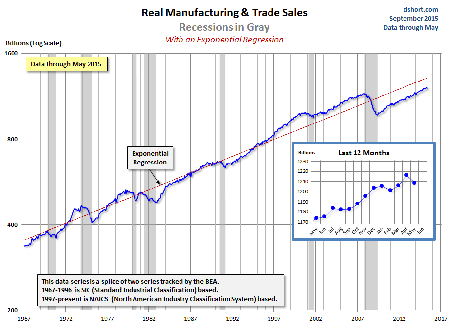

Note: I represent recessions as the peak month through the month preceding the trough to highlight the recessions in the charts above. For example, the NBER dates the last cycle peak as December 2007, the trough as June 2009 and the duration as 18 months. The "Peak through the Period preceding the Trough" series is the one FRED uses in its monthly charts, as explained in the FRED FAQs illustrated in this Industrial Production chart.