Well there goes the first half of the year. Don't know about you, and maybe I'm just getting old, but time seems to be slipping by faster and faster. Then again, maybe it's just the unusual and challenging way that this year is unfolding across nearly all facets of life.
I'll tentatively count myself among the few who managed to get it mostly right so far this year on macro and markets (I say tentatively: you never want to get too proud of yourself and pat yourself on the back with this business as it naturally leads to hubris/arrogance/complacency in what is a very competitive, complex, and unforgiving dynamic puzzle solving process).
But this does bring us to the point of this post: reviewing my "charts to watch in 2022" piece to update the thinking and reflect on initial thoughts at the start of the year.
So let's get on with it...here's a half-time progress check on the "12 Charts to Watch in 2022!" In the original article I shared what I thought would be the 12 most important charts to watch for multi-asset investors in the year ahead (and beyond).
In this article I have updated those 12 charts, and provided some updated comments on the outlook—given the dramatic shifts seen during the first half of the year.
[Note: I have included the original comments from back at the start of the year, so you can quickly compare what I'm thinking now vs what I said back then.]
Also n.b., these charts originally featured in our 2021 End of Year Special Report.
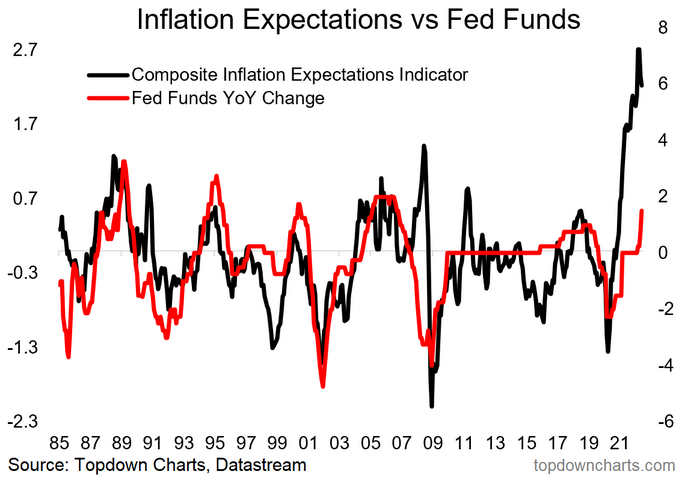
1. Fed Behind The Curve: Despite increasingly aggressive moves (+25bps in March, +50bps in May, +75bps in June...and, pattern recognizers: JP has said 100bp moves are not off the table!!), the Fed remains behind the curve on inflation. While you might argue some or even most of the current inflation is down to supply-side issues there are 2 things to remember:
1. Supply issues disappear if demand disappears; and 2. The risks are not so much in today's inflation, but in the prospect that a surge in inflation triggers an inflation expectations spiral where the expectation of higher inflation becomes a self-reinforcing, self-fulfilling feedback loop.
But above all, as noted, the Fed made its bed when it chose to avoid the risk of tightening too early—and perhaps even in going too hard on stimulus in the first place. In that respect, the forces set in motion in 2020 are simply coming full circle.
"Based only on this chart we could make an assertion that the Fed has fallen behind the curve. Against that there is the argument that other factors are important too, and not to mention the point that the Fed basically decided to position itself behind the curve to try and prevent the mistake of tightening too soon. With the composite measure of inflation expectations at 40-year highs it’s fair to suggest that the Fed may have some catching up to do as it kicks off the transition away from easing."
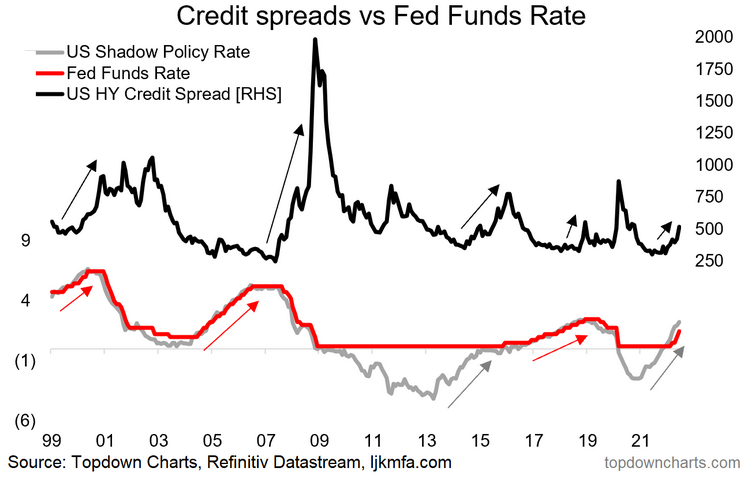
2. Fed Catch-Up Risk: Fed catch-up risk has become Fed catch-up reality. The harder they hike, the more likely it is that something will break. In the extreme, the only way to really well and truly get inflation under control is to trigger a recession, and as I detailed in a recent webinar, recession is basically now the base case.
"Naturally the Fed now faces another risk – i.e. the risk of being dragged into a game of catch-up in the context of a very complacent market that has arguably come to expect permanent easing... “the Fed has my back”. Just remember, the old saying of ‘don’t fight the Fed’ means don’t fight against the tides, and the tides are starting to change."
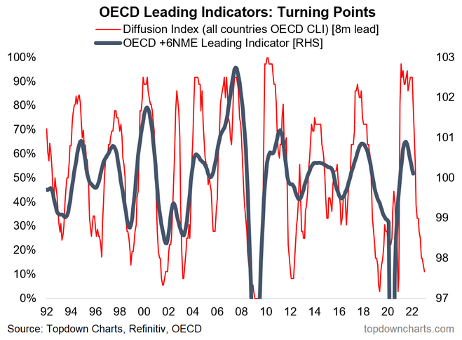
3. Growth Scare 2022: Change that to "Recession 2022"—cost pressures (energy prices, general cost of living increases), surging mortgage rates, tightening lending standards and credit markets, falling asset prices, rate hikes, fiscal drag, COVID resurgence, war, and the kitchen sink...all signs now point squarely in one direction. The bulk of my leading indicators now say recession is near-certain, likely to kick-off in H2 and carryover into 2023.
"But then again, maybe the Fed won’t even get a chance to get a rate hike out the door if the chart below proves anywhere near accurate. This and a few other leading indicators are pointing to a possible growth scare in 2022. Maybe it will be one-and-done for the Fed? Or maybe any such growth scare only serves to extend the economic expansion further by triggering renewed stimulus. Certainly a risk and a key chart to keep on the radar."
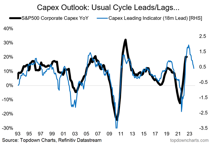
4. Corporate Capex: Even capex can't save the day, an initial cyclical rebound looks set to cap-out and rollover based on the capex leading indicator.
While some of the medium/longer-term themes likely continue (e.g., commodity capex, shipping capex, climate/EV related, space age 2.0, etc.), the cyclical outlook for capex is clearly less certain, and it seems unlikely that any lift in capex will be enough to offset the looming economic headwinds.
"This chart hints at perhaps one of the most important themes I’ve been talking about over the past year – the prospect of a possible multi-pronged, multi-year investment boom. The chart below highlights the typical cycle leads and lags in terms of capex growth, and with easier funding conditions, booming corporate earnings, and a rebounding economy it’s likely that we see a generalized uplift in capital expenditure.
But as I’ve been highlighting in the reports there are a few particular sectors that are likely to see a surge in investment in response to surging prices – for example, the global shipping sector, and commodity producers. Both of which have seen capex languish for the past decade, and both of which have seen an effective windfall from the pandemic (i.e. surging shipping rates and commodity prices)."
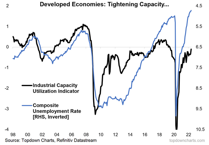
5. Capacity Utilization: Oh and back on inflation, here is a fundamental, non-transitory reason why inflation pressures are serious and why central banks should be taking it seriously. Labor market capacity utilization is basically record tight.
Even industrial capacity utilization is tight...and probably would be tighter if supply-chain issues were completely resolved. Either way, this goes to show the real underlying impetus on inflation (and perhaps one reason for firms to push on with capex).
"Another key impetus to resurgent capex is tightening of capacity e.g. measures of labor market capacity utilization are close to pre-pandemic levels. This will put upward pressure on pricing and present an incentive or signal to firms to lift investment.
But it also speaks to the inflation theme. While some of the short-term upward pressures on inflation are likely to pass (e.g. backlogs, base effects, the initial bounce-back), should we see further and sustained tightening of capacity utilization it will put upward pressure on the more core or underlying inflation pulse."
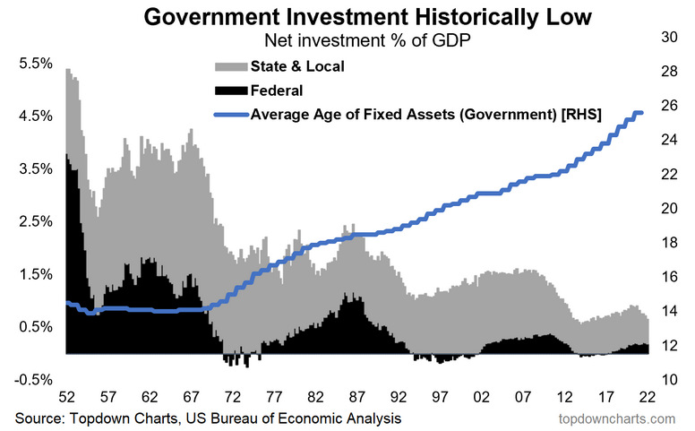
6. Government (and Green) Capex: If this year has taught us one thing it is the cost of cheap talk from governments and activists about going to zero carbon. You can't sprint into a post-fossil-fuel world without taking massive action; without investing on an unprecedented scale...nothing short of a new Manhattan Project style mobilization is required if you *really* actually want to get it done.
There is a great leap, a grand chasm, between where we are and where the grand energy utopia promised lands lie. For what it's worth, I think we probably should throw everything at it, make it happen, fully mobilize.
But the key point is that all this talk and virtue signaling—which is now a popular and mainstream thing that requires no courage and represents zero uniqueness—needs to be backed by actual action. This is why cheap-talk is expensive, and one of a few reasons for pain at the pump.
But anyway, the original idea here and with this chart was that governments would embark on climate related (*and infrastructure*) investment. And there is certainly some stuff in the pipe—especially globally, but clearly original plans in the US failed, and now distractions and disarray mean this one is a wash.
"To really drive it home, the capex/investment theme is not just about corporations responding to economic forces, it’s also about governments responding to the pandemic as well as social/political forces.
Specifically in terms of recovery/rebuilding fiscal programs which in many countries have been targeted at infrastructure. But also climate related infrastructure and investment – something that is definitely part of fiscal packages, but also part of shifting investor preferences. We’ve observed a clear trend of rising financial investment into clean energy sectors being followed by uplift in real investment. So altogether it’s quite interesting."
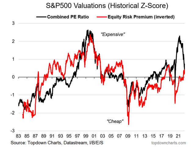
7. US Absolute vs Relative Valuations: Over to markets, this chart has changed a lot—absolute valuations have come down significantly but-1: still not cheap; and but-2: the ERP is still expensive as bond yields have drifted higher.
Indeed, at this point I look at treasuries and on my model they look slightly cheap, whereas equities still look slightly expensive...TINA [there is no alternative (to stocks)] >>> TADA! (there are definitely alternatives).
"Should all this talk of capex and investment booms come to pass, we’d likely start to see upward pressure on bond yields, and that will put a squeeze on the US equity risk premium.
The chart below is one of my favourites for thinking about US equity valuations. It points out what most of us already know: US equities are expensive in absolute terms …i.e. the PE ratio is really very high. But if we factor in low bond yields then maybe it’s not so bad. At present the chart says absolute valuations are wildly expensive, but relative valuations are ok (for now). That will change if/when bond yields rise – and in that sense it also goes to highlight the interest rate sensitivity of the market if we accept the statement that equities only offer reasonable value in a low yield environment."
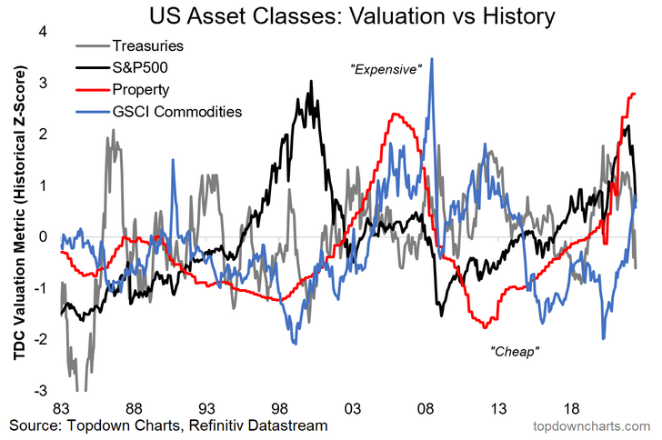
8. US Asset Class Valuations: This one has also changed quite a bit, of most intrigue is that my commodities valuation indicator has just edged out equities for second place on the pantheon of preposterous prices (I... apologize for those words.).
But again, as alluded above, bonds are now slightly cheap, but meanwhile on P's...property is off to Pluto.
"To complicate matters slightly, my valuation metrics show bonds expensive vs history as well – so: “equities look reasonable vs expensive bonds??”. To make matters worse, property prices are also sailing into rarefied air. Commodities on the other hand, while not cheap, at least look reasonable by comparison and could benefit from increased capex."
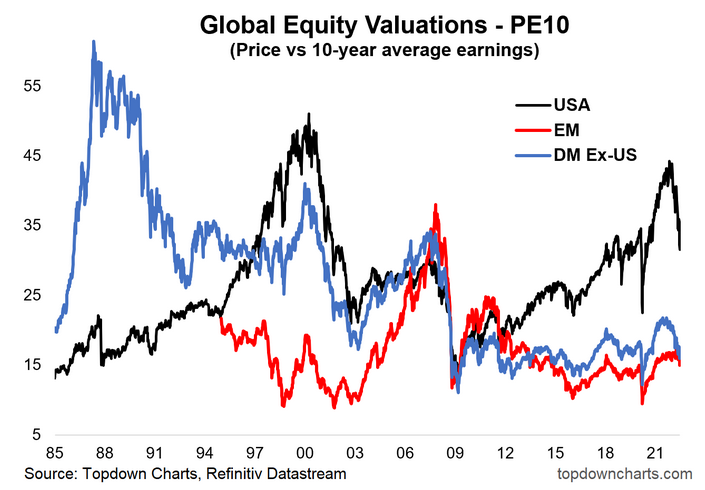
"Another chart that makes US equities look expensive by comparison is when you look at PE10 (or really just about any other valuation metric) for the US vs the rest of global equities. It is true that Emerging Markets and Developed Markets excluding the US have seen a decent rebound in valuations since the March 2020 lows, but there is a clear and compelling relative value case here."
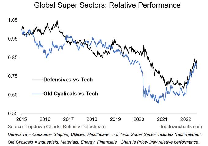
10. Global Equity Super Sectors: While Tech is just resting, commodity stocks and defensive sectors have charged out ahead. Indeed, this year one of the few assets that turned in solid positive returns was commodities and commodity stocks.
But also on the defensive side, those defensive sectors' relative performance acted like a pretty decent diversifier/downside hedge...at a time when few things worked on that front.
Looking forward, it's been a solid-short-sharp run here on this chart, and one can't help but wonder if a period of consolidation or more choppy harder gains is now due.
"The most logical pushback on the previous chart is to note that we could have said something similar for much of the past 5-10 years. So, the question is then what will it take for this gap to close?
One avenue for a turn in relative performance of global vs US is the path of the “super sectors”. A big part of US outperforming the rest of the world has been the high hurdle set by tech and tech related companies. Global ex-US has a big skew to “old cyclicals”.
In that respect, the most important technical clues to a rotation in performance between US and global will be the chart below. Specifically look for an upturn in the blue line to get a jump on a ‘virtuous turn’ in US vs global relative performance (and value vs growth for that matter, also smalls vs large – it’s a fairly sprawling issue in equities!)."
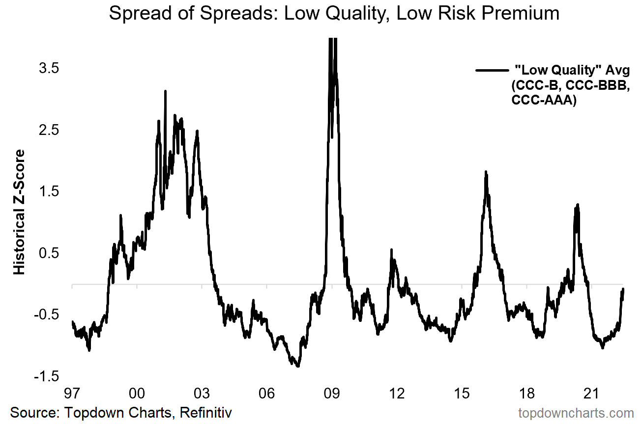
11. Low Quality Credit – Low Risk Premium: Another area where we've also seen an initial reset is in credit risk premia—the spread of spreads composite for the lowest quality credits has spiked from previously extreme expensive/complacent levels. The worry here with this one is that with recession likely incoming, rather than revert to long-term average and just stay there or go back down...probably more likely to see overshooting.
Worst case would be a round of credit stress if borrowing costs surge further, profit margins get squeezed on both ends, and something a little unforeseen dog-piles on. We're still in the middle of this thing, no time to be a hero on risk exposure just yet.
"The valuation conundrum is not just the domain of equities – credit also is looking increasingly expensive. The chart that hammers the point home to me is this composite view of where the lower quality credits are trading relative to the higher quality credits. Basically we see a lower and lower risk premium for lower quality credit.
By itself this may not be an issue, particularly if the economic and monetary backdrop are supportive of credit conditions. But if credit conditions deteriorate things could turn sharply here – and indeed, we may well even see early clues of any impending stress in this very indicator itself. So very much one to keep checking in on."
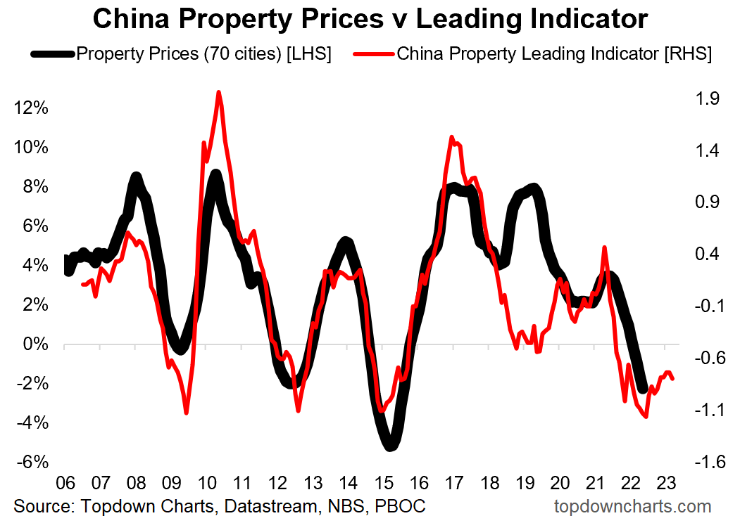
12. China Property Downturn: Finally, the property downturn in China has only intensified as COVID lockdowns complicate and policy makers have still been relatively slow to turn the corner on stimulus settings.
Right now it is clear the main focus is on controlling COVID, but I reckon the next step will be a pivot to easing—especially as and when it becomes clear the rest of the world is in recession and as the property downturn looks set to linger for longer.
Perhaps a case of bad news is good news, but again though, we do actually need to see things turn the corner: it's one thing to anticipate a change in policy—another thing for that change to actually come. Meanwhile the equities there are looking a little better.
"I always say in my many years of covering China macro, if I could only choose one indicator it would be property prices, and perhaps if I were to pick only one chart it might be the one below.
My composite leading indicator for Chinese property prices (money supply, interest rates, funding) is pointing to an extension of the current downturn deeper and well into 2022. This is of critical importance in so far as the economic pulse and commodity demand is concerned, but also – for the policy outlook: the lower that black line goes, the greater the probability of monetary stimulus (and you know what that means!)."
- The Fed has pivoted aggressively and fully into catch-up mode as inflation expectations are at a fever pitch and risk anchoring higher; expect a likely further string of rate hikes and progression on balance sheet normalization (at least until growth risks elbow out inflation risks—and it's going to need to be *obvious* to make the Fed pause let alone pivot).
- The global pivot from stimulus to stimulus removal and outright tightening poses risks to just about every asset class, as we have clearly already seen this year.
- In terms of the growth outlook, downside risks dominate over any upside risks, and virtually all signs point south for the global economy this year and into next.
- Geopolitics, COVID, and Fed catch-up have cemented the recession thesis.
- A key issue with regards to a growth slowdown and monetary tightening is the reality of multiple major asset classes still looking expensive despite an initial reset, but things have shifted here a lot. That said, property is likely the next shoe to drop given ever-loftier valuations.
- With many assets still richly priced in absolute terms, relative value remains the last bastion, and indeed rotation likely remains a key theme this year. But perhaps one pocket of emerging value is in bonds, both treasuries and global ex-US.
- All in all, a defensive skew and eye on risk management is the prudent path.
Overall: Headed into H2 it's hard roads ahead as we're clearly in the middle of a global equity bear market, and impending global recession. Valuation resets remain a work in progress, but there are clear emerging opportunities for active asset allocators.

