Since roughly the middle of January of this year we’ve seen some big changes in character taking place in many different areas of the markets. After nearly two years of low volatility, which is much easier to take, volatility has come back with a vengeance and doesn’t seem to be slowing down much.
It's been most obvious in the stock markets, but now the US dollar’s volatility has spiked, which may be suggesting something is in the wind. What that something is can be anyone’s guess, but something changed in mid-January of this year.
In this post I would like to show some old long-term charts I built out four years or so ago after the top in the PM complex was established. Some longer term readers will remember them. They had a long-term bearish tone to them. It’s been a while since I posted some of these charts because for the last several years nothing much has changed. This may be coming to an end.
I am very aware that many / most of our readers are very interested in the gold market from a bullish bias. I know many of you will find these charts,and what they are strongly suggesting, to be disturbing. I only ask that you read the following with an open mind.
If this scenario unfolds, It could very well save your financial future. Also, please take special note of the lines in the sand where the bullish outcome would become probable. Personally I would like nothing better than to have another opportunity to chart and participate in another gold bull as the last one was extremely rewarding.
Before we look at some of those old long-term charts for gold and silver I would like to update some of the US dollar charts as there has been some big changes taking place since we last looked at them, especially the shorter term daily chart.
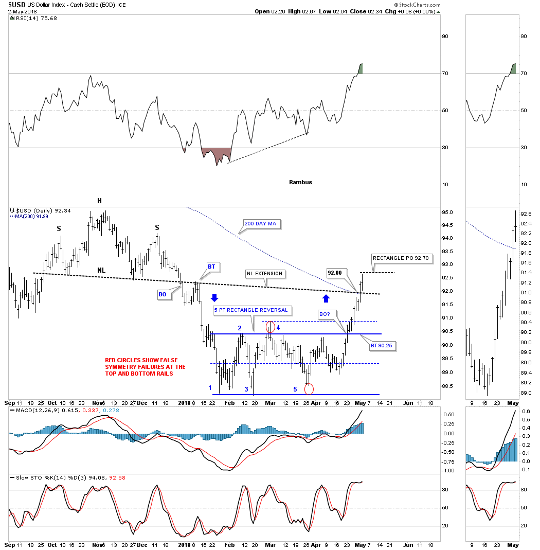
About two weeks ago we looked at this daily chart for the US dollar which was just in the process of breaking out from the 5 point rectangle reversal pattern. I showed two areas of possible resistance which was the 200 day moving average and the price objective of that 5 point rectangle reversal pattern, which came in at 92.70 which was hit. I also showed how the blue arrows suggested we could see some reverse symmetry to the upside vs how the US dollar came down over that same area.
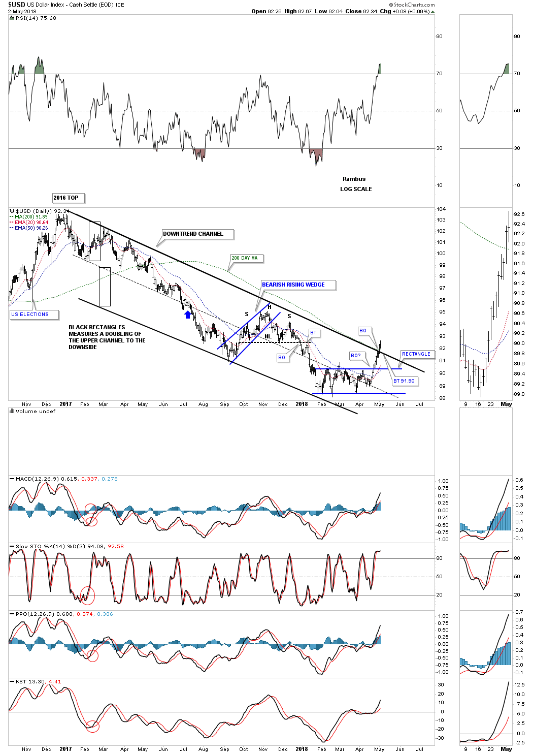
Below is a long term daily chart for the dollar which shows its parallel downtrend channel with the breakout above the top rail which happened yesterday. A backtest to the top rail would come in around the 91.90 area.
This next chart is the long-term monthly fractal chart we’ve been following for many years which now shows the false breakout below the bottom rail of the blue expanding triangle that I had previously labeled as a possible bear trap, red circle. This is important because when you get a false move like that you can often get a big move in the opposite direction, in this case up. Even though the two blue consolidation patterns are different in this fractal chart, the two thin black dashed horizontal lines show the low and high for each pattern on the same area on the chart.
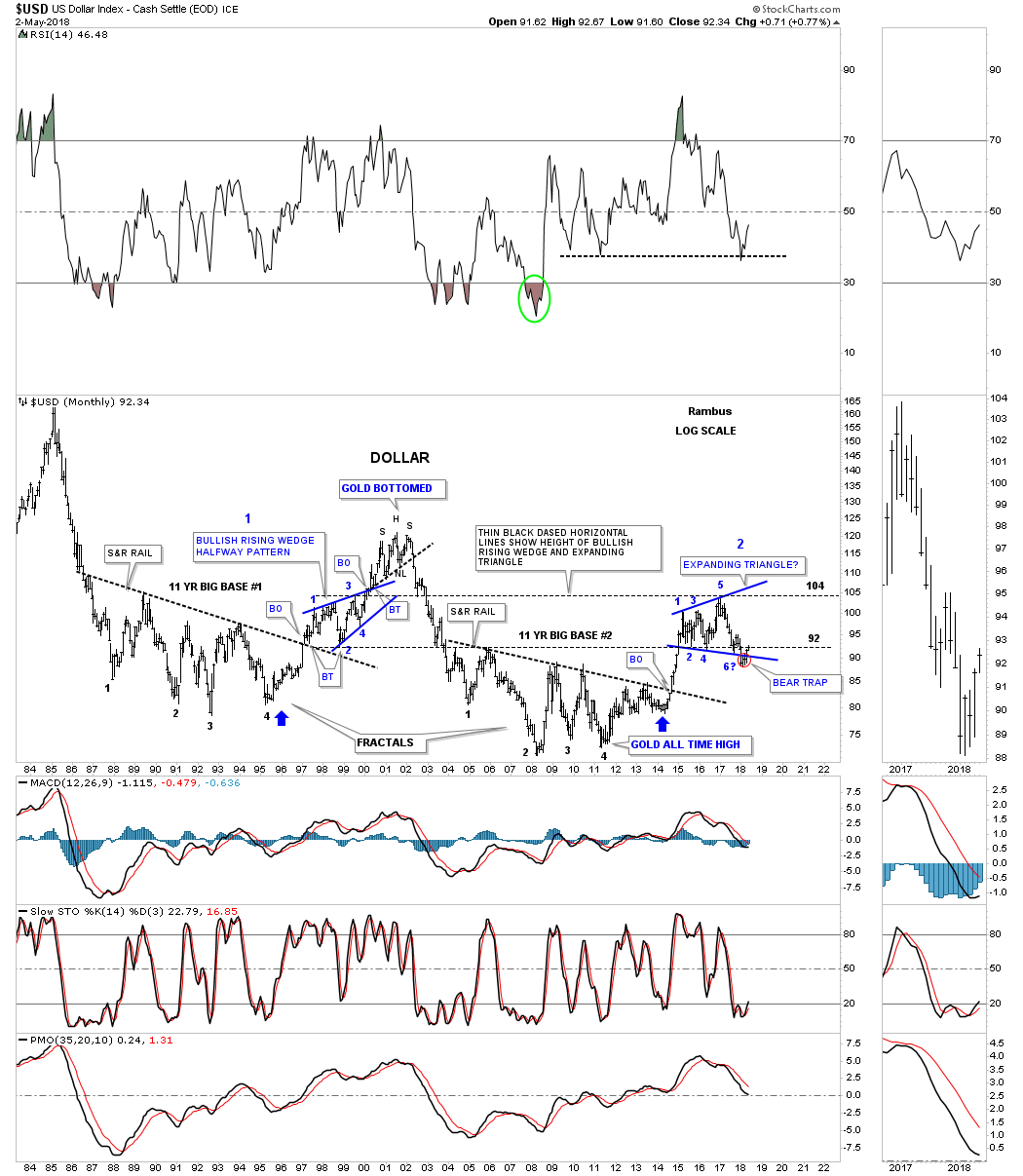
This 35-year monthly chart has always been an important chart to keep track of because we didn’t know if the top rail would hold support after such a long period when it was holding resistance. So far it has done its job.
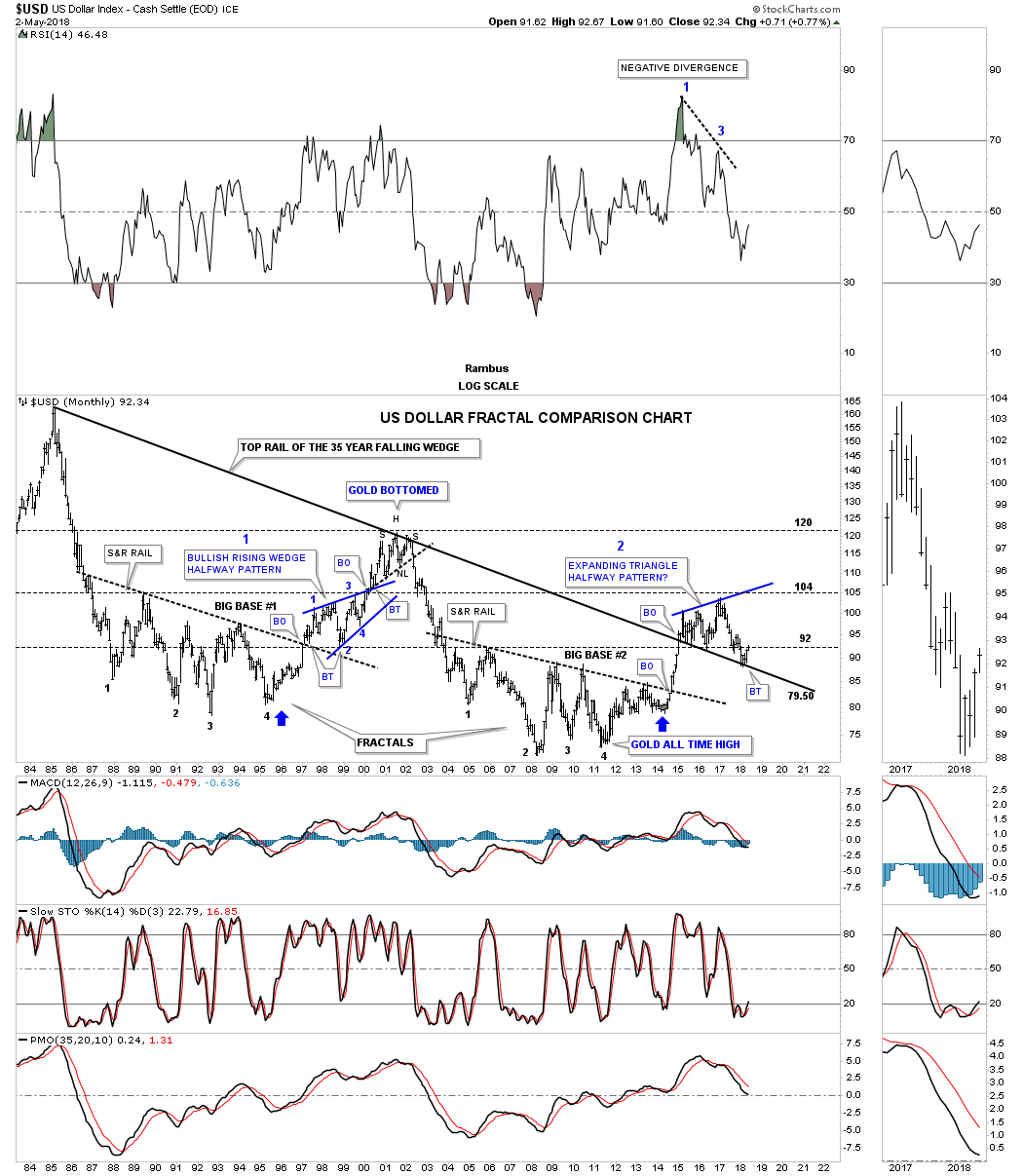
Below is the same chart which shows the US dollar’s 2011 bull market uptrend channel.
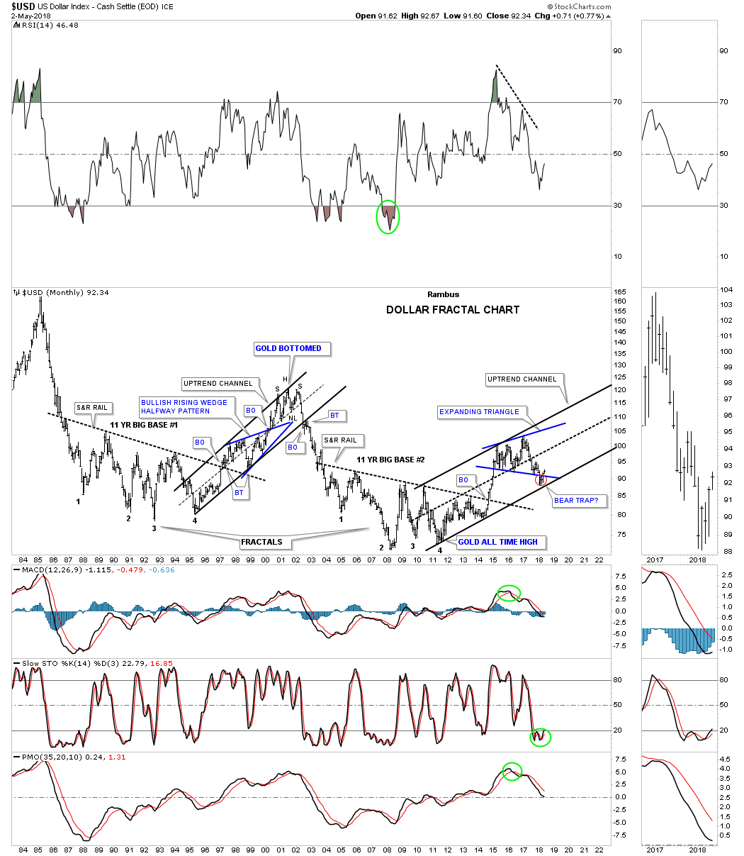
The 50-year quarterly chart shows the 35-year bullish falling wedge with the bear trap that formed between the bottom rail of the blue expanding triangle and the top rail of the 35-year falling wedge. All we would need to see to negate this bullish setup is for the US dollar to trade below the top rail of the 35-year bullish falling wedge and it would be game over for the US dollar bulls. However, until that happens the Chartology is strongly suggesting the next leg of the USD bull market is now getting underway whether we like it or not.
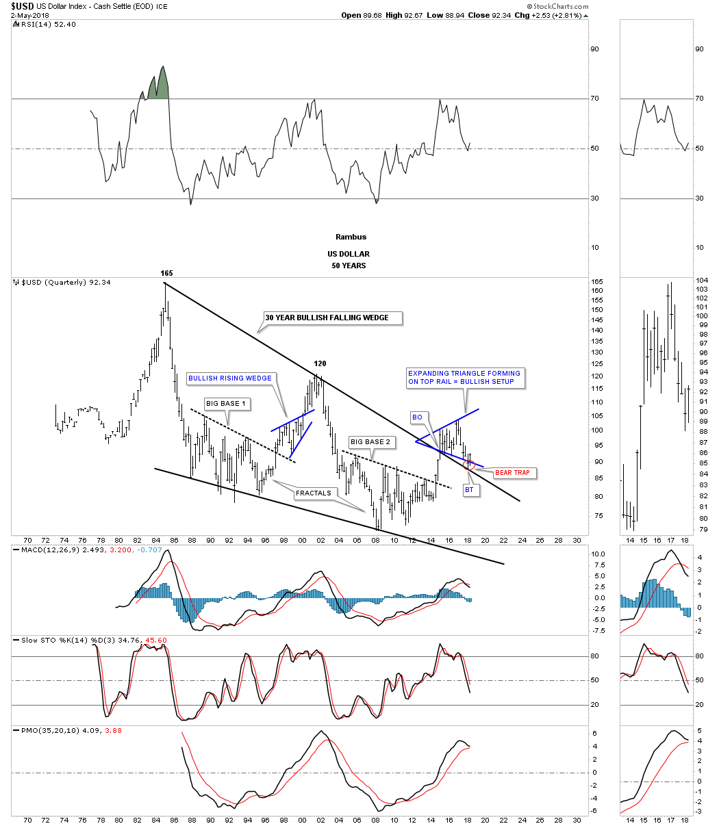
This next chart is a combo chart which has the US dollar on top and gold on the bottom. I’ve labeled it as a WHAT IF chart.
What if the US dollar has just put in its long-term low on the bottom rail of its major uptrend channel. And then, WHAT IF, gold is putting in its major high at the top rail of its downtrend channel?
This would be the very last thing most PM investors could possibly conceive of right now. Again, all we have to see to change this possible scenario is to see the US dollar break below the bottom rail of its bull market uptrend channel and for gold to take out the top rail of its downtrend channel.
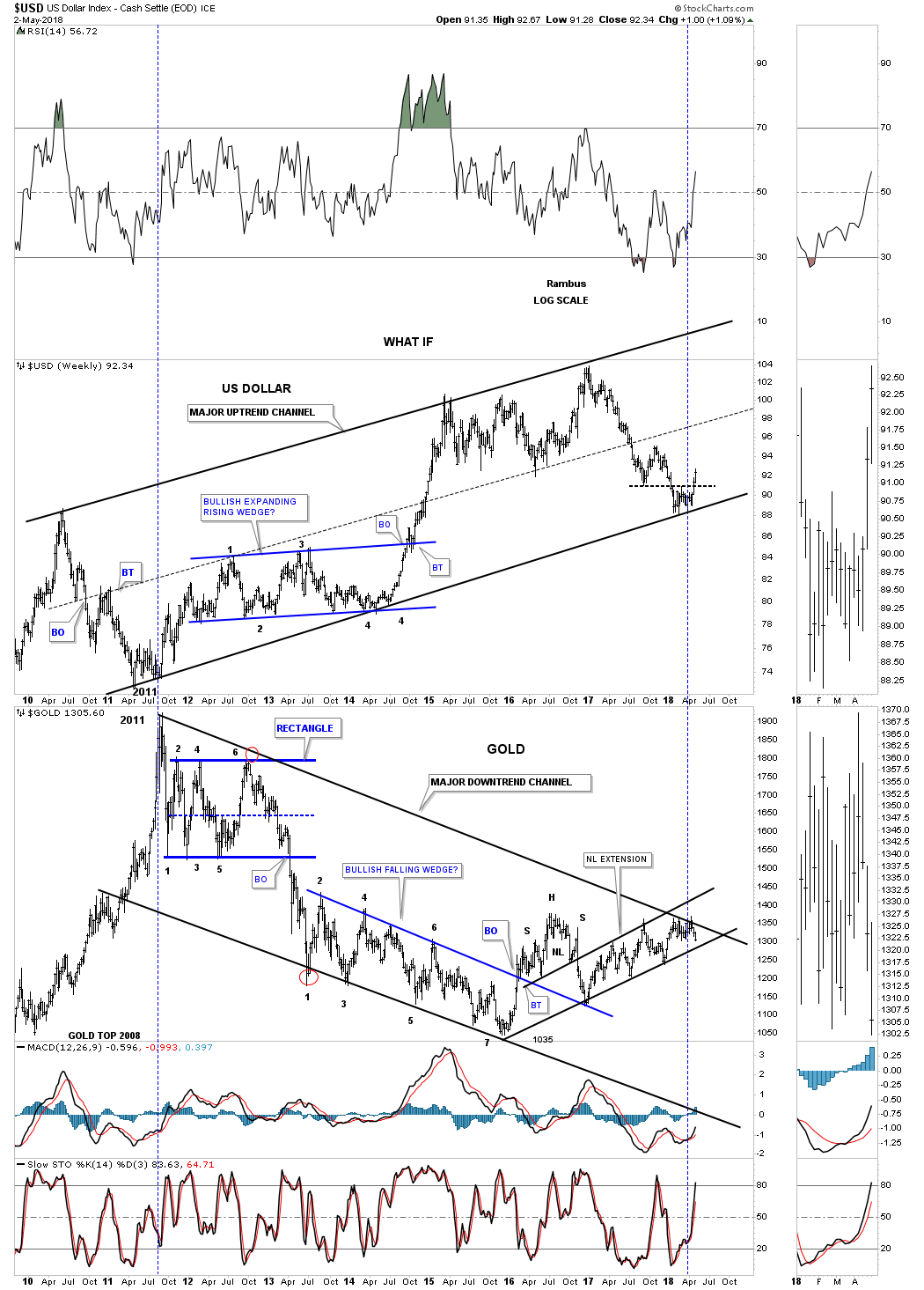
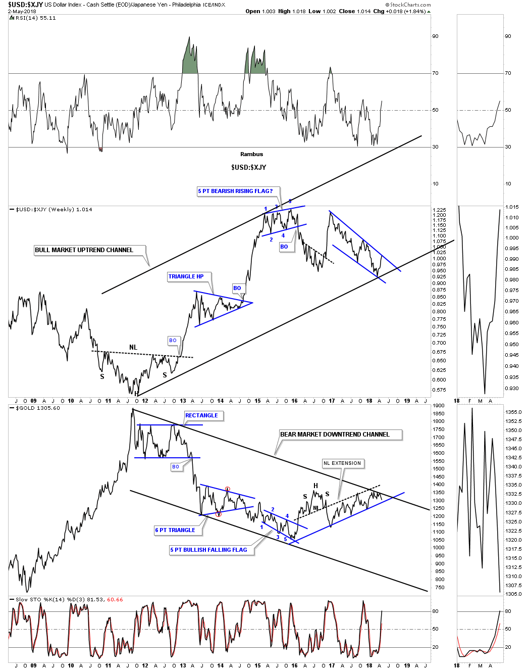
Below is another combo chart which has the USD:Japanese yen (XJY) ratio chart on top and gold on the bottom. As long as the bottom rail holds support for the ratio chart on top and the top rail for gold holds resistance then it is what it is regardless of all the reasons it can’t be.
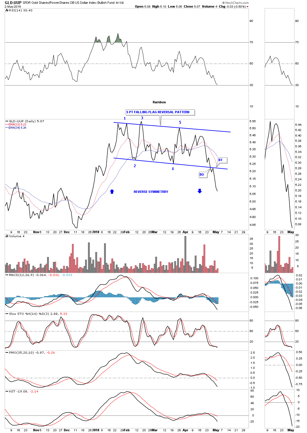
Next I would like to show you some close up looks at the US dollar to gold ratio charts so you can get a better understanding of what is taking place right here and now. This first chart is a daily line chart which compares the SPDR Gold Shares ETF (NYSE:GLD):US dollar (using PowerShares DB US Dollar Bullish (NYSE:UUP)).
This ratio began topping out during the middle of January and is now in an impulse leg down. The blue arrows show how it may reverse symmetry to the downside vs the same area on the upside.
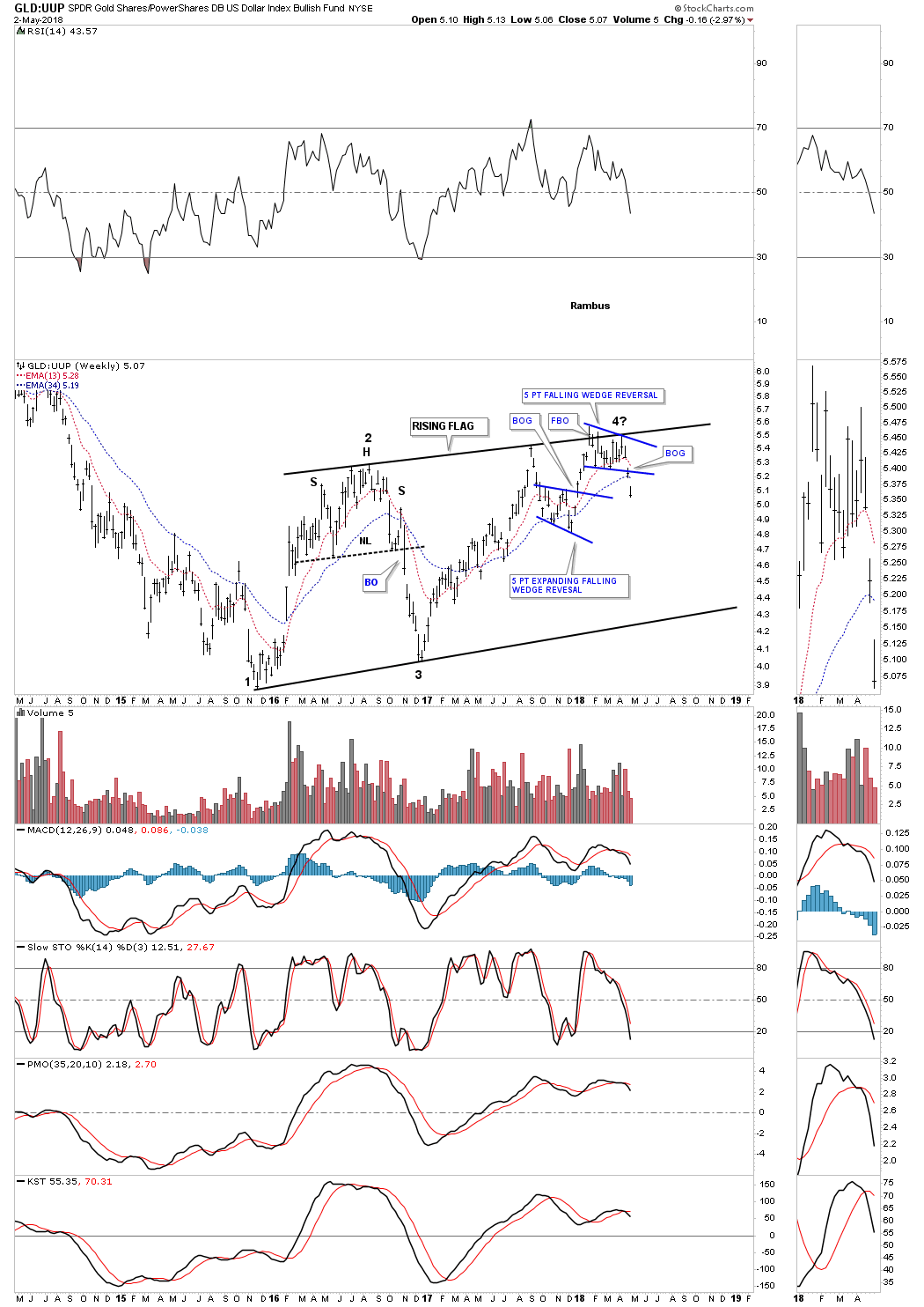
Let's step back a little further in time and look at a four year weekly chart for the GLD:UUP ratio. The three month pattern on the daily line chart above is showing up at the 4th reversal point in this 2 1/2 year rising flag formation. Remember, many times we’ll see a 5 point reversal pattern at the reversal points within a much bigger trading range.
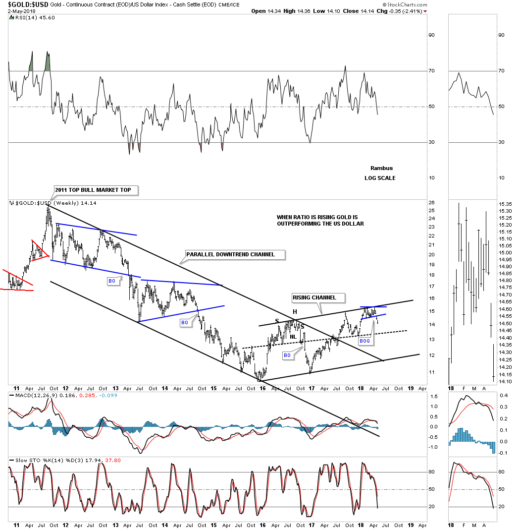
Since gold’s bull market ended in September of 2011 the GOLD:USD ratio chart had been in a perfect parallel downtrend channel until the summer of last year when the ratio broke out above the top rail. That could have been the point where gold could have really taken off to the upside, but it had a hard time rallying against the US dollar.
Here you can see how the 2 1/2 year rising channel fits into the bigger picture. All gold has to do to negate this bearish setup is to rally above the top rail of the 2 1/2 year rising flag.
During gold’s massive ten-year bull market the GOLD:USD ratio chart built out a perfect parallel uptrend channel with one consolidation pattern forming on top of the next. I left the downtrend channel off of this 18-year monthly chart so as not to put any boundaries on the bear market that began in 2011.
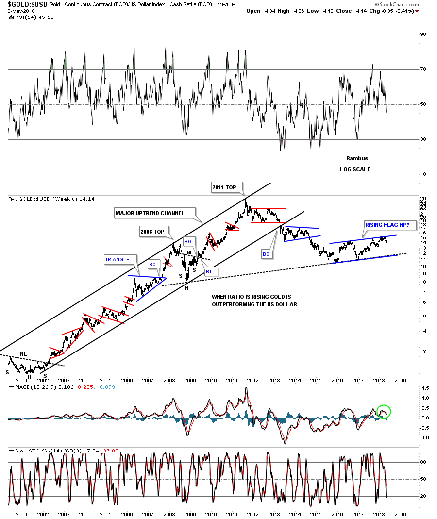
The reason I’ve been showing you so many charts on the US dollar is that it can have a profound effect on gold as you well know. The bigger the pattern the bigger the move.
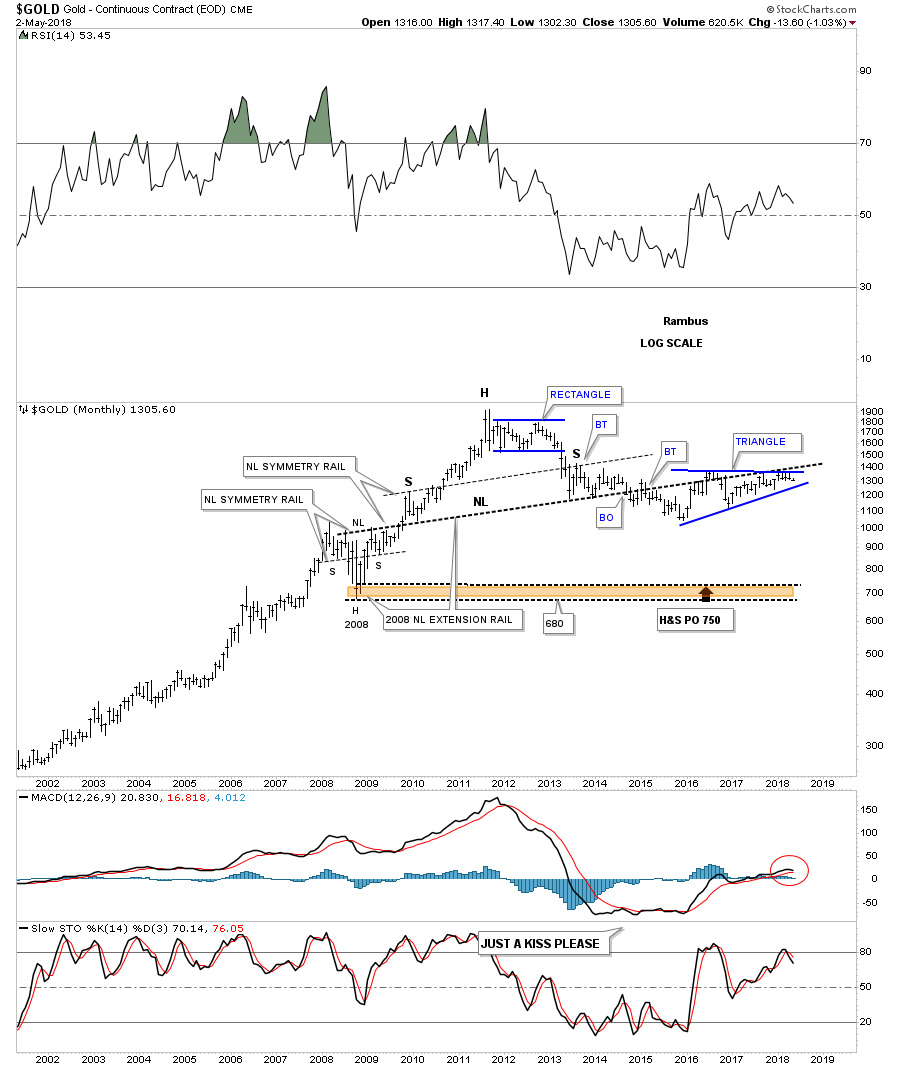
I built out this next long-term chart for gold back in 2014. Note the H&S consolidation pattern that formed during the 2008 crash low.
After gold started to bounce around after the 2013 decline I extended the 2008 H&S neckline all the way to the right side of the chart to see if I could find any support. As you can see, gold found support on that 2008 neckline extension line from 2013 to just a couple of months ago. That blue triangle is the same one we’ve been following on the shorter term gold charts. If gold breaks down from that 2 1/2 year blue triangle the most logical place to find support would be at the 2008 crash low between 680 and 750.
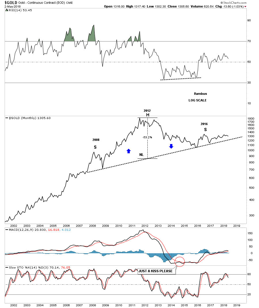
Below is a monthly line chart that spans the same amount of time as the bar chart above and gives a clear picture of the possible H&S top. Keep in mind the neckline has to be broken to the downside before we can call the possible H&S a top.
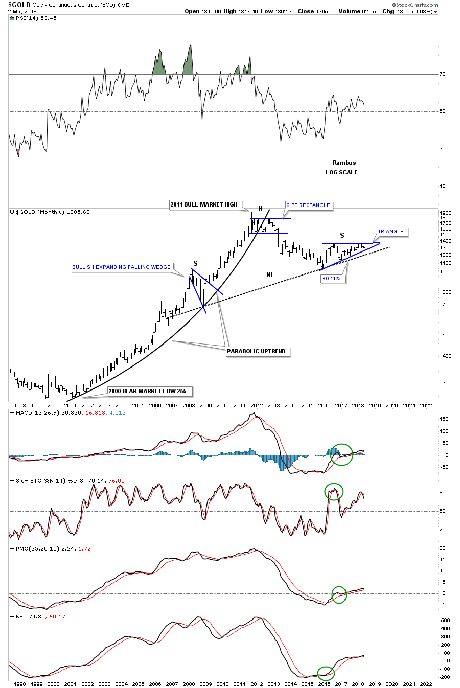
This long-term monthly chart for gold shows its parabolic bull market with its possible H&S top building out. The key is going to be what the blue triangle does.
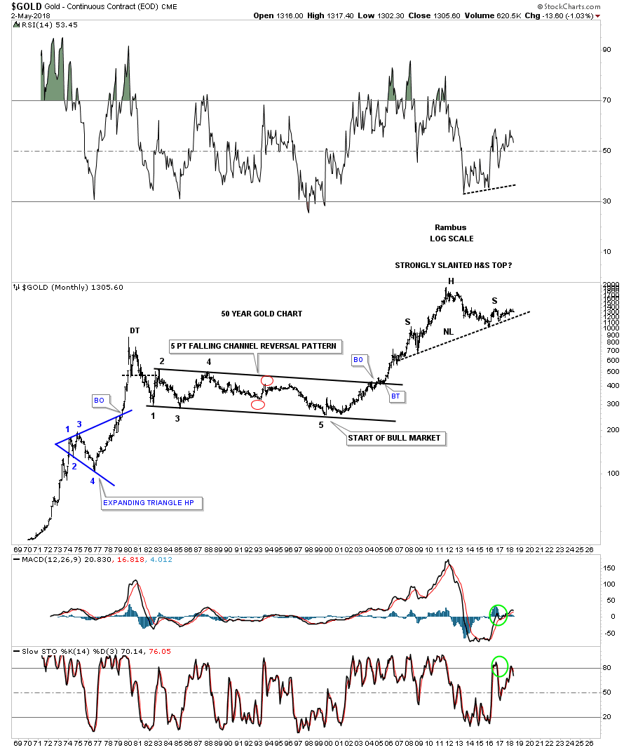
This last chart for gold is a 50-year monthly look which shows its 1970’s bull market and then the long 20-year sideways trading range. If that massive H&S top plays out my readers will be some of the first investors to know the bull market is officially over and a massive decline will ensue that will take years to complete.
About the same time I did the long-term H&S top for gold I also did one for silver as it too was producing some very nice symmetry. This 50-year chart for silver shows its massive H&S bottom which launched its bull market.
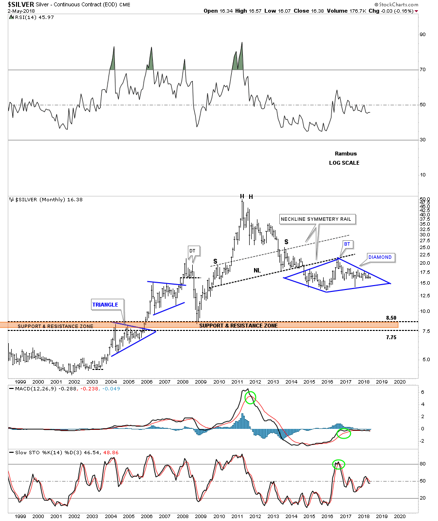
Note how the 2008 crash low found support on that massive neckline confirming it was hot. Silver also built out a very symmetrical H&S top as shown by the neckline symmetry line that shows the high for both the left and right shoulders of the 2011 H&S top.
That blue diamond might look familiar as we’ve been following it on the on the shorter term weekly and monthly charts. Is it a coincidence that it’s forming just below the major neckline?
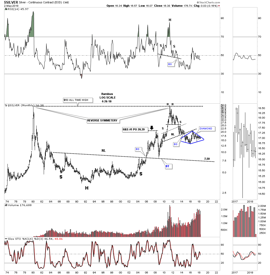
This last chart shows the H&S top in more detail with the blue diamond forming as the backtest to the neckline.
The US dollar is going to be the key factor in what takes place with the PM complex. At this point all I can say is big patterns lead to big moves and if these big patterns play out then we are going to see exactly that.
Everyone is focused in on the potential five year H&S bottom on gold which could still be a possibility. These charts give you a different perspective that you won’t find anywhere else. If they come to pass we’ll be the first to know what is actually happening.
