U.S. fires at, takes custody of Iranian cargo ship - Trump
Those that follow my personal account on Twitter will be familiar with my weekly S&P 500 #ChartStorm in which I pick out 10 charts on the S&P 500 to tweet. Typically I'll pick a couple of themes to explore with the charts, but sometimes it's just a selection of charts that will add to your perspective and help inform your own view—whether its bearish, bullish, or something else!
The purpose of this note is to add some extra context and color. It's worth noting that the aim of the #ChartStorm isn't necessarily to arrive at a certain view but to highlight charts and themes worth paying attention to. But inevitably if you keep an eye on the charts they tend to help tell the story, as you will see below.
So here's another S&P 500 #ChartStorm write-up!!
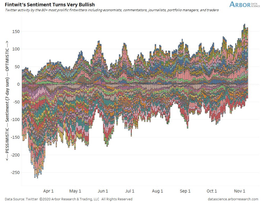
1. "FinTwit" sentiment - clear trend there... @LizAnnSonders & @DataArbor kick us off with a look at growing optimism among Finance Twitter’s most prolific accounts. With the election in the rearview mirror and no imminent stimulus details expected, there is less uncertainty versus a month ago. Investors were skittish in the weeks leading up to November 3, but just like in 2016, markets took election week in stride. Stocks have risen sharply during November, featuring an impressive comeback for some beaten-down areas. Of course, positive vaccine news helped equities early last week.
Ignoring the headlines, the S&P 500 simply had a run of the mill correction in September and just a modest decline in October. Such price action is common for that time of year. The bulls often take charge in the last two months of the year, and that narrative has played out thus far. The concern now is over-optimism all while COVID-19 cases are surging in the USA and the pandemic is still terrible for Europe. Breaking news events of sharp social restrictions that would have taken the S&P 500 down earlier this year seem to have little impact so far.
Bottom line: Fintwit has not been this bullish since the onset of the pandemic. The scenario of a Democratic POTUS and Republican Senate seems to assuage market participants. The threat of higher taxes and sharply increasing regulations appears to be off the table. How long can this goldilocks feeling persist? There are signs that investors could be getting overly optimistic. We’ll investigate it later on in the ChartStorm.
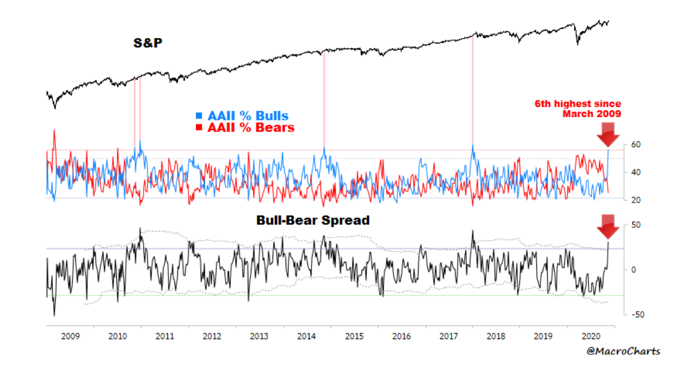
2. Risk = On. (surveyed sentiment). @MacroCharts brings us this look at AAII sentiment. The latest reading is the 6th highest since March 2009 in terms of net bulls. The American Association of Individual Investors has been taking a weekly survey of investor sentiment since 1987. The question asks members what direction the stock market will be in the next 6 months. For the week-ending November 11, 55.8% were bullish while just 24.9% were bearish. The 30.9% spread among the biggest differences since the GFC lows. MacroCharts points out that there were four similar instances. While none of the four marked major tops in the S&P 500, those points in time were not the best times to get into the market.
What’s also remarkable about the survey result is the huge 24.5% net change in bullish versus bearish responses. The 2020 election weighed on traders—perhaps even more than most pundits had thought. Pfizer’s (NYSE:PFE) positive vaccine news from November 9 may have also played a role. A third factor, maybe investors flipped open their calendars to see that the S&P 500 entered the famed November-April stretch that is usually bullish for equities.
In all, the latest weekly AAII survey rose to the highest level of bullishness since January 2018. January 2018 was also a peak for global markets. The all-world ex-USA index and emerging market index have yet to eclipse the peak from nearly 3 years ago. Remarkably, bullish sentiment had been running below its long-term average for 35 straight weeks before the latest reading, according to AAII.
Bottom line: Fintwit pundits and AAII members alike have turned sharply bullish. Investors should be on guard as historical moves to this level of optimism are often a sign that significant gains are in the recent past, not necessarily the future.
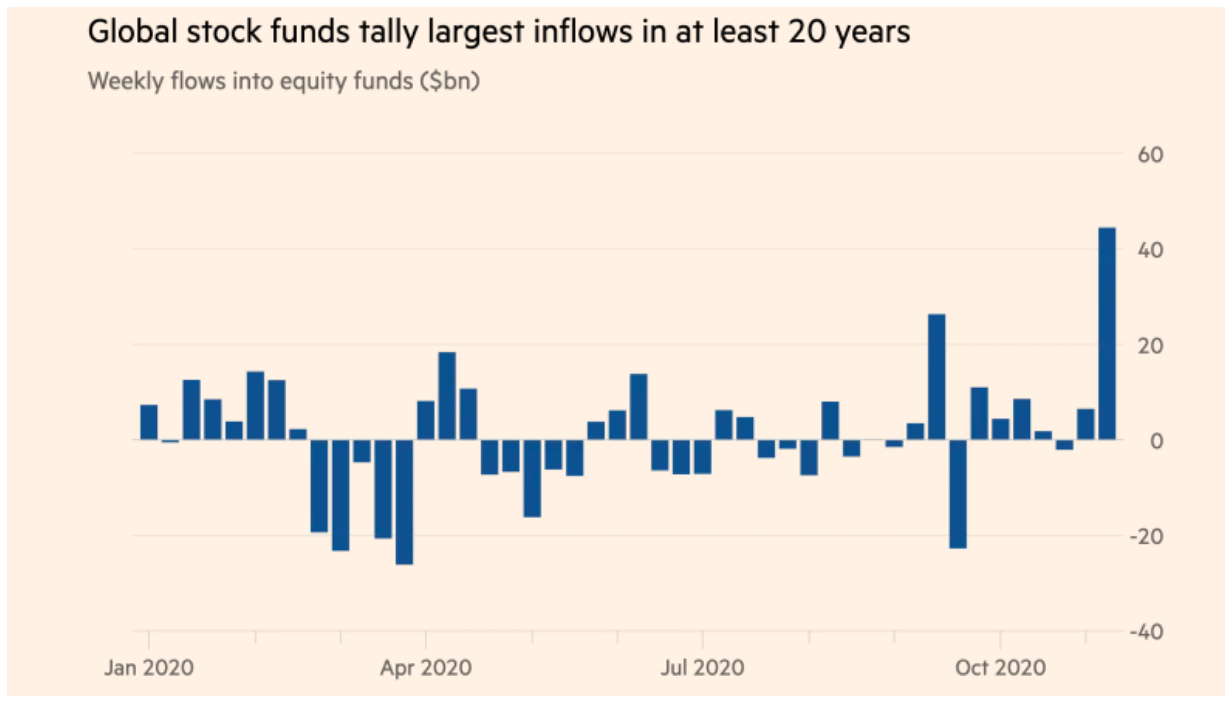
3. Risk = On. (fund flows) Thanks to @JulianKlymochko for this Financial Times chart of flows into global stock funds. The latest weekly report shows that a record $44.5 billion moved into global equities according to EPFR Global. It was the biggest weekly inflow since data has been kept (2000). FT detailed that $41.1 billion came from institutional investors while just $3.3 billion was put to work by retail investors.
It wasn’t just Robinhood traders this time around. So investors were putting their money on the line to go along with their bullish sentiment (charts 1 & 2). The influx of capital helped the total world equity index climb to a new all-time high last week. Risk is on across financial markets. Early last week, the vaccine news sent futures sharply higher, but a chunk of the gains were given back by the close Monday afternoon.
The rally during the end of the week was impressive considering the price-action was indicative of a ‘sell the news’ event. It will be interesting to see if fund flows remain sharply positive in the face of a worsening global pandemic. Sure the initial reaction to the Pfizer headline was short-term euphoria, but second-order thinking could be in the offing. Bridging the gap between now and when a vaccine will be widely available will be a challenge. Can markets hold the gains?
Bottom line: It’s not just a good feeling—investors, mainly institutional, put money on the line according to the latest report on global fund flows. Is everyone back on the bullish train? Is this a bearish contrarian indicator? We’ll have to dive deeper to see what other warnings signs are out there.
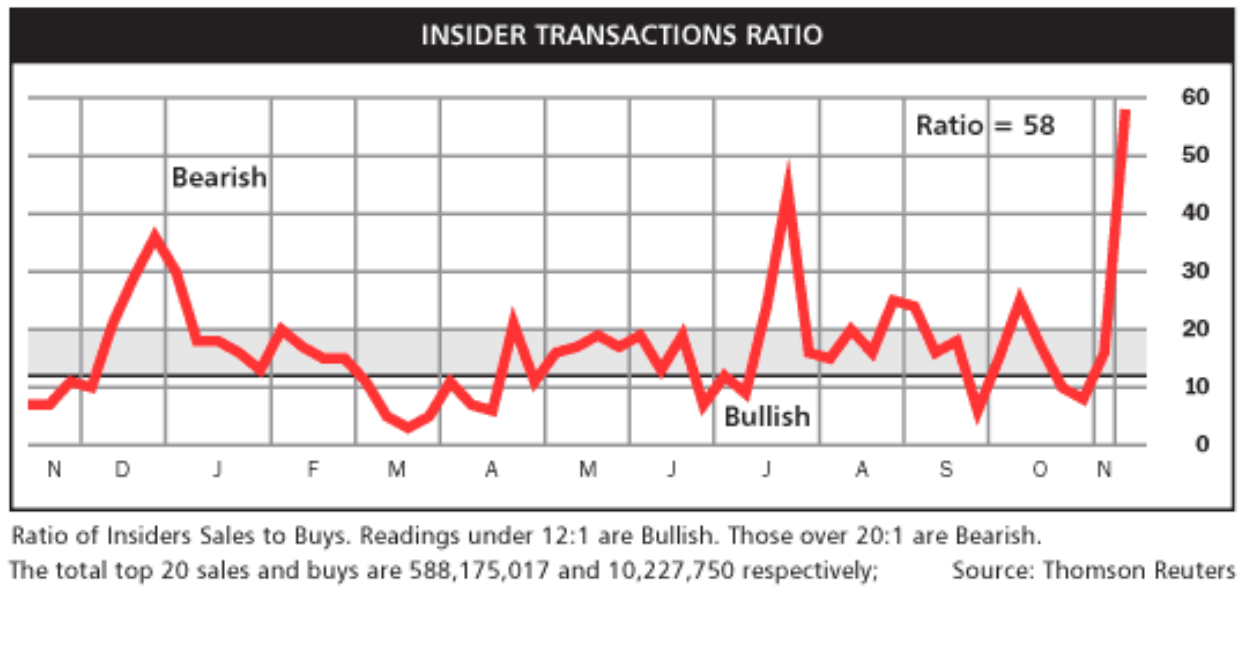
4. Insiders cashing in.... @hmeisler highlights a red flag. Insiders have sold stock at a pace not seen in over a year. We have written about spikes in insider selling in recent months, but the latest reading puts it all to shame. The ratio of insiders’ shares sold to bought is 58—well above the 20-line which demarcates a neutral reading from a bearish one.
While pension funds and other institutional accounts were net buyers, corporate managers were unloading stock. You’ll notice two prior spikes—one in late 2019 and the other in mid-June. The year-end selling could be tougher to gauge as there may have been some tax-motivated moves happening, but the June surge is interesting. Early to mid-June was a near-term top in the stock market.
Small caps had rallied huge from the March 23 lows to the June high, so the spike in insider selling appears to have coincided with the rebound high in the stock market. Two recent jumps above 20 happened around short-term strength in the S&P 500, too. Recall how equities topped-out around Labor Day and then rebounded from the September correction in mid-October. Insiders took advantage of those peaks by cashing out. Hence, the insider transaction ratio has provided to be a decent indicator this year.
Bottom line: Insiders dumping shares is not something the bulls want to see. Considering sentiment is running hot and investors have already poured billions into the market over the last couple of weeks, there could be some pain ahead if recent history is a guide. Insiders have a rather strong track record of timing the market over the last year.
5. Memories of 2016... My how times have not changed so much. The parallels of the last month’s price-action to that of 2016 are many. 2016 began with the world emerging from an earnings recession that hit energy and industrial firms hard. Global stocks fell more than 20% from their 2015 peak to the January and February 2016 nadirs. The S&P avoided a technical bear market, but the Russell 2000 dropped about 25%.
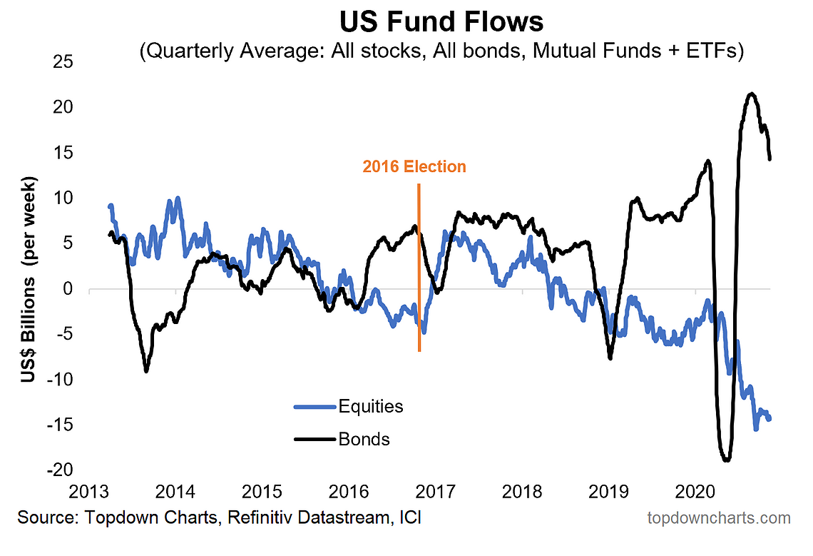
To combat the rough economic patch, central banks did what they do best—throw boatloads of liquidity into the financial system. Economic indicators turned upward as the year progressed, but investors were nervous ahead of the US general election. The election came and went, and investors put money to work in equities.
Fund flows were negative for bonds in the weeks after the election. The party didn’t last long though in terms of fund flows—equity flows resumed their general downtrend in 2017 despite a rising stock market. The balance of this year’s equity fund flows will be interesting to monitor considering a similar backdrop to that of 2016.
Bottom line: Could it really be that simple? Are we (investors as a whole) this predictable? Hard to say, but history seems to at least by rhyming. Stocks, led by US small caps, surged following the 2016 election, and the same pattern has played out in the short-term after the 2020 election. Yields have risen, also similar to the 2016 playbook. How long will the parallels hold up?
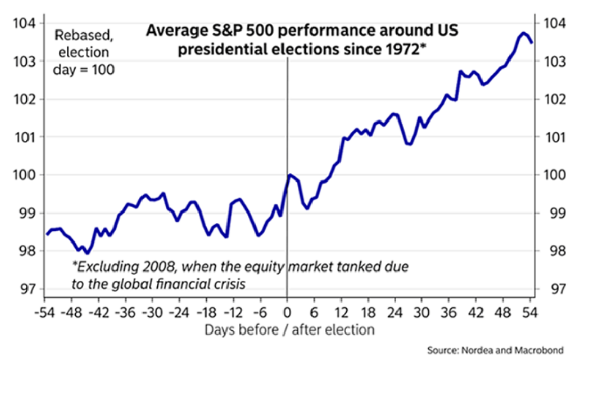
6. With regards to post-election day trading... @Financial_Orbit brings us a chart from Nordea and Macrobond showing S&P 500 performance before and after US presidential elections since 1972. So let’s dive deeper into the historical trend around elections. The two and a half months before voters head to the polls usually feature sideways and volatile trading as investors turn uneasy regarding potential changes in DC.
It’s important to think back to some major financial market events happening alongside general elections—2000’s dot com bubble burst and 2008’s financial crisis are two that jump out. So it’s good to be mindful that other important events are always happening. Regardless of the fundamental and macro conditions, there is a clear positive price response to presidential elections. The week before the big day and the two and a half months after it shows a clear uptrend (the caveat on this chart is that 2008 is removed). If history is a guide, stock market gains could persist through much of January.
Bottom line: The election period playbook has gone according to plan thus far. Stocks peaked two months ahead of the 2020 US presidential election and volatility ticked up. There was a final pullback in late October before stocks rallied immediately before November 3. The S&P 500 went on to have its best election week performance since 1932. Last week’s climb resulted in the highest weekly settle on record for the S&P 500. Prior election price patterns indicate more gains could be had.
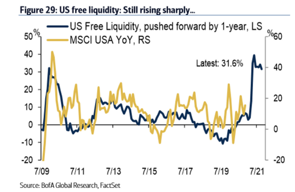
7. Bird Box for bears (don't let them see this chart!) Thanks to @thedogchart for this chart from BofA Global Research showing the apparent correlation between liquidity and stock market performance. Going back to 2009, jumps in liquidity tend to cause stocks to move higher.. surprise, surprise. The BofA chart pushes forward US Free Liquidity by a year to align it better with stock market performance. The presumption is that stocks are likely to perform well due to aggressive actions taken by central banks.
Recently, however, the year-on-year increase in free liquidity growth has slowed. Something else to consider is that much of the stimulus came during the March through April period of this year, so there could be a big tick off the highs in the blue line in a few months. For the MSCI USA YoY, RS yellow line, it will shoot up come March when the comparison is against the COVID-crash lows. So while the chart would indicate that stocks could perform well over the next year due to massive liquidity injections, the reality is the major chunk of the equity market gains could be in the books. But the bears are still fighting very accommodative central banks.
Bottom line: The angst of the bears is central bank policy action. 2020 has been like no other year in terms of liquidity injections. The monetary support has lent its way into the equity markets. Stocks around the world, big and small, have surged over the last 8 months while interest rates remain depressed. The last 11 years show big jumps in liquidity often precede uptrends for stocks.
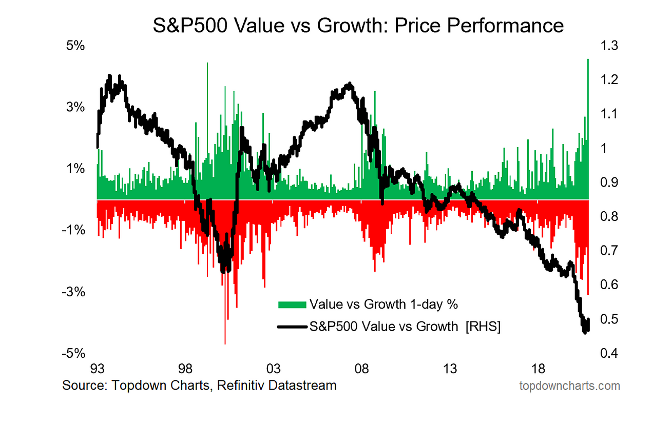
8. Value vs Growth—biggest 1-day % move on record. "Is this *the* turning point?" ... Me: "if not now, then when". In our latest Weekly Macro Themes report, we highlight the wild swings in value versus growth. The day-to-day volatility has been massive this year—similar to that of the dot-com bubble and GFC. Interestingly, both of those times marked at least near-term troughs in the value style’s relative performance. Last week featured big gains for value stocks as energy & financials performed well in hopes of a bounce-back in economic activity should a vaccine become widely distributed.
Monday last week was value’s best day ever versus growth; of course that came just a few days after its worst relative daily performance). For the week, value beat growth by nearly 7%. But are value stock finally about to shine? Is this *the* turning point? It feels like it at the very least, but we have to turn to the data and charts to find out more. One of our favorite charts is the relative cheapness of ‘cheap stocks’ versus ‘expensive stocks’ – right now, the cheaper parts of the market are much cheaper than average. This bodes well for the long-term returns for value stocks.
It might very well come down to the Information Technology sector though. The difference between growth and value is growth’s major overweight in IT while value is heavier in energy and financials. Tech was positioned perfectly for the pandemic, and the sector is now very richly valued. It’s hard to justify future returns being impressive for the behemoth sector of growth style and US stock market.
Bottom line: Optimism regarding value vs. growth has popped-up here and there during 2020, but each move has proved to be a head fake. There are signals that right now could be an important turning point for the beleaguered value style. Global value stocks have turned higher while US tech names remain below their early September 2020 highs (sans Google (NASDAQ:GOOGL)).
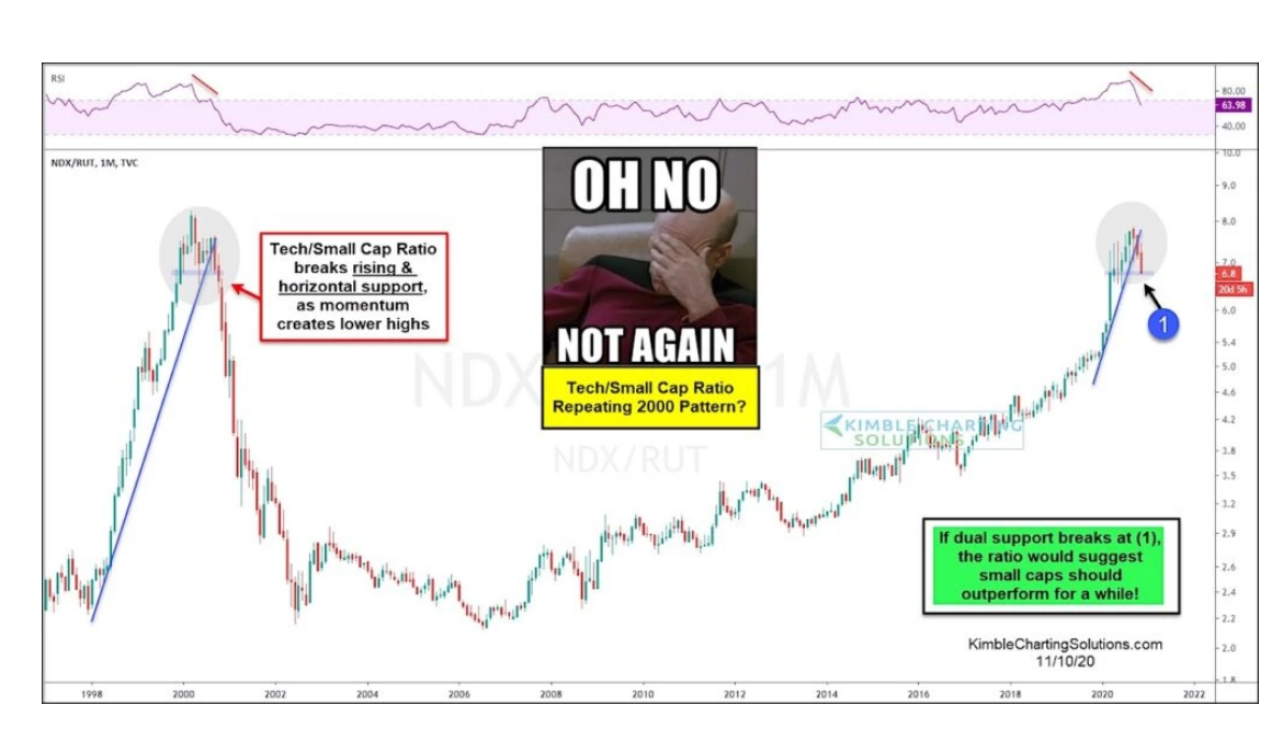
9. Tech vs Small Caps - is history about to rhyme? @seeitmarket & @KimbleCharting bring us an interesting look at the NASDAQ 100 versus the Russell 2000. Could history be repeating? Shares of tech stocks have risen big on an absolute basis, but relative to the small cap index, the NDX is finding resistance at the 2000 peak. The ratio chart shows that the recent uptrend has broken, which is similar to the move seen at the burst of the dot-com bubble. US small cap stocks held up relatively well during the 2000-2002 equity market decline while big cap tech was demolished. Keep this chart on your radar for clues to possible turning points within the stock market - intermarket analysis is critical when markets rotate.
Chris Kimble also points out that if near-term support fails, small caps could outperform large cap technology stocks for a while. What’s also interesting is the RSI indicator above the price chart. Notice how the RSI reading peaked on both occasions. Momentum often turns before price, so that indicator lends support to the thesis that mega tech growth stocks could be in the penalty box for a while. Is history rhyming once again?
Bottom line: Small caps could be on the verge of a long-term outperformance to big tech. Recent price action between the NASDAQ 100 and Russell 200 is similar to that in early 2000. Traders should monitor the upcoming moves of this ratio chart.
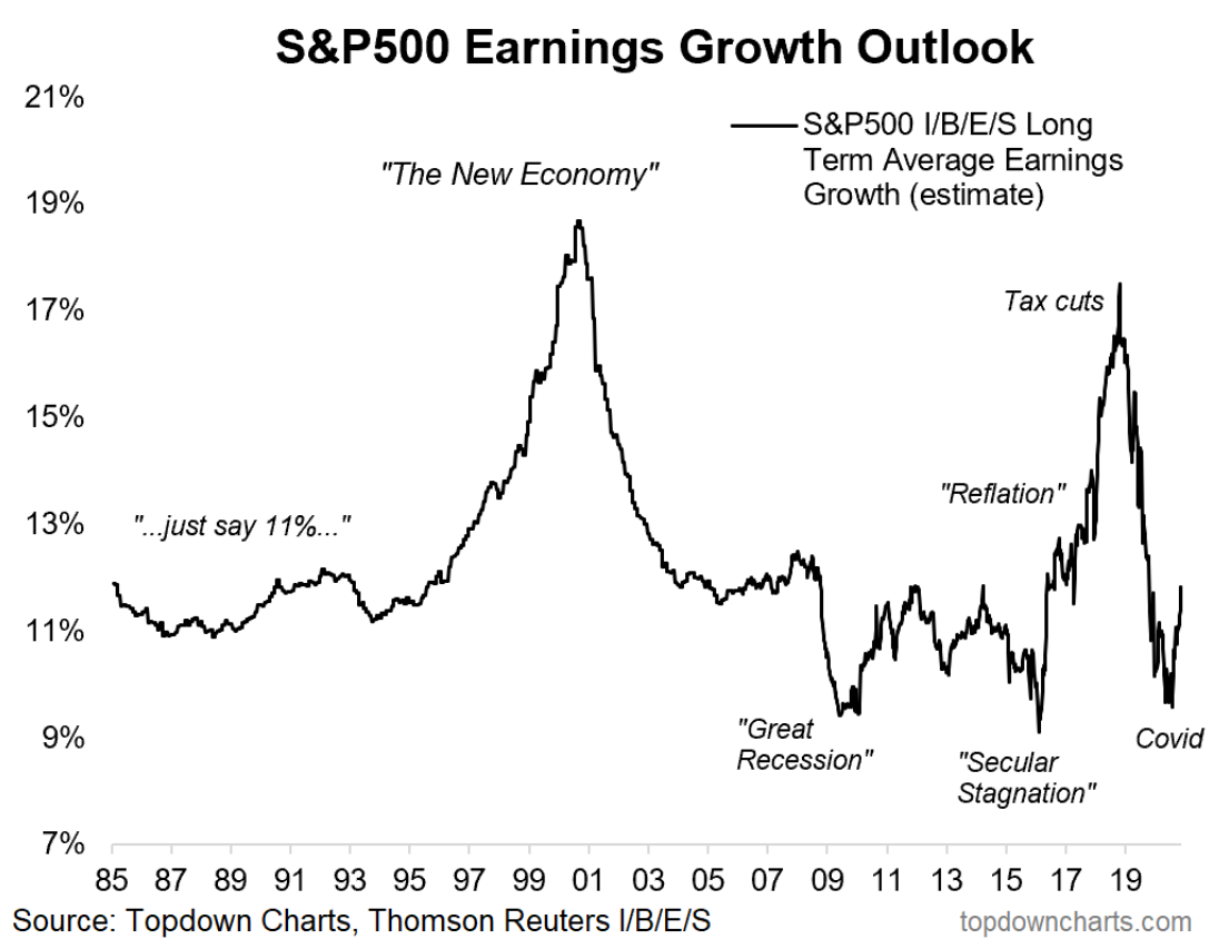
10. S&P 500 Long Term earnings growth outlook on the up... @topdowncharts wraps up this week’s ChartStorm with a look at the S&P 500’s earnings growth outlook. The last two quarters featured earnings results that were much better than Wall Street analyst expectations. While still negative year-on-year, the EPS picture has improved drastically from March and April.
The long-term average earnings growth estimate is now back near 11-12%, about in-line with the historical average. It peaked following the Tax Cuts and Jobs Act and then collapsed during COVID. Recent operating performance among US firms, particularly the mega cap growth space, has proven how resilient corporate American can be. The Fed’s liquidity injections and massive fiscal stimulus didn’t hurt either.
Bottom line: Earnings expectations are off the lows. The impressive EPS beat rates featured in the Q2 and Q3 reporting season helped drive the S&P 500 earnings forecast higher. Nevertheless, US equity valuations are sky high and future returns are likely to be very weak. As we head into 2021, can firms keep beating analyst estimates? More importantly, how much of the earnings recovery is priced-in?
So where does all this leave us?
1. Sentiment and flows.
Investor pulled a 180. Pessimism was rampant in September and October as stocks sagged ahead of the US presidential election. The experts on Finance Twitter were about to throw in the towel, but election day came & went, and suddenly everyone is bullish. One of the most famous measures of investor sentiment is the AAII weekly survey. The latest reading shows the 6th highest measure of net bulls since March 2009. Investors should be skeptical and cautious when optimism turns this high. And it’s not just hope – EPFR data shows that last week was the biggest inflow into global equities in the last 20 years. Meanwhile, the smart money is cashing out according to the insider transaction ratio. This does not seem to be a favorable event mix for the bulls.
2. Seasonality and Liquidity.
This year isn’t all that special. 2016 is a decent analog in terms of a dicey economy that is held up by immense central bank stimulus – all within an election year. Following 2016 Trump’s win, equity fund flows turned positive through year-end. Will the same take place in 2020 after Biden’s victory? The uncertainty has passed and everything is roses, right? That’s what the historical election price pattern would suggest. An uptrend often persists through inauguration day. Meanwhile, bears continue to fight aggressive central bank policy actions. The latest 31.6% jump in US free liquidity could portend further gains for the MSCI USA equity index.
3. Long term trends.
Turning away from the election (thank goodness), value could be at an important crossroads versus growth. Volatility between the two styles is running high – similar to that of the dot-com bubble and GFC. Value could finally be making its comeback. Strength has been seen in the energy and financial sectors while IT remains below its early September 2020 peak. Analyzing tech versus small caps, recent moves are also similar to what happened in March 2000. Traders should pay close attention to what the Russell 2000 does versus the NASDAQ 100. Finally, long-term earnings expectations appear to be on the path to recovery from the COVID crash lows.
Summary
What a week. Equities soared, led by small cap value, as investors turned optimistic regarding life possibly returning to normal at some point next year. Headlines of lockdowns did not seem to negatively impact the markets (at least not yet). Last Monday morning’s meteoric rally was met with profit-taking initially, but the bulls capped off the week with a solid gain on Friday to bring the global equity market to an all-time high. Investors have turned bullish, but is that cause for concern? Although often wrong at extremes, sometimes the crowd is right—especially at the beginning of new trends. It looks like the value rally has legs, but it could be a bumpy ride as a number of known risks look set to linger...
