Milton Friedman once declared that “inflation is always and everywhere a monetary phenomenon, in the sense that it can only be produced by a more rapid increase in the quantity of money than in output.”
Friedman might not have been 100% correct on this, but he was damn close. For instance, San Francisco real estate price inflation can be more easily explained by artificial scarcity resulting from development restrictions than money supply growth. Yet, most instances of nation-wide price increases can be explained by high money supply growth, typically resulting from excess spending by the Federal government, and/or via loose monetary policies from the Federal Reserve Bank.
For this reason, I’ve been watching money supply growth and housing prices closely over the past few months. My view is that stagflation is a real possibility in the upcoming years; perhaps somewhat similar to what we saw in the 1970′s. Such an episode would favor certain investment classes, with real estate, commercial banks, and insurers being most likely to benefit in my view.
It’s extremely difficult to predict rates of inflation or future housing prices with any degree of accuracy, and it normally suffices merely to be correct about the general direction of things. That’s my primary goal.
Unfortunately, it’s complicated by the tug of war that is currently happening in Washington. Even with the fiscal cliff deal, we now have another potential debt ceiling battle. Let’s also not forget another major economic event that will take place over the next year: the implementation of Obamacare. While the past data may point one way, it would be easy for another political event to shift things in another direction.
That said, here’s the data I’ve been looking at.
The Budget Deficit and the Fiscal Cliff Deal
The Federal Reserve’s recent statements regarding an employment mandate are cause for concern, but it’s reckless spending by the current Administration and Congress that worry me more than anything. The chart below shows the U.S. budget deficit as a percentage of GDP since 1947.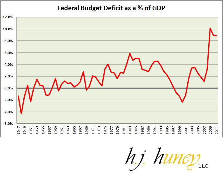
Given that the U.S. is a sovereign issuer of its own currency, what this means is that deficits are quickly monetized, and that larger budget deficits mean higher inflation risks. The recent fiscal cliff deal barely puts a dent in this, lowering the projected budget deficit from around $1.1 trillion to maybe $900 billion. Even that is based on the flawed assumptions that higher taxes won’t lead to some contraction in Federal tax revenues and that entitlement spending won’t increase significantly in the upcoming years (a dangerous assumption if there ever were one).
M2 Money Supply Growth in the US
Fiscal deficits should eventually result in significant increases in money supply growth. M2 is the broadest measure of money supply we have available, since M3 was discontinued in 2006, so this article focuses primarily on that measure.
Let’s start out with the basics. The following chart shows the year-over-year growth in M2 money supply since 1982. 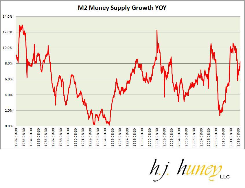
We are by no means at the highest level on that chart right now at 8.2% YOY growth, but we are nevertheless well above the historical average of 6.0% for the 30-year time period.
YOY charts of M2 growth can be a bit volatile, so one thing I like to examine is a 3-year rolling average of M2 growth. This has some advantages and disadvantages. The big advantage is that it smoothes out the growth rate and creates a more coherent chart that tends to make more sense historically. The disadvantage is that the figures can be skewed upwards or downwards by older data.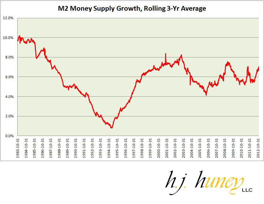
The 3-year rolling average shows us to be close to the high end in the 30-year time frame surveyed, with growth most similar to the late 90′s. There are two reasons to be concerned about this: (1) the spike in money supply growth in the late 90′s seemed to signal the beginning of the housing boom, and more ominously, (2) GDP growth is much lower this time than it was during that late 90′s/early 00′s spike. Remember, we are not only concerned with money supply growth, but also output and if money supply growth is similar to the late 90′s, output growth most certainly is not.
M2 versus NGDP Growth
Due to this dilemma, I decided to take a look at M2 growth versus nominal GDP ["NGDP"] growth. The chart below shows M2 growth minus NGDP growth.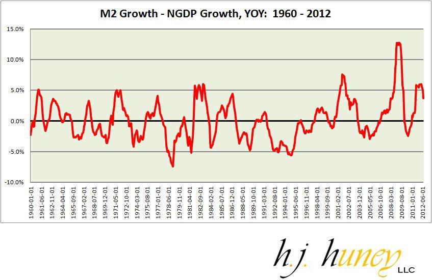
The way to read this chart is to focus on the 0% line. Anything above 0% indicates M2 growth that outpaces NGDP growth. Anything below 0% indicates NGDP growth outpacing M2 growth. We tended to stay with about 4% of that line for most of the series, but there are a few spikes above and below that. The mid 90′s produced the most interesting dip below 5%, while the biggest jump upwards (before the past few years) came around 2002 as the housing boom was gathering more steam.
We saw another massive jump upwards during the financial crisis. And now we are in the midst of another mini-spike above 5%. Once again, we can examine all of this on a 3-year rolling average, as well.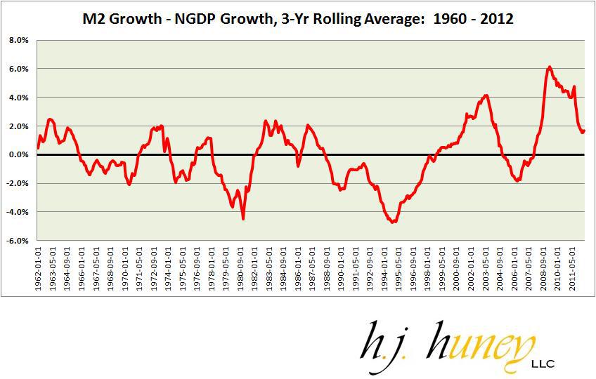
Even though it looks like the figure is improving towards 2012, it’s actually the result of the 2010 data skewing things downward. This data set cuts off in July 2012, and the 3-year rolling M2 growth rate is 6.0%. In comparison, the 2-year rolling M2 growth rate is 8.0% for that same timeframe; a significant jump. Meanwhile the NGDP growth rate difference is somewhat negligible with the 3-year growth rate at 4.3% and the 2-year rate at a modestly lower 4.1%.
Suffice it to say, there is a large difference developing between M2 growth and NGDP growth and this has been a common state for much of the past 15 years, with the 2004 – 2008 period providing the sole exception to this rule (and a rather minor exception at that).
M2 Money Supply Growth as a Percentage of NGDP
There are strengths and weaknesses with every chart in this article. My biggest concern with the M2 minus NGDP growth stat is that it fails to look at the M2 growth rate as a percentage of the overall economy. For instance, this stat would measure 15% M2 growth with 14% NGDP growth exactly the same as it would 3% M2 growth with 2% NGDP growth. Yet clearly, the former condition is more likely to lead to problematic inflation, and the high NGDP growth rate may merely be a result of said inflation.
You may notice in this flaw in the above two charts as there are no significant spikes in the highly inflationary 1970′s. In order to compensate for this weakness, let’s examine M2 growth as a percentage of NGDP.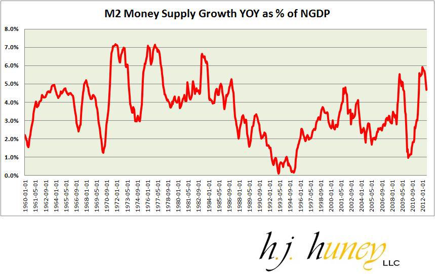
And let’s also look at the 3-year rolling average again.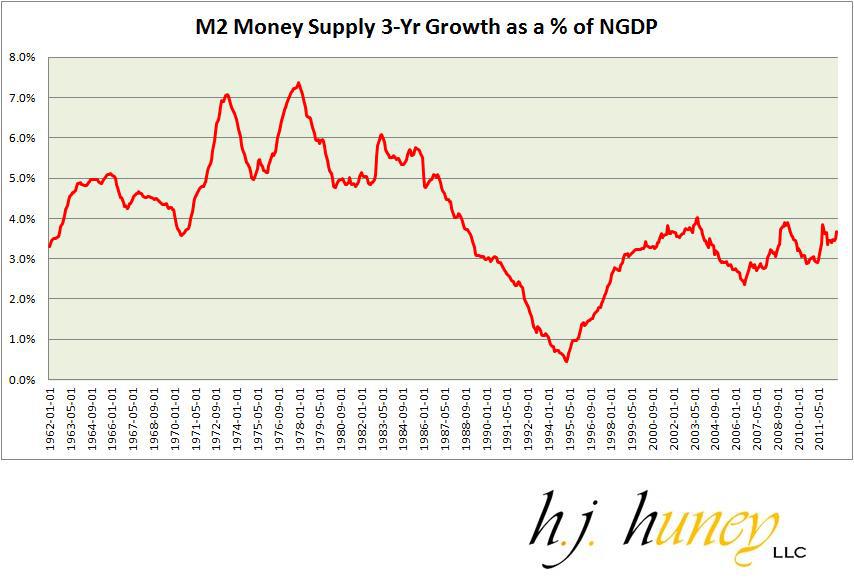
chart more clearly exposes the pattern in the inflationary 1970′s, as well as highlighting the low inflation, and more stable growth era in the mid 90′s. The housing boom on these charts does not look as bad as the 1970′s, but still shows much more rapid M2 growth than during the more stable early to mid-90′s period. We are at similar levels right now, but once again, the scarier thought here is that this M2 growth is coming without late 90′s GDP growth. Our NGDP growth over the past few years has been around 4%, whereas late 90′s GDP growth averaged closer to 6%.
Japan versus the United States
Many have compared the United States’ housing crash with the collapse of the Japanese Asset Bubble, but in my view, there are major differences between the two. The next few charts are very enlightening in showcasing the very different M2 growth patterns in the U.S. vs. Japan.
The first chart shows the basic YOY growth in M2 money supply in Japan from 1980 to 2012.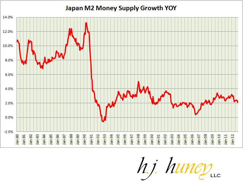
We can see elevated M2 growth sustained over a long period in the 1980′s in Japan. From 1984 to 1991, M2 growth stayed above 8% and even drifted above 10% for most of the time between 1987 and 1991. After that, M2 growth plunges all the way below 0% by 1993, before stabilizing in the 2% – 4% range for several years, then eventually leveling off in the 2% – 3% range for most of the past decade.
We can also look at the 3-year rolling average with Japan, as well.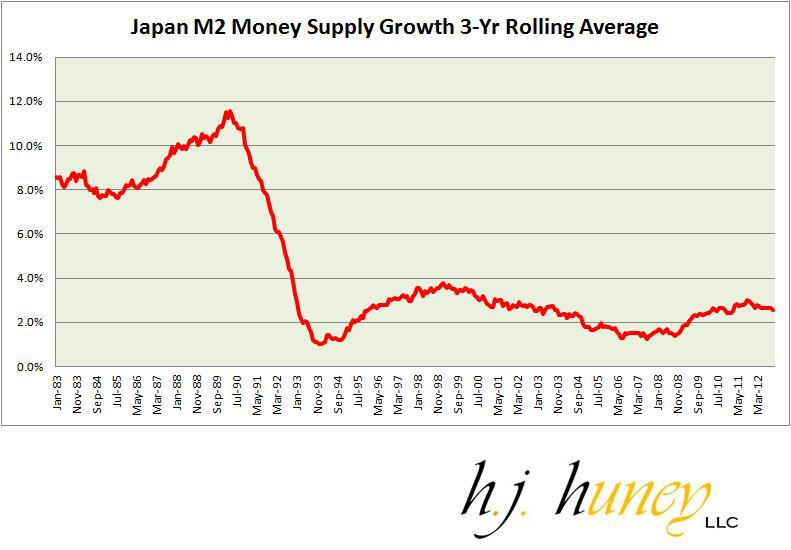
We see the exact same pattern, albeit with some of the spikes smoothed out. Now, let’s compare that to the U.S. over the same timeframe.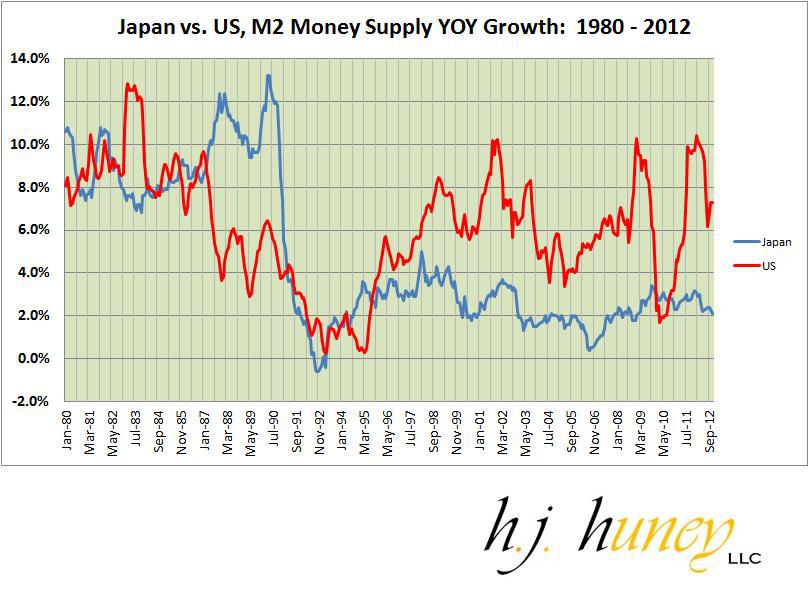
The YOY chart may be a bit difficult to read, but the most noticeable distinction is the Unites States’ consistently high M2 growth rate relative to Japan after 1997. The 3-year rolling average is more enlightening.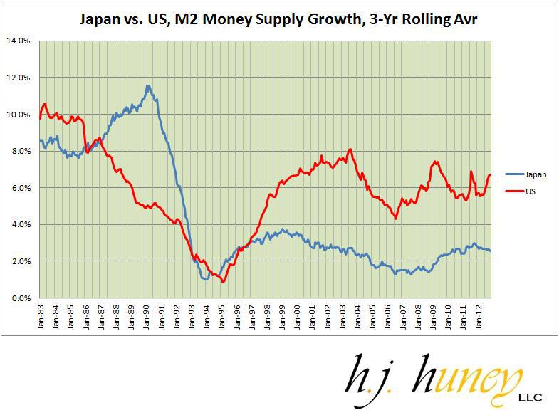
By this measure, the U.S. has maintained a significantly higher M2 growth rate than Japan after 1997. The United States’ M2 growth rate would appear to average at least 400 to 500 bps higher than Japan’s over the past decade and a half. If you want to look at both nations in terms of their respective crashes, the following chart examines this very theme. However, it first requires explanation.
For Japan, this chart starts in 1989. For the U.S. it starts in 2006. For each nation, I pegged this about 12-24 months before the crash. The x-axis is the number of months that have elapsed since the initiation date.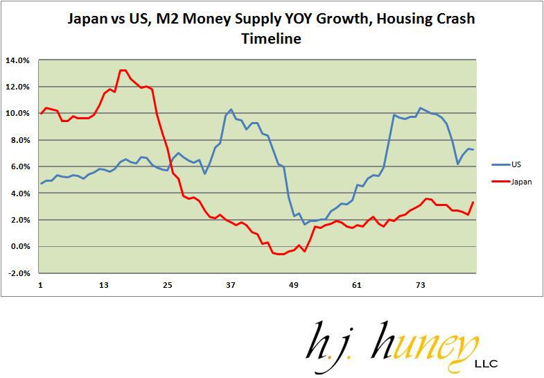
There’s a very noticeable difference here, with Japan’s M2 growth rate starting out at an extremely elevated level and plunging downward. Meanwhile, the U.S. starts at a more moderate M2 growth rate, but there are two massive humps after the crisis hits. Those two massive humps are two very big reasons why the U.S. may not be that much like Japan when it comes to inflation after the crash.
The Case-Shiller Index
Finally, let’s take a look at some Case-Shiller data. Below I examine the 10-city index. The downside with this index is that it’s not as broad of a dataset as the 20-city index. The upside is that the data set runs much longer as the C-S 10 has been around since 1987, whereas the 20-city index was only created in 2000. I examined the differences between the two before and they have typically been very small.
Except, instead of looking at YOY changes, I want to look at quarter-over-quarter (QOQ) and half-over-half (HOH) changes. The reason for this is that housing prices were declining through January / February 2012. Since that point, prices have rebounded rapidly, making the YOY changes a bit deceiving. Indeed, the YOY growth for the Case-Shiller 10 index is now at 3.4%, while the half-year increase is exactly the same! In other words, almost all the gains have come in the past six to nine months.
Below are the quarterly increases in the Case-Shiller 10.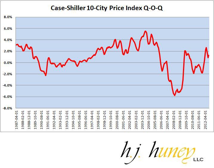
And now for the six month increase.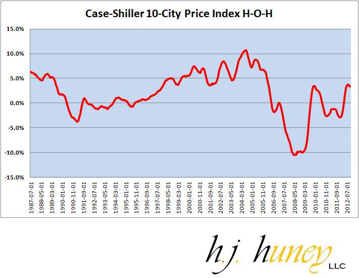
Difficult to know what to make of this yet, but the pattern of price increases more closely resembles the beginnings of the late 90′s/early 00′s housing boom than the early 90′s gradual recovery. It is worth noting that some of the large gains are coming from a handful of cities that have seen significant price declines previously (e.g. Las Vegas). Therefore, this could simply be driven by a rebound in some of the more depressed housing markets. All the same, it’s worth keeping an eye on, and I would not view the high volatility as a positive sign.
Conclusions
Given the complex myriad of factors that determine inflation, I can provide no answers as to what the future holds. However, the charts in this article at least allow us to get a better sense of the inflationary risks moving forward. In my view, from the data I’ve examined, inflationary risks are rising.
It’s difficult to know how the fiscal cliff deal, the renewed debt ceiling debate, and the implementation of Obamacare might affect things, but assuming a continuation of the status quo, I believe that we would likely see a rise in inflation over the next 12-36 months, that could possibly force the Federal Reserve to re-evaluate its dovish stance.
- English (UK)
- English (India)
- English (Canada)
- English (Australia)
- English (South Africa)
- English (Philippines)
- English (Nigeria)
- Deutsch
- Español (España)
- Español (México)
- Français
- Italiano
- Nederlands
- Português (Portugal)
- Polski
- Português (Brasil)
- Русский
- Türkçe
- العربية
- Ελληνικά
- Svenska
- Suomi
- עברית
- 日本語
- 한국어
- 简体中文
- 繁體中文
- Bahasa Indonesia
- Bahasa Melayu
- ไทย
- Tiếng Việt
- हिंदी
14 Charts On Money Supply, Deficits, And Housing Prices
Published 01/06/2013, 02:24 AM
Updated 07/09/2023, 06:31 AM
14 Charts On Money Supply, Deficits, And Housing Prices
3rd party Ad. Not an offer or recommendation by Investing.com. See disclosure here or
remove ads
.
Latest comments
Install Our App
Risk Disclosure: Trading in financial instruments and/or cryptocurrencies involves high risks including the risk of losing some, or all, of your investment amount, and may not be suitable for all investors. Prices of cryptocurrencies are extremely volatile and may be affected by external factors such as financial, regulatory or political events. Trading on margin increases the financial risks.
Before deciding to trade in financial instrument or cryptocurrencies you should be fully informed of the risks and costs associated with trading the financial markets, carefully consider your investment objectives, level of experience, and risk appetite, and seek professional advice where needed.
Fusion Media would like to remind you that the data contained in this website is not necessarily real-time nor accurate. The data and prices on the website are not necessarily provided by any market or exchange, but may be provided by market makers, and so prices may not be accurate and may differ from the actual price at any given market, meaning prices are indicative and not appropriate for trading purposes. Fusion Media and any provider of the data contained in this website will not accept liability for any loss or damage as a result of your trading, or your reliance on the information contained within this website.
It is prohibited to use, store, reproduce, display, modify, transmit or distribute the data contained in this website without the explicit prior written permission of Fusion Media and/or the data provider. All intellectual property rights are reserved by the providers and/or the exchange providing the data contained in this website.
Fusion Media may be compensated by the advertisers that appear on the website, based on your interaction with the advertisements or advertisers.
© 2007-2024 - Fusion Media Limited. All Rights Reserved.
