Some parts of the world pretty much sailed through the 2008-2009 recession, while other parts of the world had huge problems. The part that sailed through the recession is what I call the “Growing Part of the World.”
I thought it would be interesting to see how the countries in the “Growing Part of the World” have behaved over the long term with respect to a number of variables (energy, GDP, and population). I compare these countries to two other groups of countries which did not fare as well during the 2008-2009 recession:
- European Union 27, United States and Japan
- Former Soviet Union (FSU)
Together these three groups equal the whole world, which is why I call the Growing Part of the World “Remainder” on my charts.
Figure 1 (below) shows that GDP growth rates have been quite different over the long term for the three groups, with the growth rate of the Growing Group higher than that of EU, US and Japan. The FSU’s growth rate has been more variable. Thus, it is not just during the 2008-2009 recession that the groups were different.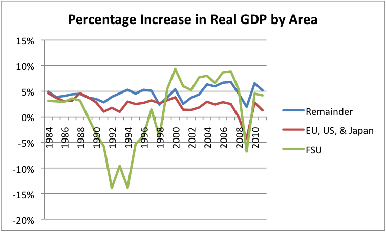
Figure 1 – Annual per cent increase in real GDP by area, based on USDA Economic Research Service data. “Remainder” corresponds to the Growing Part of the World.
The charts I have prepared show huge differences in variables besides GDP growth: in population levels, growth rate of population, and types of energy used, for example. The amount of energy for each unit of GDP varies widely, as does the pattern over time. While the FSU and the “EU, US & Japan” grouping show lower energy consumption for each unite of GDP over time, the Growing Group in total does not.
At the end of this post, I explain the reasons that why the Growing Part of the World seems to be doing so much better than the world economically and offer my view of what its prospects are for the future.
Which Countries are in the Growing Group (Remainder)?
The Remainder, or Growing Part of the World, includes:
- China, India, Korea, Hong Kong, and other Asian countries, other than Japan
- All of the oil exporting countries, including OPEC, Canada, Mexico, and Norway
- Countries in Africa and Central and South America
- Australia and the island nations of the Pacific
My split was calculated using readily available totals, so it isn’t perfect. Some individual countries might be handled differently. Also, there is a tiny overlap problem between EU-27 and FSU, handled by making the Remainder smaller.
The Growing Group is one group that has been making money from oil exports, although the amount that it has been making has been dropping, as the FSU’s share of oil exports grows. The Growing Group’s revenues from exports no doubt helped protect them in the past, at the same time that the cost of the imports handicapped US, EU, and Japan.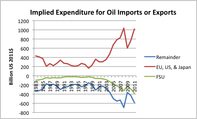
Figure 2. A rough calculation of expenditure (in 2011$) associated with oil imports and exports, based on 2012 BP Statistical Review data, for three areas of the world: the Former Soviet Union (FSU), the sum of EU-27, United States, and Japan, and the Remainder of the World. (Negative values from revenues are exports.)
Population
The growing part of the world is where population is growing: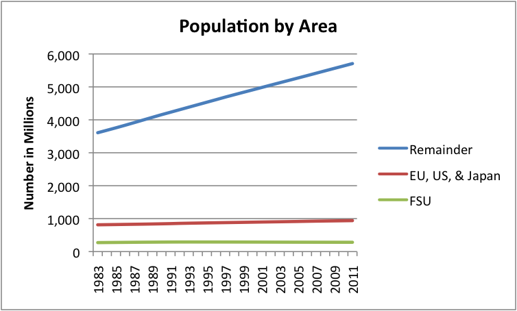
The population of the Remainder is huge–almost 6 billion. Population (according to EIA’s International Energy Statistics) is growing about 1.3% per year for the area, but varies by country. China’s population is growing about 0.5% per year; India’s population is growing at about 1.4% per year, the rest of this group is growing by an average of 1.6% per year. Given that we have finite resources on the earth, continuation of this pattern looks like a serious problem.
Real GDP by Area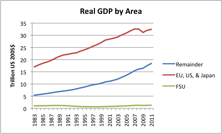
Figure 4. Real GDP by area in 2005$, based on USDA Research Service compilation.
A graph of real GDP for the three areas of the world shows that the Remainder (or Growing Area) is actually adding more dollar value of real GDP in recent years than EU, US, and Japan combined. In other words, the blue line is getting closer and closer to the red line. The FSU’s GDP continues to be quite low, but has risen since its low point in 1998.
Energy Consumption by Area
Energy consumption has varied greatly for the three areas: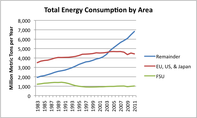
Figure 5. Total energy consumption by area, based on BP’s 2012 Statistical Review data.
The Growing Area (Remainder) is now the largest consumer of energy in the world. Its energy consumption grew by an average of 5.0% per year between 2005 and 2011; the energy consumption of the FSU grew by an average of 0.7% per year in the same period; and the UK, US, and Japan’s energy consumption declined by an average of 1% per year in that period.
We can break down energy consumption into its components. First oil: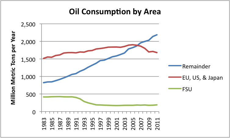
Figure 6. Oil consumption by area, based on BP’s 2012 Statistical Report
The production of world oil has been flat in recent years, but a person would never guess this by looking at the growth in the consumption of the Growing Group (Remainder). Between 2005 and 2011, oil consumption for the Growing Group grew by an average of 3.1% per year. In comparison, oil consumption for the FSU grew by 1.2% per year between 2005 and 2011, and contracted by an average of 2.1% per year for the EU, US, and Japan combined.
Thus, there has been a huge rearrangement in who gets oil.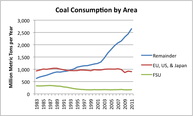
Figure 7. Coal Consumption by Area, based on data from BP’s 2012 Statistical Review.
The Growing Group (Remainder) has shown amazing growth in coal consumption since about 2002. The Kyoto Protocol, trying to discourage the use of coal, was adopted in 1997 (mostly by countries not in the Growing Group), but this does not seem to have changed any consumption trend lines downward. The sharp upward bend in the Growing Group’s consumption comes shortly after the China joined the World Trade Organization (November 2001). In total, the world’s use of coal, not shown on the chart, has risen sharply in recent years.
In the period 2005 to 2011, coal consumption has grown by an average of 6.5% per year in the Growing Group; by 0.6% per year in the FSU; and has decreased by an average of 1.8% per year in the EU, US, and Japan grouping.
Natural gas is the fossil fuel that by some calculations is less bad for the environment than oil and coal. Let’s see what happens with it.
Figure 8. Natural gas consumption by area, based on BP’s 2012 Statistical Review of World Energy.
Here again, the consumption of the Growing Group (Remainder) is growing much faster than the other two groups. In the Growing Group, natural gas consumption grew by an average of 5.6% per year in the period 2005 to 2011. Natural gas consumption grew by an average of 0.6% per year during that period for both the FSU and the EU, US, and Japan.
Let’s look at Nuclear next: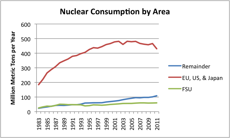
Figure 9. Nuclear electricity consumption by area, based on BP’s 2012 Statistical Review data.
The Growing Group’s (Remainder’s) nuclear consumption is growing, but from a very small base. Looking at the EU, US, and Japan, we might think that “peak nuclear” had come in the 2002 to 2004 timeframe. Growth in nuclear averaged 2.9% per year in the 2005 to 2011 period for the Growing Group; averaged 1.1% for the FSU; and amounted to an average decline of 1.8% per year for the EU, US, and Japan combined.
Even in the Growing Group, the growth in nuclear has been much lower than for other types of energy in recent years.
Moving on to Hydroelectric: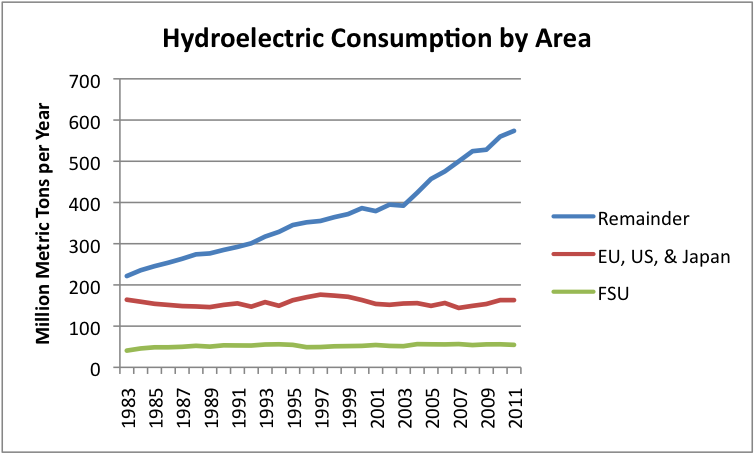
Figure 10. Hydroelectric consumption by area, based on BP’s 2012 Statistical Review.
Hydroelectric is the one area where the Growing Group (Remainder) started out in 1983 with the highest production of the three groups. The Growing Group has widened its lead in recent years, especially after China was added to the World Trade Organization in late 2001.
In the period 2005 to 2011, the Growing Group’s growth in hydroelectric averaged 3.9% per year; the EU, US, and Japan combined averaged 1.5% per year (although over the longer term this just looks like “wobbles”); and the FSU has contracted by an average of 0.4% per year during the same period.
One last group–Other Renewables: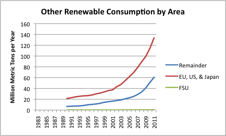
Figure 11. Other Renewable Consumption by Area, based on BP’s 2012 Statistical Review.
This grouping is by far the smallest of the groupings. It includes wind, solar, and some other categories like geothermal, but does not include biofuels, which are buried in oil consumption.
In terms of total consumption, the EU, US, and Japan is highest, but in terms of growth rate, the Growing Group is out ahead. In the period 2005 to 2011, the growth in Other Renewables has averaged 17.9% for the Growing Group and 13.8% per year for the EU, US, and Japan combined. The FSU is basically not doing much in the way of “Other Renewables”.
Per Capita Energy Consumption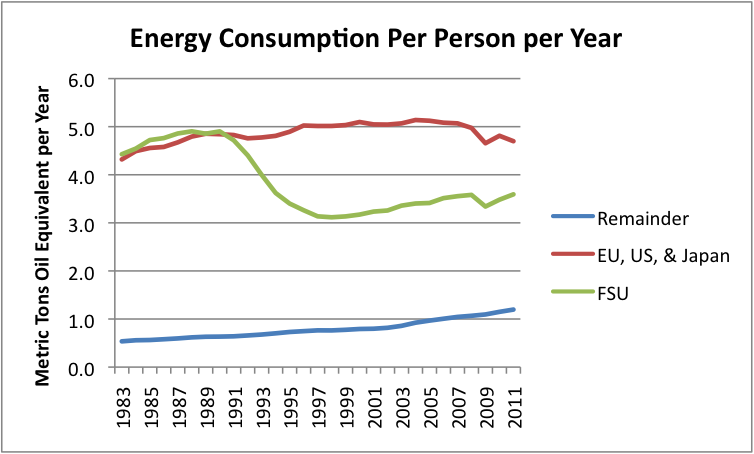
Exhibit 12. Energy consumption per person per year, in metric tons of oil equivalent, calculated by dividing Energy Consumption shown in BP’s 2012 Statistical Review by EIA’s population estimates.
Here we find that the energy consumption per capita of the Former Soviet Union (FSU) was virtually the same as (or a bit higher than) that of the grouping EU, US, & Japan, but started falling in 1991, and continued falling until 1998. The Growing Group has much lower energy consumption per capita, and it has been rising.
Looking at growth in average energy consumption per capita, we find that in the period 2005 to 2011, the Growing Group averaged 3.6% growth; the FSU averaged 0.9% growth; and the EU, US, and Japan averaged a decline of 1.4% per year in per capita energy consumption.
Energy Consumption per Unit of Real GDP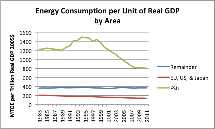
Figure 13. Energy consumption per unit of real GDP, based on Energy Consumption from BP’s 2012 Statistical Review, and real GDP from USDA’s Research Service.
Figure 13 shows that energy consumption per unit of GDP is vastly different for the three groups–in fact so much so that it is hard to put the lines on the same scale. In my view, part of the reason the that the FSU’s ratio is high is because the FSU’s GDP is depressed compared to that of EU, US & Japan. This happens because much of what would be recorded as GDP in the EU, US, and Japan is done within the household sector, the informal economy, or as free government services. Also, the FSU is geographically very large and much of it is quite cold, so it requires fuel for heating and transportation, even if little is produced as a consequence.
It is little hard to see on Figure 13, but the Growing Group’s (Remainder’s) energy consumption per unit of real GDP has been pretty much flat for the entire period shown in the graph.
To get a better view of the situation, I made a second graph (Figure 14) that leaves off the FSU amounts, and instead substitutes the comparable amounts for the World as a whole. (The Remainder is still defined the same as it has been on the other graphs–it is still the Growing Group.)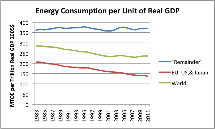
Figure 14. Energy consumption per unit of real GDP for the World, for the EU-27, US, and Japan grouping, and for the Remainder (=Growing Group), similar to Figure 13.
What we can see a little better with this scale is that energy consumption per unit of real GDP for the Growing Group (Remainder) has been essentially flat for the entire period of 1983 to 2011. In contrast, energy consumption per unit of real GDP has been falling for the entire period for the grouping EU, US, and Japan. For the period 2005 to 2011, the average percentage decrease in energy per unit of real GDP has been 1.6% per year, for the EU, US, Japan grouping.
World energy consumption per unit of real GDP was dropping until about 2000, after which it pretty much leveled off. The much bigger role that the Growing Group is now playing in total real GDP (see Figure 4), and the “flatness” of Growing Group’s Energy Consumption per unit of Real GDP would seem play a part in this leveling.
A Few Observations
These graphs demonstrate how wide ranging the differences in different areas in the world have been.
They also demonstrate that for the Growing Group, energy consumption has tended to rise as fast as GDP. I can examine this to a greater extent, in a future post.
The Growing Group has consistently done well in terms of economic growth. Part of the reason for this growth seems to the long-term ramp up in energy sources of all types, with the biggest emphasis on coal. When coal is internally produced, it is often a cheap source of energy, helping make these countries more competitive.
The Growing Group has a number of advantages:
1. Much of the group still has inexpensive energy resources that have not yet been exploited, that can easily be ramped up. If development of these countries had been going on for a long time (as in Europe and Russia) these resources would already have been developed. This is a big advantage for the Growing Group.
If we think of extraction of resources as working from the top to the bottom of a resource triangle (see Figure 15), extraction usually goes from the cheap, easy to extract resources at the top of the triangle to the more expensive, slower to extract, resources at the bottom of the triangle. The later resources are often more polluting as well.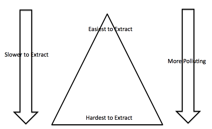
Figure 15. Author’s illustration of impacts of declining resource quality.
These resources are of a variety of types–coal, hydroelectric, and even oil and natural gas. To the extent that governments can exploit these easy-to-extract resources cheaply, and get the benefit of them without going through the world market, they can develop their economies directly. Even if the process involves a business from elsewhere extracting resources and selling them on the world market, local economies can benefit from increased employment and taxes on resource extraction.
2. Much of the Growing Group is in warm climates where houses can be built very inexpensively, people can commute by bicycle even during the cold part of the year, and the cost of living is very low–for example, China, India, Bangladesh, Thailand, and Philippines. These countries can pay low wages to their workers, and the workers can still have an acceptable standard of living. The wages of these countries can be extremely competitive with countries in harsher climates, since wages need to be higher there, to have an acceptable standard of living.
3. The push by developed countries toward energy efficiency, carbon taxes, and reduced CO2 emissions have inadvertently benefited many of the countries of the Growing Group. For example, if new, more efficient refrigerators are needed, it is the countries of the Growing Group who often produce them. Many solar panels are also produced in the Growing Group, and refineries that would be deemed too polluting for developed economies are built in countries of the Growing Group.
The use of higher taxes on oil consumption and carbon taxes has inadvertently benefited the Growing Group, as well. What happened is that economists put their tax models together without understanding what happens when the total supply of an essential product is constrained. (Or perhaps they understood, but didn’t think such models applied to oil.)*
In the case of oil, we are dealing with a world market, and the total supply is very “inelastic”. This means that oil supply stays pretty much the same regardless of price, above a certain threshold. If you or I eliminate our part of demand, the world oil price theoretically drops by some tiny fraction, but at this lower oil price, theres is still plenty of other demand elsewhere. So a tax that results in savings in oil consumption in, say, Spain, doesn’t reduce world oil consumption; it mostly shifts oil consumption elsewhere.
The graphs illustrate that, in practice, this seems to be what is happening. Taxes on oil consumption do severe a useful purpose, though–they help reduce the dollar amount of oil imports, and thus help the budgets of oil importing nations. They also help make the distribution of oil more equitable: countries with lower consumption get a larger share of the total. Energy taxes just weren’t explained that way.
4. Much of the Growing Group has a serious shortage of products and services that Europe, the United States and Japan take for granted, such as paved roads, water that can be drunk from the tap, motorized vehicles, and air conditioning. This means that there is a great deal of pent-up demand for “stuff,” and that stuff is generally made with fossil fuels.
What the Future Holds for the Growing Group
We can expect the Growing Group will gradually lose its ability to grow rapidly, as these countries gradually erode their resource bases, and lose the ability to keep ramping up energy extraction of various types cheaply. Whether or not “peak coal” is reached, imported coal tends to be quite a bit more expensive than locally produced coal, reducing the cost advantage of countries using it. We can see from Figure 2 that the relative dollar value of oil exports of the Growing Group is already declining.
Much of the Growing Group will have a cost advantage in manufacturing of goods as long as long-distance transport remains cheap and available, and local energy usage remains low, keeping the cost of living low. Countries in cold climates will permanently have a disadvantage because of the need for sturdier housing and the energy cost of heating. Thus, the drain of jobs to the Growing Group can be expected to continue, as long as free trade is available and encouraged. This will make it difficult for manufacturing in the FSU and the EU, US, and Japan to be competitive, and will tend to keep the Growing Groups’s growth rate above the rest of the world. This will also tend to push the rest of the world toward recession.
Thus, my long-term expectation is that the growth rate of the Growing Group is likely to decline. The growth rate will still stay above that of EU, US, and Japan, however. FSU cannot compete with the Growing Countries in manufacturing, so their growth will continue to depend primarily upon resource extraction. When FSU’s resource extraction starts to hit limits, their GDP will begin to decline as well.
Note:
*There are other issues with these taxes as well. They don’t apply to exports, and they don’t apply to imported products. Theoretically, they might work for coal and natural gas, if these other deficiencies were fixed as well.
