Oracle stock jumps 5% on TikTok deal progress, OpenAI fundraise talks
In a series of posts[1] [2] [3] [4] [5] over the last couple of months, fellow Economonitor blogger L. Randall Wray and I have been exploring the conditions under which the government’s debt can be said to be sustainable. Wray writes from the point of view of Modern Monetary Theory (MMT), while I adopt a more eclectic and skeptical approach.
A pivotal issue in our discussion turns out to be whether the central bank can or should hold the nominal rate of interest on government debt, R, below the rate of growth of nominal GDP, G. (We could frame the discussion in real terms instead by subtracting the rate of inflation, ΔP, from both sides; it makes no difference.) If R is held below G, then essentially any level of the government’s budget deficit is “mathematically sustainable,” a term we have been using to mean that the debt-to-GDP ratio does not grow without limit over time. On the other hand, if R exceeds G, the budget balance must show a primary surplus, on average over the business cycle, to achieve mathematical sustainability of the debt. (See the first of the posts referenced above for a detailed discussion of the conditions for mathematical sustainability.)
It seems well established that the the central bank can hold R down to any desired level, if it wants to, by buying a sufficient quantity of government securities. Barring legal restrictions like the debt ceiling, it could, if necessary, buy up all of the outstanding government debt in exchange for currency and bank reserves. Economists call this procedure “monetizing the debt.”
The “should” part of the question concerns whether the degree of monetization necessary to hold R below G would have undesirable inflationary side effects. True, when the economy is operating far below capacity and inflation is quiescent, as it has been these last few years, low interest rates and rapid money growth, backed by strong fiscal stimulus, may be just what the doctor ordered. You don’t have to subscribe to MMT to make that argument. Just read Paul Krugman. However, what happens when the economy approaches full employment and prices begin to rise? Is it still a good idea to hold R below G? That is where I become more skeptical.
So far, our discussion has proceeded largely on theoretical grounds. Now might be a useful time to supplement the theorizing with a look at the historical relationship of GDP growth to interest rates in post-World War II US experience. Doing so reveals some interesting and relevant patterns.
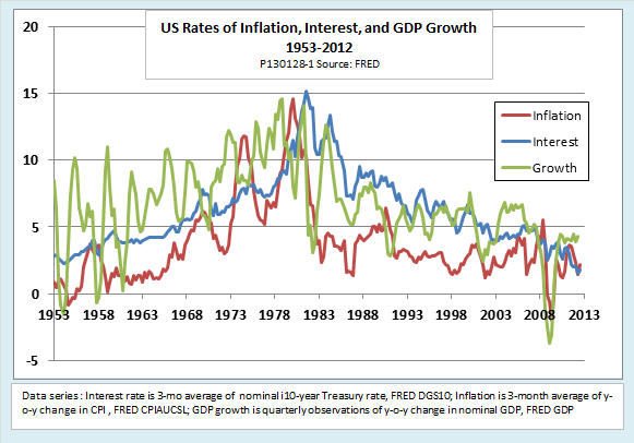
The following chart shows the evolution of three key variables from 1953 through 2012. The first is the inflation rate, plotted as quarterly averages of year-on-year changes in the Consumer Price Index. The second is the quarterly average interest rate on 10-year Treasury securities. (Rates on other maturities move closely together with the 10-year rate over the medium term, although shorter maturities show more quarter-to-quarter volatility.) The third variable is the growth rate of nominal GDP, plotted as quarterly observations of year-on-year changes.
A quick glance at the chart shows that the interest rate R has been sometimes above and sometimes below the growth rate G. Up to 1980, R was mostly less than G, as MMTers would like it to be. From the early 1980s through the 1990s, R mostly exceeded G. From the early 2000s to the onset of the global financial crisis, G moved back above R, but not by as much as before 1980. During the Great Recession, R has once again fallen below G.
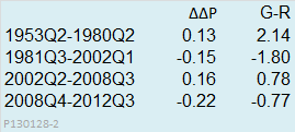
We can see another regularity in the chart, as well. The periods when interest rates are held below the GDP growth rate tend to be periods of accelerating inflation, while those when R rises above G show decelerating inflation. The following table brings out that feature by dividing the years shown in the chart into periods broken by major turning points in the trend of inflation. The column labeled ΔΔP shows the average quarter-to-quarter acceleration (+) or deceleration (-) in the annualized rate of inflation during each period. The column labeled G-R shows the amount by which the average annual rate of NGDP growth exceeds (+) or falls short (-) of the nominal interest rate. Comparison of the two columns shows that inflation tended to accelerate during periods when G-R was positive and to slow when G-R was negative.
The apparent regularities shown in the chart and table have a direct bearing on the debate over sustainability of fiscal policy. MMT proponents argue that the interest rate on government debt is a policy variable that the central bank of a country with a sovereign, floating-rate currency can set wherever it wants. As long as R is held below G, they say, the debt can never become mathematically unsustainable. By holding R permanently below G, the government can focus fiscal policy on achieving full employment without worrying about the budget deficit or the debt ratio. On the other hand, if a policy of holding R below G produces accelerating inflation as a side effect, it starts to look less attractive, at least to observers outside the MMT camp.
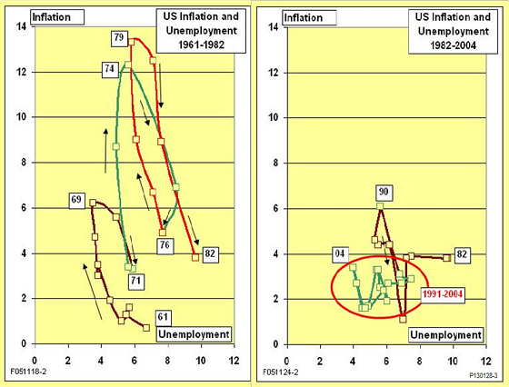
Let’s now add another variable, unemployment, to the discussion. The next pair of charts, like the familiar Phillips curve, plot unemployment on the horizontal axis and inflation on the vertical axis. However, the patterns in these charts look nothing like the classic Phillips curve, which posited a smooth menu along which policymakers could choose lower unemployment at the expense of a bit of inflation, or vice-versa.
Instead, the left-hand chart, which covers 1961-1982, shows an unstable stop-go cycle with a distinct inflationary bias. Each repetition of the cycle reaches a higher inflation maximum and turns up again from a higher inflation minimum. The minimum and maximum values of unemployment also increase with each cycle. The stop-go pattern coincides with the period during which interest rates on the federal debt averaged less than the growth rate of nominal GDP.
After 1982, the pattern changes sharply, as shown in the right-hand chart. There is a transition period in the mid-to late 1980s, after which, from the early 1990s up to the start of the global crisis, the economy exhibits remarkable stability. These were the years we call the Great Moderation. The transition and the early part of the Great Moderation coincided with a level of R significantly above G. After 2002, G rose above R once again. Most readers are probably familiar with the argument that the Fed’s attempt in the mid-2000s to prolong the Great Moderation by holding interest rates low contributed to the housing bubble and set the stage for the crisis.
Of course, these are only charts. They show associations, not causation. Even so, the charts by themselves pose an inconvenient truth for proponents of MMT, in much the same way that charts showing an association between atmospheric CO2 and rising global temperatures pose an inconvenient truth for climate skeptics. In both cases, the hypotheses of causation, which leap out from charts even for naïve observers, are backed by bodies of theory that many experts in the fields find plausible. The associations, backed by plausible theory, are not irrefutable, but they do shift the burden of proof.
The question stands then: Is it not just possible but also desirable for the central bank to hold nominal interest rates on government debt below the rate of nominal GDP growth, and to do so not just as a temporary measure during a deep slump, but as a long-term policy? Do past episodes when low interest rates were associated with accelerating inflation and stop-go instability provide grounds for caution, or does each such episode have some benign, extrinsic explanation? I look forward to learning more about how MMT proponents interpret the features of the charts presented here.
Original post
