Some call me a bear or negative or pessimistic, but nothing could be further from the truth as someone who tends to see things quite brightly with the real truth lying in the fact that the bearishness discussed in these notes is lodged in the charts analyzed and the fundamentals shown by those charts.
This point is made best by charts that absolutely astound me with each and every viewing and those are the 10-year+ charts of almost any individual equity, equity-ETF and equity index. As has been said here often, charts never lie, and let me tell you, these charts are telling the truth about the world’s 30-year borrowing binge having come to an end in 2007 with early manifestations of that ending having played out three years ago but with the middle innings and finale yet to come.
Unfortunately, these long-term charts are suggesting that the middle and the end of the financial crisis – the European sovereign debt and banking crisis and the lender of last resort crisis, respectively – may be more painful than the beginning despite the best efforts of the Federal Reserve to engineer a somewhat soft landing out of what would have been a devastating crash had it occurred all at once.
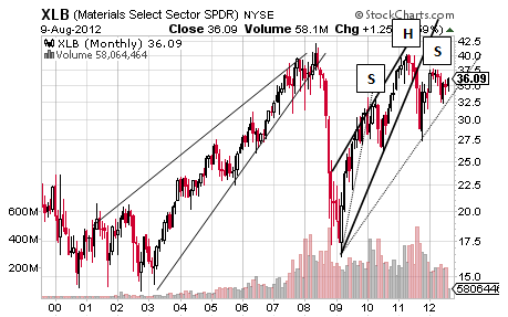
Let’s, then, look at a few of these “shock and awe” long-term equity charts that show how gross consumerism and an obscene focus on short-term gratification end and that is to say not so well. Exhibiting this hard landing – at best with the alternative called a crash – is the heart of the economy as discussed last week through the Dow Transports along with the basic materials sector ETF below.
Maybe the XLB defies its current multi-year Rising Wedge and Head and Shoulders combination to take out resistance near $40, but it was unable to do so on the best reinflation efforts of the Federal Reserve over the last few years and is showing a 4-year trend of lower highs as a result.
This means that companies like Alcoa and Dow Chemical and United Steel are likely to suffer from steep revenue and profit declines over the next year to few years with signs of those strains showing over the last year as a possible warning of what’s to come in a world of slowing demand and growth.
Relative to the technicals in the chart above, the XLB’s reinflation rally began to reverse in 2010 and will do so officially if it drops below about $34 with the fulfilling Rising Wedge suggesting such a decline will occur considering that pattern’s target of $17.50. It is supported by one of the bigger “helper” patterns out there in the Head and Shoulders pattern that confirms near $27.50 for a target of about yes, you guessed it, $17.50 with the shared target range supporting its likelihood of being hit.
Unless the XLB takes out resistance around $40 and something that, again, was not accomplished under the less-diminished impact of QE1 and QE2, these long-term bearish technicals are very likely to play out in some form and fashion even though it is tough to have a grasp on precise timing.
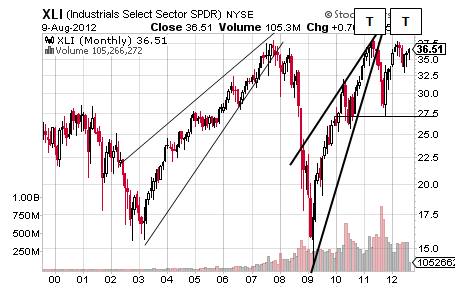
Does this sort of economic decline also known as a recession show in other sector ETF charts? Absolutely with the XLE looking a lot like the XLE but with a much more distinct peak in 2008 and one that is unlikely to be taken out any time too soon even though the case for an extreme and shaky Double Bottom could be made and so let’s turn to the industrials sector ETF that suggests companies like Boeing and Caterpillar and General Electric are going to suffer from severe revenue declines. 
As can be seen, the XLI is trying to fulfill a multi-year Rising Wedge and a pattern that tends to go longer and further than would seem possible initially but not higher than resistance as shown by the Double Top that confirms at $27.50 for a target of about $17.50 and just a bit above the target of the Rising Wedge at $15.
Clearly the XLI’s last Rising Wedge succeeded and this provides good reason to believe that the current pattern will as well to some degree even if not for the more than 50% decline predicted. Interestingly, it is not showing the extreme Double Bottom possibility playing in the XLB and XLE and this probably means that unlikely “rescue” will happen.
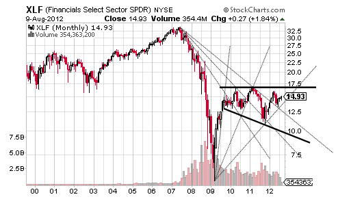
Lastly, let’s turn to sector ETF representing the heart of the financial crisis and this, of course, is the financial sector ETF that has not come even close to recovering from its hit taken in 2007 through 2009. There is good news and bad news to that diagnosis with the former contained in the fact that the XLF started to reverse its decline born of its 2007 peak while the latter is shown by the fact that the XLF is very close to reversing the recovery uptrend from its 2009 low and all of this equals sideways.
There is good reason, unfortunately, to think that the recovery rally that began in 2009 will begin to reverse over the next year whether the XLF tries to take on resistance around $17 or not and this reversal would occur if the XLF drops below the third Ascending or Bear Fan Line at about $14 currently and then rising. 
More likely than the XLF rising back to resistance at $17, though, is its Rising Wedge born of 2011 continuing to fulfill down to its target of $10.95 and then down toward the bottom of the Broadening Formation outlined a pattern that tends to be bearish in nature, very bearish, for a target of about $5.
Maybe the XLF defies that latent bearishness to its chart, though, by trading into some sort of a multi-year Ascending Triangle and/or Double Bottom, but this possibility can be considered only if the XLF rises well above $17 on a multi-week closing basis. Otherwise it appears that the financial sector may give in to the same recessionary pressures showing in the charts of XLB and XLI not to mention in the long-term charts of the energy, technology, consumer staples, consumer discretionary and even the utilities and even healthcare with all of these charts showing the tell tale signs of the bearish Rising Wedge pattern that produced, in most cases, the crash in 2008 and 2009.
What makes this pattern tricky is the fact that it is a bearish pattern built of an uptrend that shows slowing buying momentum in the face of increasingly anxious sellers until the confluence of those inauspicious aspects concludes in outright panic selling that “feels” like the fall of 2008 and winter of 2009.
Put otherwise, a long look at the sectors looks like a little risk-off.
Sam’s Stash, Gold And The S&P
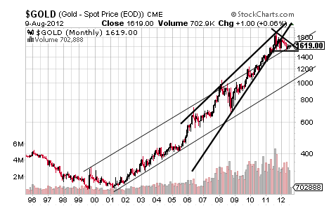
But will this risk-off mean investors will flock to the “safety” of gold? Au contraire mon frère with that yellow metal looking as vulnerable as equities as has been discussed on multiple occasions with last September’s Gold to Fall By 50% being an earlier display of gold’s decade-long Rising Wedge that is an extreme display of the faults of flock-like, or lack of, thinking that was, however, undeniably very profitable for the last ten years.
Specifically, gold’s Rising Wedge shows the ingenuity and out-of-the-box smart thinking of investors back in the early years of the last decade who were concerned by the ultimate effects of the aforementioned consumerism in the form of money printing and monetizing the debt, and thus sought gold as an alternative store of value.
It was this sort of thinking that shaped the beginning of gold’s long-term uptrend and Ascending Trend Channel, but it was the fear introduced in 2008 and 2009 that caused gold to go silly as shown by the converging nature of its Rising Wedge. 
The very buyers who were so smart in the early part of the last decade became less interested in buying more gold and perhaps even anxious about locking in some, not even close to all, of those huge profits with the uncertainty around whether the Fed will print more money causing the stall shown by the massive Descending Triangle that has developed over the last year.
This sideways pattern is typically bearish and this outcome appears to be likely when considering that its downside target matches the levels around the bottom of the Ascending Trend Channel.
Before discussing the specifics around the Descending Triangle’s downside scenario that would be a gift for gold lovers everywhere relative to the objective of the Rising Wedge, let’s look at the less likely upside scenario of the Descending Triangle that would mean the world is awash in additional accommodation and something that will end quite poorly for equity and gold investors alike. This possibility confirms at $1,912 per ounce for a full target of $2,300 per ounce and a level that would create quite an apex for its Rising Wedge that would become a bit wider.
More likely, though, is the Descending Triangle confirming at $1,525 per ounce for a target of $1,138 per ounce and one that is far more forgiving than the target of the currently confirmed and fulfilling Rising Wedge in present form of $681 per ounce.
Interestingly, this congestion is set to break soon as in this year or early next year with confirmation on either side holding the key to whether that massive move will be up or down with a long look at the sectors suggesting it will be down with gold’s last reaction to a real round of risk-off in 2008 having been rocky at best.
- English (UK)
- English (India)
- English (Canada)
- English (Australia)
- English (South Africa)
- English (Philippines)
- English (Nigeria)
- Deutsch
- Español (España)
- Español (México)
- Français
- Italiano
- Nederlands
- Português (Portugal)
- Polski
- Português (Brasil)
- Русский
- Türkçe
- العربية
- Ελληνικά
- Svenska
- Suomi
- עברית
- 日本語
- 한국어
- 简体中文
- 繁體中文
- Bahasa Indonesia
- Bahasa Melayu
- ไทย
- Tiếng Việt
- हिंदी
A Long Look At The Sectors Looks Like Risk-Off
Published 08/13/2012, 12:49 AM
Updated 07/09/2023, 06:31 AM
A Long Look At The Sectors Looks Like Risk-Off
Latest comments
Loading next article…
Install Our App
Risk Disclosure: Trading in financial instruments and/or cryptocurrencies involves high risks including the risk of losing some, or all, of your investment amount, and may not be suitable for all investors. Prices of cryptocurrencies are extremely volatile and may be affected by external factors such as financial, regulatory or political events. Trading on margin increases the financial risks.
Before deciding to trade in financial instrument or cryptocurrencies you should be fully informed of the risks and costs associated with trading the financial markets, carefully consider your investment objectives, level of experience, and risk appetite, and seek professional advice where needed.
Fusion Media would like to remind you that the data contained in this website is not necessarily real-time nor accurate. The data and prices on the website are not necessarily provided by any market or exchange, but may be provided by market makers, and so prices may not be accurate and may differ from the actual price at any given market, meaning prices are indicative and not appropriate for trading purposes. Fusion Media and any provider of the data contained in this website will not accept liability for any loss or damage as a result of your trading, or your reliance on the information contained within this website.
It is prohibited to use, store, reproduce, display, modify, transmit or distribute the data contained in this website without the explicit prior written permission of Fusion Media and/or the data provider. All intellectual property rights are reserved by the providers and/or the exchange providing the data contained in this website.
Fusion Media may be compensated by the advertisers that appear on the website, based on your interaction with the advertisements or advertisers.
© 2007-2024 - Fusion Media Limited. All Rights Reserved.
