With all that's going on in the world right now, the constant news flow, twittering and tariffing, recession obsession, and of course a little extra market volatility here and there, it might seem strange for me to write about what is a somewhat obscure and long-term focused topic.
But if anything, now is probably a great time to actually tune-down the noise levels a bit and briefly press pause on the urgency of the short-term and spend a little time thinking about the medium-longer term outlook across asset classes.
While I will make reference to other asset classes, I'm going to focus on global equities because I think that's where the most interesting opportunities are, and where perhaps some of the biggest misconceptions and opportunity for misunderstanding lies.
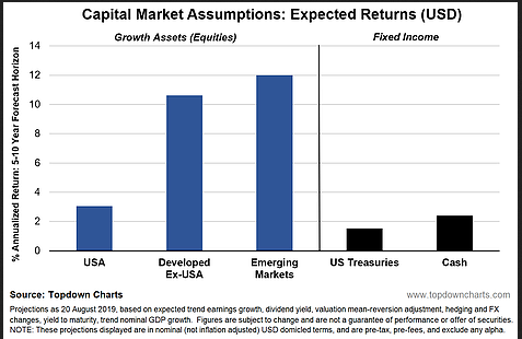
On with the first chart. This one might be familiar for regular readers, it provides an extract of the expected returns for some of the key asset classes (from a U.S.D perspective).
I would say there will most likely be some disagreement with my analysis in terms of the absolute levels, but I think most people who have done any work on this will agree broadly with the relativities (which when it comes to portfolio construction is perhaps the most important issue).
Basically, Treasuries are expected to deliver the worst return over the long term (low yields = low returns). Cash is next worst ... I would expect some will probably proffer that the cash rate forecast should be much lower or even negative, but we need to be careful about mixing the cyclical view with the long-term forecasts.
Cash rates will almost certainly go lower short-term, but I would caution against putting too much weight in the punditry—more often than not they are merely extrapolating current conditions/recent trends out to eternity, and they often shout the loudest when things are at an extreme, so you can get fooled by these suspects into thinking that a cyclical condition is a permanent fixture.
Moving on, perhaps the most important point is that "equities" are expected to outperform 'safe' fixed income over the medium-long term. Another way of saying this is that the equity risk premium [ERP] is positive (and I run a number of measures of the ERP, all are positive, and for the most part have risen materially over the past year as valuations have broadly not moved a great deal and bond yields have collapsed).
Within equities, the U.S. is expected to deliver positive returns over the medium-longer term, but global ex-U.S. (emerging markets and developed excluding U.S.) is expected to substantially outperform U.S. And this is probably where the most misunderstandings, misconceptions, and mix-ups can be found. The other thing is, it is where the largest return spread can be found in that chart, so it makes sense to look at this in further detail.
So first stop is to breakout global equity expected returns into its key components (at least within the framework that I use). The chart below shows the 4 key components of longer term expected returns for U.S. equities, Developed Markets excluding U.S., and Emerging Markets (the same as in the first chart), but also shows ACWI (All Countries World Index - i.e. global), and Frontier Markets.
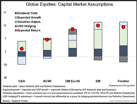
So let's go through the key differences and then look at some of the trends and rationale. First, you can see the U.S. has the lowest dividend yield (let's set aside the issue of the buyback yield for now), but the biggest thing is the U.S. has a large expected negative contribution from valuation, whereas global ex-U.S. is expected to have a positive contribution from valuation changes. Expected growth varies: the U.S. is middle of the pack, developed ex-U.S. is lower, and EM/FM are higher. Expected hedging premium (discount) is positive for developed ex-U.S., and negative for EM/FM.
That's a relatively short paragraph, but there is a lot to unpack. Probably also some controversy!
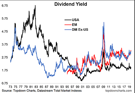
Dividend Yield
As far as I'm concerned, expected returns should always start with dividend yields. Dividends are typically a stable and significant contributor to total returns over the longer term.
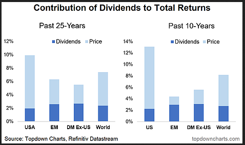
The chart below shows the contribution of price vs dividends to total returns over the past 25 and 10 years for the major chunks of global equities.The U.S. has enjoyed a particularly strong run of price performance over this period, but even then dividends accounted for around 20% of total returns.
For EM and DM, with price returns less impressive over that period, dividends accounted for as much as 50% or more of total returns. As a side note, some of you are probably looking at that chart and immediately agreeing with the longer term return expectations that say EM and DM ex-U.S. will out perform U.S. over the next 10 years—but more on that in the valuations section!
Aside from giving some sense of the expected returns from dividends, the dividend yield also implicitly brings a valuation aspect in, and you can see the more expensive U.S. equities headline dividend yield is much lower compared to EM/DM. The key point though, is the dividend yield is materially higher for EM and DM. In fairness, you can probably partially close that gap by including the effective dividend from historically high corporate buybacks in the U.S.A. But it's not enough to change the overall conclusion.
Valuation Adjustment
Moving on more specifically into valuations, my rule of thumb or one-liner is "valuations have a habit of speaking for themselves over the longer term." That is, cheap assets tend to do better in the long run vs expensive assets. The chart below provides an insight into the valuation trends across the 3 major buckets of global equities that we have been discussing.
The blended PE in this chart is a mix of the trailing PE, forward PE, and PE10 ratios. It is designed to be a compromise between the benefits/drawbacks of each of those metrics and gives each indicator a vote in telling us whether valuations are high/low.
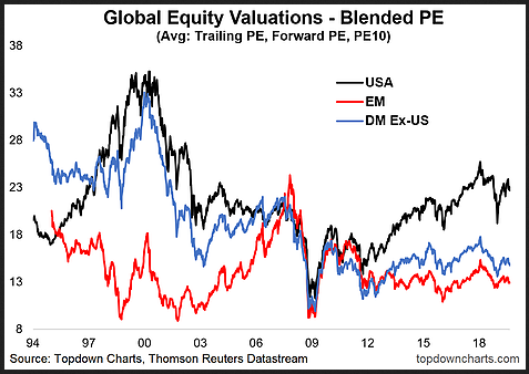
As I alluded to with the total returns chart, this one explains most of the difference in expected returns. Quite simply, U.S. equities are somewhat expensive vs their own history and significantly expensive relative to emerging and developed markets. Meanwhile both emerging and developed market equities are both trading on low valuations relative to their respective historical track record.
If you assume some level of mean reversion and convergence over the forecast period, then there should be a significant valuation headwind for U.S. equities, and substantial valuation tailwind for emerging market and developed (ex-U.S.) equities.
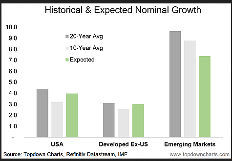
Expected Growth
I think it's probably fair to say that there can be some agreement on valuations—it's relatively clear cut. But I would say there's probably more angst on growth expectations.
Stylistically I think you would be hard pressed to find anyone who would disagree with the basic premise that developed economies ex-U.S. will experience slower trend growth than the U.S.A (the U.S. economy has historically had a strong track record in terms of productivity growth and population growth... whereas developed ex-U.S. [think Europe, Japan] typically have poorer demographics and have been slow to move on substantive reforms to dial up the structural growth outlook).
Again, you would probably find most people will agree that emerging economies will grow faster than both the U.S. and developed ex-U.S., with a variety of reasons like population growth, potential for pro-growth reforms, catch-up potential, infrastructure build-out, etc. Probably the point of contention is how much lower it will be in the coming years vs the last couple of decades. In any case, I have provided a view of my growth assumptions against the historical context both in terms of the last 10-years (probably not a fair comparison for developed economies given the procession of recessions/crises—sometimes referred to as secular stagnation), and a longer term (20-year) view. Again, I think the key point here is about the relativities.
Hedging Premium
In this section I'm going to use UIP (uncovered interest parity) as a mental short-cut to deal with those who say "but I don't/won't hedge"... so we can conveniently interchange "expected hedging premium(discount)" with "expected currency appreciation (depreciation)".
But really the main thing we are dealing with here is interest rate differentials:
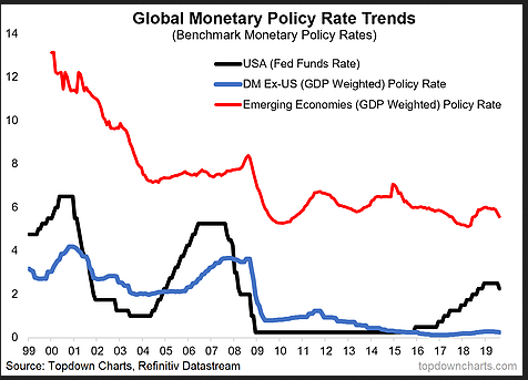
The chart above shows the current picture and historical trend in policy rates across the emerging, developed and U.S. economies. Obviously the expected returns can be re-cut to any other currency domicile with ease, but at least from a USD perspective, we can see how the interest differentials will dictate a hedging premium for developed markets and a hedging discount for emerging markets (because FX forward points are calculated off short-term interest rates).
Some investors may overlook the currency/hedging aspect, but it can be a key contributor or detractor to returns, particularly over the medium-longer term. So don't neglect that aspect.
So overall by now you should have a good appreciation for why my medium-longer term forecasts paint EM and DM in such a positive light relative to U.S. equities (it's an important issue, because U.S. equities still account for close to 50% of global equities). Basically the combination of relative dividend yields, expected growth, expected valuation change, and expected hedging/FX effects is informing this projection.
Finally, in case you just skimmed and jumped to the bottom in hopes I put a summary in:
Over the medium-longer term, equities are expected to outperform fixed income. Within equities, global ex-U.S. are expected to substantially outperform U.S. equities. As detailed, the main reason for this expectation is a combination of higher dividend yields, cheaper valuations, and a positive hedging premium for developed market equities and superior growth for emerging market equities. As the chart of total returns showed, the last decade was great for U.S. equities vs global ex-U.S., and it's entirely possible the next 10 years brings a reversal of that.
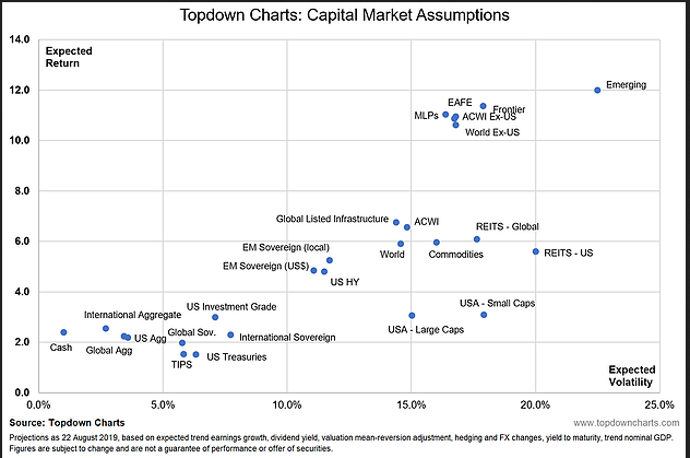
BONUS CHART: the chart below comes from our Monthly Chartbook (part of the institutional research service), and shows the expected returns for an expanded set of asset classes (set against their respective expected volatility). This adds another layer of context for what we discussed in this article and how they fit in the broader landscape.
