- All Instrument Types
- Indices
- Equities
- ETFs
- Funds
- Commodities
- Currencies
- Crypto
- Bonds
- Certificates
Please try another search

MACD
What Is An MACD?
Moving Average Convergence Divergence (MACD), created by Gerald Appel in the late 1970s, is a technical indicator that generates buy and sell signals. Securities traders use it to enter and exit positions.
Values of MACD are displayed on a separate chart from the price of a security, usually in a window above or below the price chart. The MACD x-axis is the same as the price chart, e.g., daily, hourly, etc., but values of MACD on the y-axis are much smaller and oscillate around a value of zero, making it more practical to show the study in a separate window.
How MACD Works?
Although MACD is considered an oscillator, because values rise and fall around zero, the scale is not normalized to a limited range like other oscillators, e.g., RSI and Stochastics. Without upper or lower limits, MACD is not typically used to indicate whether a market is overbought or oversold. Nonetheless, unusually high values of the MACD oscillator create bearish possibilities, while unusually low values create bullish possibilities.
MACD charts typically include three components: the MACD line, the Signal line, and a histogram of the difference between the two. At its simplest: a bullish signal occurs when the MACD line crosses above the Signal line, and a bearish signal occurs when the MACD line crosses below the Signal line.
The value of the MACD line is calculated by subtracting the 26-period exponential moving average (EMA) from the 12-period EMA (although an analyst can use other averages, if desired, to optimize the indicator).
Once that calculation is complete the Signal line and a histogram of the difference of the two can be determined.
The Signal line is simply a moving average of the MACD line, typically a 9-period EMA, which “smoothes” out values of the MACD line, producing a “slower” dataset. (To optimize the Signal line, the 9-period EMA can also be changed.)
The last component of the MACD chart is the histogram, which is determined by subtracting the Signal line from the MACD line.
Thus, the calculations are as follows:
- MACD = 12-period EMA - 26-period EMA
- Signal = 9-period EMA of MACD
- MACD histogram = MACD - Signal
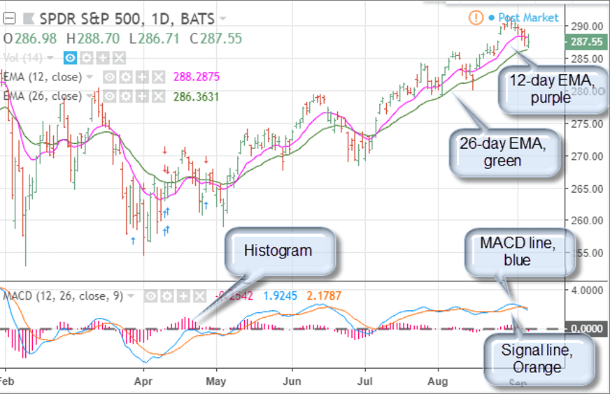
As an example, consider a daily chart of SPY (NYSE:SPY), below:

Upper Chart:
- 12-day EMA = Purple line
- 26-day EMA = Green line
Lower Chart:
- MACD line = Blue line
- Signal line = Orange line
- Histogram = Pink line
- Zero = Gray line
All references refer to the chart above:
A bullish trigger occurs when the MACD line rises above the Signal line (early April); conversely, a bearish signal occurs when the MACD line falls below the Signal line (mid-June). Confirmation of a bullish trigger occurs when MACD is above the Signal and both rise through zero (early May).
Confirmation of a bearish condition occurs when MACD is below the Signal line and both fall through zero (late February). A failure to get through the zero lines is a strong indication that sentiment has reversed (early July).
Divergences are also strong components of the MACD study. A Divergence occurs when a new high or low price is not accompanied by a new high or low on MACD. This often suggests that momentum behind the push to the new price extreme is not strong enough to continue, creating the possibility of a major market turn.
On the chart above, the mid-June and late August peaks could be considered a divergence because prices are much higher in August, but MACD readings are the same or weaker.


