Current Position of the Market
SPX Long-term trend: The long-term trend is up but weakening. Potential final phase of bull market.
SPX Intermediate trend: The uptrend from 1810 continues. It could soon enter a corrective phase.
Analysis of the short-term trend is done on a daily basis with the help of hourly charts. It is an important adjunct to the analysis of daily and weekly charts which discuss longer market trends.
Market Overview
After trading in a narrow range for about three weeks, SPX had a brief correction followed by a move of a few points higher to a new all-time high, and it is now in the process of developing another range-bound trading pattern similar to the one that just ended. The entire formation is creating a topping structure of decelerating prices replete with bearish divergences in the daily indicators and yet, we do not seem quite ready to start a correction. A couple of downside forays were attempted recently, but buyers immediately stepped in to take advantage of only slightly lower prices.
Friday was another of those days, with the index opening down a little over ten points and spending the rest of the day crawling back up to recoup most of its losses. Of course, Friday was options expiration and much of the price action was probably due to that fact. One of the indexes that we have repeatedly mentioned as laggard-in-chief, the Dow Jones Transportation, was one of the best performers. If it follows through over the next few days, it may start leading the market on the upside! I follow some leaders like iShares Russell 2000 (NYSE:IWM) and PowerShares QQQ Trust Series 1 (NASDAQ:QQQ) on Point & Figure charts, and there is hardly any distribution showing. Until that changes, it’s probably too soon for a correction to take hold.
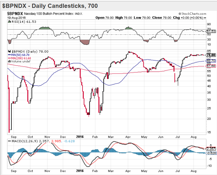
An update of the BPNDX (courtesy of StockCharts.com) gives a good rendition of our current market activity with a flat-line pattern. The market looks as if neither the bulls nor the bears want to take an important position. We’ll need some sort of catalyst to get a trend started – most likely on the downside!
SPX Chart Analysis(This chart and others below, are courtesy of QCharts.com.)
Daily chart
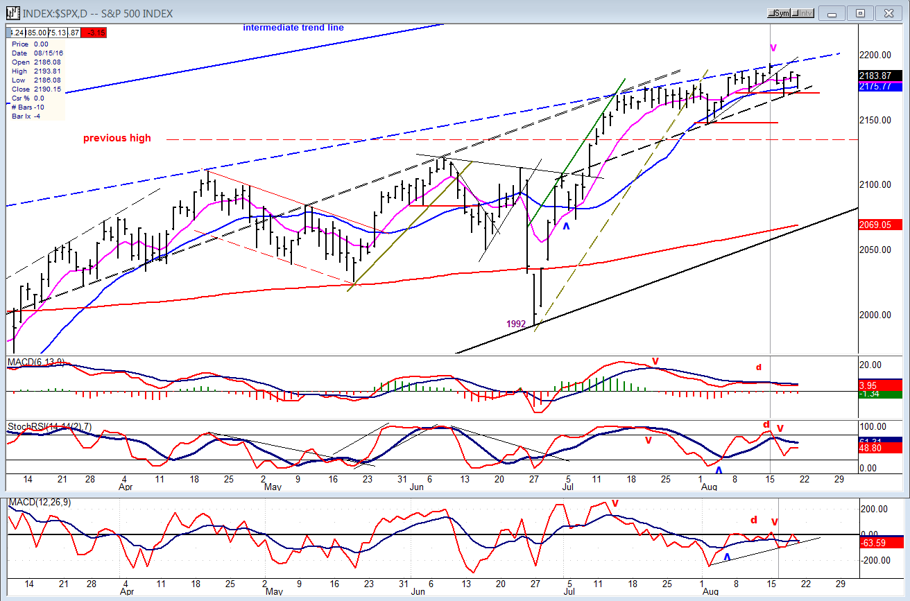
On July 14 (Bastille Day), SPX first made contact with a (dashed) parallel to the intermediate trend line (shown at the top of the chart) anchored to the April 20 peak, and it has not been able to close above it since. This is obviously an important line of resistance which will have to be penetrated conclusively on the upside if the index is to establish a new uptrend. If it can’t, the best the bulls can expect will be another push up against it and if even that does not happen, the bears will have to break through the black dashed line across the recent lows. That lineis a parallel to the trend line drawn from the 1810 low to the 1992 low. The parameters for the beginning of a new uptrend or downtrend are as well defined as you can ever expect to find in this index.
Even if (when) we do start a correction, we will soon encounter all sorts of support: first at the former high of 2135, and then between 2100 and 2120. As mentioned previously, there is a good projection target to the mid-2200s which should be reached or approximated before we can hope to put an end to this (Fed engineered) bull market. (Bill Gross has written extensively on the risks involved in the Fed’s low interest rate policy. You can readily find his recent articles on Google.
The deceleration pattern of the index (which even a visionally challenged person could see) is all the more apparent in the oscillators which are displaying extreme bearish divergence. The market has seldom recovered from such a pattern before first correcting to relieve, even temporarily, the overbought condition. I also mentioned last week that Eric Hadik points to important cycles topping in this time frame. Their effect on the SPX is highly visible as it forms a slow rounding top.
Hourly Chart
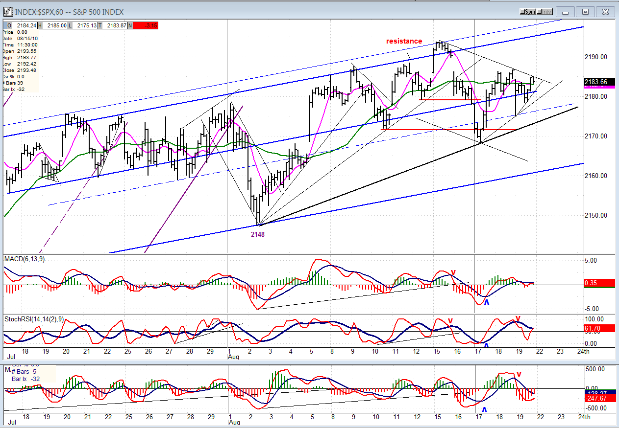
The hourly chart magnifies the blue parallel which has stopped all attempts at moving higher and has generatedthe price channels. There was originally a narrow channel which contained prices on the downside, but it was expanded when the index had a brief correction to 2148. Since then, the top of the channel has stopped the next rally, broken a minor trend line, and created another shallower trend line from the 2148 level. When this new trend line is broken, we could find support one more time at the bottom of the larger channel, and only when SPX comes out of it can we be fairly certain that a correction is finally underway.
The three oscillators dipped with Friday’s early sell-off. But as the market rallied, so did they, stopping just shy of giving a near-term buy signal -- as did the market when it failed to break through the minor downtrend line. If we have a positive opening on Monday, we could make another trip to the top of the blue channel, and this would delay the start of a correction by a few more days.
Some leading & confirming indexes (Weekly)
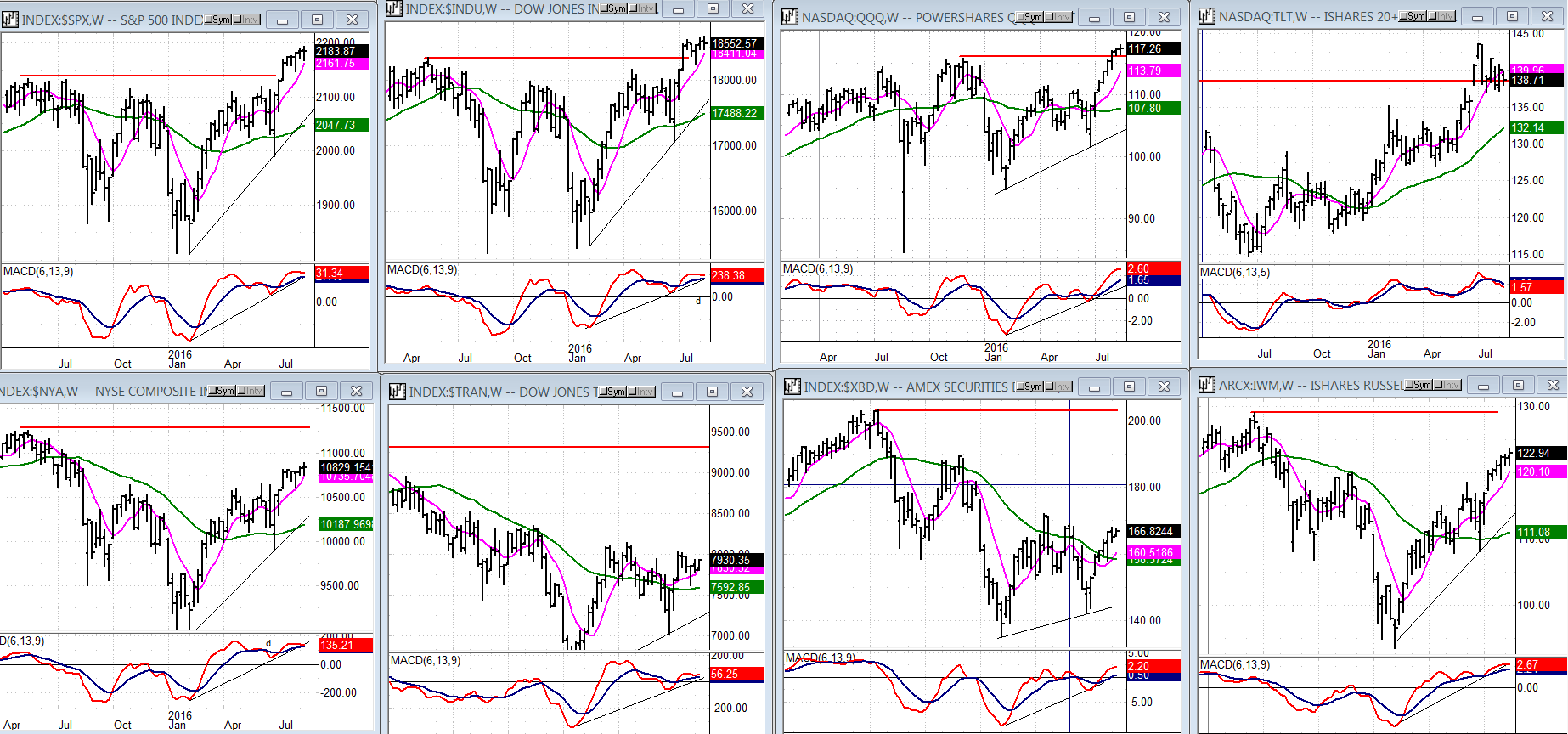
Weekly charts offer a better perspective of the market’s condition. In spite of the disparity of performance between the indices shown here, it is obvious that the bull market is still on track. But the fact that TRAN and ARCA Securities Broker are trailing the majors by such a wide margin, this tells us that, in spite of its apparent strength, this is not a healthy market. Which leads us to conclude that the risk/reward ratio is not favorable to investors. This has become so obvious that it explains the reluctance to push prices even higher.
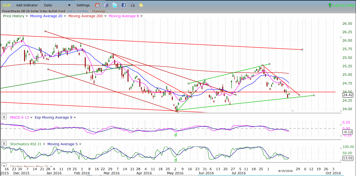
PowerShares DB US Dollar Bullish (NYSE:UUP) (dollar ETF)
UUP is still correcting but appears to have found support on the lower trend line. If it can hold at this level and rally past 25, the recent decline may actually turn out to be a plus. By returning to 24.50, UUP has improved its P&F chart and a move past 25 could lead to 26 and a challenge of the October 2015 high.
GDX (Gold Miners ETF (NYSE:GDX))
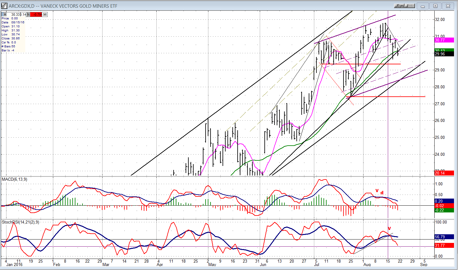
After meeting its base projection target, GDX has found a temporary high and started what could be an important correction. Even a normal retracement of .382 of its uptrend would require a decline of 7.50 points, and a 50% correction,9.50 points. There is probably already enough distribution in place to accommodate the former.
On Friday, GDX closed just below its secondary uptrend line. This may be enough of a breach to bring sellers to the fore and push it lower. Monday should tell us! The pattern being made by the oscillators is obviously bearish.
United States Oil (NYSE:USO) (US Oil Trust)
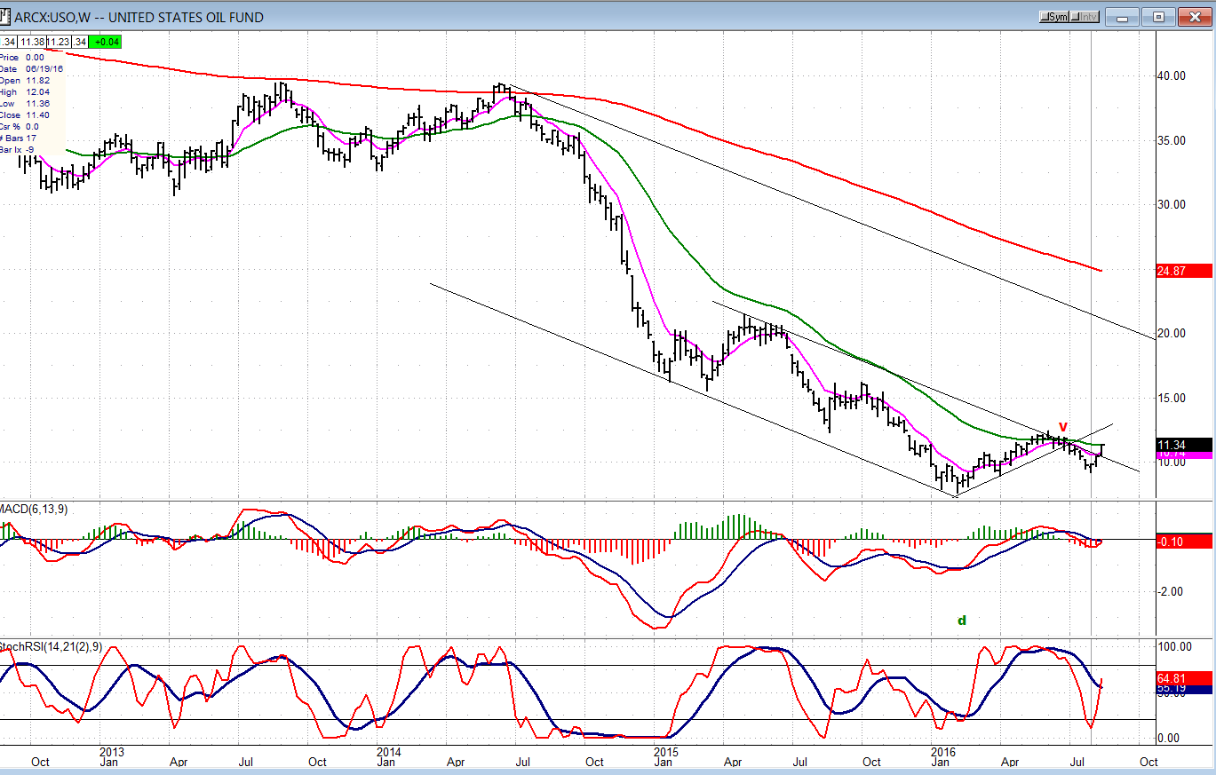
After finding support at the bottom of its minor corrective channel, what started as a bounce for USO (NYSE:USO) has turned into a rally which is now challenging the top of a larger channel. News that there will be another attempt by OPEC to freeze prices is causing another bullish run which could actually bring slightly higher recovery prices, especially if this new effort succeeds.
Whether or not it does, the weekly chart below gives you an idea of the work that the index still has to do before it can get back into a decent uptrend.
Summary
Every week SPX comes a little closer to making a reversal which could start a correction of intermediate nature by retracing a good portion of its rally from 1992. While this may not happen tomorrow, we are in a cyclical time frame which makes it imminent, and this is visibly reinforced by the daily price and indicator patterns.
