After months of consistent predictions by the mainstream media that markets would only march higher, airtime is now dominated by one simple question: "How big will this correction be?"
That is the question that I want to explore in more detail strictly from a technical viewpoint.
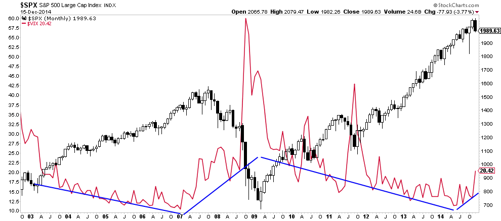
Since the end of the Federal Reserve's last round of "QE," market volatility has increased. Most importantly, market volatility appears to be in the early phases of challenging the downtrend that began in 2008. This is critically important as the change in the trend of volatility tends to occur with changes in the trend of the overall market. As shown in the monthly chart of the S&P 500 and VIX below, this change in trend occurred previously in 2007 as the market began its final acceleration to its peak late that year.
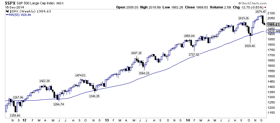
It can take quite some time before we now for sure that a change in the general trend of the markets have occurred. Therefore, as investors, we need to have some understanding about the general dynamics of market movements within the current trend of the market. The series of charts below is a layered build using a weekly data chart of the S&P 500 index to smooth out the noise of daily data.
In the mainstream media, it is considered near heresy to discuss market corrections. Furthermore, if you do, and it does not happen coincident with the utterance of the word "correction," you are simply wrong. However, in the "real world" where investors have capital at risk, corrections happen on a very regular basis. Moving averages, over time, act like gravity. When market prices deviate too far in one direction from their long-term moving average, the gravitational pull eventually pulls prices back from orbit. Over the past couple of years, the 50-week moving average has acted as a consistent support for the markets keeping prices contained within a consistent bullish trend.
The portfolio model I publish each week in the free e-letter utilizes a trend following model to keep portfolios allocated during rising bullish trends with regular rebalancing instructions when prices deviate too far from the underlying moving average.
Currently, the 50-week moving average is sitting at 1928.44 which suggests that the markets still have some more work to do on the downside. However, during 2013 and 2014 those corrections did not decline fully due to Federal Reserve or ECB commentary the ignited the markets with hopes of continued liquidity interventions. The correction this past October was stopped "dead in its tracks" by Federal Reserve President Bullard's comments that the Fed should consider not ending QE.
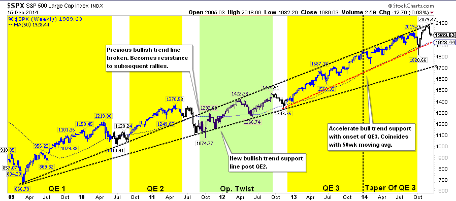
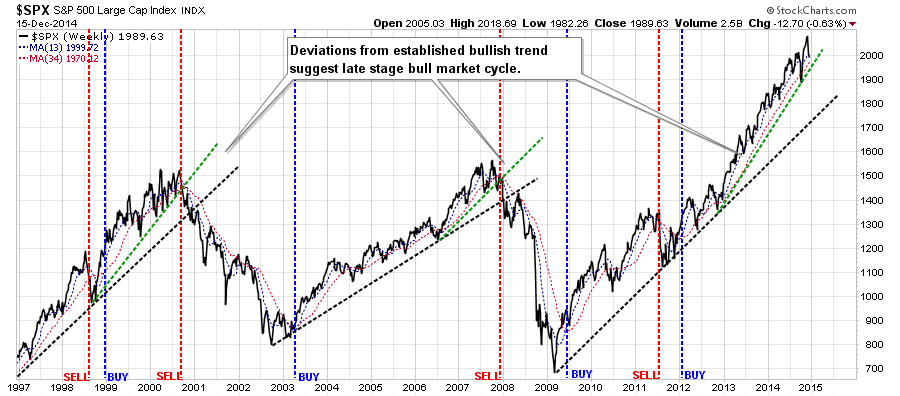
While the shift to "Verbal Easing" by the Federal Reserve has supported the markets since the end of QE-3, as shown in the next chart, the market has remained confined to a bullish trend channel. Following the 2008 crash, the markets began a bullish trend supported by the initial rounds of QE. That bullish trend was broken in 2011 as QE-2 ended which collided with a Japanese manufacturing shutdown and debt-ceiling debate. The Federal Reserve quickly intervened that September with "Operation Twist" to which there was a more muted effect in the markets.
As the end of 2012 approached, Ben Bernanke, then Chairman of the Federal Reserve, became concerned about the potential economic and financial impact of the impending "Fiscal Cliff." December of 2012 witnessed the launch of a massive third QE campaign lifting the markets into an accelerated bullish trend higher (dashed red line below). Importantly, that new bullish trend has not yet penetrated the original bull trend support line which has now become formidable resistance.
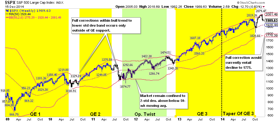
A retracement back to the current elevated bullish trend support line would require a decline to 1928.44 or 7.3% from the recent peak. Such a decline is the highest probability event currently for investors. That analysis is confirmed by the recent push to 2-standard deviations above the long-term moving average. IF the markets break below the long-term moving average, a full correction, as seen in 2010 and 2011, would entail a decline to 1776 or 14.6% from recent highs.
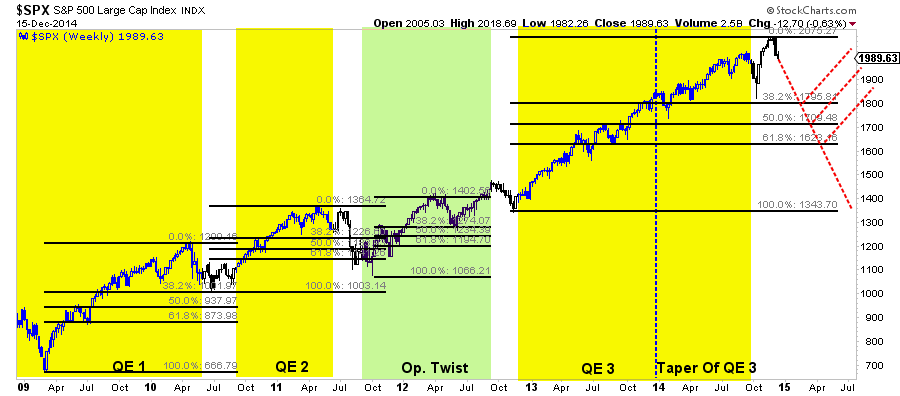
A study of Fibonacci retracements over the past six years confirms much of the same. Fibonacci Retracements are ratios used to identify potential reversal levels. These ratios are found in the Fibonacci sequence of 61.8%, 50%, and 38.2%. As shown, the retracement following the rally during QE-1 was contained at 38.2% while 2011 was more severe but remained supported at 68.2%. As stated, the financial markets had a much more muted effect to "Operation Twist" along 38.2% retracement in 2012.
As shown, these levels have been important turning points from previous declines. By applying Fibonacci retracement levels to the advance that began in 2013 we can identify three potential corrective levels at 38.2% = 1795, 50% = 1709 and 61.8% at 1623. Should the current decline, post stimulative programs, remain consistent with recent history this suggests declines of 13.7%, 17.8% and 21.9% respectively. This is far larger than any mainstream analysts currently expects.
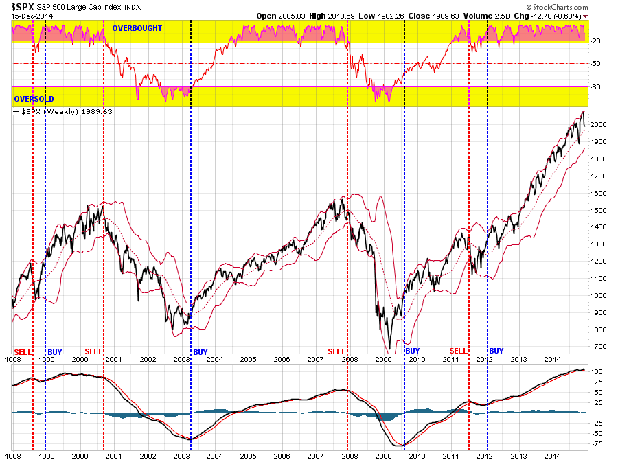
The next two charts are the "buy" and "sell" signals used in my portfolio management process. Many readers tend to extrapolate these signals into meaning that my portfolios are either "all in" or "all out" of the markets. That is not the case. "Market timing," even with an extremely reliable set of indicators, is very difficult to consistently implement due to "emotional biases."
However, as shown in the chart below, using a set of indicators to identify potential "changes in trend" can be utilized to effectively increase or decrease exposure to risk in portfolios relative to the overall market. (For more on this strategy read this)
Currently, the bullish trend remains intact and the current correction has not indicated anything more severe than just a normalized pullback. However, as noted by the lower indicator, we are currently as close to a "sell signal" as we have been since the summer of 2012. This is something worth paying very close attention to as it will flash an "exit" sign long before the bullish proletariat has recognized the change in market dynamics.
Lastly, despite the ongoing commentary that we are in a new "secular bull market," despite the lack of the catalysts necessary for one, the current market advance is more extended than the last two liquidity driven excesses. Both the duration and elevation suggests that the current cyclical bull market advance is very "long in the tooth." While Bob Farrell once quipped "bull markets are more fun than bear markets," while true it is important to remember that both eventually do end.
As discussed, the current correction has a lot of support clustered at the 50-week moving average which suggests that investors remain primarily allocated to equities for the time being. However, there is a rising level of risk that will eventually lead to a large destruction of investor capital for those not paying attention.
While the mainstream media remain eternal optimists, because that is what attracts views and sells advertising, it is imperative to remember that markets do operate in full cycles. What goes up will eventually come down, and there is truth to the saying that "the higher they rise, the further they fall."

