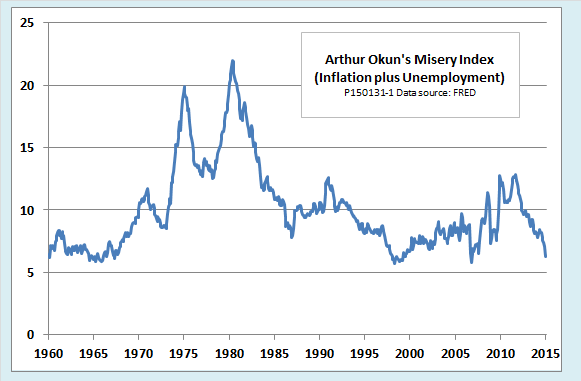
Remember the 1960s? The 1970s? Back then, inflation surged from one peak to another but failed to deliver the low unemployment rates promised by the Phillips curve. In fit of frustration, economist Arthur Okun invented what he called the misery index—the sum of the inflation and unemployment rates. As the following chart shows, those were miserable years indeed:
Today we don’t hear much about the misery index. True, the index hit a 20-year peak in the depths of the Great Recession, but people hardly noticed. Now it is back to a relatively comfortable level and still headed down. In an era of chronically low inflation, Okun’s index just isn’t miserable enough to make the headlines. Couldn’t we add something to spice it up a little?
Spicing Up the Misery Index
Economists Robert Barro and more recently, Steve Hanke, have tried to do just that. Both have added measures of real output growth and an interest rate to the misery index in an attempt to capture macroeconomic factors other than inflation and unemployment that make people unhappy.
Adding a growth-related variable makes intuitive sense to me. It is easy to believe that people will be less happy in an economy that is stuck in high-unemployment stagnation than in one that has the same unemployment rate, but is briskly recovering from a brief cyclical downturn. Barro, Hanke, and others have tried different formulations of the growth variable—the rate of increase of real GDP, the change in the growth rate, the difference between current growth and trend growth, the output gap, and so on. As far as I can see, the simple growth rate works as well as anything else. In all cases, the growth variable enters the misery index with a negative sign, since more growth means less misery.
Both Barro and Hanke also include a long-term nominal interest rate in their indexes. I agree that high interest rates can be a source of misery—home mortgage rates are one obvious example. The problem that I see is that including a nominal interest rate and inflation in the same index means double counting for inflation.
The source of the double counting becomes clear when we consider the Fisher effect, according to which the nominal interest rate is equal to the real interest rate plus an inflation premium. For example, if both borrowers and lenders were satisfied with a 3 percent interest rate in a zero inflation economy, they would be equally happy with an 8 percent nominal rate if both parties expected 5 percent inflation throughout the term of the loan. (See here or here for a fuller discussion of the Fisher effect.) Taking the Fisher effect into account, we can see that the Barro-Hanke version of the misery index is equal to inflation + unemployment – growth + the real interest rate + inflation (again).
A nice piece of empirical research by Heinz Welsch of the University of Oldenberg substantiates the redundancy of the inflation rate in the Barro-Hanke misery index. Oldenberg examines the relationship between a measure of life satisfaction (that is, misery with the sign reversed) and macroeconomic conditions for various European countries and for several versions of a misery index.
Starting with the traditional Okun misery index, Welsch finds a significant negative relationship between life satisfaction and both inflation and unemployment. He next considers a three-variable index that includes inflation, unemployment and growth. The growth variable has a positive influence on life satisfaction. Both inflation and unemployment remain negative and statistically significant.
The crunch comes when Welsch adds a long-term nominal interest rate to the mix. Whether or not growth is included, adding the nominal interest rate causes the inflation variable to lose its statistical significance and reverses its sign to a counterintuitive, although small, positive value. The nominal interest rate itself, however, has a clear negative effect on life satisfaction. In fact, its influence is stronger and more statistically significant than that of inflation alone, whether growth is included or not. The reason, I think, is that the real interest rate component of the nominal rate may have an independent effect on life satisfaction above and beyond the inflation premium that is also included in the nominal rate.
It seems to me, then, that what we ideally want is a four-factor misery index that includes unemployment, inflation, growth, and a real interest rate. Statistically, that would be identical to a three-factor misery rate consisting of unemployment, growth, and a nominal interest rate with the explicit inflation variable left out. For lack of a better name, I will call that a UGR index, using U for unemployment, G for growth, and R for the nominal interest rate.
Unfortunately, Welsch does not include a UGR index in his regression results. I hope that someone with access to good econometric software and an army of eager grad students will do so. It would be helpful to include life satisfaction and macroeconomic data for countries outside Europe as well as those examined by Welsch. Meanwhile, since this is only a blog post, not a scholarly paper, we will have to be satisfied with some chart-o-nomics.
Three Views of Misery in the United States
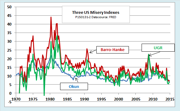
The next chart compares three misery indexes, the traditional Okun index, the Barro-Hanke index, and the one I like best, a UGR-type misery index that consists of the unemployment rate minus the growth rate plus the nominal interest rate. (I use the 30-year conventional mortgage rate, but I think a bond rate would work just as well.)
Although the Barro-Hanke and three-factor UGR indexes reach higher maximum values and are more volatile than the traditional Okun index, the general picture is much the same. All three indexes show that US macroeconomic policy was pretty miserable in the 1970s and has improved greatly since then. The global economic crisis of 2008 saw a spike in misery, but one that was, at least by the Barro-Hanke index, not as bad as the 1990-91 recession. Since the crisis, misery has receded to a level that is surprisingly moderate by standards of the past forty-five years.
Misery by Presidential Administrations
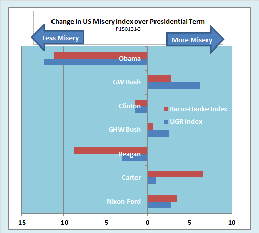
Both Barro and Hanke look at misery by presidential administration. Their performance metric is the amount by which the misery index changes from the quarter in which a president is inaugurated to that in which he or she leaves office. Here is my version of the chart, incorporating data both for a Barro-Hanke type index and a three-factor UGR index.
It turns out that the choice of index makes some dramatic differences in the evaluation of presidential performance. The Barro-Hanke index shows strikingly good performance for the Reagan administration and a pretty miserable performance for poor Jimmy Carter. However, on closer examination, we see that these results are entirely due to the double counting of inflation in the Barro-Hanke index. Inflation rose from 5 percent per year to 10.6 percent per year during the Carter administration and fell back by about the same amount, to 4.9 percent, under Reagan. If you double those figures, you make the swing in misery look much more dramatic. In fact, if all you want to do is score political points, why not count inflation three times over, or four? On the other hand, if you count inflation only once, as in the UGR index, neither the Reagan nor the Carter presidencies look so exceptional.
The performance of the George W. Bush administration also looks quite different depending on how you score it. Inflation was a modest 3 percent in Q1 2001, when W was inaugurated. By the time he left office in Q1 2009, the economy was in free fall with inflation at -0.4 percent. If you count that disinflation as a reduction in misery—not only count it, but double count it à la Barro-Hanke—the slowdown in the CPI helps to offset the fact that growth slowed and unemployment increased from 2001 to 2009. If you use a UGR index, the Bush 43 era doesn’t look so good.
Barak Obama’s term in office has two years yet to run, so it is not quite fair to include it in the chart. Things could very well go to hell in a handbasket before he has a chance to make the hand-off to Hillary or Ted Cruz or whomever it may be. Still, the Obama administration’s performance to date is not too shabby by recent standards, no matter which index you use.
Misery around the world
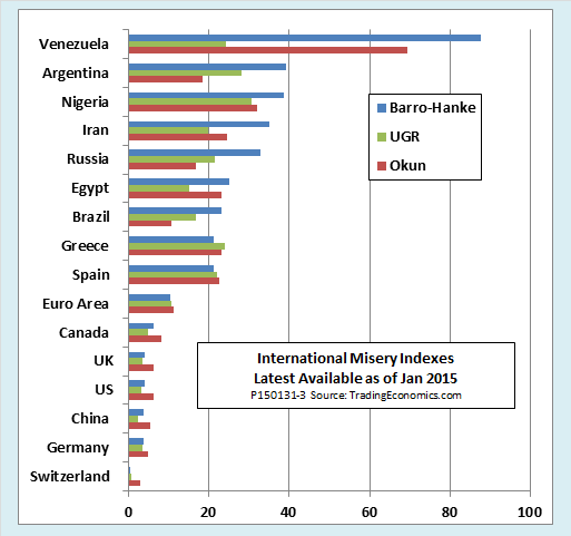
Finally, Hanke uses his misery index to make some international comparisons. The next chart shows my attempt to do the same, using the same three kinds on indexes as for the United States. Venezuela wins the misery sweepstakes, with Argentina, Nigeria, and Iran not far behind and Russia rising fast. Switzerland, Germany, and China clock in among the least miserable, due to low inflation and unemployment in the first two and high growth in the last.
For international comparisons like this, my preference among the indexes is different than for the US and Europe. The reason, once again, has to do with interest rates and Fisher’s law. For the free market economies of the OECD, with their liberal financial markets, the idea that nominal interest rates vary with the rate of inflation while real interest rates mostly remain low and positive works pretty well, at least as a rule of thumb. For nonmarket economies like Venezuela, Russia, and China, it does not.
The fact is that long-term nominal interest rates don’t mean much in those economies. You can’t float 30-year corporate bonds in rubles or take out a 30-year fixed-rate mortgage from your friendly local Caracas bank. For that reason, in contrast to the US charts, I have used short-term official policy rates for the international indexes. Even then, there are obvious problems. For example, official data show a minus 44 percent real rate of interest for Venezuela, although I doubt that anyone but a dear friend of the President could actually borrow money at the stated nominal rate of +19 percent when inflation is officially running at 65 percent (and in reality, probably much higher).
In my view, at least at the high end, the Barro-Hanke index gives a more plausible international ranking of misery than a UGR-type index that drops inflation and then depends on the nominal interest rate variable to pick it up again. For that reason, I have sorted the international chart according to the Barro-Hanke index. Still, it is worth noting that the three different indexes don’t rank the relative misery of nations all that much differently. Countries that have slow growth, high inflation, and high joblessness are nasty places to live however you measure it. Compared to Venezuela, Russia, or Nigeria, give me Switzerland, the United States, or even the slow-growing Eurozone any day.


