
As the bond-stock relationship continues to evolve, we saw a big drop in bond prices while U.S. stocks also took their punches. The S&P 500 (SPX) finished the week down 1.10%, Small Caps dropped 0.87%, and Commodities (PowerShares DB Commodity Index (ARCA:DBC)) continued their slide with a -3.5% move last week.
In last week’s Technical Market Outlook I showed a chart of the ratio been the US Dollarand Emerging Market Currency Bonds and how this ratio has often led the Treasury market. The ratio between the Dollar and these Currency Bonds had created a divergence, which I noted may lead to the U.S. 10-Year Treasury Yield also rising. In fact, last week we saw the Treasury yield advance by 6.22%, the largest one week increase since September ’13. The Relative Strength Index inched into ‘overbought’ territory on Friday for TNX, so I’m curious if bond bears are able to keep the party going or if we see some consolidation or decline in yield this week.
Trend
While we saw a 1% drop in stocks last week, the trend is still positive for the S&P 500. Price is now under its 20-day Moving Average but we are still firmly above the 100-day MA and the rising trend line.

Relative Rotation Graph
I’ve shown the Relative Rotation Graph a couple of times on the blog, and every couple of weeks I’ll do an update to see how the sectors are moving. As a reminder this tool shows the momentum of the trend of relative strength and is plotted on the Y-axis and the trend of relative strength is then plotted on the X-axis. The sectors typically move in a clockwise fashion as their relative performance vs. the S&P 500 rises and falls and the momentum of that performance also rises and falls. Click the hyperlink above to read more.
Health Care (SPDR - Health Care (ARCA:XLV)) and Technology (SPDR Select Sector - Technology (NYSE:XLK)) continue to advance in the ‘Leading’ category. While Financials (Financial Select Sector SPDR Fund (ARCA:XLF)) have not been a stellar performer this year, it’s been making good improvement over the last several weeks. I’ll be discussing this sector later in the post. Energy (SPDR Energy Select Sector Fund (ARCA:XLE)) which had been the best performing sector for a couple of weeks this year, has been moving fast as it left the ‘leading’ category and has fallen hard in the ‘weakening’ category.

Breadth
Last week I discussed the divergences that were taking place in both breadth and momentum and how they could cause some headwinds for stock prices but were not extreme divergences and thus were unlikely to be signaling major bearishness. The decline in the Advance-Decline Line has continued. What concerns me is the short-term trend line that had acted as support appears to now be resistance.

Momentum
Like breadth, momentum continues to weaken as prices fell last week. The Relative Strength Index (RSI) remains above support that was created on previous declines and currently is testing its midpoint which may act as support – we’ll see.

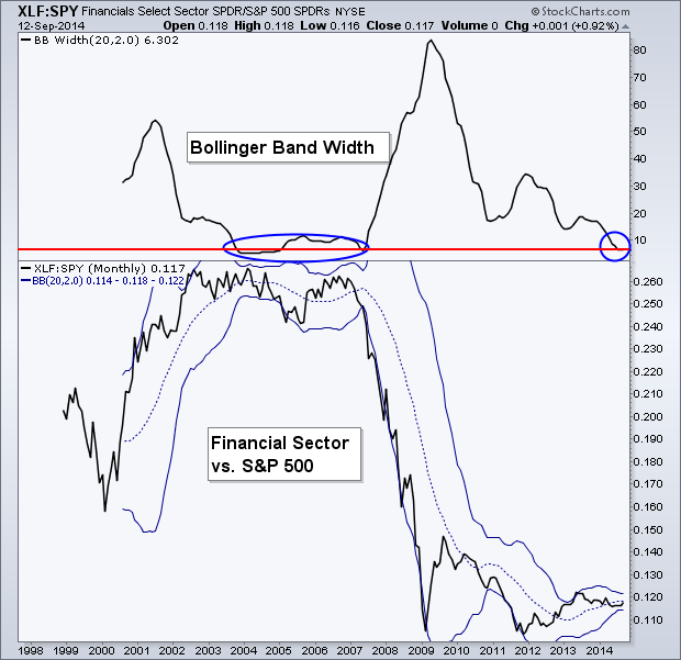
Financial Sector
I tweeted out on Friday the chart below, but I wanted to also show it here today. The following chart is the relative performance line between the Financials Sector (Financial Select Sector SPDR Fund (ARCA:XLF)) and the S&P 500 (SPDR S&P 500 (ARCA:SPY)) on a monthly basis going back to 1999. The top panel shows the width of the Bollinger Bands® around the ratio of these two ETFs. Typically when the bands contract a large move follows. Think of a coil as it contracts. We are now seeing the Bollinger Bands for this ratio contracting to the tightest range since 2007 and 2004. This led to a massive under-performance of Financials and of course the eventual Financial Crisis in 2008.
So does this chart signal a coming crisis? Of course not. What it does tell us is that a possible large move may be coming as the Bands tighten. However, we can not use the width of the Bollinger Bands to estimate the direction of the move.
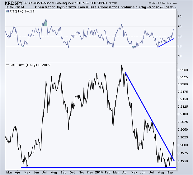
Regional Banks
In the Relative Rotation Graph we saw that XLF has been improving and in the above chart we can see the Bollinger Bands for the ratio between XLF and SPY has narrowed considerably. Now lets take things a step further and look specifically at Regional Banks (KRE).
Again, we are looking at the relative performance against the S&P 500 with the ratio of KRE and SPY. At the end of August we saw this line test its previous low in May ’13. We also began to see a positive divergence in the Relative Strength Index (RSI) indicator, which is shown in the top panel of the chart below. This told us that we may see a change in trend as Regional Banks improve in relative performance. Price eventually confirmed the bullish divergence in momentum and has now broken its falling trend line as KRE outpaces SPY.
60-Minute S&P 500
Last week I highlighted the negative divergences that were being created in the RSI and MACD momentum indicators and that I was watching to see if 1990 could hold up as support for the S&P 500 on the 60-minute chart.
We ended up closing out the week under 1990 as price created a falling channel. While the 1% drop in the S&P last week is far from terrifying, we have yet to see momentum break into ‘oversold’ territory as it has during previous dips, so it’s possible traders may not be doing selling.
Some may see the lack of lower lows in the RSI indicator as a possible bullish divergence, and they would be correct, however divergences that take place between 70 and 30 are typically less reliable in my opinion but I suppose it’s still good to note.

Last Week’s Sector Performance
Last week the Technology sector and Financials showed to be the best performers. While Energy and Utilities were the worst performing sectors. It’s interesting to see the two sectors that had been the strongest during the start of the year now being sold off. This is a great example of traders rotation out of strength and into the under-performing spaces like Financials.

Year-to-Date Sector Performance
Health Care remains the best performer for 2014 and Tech has now moved into the number two spot for the year, edging out Utilities. With these three sectors showing 5-8% out-performance of the S&P for this year, they have also moved well ahead of the other six sectors.

Disclaimer: Do not construe anything written in this post or this blog in its entirety as a recommendation, research, or an offer to buy or sell any securities. Everything in this post is meant for educational and entertainment purposes only. I or my affiliates may hold positions in securities mentioned in the blog. Please see my Disclosure page for full disclaimer.