Summary: The move into the perceived safe havens of Treasuries and gold in 2016 appears to have reached a point of short-term exhaustion. That trend might resume, but odds suggest a pause is ahead. If optimism reached a peak in safe havens, pessimism likely reached a trough for equities. None of this will matter if oil and equities continue to be highly correlated and oil is unable to stop falling. A strong 2-day rally still left oil lower than it was on Tuesday. Unlike last week, equities now have a bottom to trade against.
The SPDR S&P 500 Fund (N:SPY) had dropped nearly 4% during the week by mid-day on Thursday; it then staged a 3% rip into Friday's close. For the week, SPY ended lower by 0.8%. The Nasdaq 100 (NDX) lost just 0.1%. The big winners were gold and Treasuries, gaining 5% and 2%, respectively.
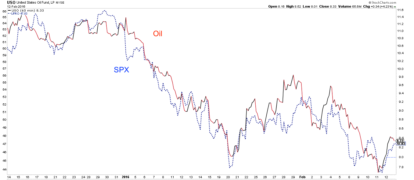
As in recent weeks, equity activity was driven by volatility in oil (illustrated in chart below, S&P 500 vs United States Oil Fund (N:USO)). At its low on Thursday, oil had lost more than 14% on the week. The subsequent rally in stocks was accompanied by a 10% gain in oil. It's repetitive, but the correlation between oil and equities continues to be very tight, and represents a significant wild card for the days and weeks ahead. Simply put, any bet on a further gain (or loss) in equities seems to be largely a bet on the direction of oil.
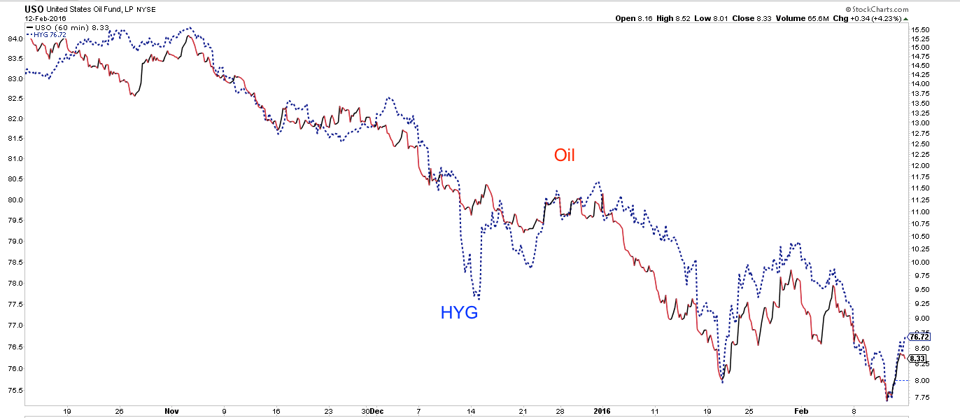
Lower oil prices are also driving high-yield spreads higher, as a small portion (about 15%) of high yield is exposed to the sector (below, USO vs iShares iBoxx $ High Yield Corporate Bond Fund (N:HYG)).
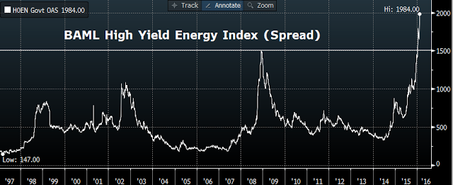
In turn, the drive upwards in high-yield spreads is fueling concern that the US and the global economy are tumbling into a recession. After all, prior spikes in 2002 and 2008 coincided with recessions.
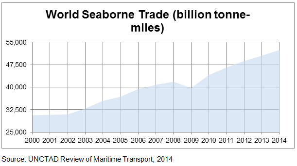
Likewise, the continued collapse in the Baltic Dry Index (BDI, which tracks shipping rates) has been linked to worsening global trade.
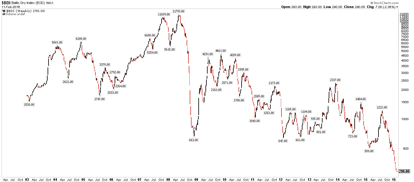
But neither of these indicators are supported by other facts. Start with BDI, which has fallen primarily due to the 30% overcapacity in the shipping industry. Cargo volumes have been growing, adding 2.3% in 2015. BDI is a terrible economic measure, confusing price with volume and excess supply with growing demand.
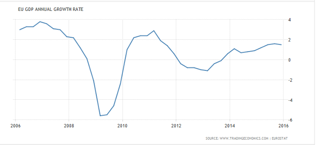
Eurozone growth may not be strong, but it is positive. 2015 GDP for the region grew 1.5%, which is nearly equal to its average over the past 20 years (1.6%). To be sure, growth is sluggish, but it is not recessionary.
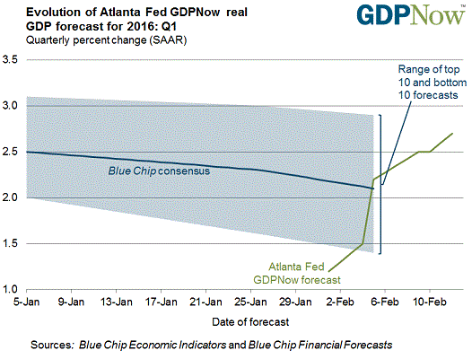
Likewise, US economic growth remains firmly non-recessionary. 1Q16 is tracking 2.7% growth. This is ahead of the consensus and would represent an improvement over 4Q's 1.8% growth (data from the Atlanta Fed).
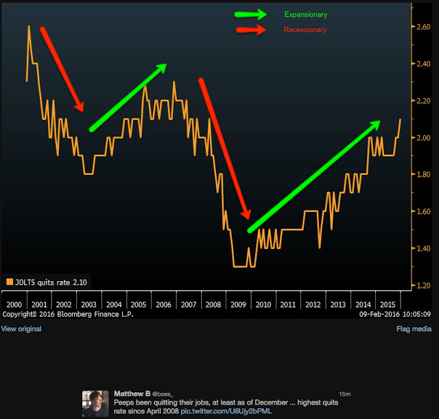
US growth is being driven by rising employment and wages. The jobs market is sufficiently robust that workers are voluntarily quitting their old jobs for better ones at the highest rate in 8 years. In a recession, that trend would be down (red arrows), not up (data from Bloomberg).
Retail sales in January expanded by 3.4% yoy. It's at a new all-time high. Excluding the effects of lower gasoline prices, retail sales is 4.3% higher than a year ago. This is decent growth, as you'd expect when more people are working and earning higher wages.
It's also key to driving growth higher in the months ahead. Higher consumption fuels private investment which in turns leads to better employment and wages and thus better consumption. This is the positive reinforcing cycle the US economy appears to be in at present.
Which brings us back to equities, Treasuries and gold.
Money has been flowing out of equity funds (including ETFs) 10 of the past 11 weeks, a period which roughly corresponds to the equity high point in December. That money has been moving primarily into the safety of Treasuries, with positive flows 9 weeks in a row. Remarkably, the total return from SPY and iShares 20+ Year Treasury Bond ETF (N:TLT) is now equivalent over the past 6 years (to January 2010).
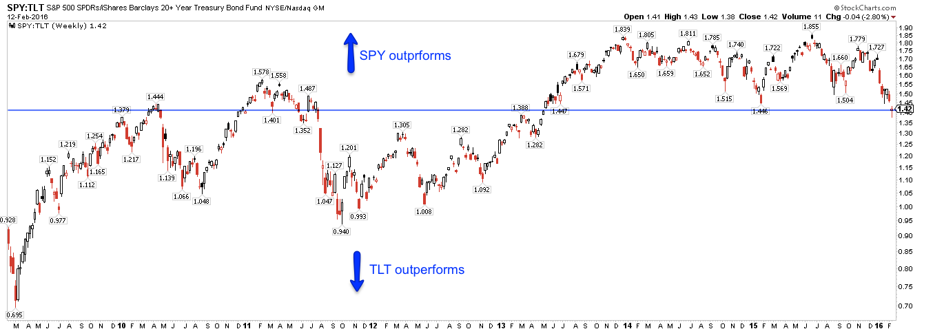
For context, this is the first time since the week of March 10, 2009 that equity outflows have been negative 10 out of 11 weeks.
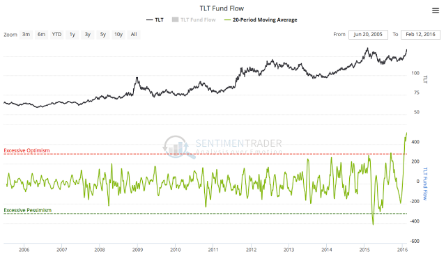
The drive higher in Treasury prices (lowering yields) in 2016 has been remarkable. We've commented on the exceptional fund flows in prior posts (here and lower panel below; data from Lipper and Sentimentrader).
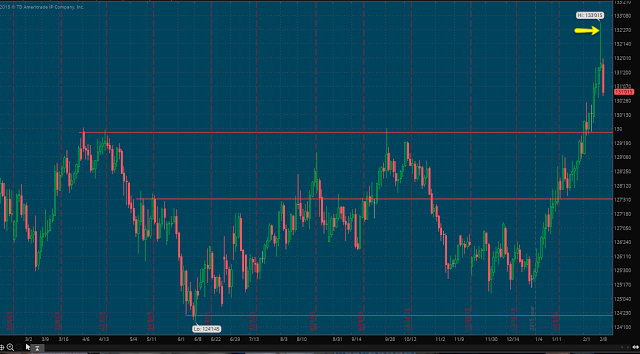
The reversal in oil and equities this past Thursday is clearly reflected in 10-year futures: a high wick candle (arrow) followed by Friday's fall that eclipsed the prior 3 days' gains. After a near parabolic rise, that trend looks to be ending, at least short-term.
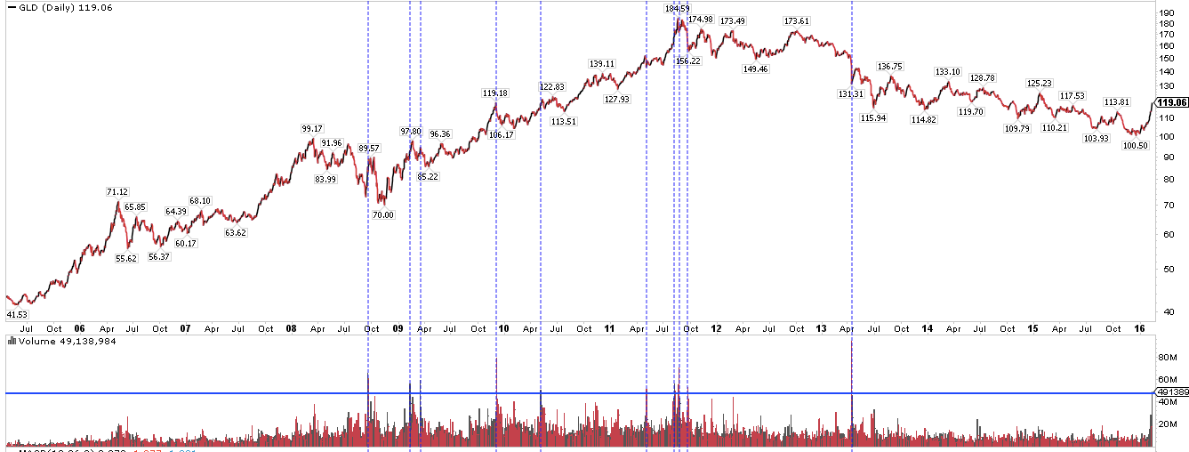
Similarly, gold funds (via SPDR Gold Shares (N:GLD)) have recently seen their second largest fund inflows in the past 6 years. By last Thursday, gold futures had gained 20% YTD. Volume on Thursday was 700% of normal and the highest in 3 years. Spikes in volume (lower panel and vertical lines) have frequently coincided with at least a short-term change in trend for gold, both up and down.
Optimism in gold is now the highest since the equity bottom in early 2009 (lower panel). Excessive optimism has also most often coincided with at least a short-term change in trend (one exception shown with orange line; data from NDR).
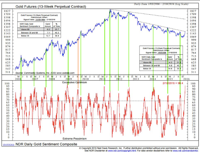
In other words, the move into the perceived safe havens of both Treasuries and gold in 2016 appears to have reached a point of exhaustion. That trend might resume, but odds suggest a pause is ahead. If so, this favors equities.
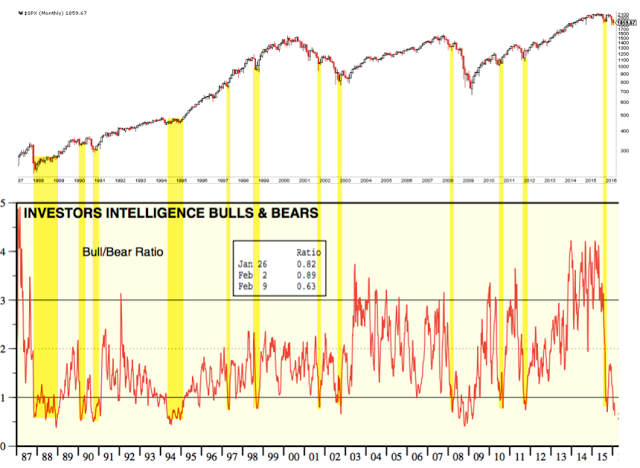
If optimism reached a peak in safe havens this past week, pessimism likely reached a trough for equities. The oldest gauge of investor sentiment, the Investors Intelligence bull/bear ratio, dropped to a 7-year low this week. By this measure, equity investors haven't been this worried since the depths of the 2008 meltdown. Prior lows have corresponded with the ends of bear markets (1987, 2003, 2009) and the ends of recessions (1990).
It's also fair to say that lows like this have come in the middle of bear markets (e.g., March, July and October 2008). But in each of those cases, SPY rallied 12%, 9% and 20%, respectively. The rally from a similar low in sentiment last October was 12% (data from Yardeni).
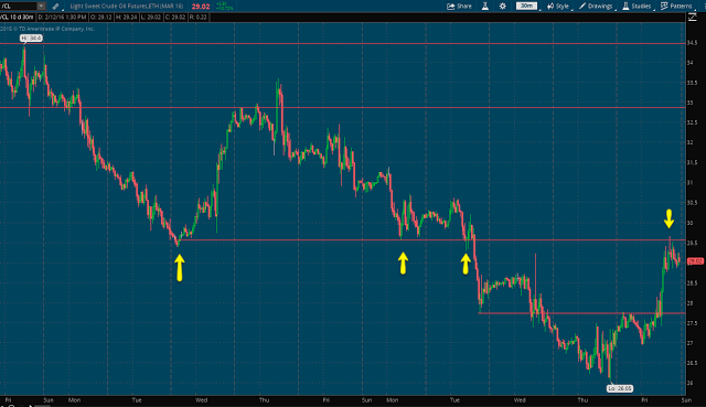
The wild card, for now at least, is oil. None of the above will matter if oil and equities continue to be highly correlated and oil is unable to stop falling. The strong 2-day rally at the end of last week still left oil lower than it was on Tuesday.
On a short time scale, there is a nice bottoming pattern in oil. Friday's close was right at the first level of resistance, formed by last week's low and trading early this week. Holding above $27 is the near term challenge; Above $29.5 and the next upside is near $33.
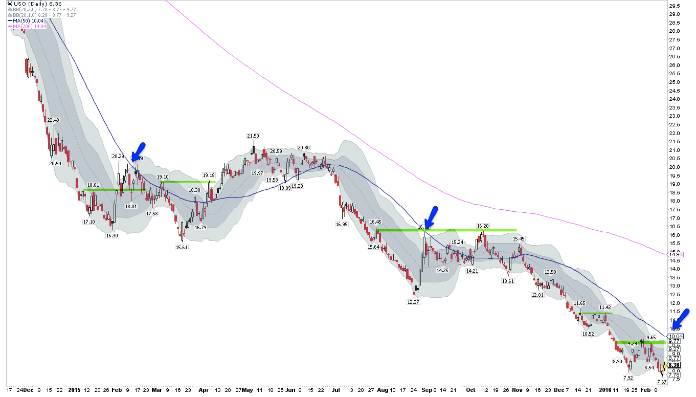
Longer term, oil is still 15% below its 50-dma (blue line) that has marked the first strong resistance on good rallies (arrows). Getting above the prior pivot high (green line), also 15% higher, would mark a potential change in trend. In the most optimistic scenario: there will likely be a basing period, during which a trading range develops and the 50-dma flattens, before a sustained rise in oil takes place. If this is the low in oil, it's still early in the process. More on how oil bottoms here.
The longer term trend for SPY remains bearish. SPY made a lower high in November relative to last summer and the 20-wma (blue line) is trending down; in comparison, note how the 20-wma mostly held lows during the uptrend in 2012-15. Momentum (top panel) is oversold; strong markets stay overbought but the index hasn't been overbought since early November.
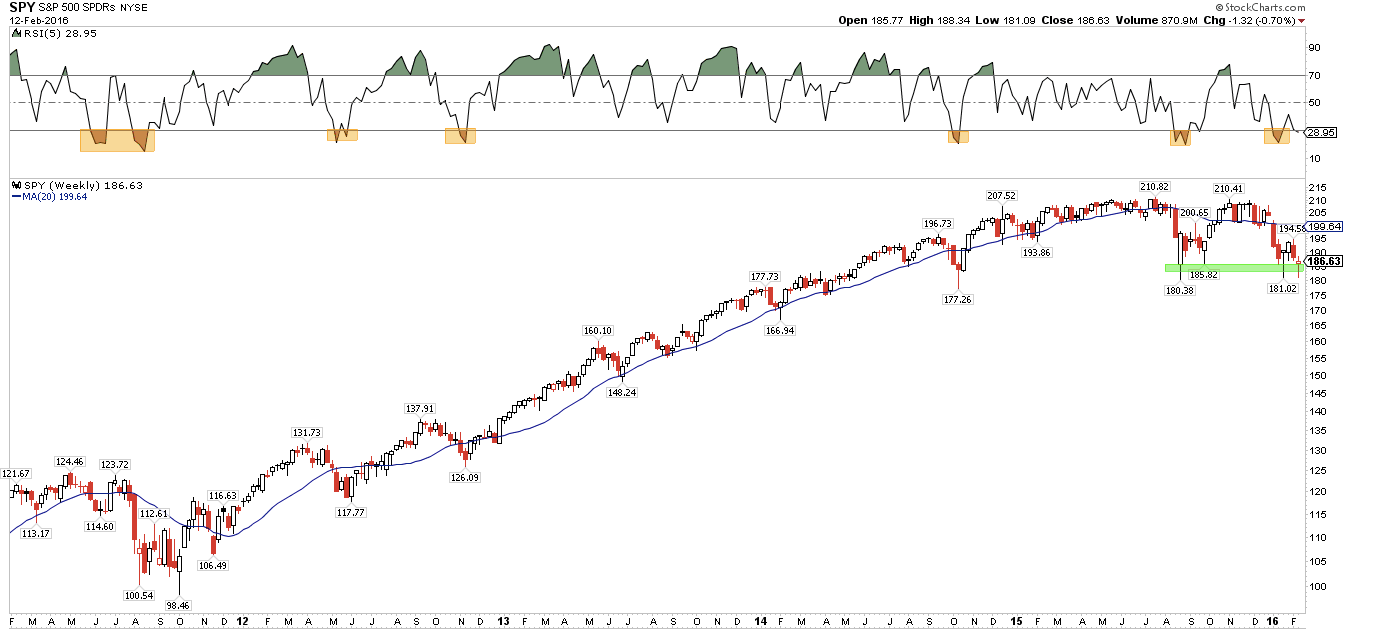
To recover trend, SPY needs to first regain and hold above the 20-wma at 199, just as it did in late 2011 (left side of the chart above). Longer term, if SPY regains 210, there's a potential 'W' bottoming pattern. On a positive note, the lows from August/September/January held once again this past week (green line). That support will most likely fail if retested again any time soon.
SPY is still downtrending on a shorter time scale as well: "lower highs" and "lower lows" so far in February. What to look for in the coming week:
- (1) hold above the 5-dma (green line) as it did in November (green arrows);
- (2) make a "higher high" above 188 (in the yellow shaded area);
- (3) stay overbought, something SPY has been unable to do for much of 2016 (blue arrows in the upper panel). Friday was a good start, but follow through early next week is essential.
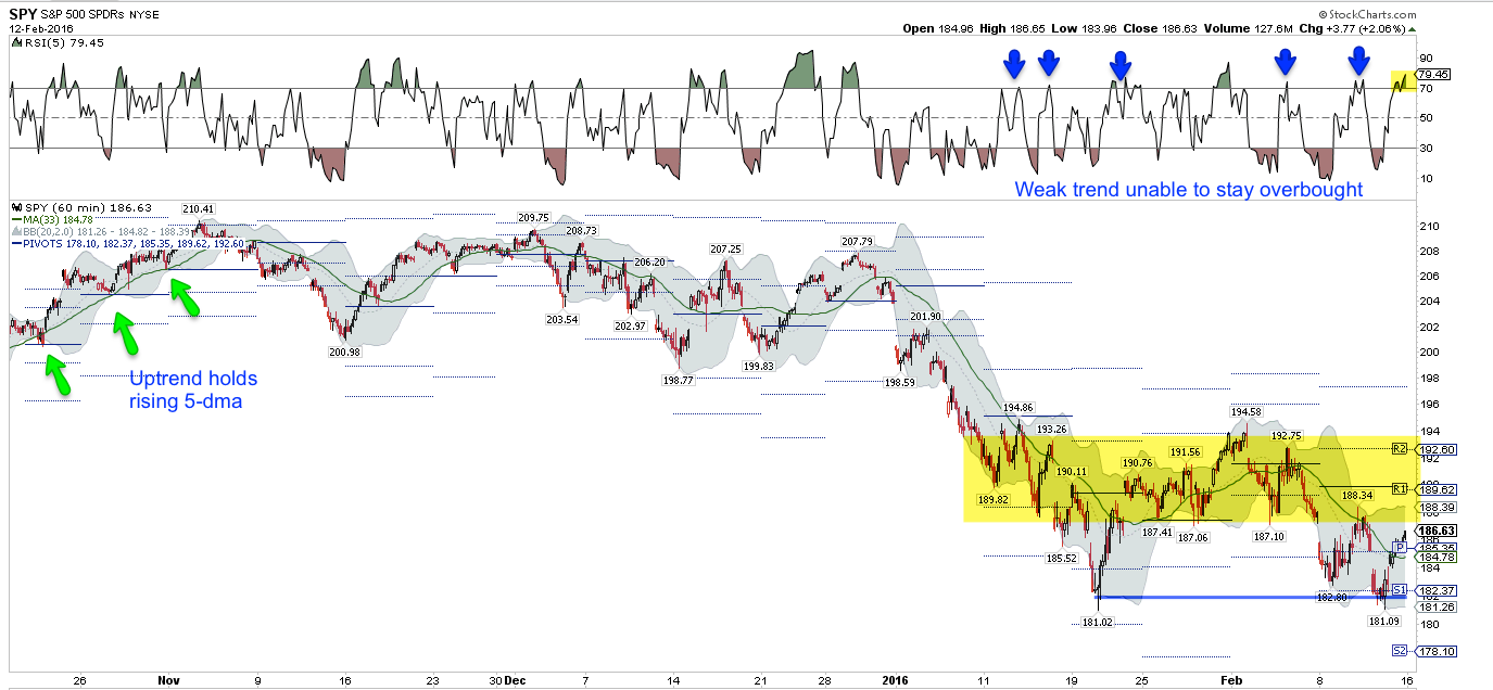
In the chart above, 181 support held (blue line), a key point of reference for the weeks ahead. The next support below is near 178 from October 2014.
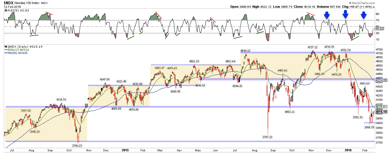
There's an even better bottom to trade against in NDX: the low was made last Monday and then retested twice more during the week. That makes 3900 critical support. 4100 is likely to be significant resistance. There is a long way to go before NDX makes a "higher high" above 4300.
With the exception of utilities (and perhaps staples), every SPX sector is trending downward (see charts below, via Financial Select Sector SPDR (N:XLF), Technology Select Sector SPDR (N:XLK), Consumer Discretionary Select Sector SPDR (N:XLY), Industrial Select Sector SPDR (N:XLI), Energy Select Sector SPDR (N:XLE), Materials Select Sector SPDR (N:XLB), Utilities Select Sector SPDR (N:XLU), Health Care Select Sector SPDR (N:XLV), Consumer Staples Select Sector SPDR (N:XLP) and iShares Transportation Average (N:IYT)).
It's notable, however, that while the indices retested (or broke) their January lows, 6 sectors did not, making "higher lows" instead (green lines). So the sell-off was selective. Moreover, 3 of the 4 sectors that fell to (or below) their January low spent the week making a base (yellow shading). Like NDX, this now presents a clear point of failure in the weeks ahead.
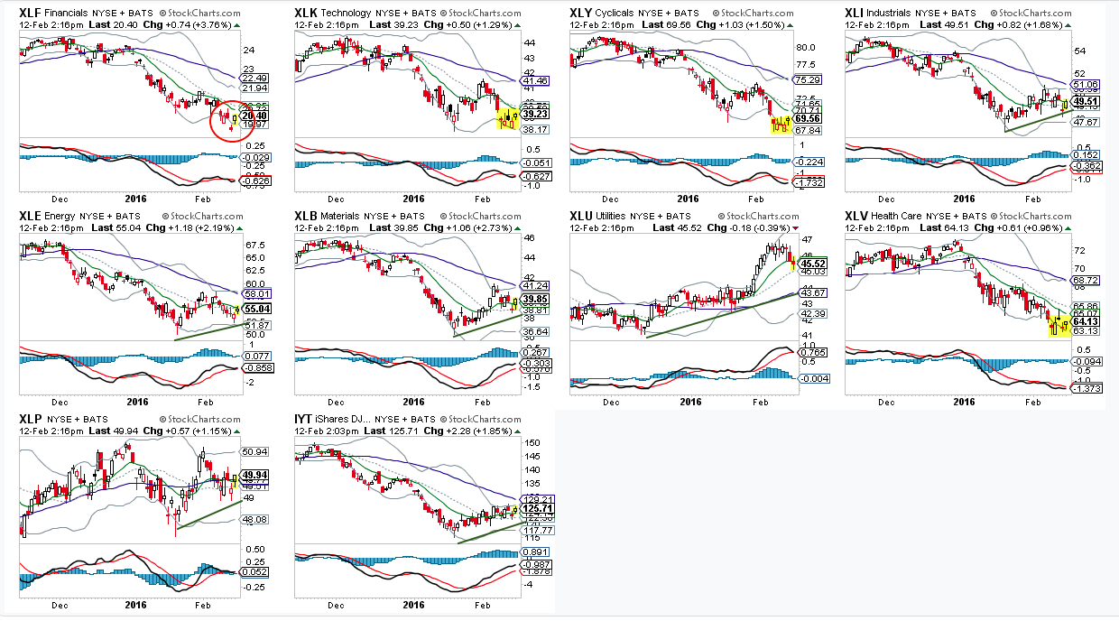
The weakest sector is financials (circled above). Investors had bet that longer term rates would increase after the Fed raised the FFR in December; instead, yields have fallen, and so banks have been sold off hard. If Treasury yields reverse upward, financials may well lead higher. The next sell-off in financials needs to hold above this past week's low; right now, that low is untested.
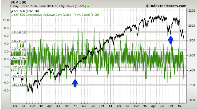
One possible concern is that selling pressure this past week was strong, and that level of persistence in selling normally doesn't abruptly end. SPX fell 5 days in a row last week, through Thursday. Since 2011, that has happened 14 other times; 12 of these (86%) made a lower low than day 5 during the next month. The two exceptions were late December 2012 and late September 2015 (arrows). Certainly the latter case bears a resemblance to what we're seeing today (more than 10% fall and very negative sentiment), but the trend was positive then versus negative now (data from Index Indicators).
The VIX spiked higher this past week, and then started to roll over. Has it reached a near term peak? The pattern suggests that it has: note in the chart below similar spikes to the upper Bollinger® with RSI (top panel) becoming overbought. VIX and SPY move opposite each other about 80% of the time, so a move lower in the VIX supports a higher SPY. Look for the VIX to become oversold.
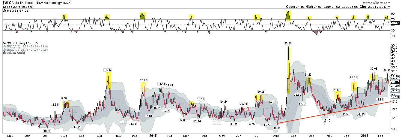
Note in the chart above that the VIX has been trending higher since last summer. Is that unusual?
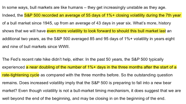
Probably not. Volatility has increased this year. 1% days, both up and down, have become common. That's actually less surprising than it might seem. As bull markets age, they naturally become more volatile. This year also follows the first hike in interest rates since 2006, and that has also led to an increase in volatility (data below from Sam Stovall).
The coming week is Options Expiration. Markets are closed on Monday. New home sales and Industrial Production data will be released on Wednesday and CPI on Friday.
In summary: The move into the perceived safe havens of Treasuries and gold in 2016 appears to have reached a point of short-term exhaustion. That trend might resume, but odds suggest a pause is ahead. If optimism reached a peak in safe havens, pessimism likely reached a trough for equities. None of this will matter if oil and equities continue to be highly correlated and oil is unable to stop falling. A strong 2-day rally still left oil lower than it was on Tuesday. Unlike last week, equities now have a bottom to trade against.
