Before You Dismiss Me
I realize with a title like this there will likely be great skepticism that this article is just click bate. However, that’s not the case and I’ve chosen my words very carefully. You see I am not saying we have reached a market peak – we can’t know that until after the fact. I’m not calling for a future top to the market, because while we can judge the probabilities of an outcome, we can’t know for sure. What I am suggesting, and what I’ll explain in the following paragraphs, is that the risk of a turning point in the long-term trend of the stock market hasn’t been this high in my opinion since the start of the bull market in 2009.
My full-time job is to manage money on the behalf of my firm’s clients. A large part of that job is to analyze risks in our portfolios and determine if action needs to be taken. One of those risks is always the chance of a market peak and bear market. I’ll now go into how I’ve evaluated those risks below. While I believe the risks are currently elevated, price confirmation has, and always will be, the determining factor for me to take an action and at this point, as the first point below will show, we are still in an up trend.
First Comes Price
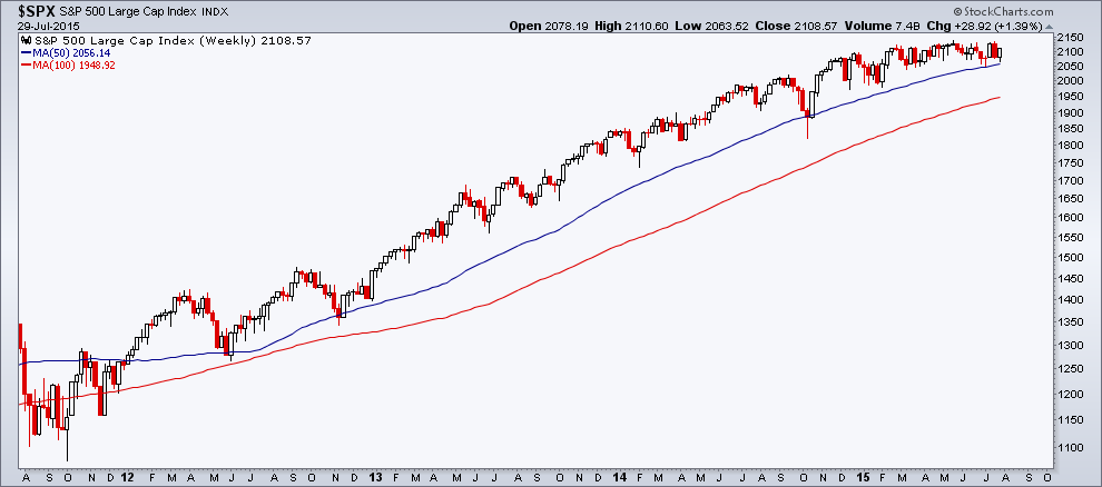
We are still in an uptrend. Let me begin with that. Nothing else supersedes price when evaluating a trend. I use weekly and monthly charts to view trends, removing some of the noise involved from day-to-day trading activity. Below is a chart of the S&P 500 on a weekly timeframe going back to late 2011 along with the 50-week and 100-week Moving Averages. Both MA’s are trending up and since 2012, the S&P has remained above both levels. It’s simple as that – the trend in price is up.
Market Participation
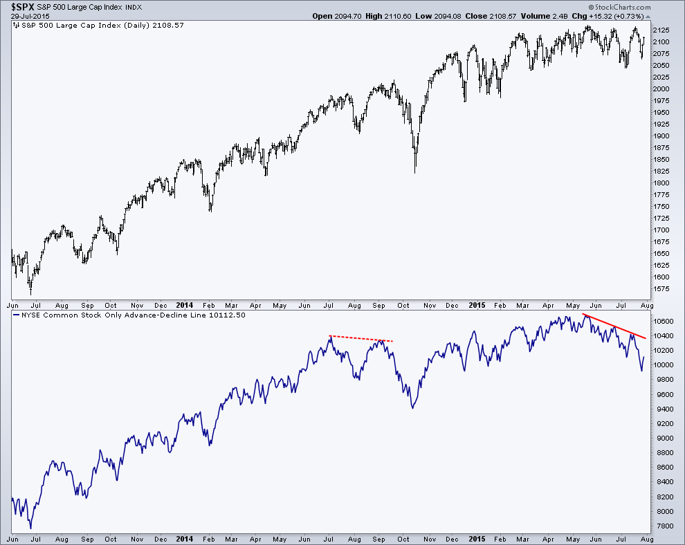
The Common Stock-Only Advance-Decline Line had fallen roughly 6.5% before the S&P 500 had ultimately put in a peak back in 2007. While seeing a divergence (a series of lower highs vs. an index making higher highs) stands out, the degree at which it’s diverging is often an overlooked component. Besides the most recent divergence, the only other diverge I’ve seen for the A-D Line was in July-Sept. of last year, in which the breadth measurement fell less than 1% before the S&P decline nearly 10%. While the market did decline, somewhat ‘confirming’ the weakness in market participation, the degree of which the Advance-Decline Line fell was negligible. Most recently, the A-D Line has fallen 3% between market highs set in May and July. While the drop is more significant than in 2014, its still not as severe as 2007, but I don’t believe it should be dismissed.
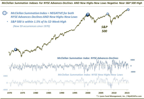
Another great way of showing this type of data comes from my friend Dana Lyons, who recently wrote an article looking at the Summation of two breadth measures. A Summation Index simply adds together the readings of the indicator; you can read Dana’s article for more details. Below is his chart showing the current deterioration in the Summation Index for the Advance-Decline Line and the NYSE New High minus New Lows indicators and how they are at levels not seen since 2007, 1999/2000, and 1972. While the chart appears to only show a handful of instances, there are in fact 58 – a large cluster took place between ’99 and ’00. The median return for the S&P 500 after 1 year for each of the 58 occurrences is -8.8%, with none of them providing a positive return. The 6-month median return, however, does show a bulk of the returns being positive, but with a median return of just 1.6% – hardly anything to get excited about.
Participation, Valuation, and Sentiment Combined
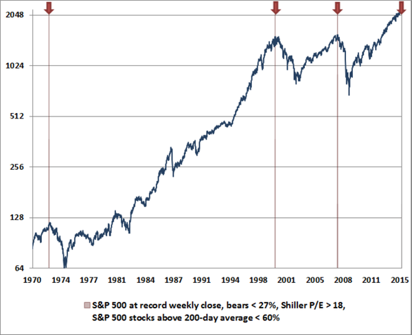
John Hussman has been a vocal market bear for the bulk of the long-term uptrend in stocks. Although, he recently published a chart that really stood out to me. Hussman screened for the S&P 500 being at a fresh high, sentiment being positive (using Investor Intelligence data), valuations high (based on Shiller P/E), and participation low (based on the number of stocks trading above their 200-day Moving Average). The examples meeting his screened criteria match those of Dana Lyons’ study: 2007, 2000, and 1972. While John has shown bearish charts like this before, I found it interesting that the same ‘markers’ were similar to the deterioration found by Dana. I simply read this as a sign that the risk/reward paradigm is currently not favoring the reward side of the equation.
Tight Trading Range
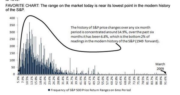
There has been much written about the tight trading range that the U.S. equity market has been in this year; Ryan Detrick has covered this topic extensively. Ryan recently wrote a post highlighting the results of prior instances where the S&P did not have a 1% weekly move after 8 weeks, the average 6-month return was -1.68%, with only 33% of the time seeing stocks go higher 6 months later. While tight ranges can resolve themselves in either direction, market ‘boredom’ seems to historically favored a downside resolution.
The current 6 month range is in fact in the bottom 2% of all readings since 1949! It doesn’t get much tighter than that, as shown by this chart recently tweeted by ValueWalk.
Stocks Relative To Their Own Highs and Lows
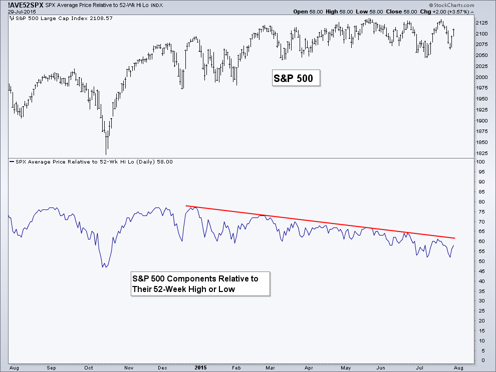
I wrote about this set of data in May, noting that one of the tools used by Lowery’s Research when viewing market peaks is the number of individual stocks that are 20% or more off their own 52-week high – essentially another way of looking at market participation. Using the average price of the S&P 500 stocks relative to their own 52-week high and 52-week low when the broad index itself was at 2120, the data at the end of May was at the lowest point since 2011 and 2007. The most recent attempt at a new high in July saw an even lower reading as more S&P stocks move closer to their 52-week lows and away from their 52-week highs. Since 2001, this data set has never been this low when the market was less than 0.15% away from a new 52-week high, not even in ’07.
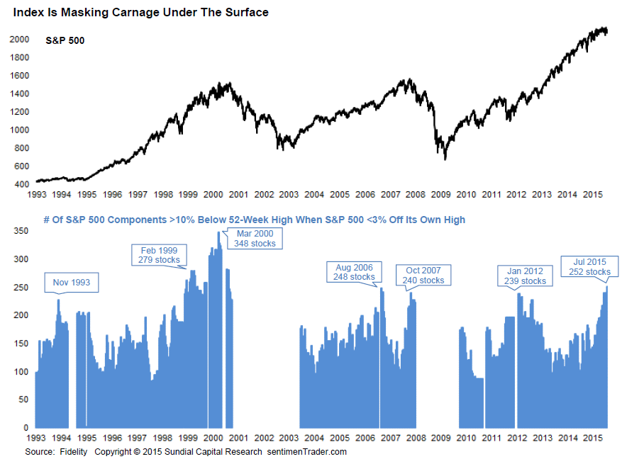
Another interesting way of showing this is by a chart from SentimenTrader. The chart below shows the historical number of S&P 500 stocks that were more than 10% below their prior high when the index was near its own 52-week high. Currently we are seeing more stocks trading lower than at the 2007 peak, only the dot-com bubble exceeds the current level of weak participation.
What About Momentum?
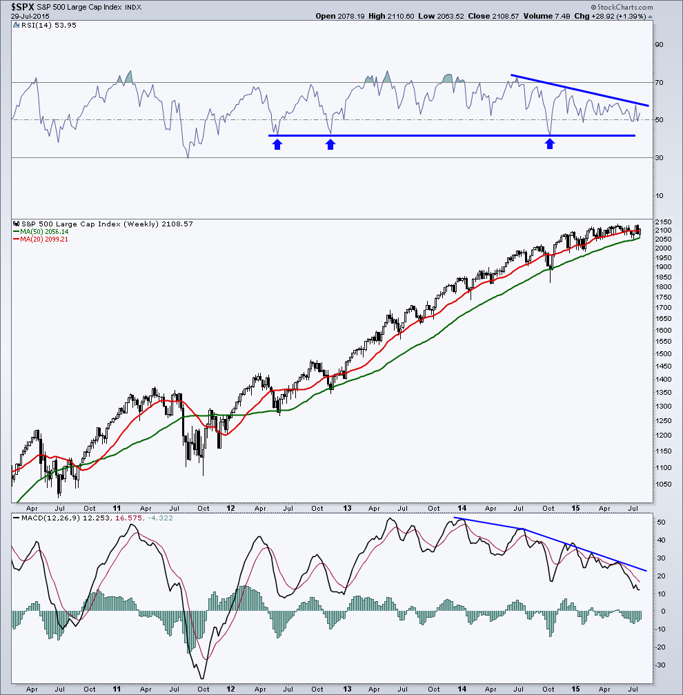
This next chart is one I’ve often shown on my blog and on Twitter (NYSE:TWTR). It’s a weekly chart of the S&P 500 along with the Relative Strength Index (RSI) and MACD momentum indicators. Since 2014, the RSI indicator has been diverging, creating lower highs while the market makes higher highs. This is typically bearish. But it’s also still in a bullish range. This means that while momentum is starting to trend (lower highs) lower, it’s not making lower lows and is staying above prior support as shown by the blue arrows. The MACD is also trending lower as price has stayed in a tight range.
A break of support in the Relative Strength Index would be a bad sign. First, we would see RSI get materially under 50 (its midpoint), which hasn’t happen yet in 2015; this would be our first ‘early warning’ of a possible break in support. Then I’d be watching if momentum got under 40, which would provide a possible signal that the range in momentum has begun to shift away from the bullish camp.
What About the Economy or the Fed?
It’s true that most major market declines involve a recession. I have two economic models that I use to ‘monitor’ economic growth and neither of them have flipped negative, indicating an increase in the risk of a recession. So from an economic stand point, based on current data, things appear fine. As far as the Federal Reserve goes, I don’t subscribe to the belief that the market is ‘rigged’ or controlled by the government. I think the Fed has had a great influence through the injection of monetary stimulus, the equity markets response to the QE spigot being turned on and off is hard to ignore. But that appears to be behind us as the conversation as shifted away from the Feds monetary stimulus and towards when they will begin raising rates.
Summary
I’ll repeat once again, I am evaluating the RISKS of a market peak, I am not making a prediction for one. In my opinion, the risks are currently higher than they have been in a quite a while. The next step in my thought process is to focus on price movement and see if price begins to reflect the above mentioned bearish data. I have the levels I’m watching and patience will persist until they are broken and price declines.
Disclaimer: Do not construe anything written in this post or this blog in its entirety as a recommendation, research, or an offer to buy or sell any securities. Everything in this post is meant for educational and entertainment purposes only. I or my affiliates may hold positions in securities mentioned in the blog. Please see my Disclosure page for full disclaimer.
