
Here is the lead paragraph from the Employment Situation Summary released Friday morning by the Bureau of Labor Statistics:
Total nonfarm payroll employment increased by 162,000 in July, and the unemployment rate edged down to 7.4 percent, the U.S. Bureau of Labor Statistics reported today. Employment rose in retail trade, food services and drinking places, financial activities, and wholesale trade.
Friday's nonfarm number was weaker than the Investing.com forecast, which was for 184K new nonfarm jobs, but the unemployment rate dropped to 7.4% from 7.6%. Investing.com was expecting a decline to 7.5%. The nonfarm jobs number for the previous month was revised downward to 188K from the original 195K.
The unemployment peak for the current cycle was 10.0% in October 2009. The chart here shows the pattern of unemployment, recessions and both the nominal and real (inflation-adjusted) price of the S&P Composite since 1948.
Unemployment is usually a lagging indicator that moves inversely with equity prices (top chart). Note the increasing peaks in unemployment in 1971, 1975 and 1982. The inverse pattern becomes clearer when viewed against real (inflation-adjusted) S&P Composite, with its successively lower bear market bottoms. The mirror relationship seems to be repeating itself with the most recent and previous bear markets.
The second chart shows the unemployment rate for the civilian population unemployed 27 weeks and over. This rate has fallen significantly since its 4.34% peak in April 2010. The latest number is 2.7% -- down from the 2.8% reading of the past three months. This measure gives an alternative perspective on the relative severity of economic conditions. As we readily see, this metric remains higher than the peak in 1983, which came six months after the broader measure topped out at 10.8%.
The next chart is an overlay of the unemployment rate and the employment-population ratio. This is the ratio of the number of employed people to the total civilian population age 16 and over.
The inverse correlation between the two series is obvious. We can also see the accelerating growth of women in the workforce and two-income households in the early 1980's. Following the end of the last recession, the employment population has three times bounced at 58.2% — a level that harkens back to the 58.1% ratio of March 1953, when Eisenhower was president of a country of one-income households, the Korean War was still underway, and rumors were circulating that soft drinks would soon be sold in cans.
The latest ratio is 58.7%, which is around the middle of a consistently narrow range (58.2% to 59.3%) since the end of the last recession.
For a confirming view of the secular change the US is experiencing on the employment front, the next chart illustrates the labor force participation rate. To two decimal places we're at 63.40%, fractionally off the interim low of 63.28% set in March. Friday's level was first seen in November 1978.
The employment-population ratio and participation rate will be interesting to watch going forward. The first wave of Boomers will continue be a downward force on this ratio. The oldest of them were eligible for early retirement when the Great Recession began, and the Boomer transition to the retirement will accelerate over the next several years.
What is the average length of unemployment? As the next chart illustrates, we are perhaps seeing a paradigm shift — the result of global outsourcing and efficiencies of technology. The post-recession duration of unemployment has remains disturbingly high at 36.6 weeks, up from 35.5 last month.
The last chart is one of my favorites from Bill McBride at Calculated Risk. It shows the job losses from the peak employment month since World War II. Note the addition of the dotted-line alternative for the current cycle, which shows unemployment excluding the temporary census hiring.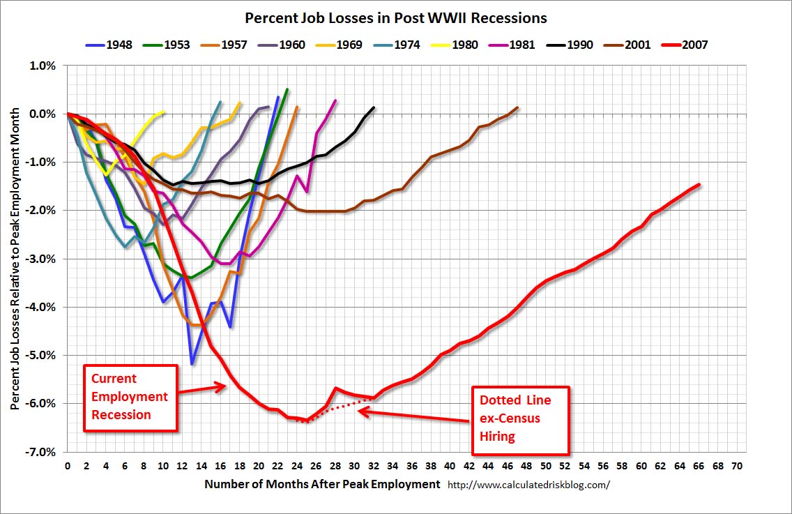
The start date of 1948 was determined by the earliest monthly unemployment figures collected by the Bureau of Labor Statistics. The best source for the historic data is the Federal Reserve Bank of St. Louis.
Here is a link to a Google source for customizable charts on US unemployment data (not seasonally adjusted) since 1990. You can compare unemployment at the national, state, and county level.
- English (UK)
- English (India)
- English (Canada)
- English (Australia)
- English (South Africa)
- English (Philippines)
- English (Nigeria)
- Deutsch
- Español (España)
- Español (México)
- Français
- Italiano
- Nederlands
- Português (Portugal)
- Polski
- Português (Brasil)
- Русский
- Türkçe
- العربية
- Ελληνικά
- Svenska
- Suomi
- עברית
- 日本語
- 한국어
- 简体中文
- 繁體中文
- Bahasa Indonesia
- Bahasa Melayu
- ไทย
- Tiếng Việt
- हिंदी
Only 162K New Jobs, But Unemployment Rate Drops To 7.4%
Published 08/04/2013, 01:28 AM
Updated 07/09/2023, 06:31 AM
Only 162K New Jobs, But Unemployment Rate Drops To 7.4%
3rd party Ad. Not an offer or recommendation by Investing.com. See disclosure here or
remove ads
.
Latest comments
Install Our App
Risk Disclosure: Trading in financial instruments and/or cryptocurrencies involves high risks including the risk of losing some, or all, of your investment amount, and may not be suitable for all investors. Prices of cryptocurrencies are extremely volatile and may be affected by external factors such as financial, regulatory or political events. Trading on margin increases the financial risks.
Before deciding to trade in financial instrument or cryptocurrencies you should be fully informed of the risks and costs associated with trading the financial markets, carefully consider your investment objectives, level of experience, and risk appetite, and seek professional advice where needed.
Fusion Media would like to remind you that the data contained in this website is not necessarily real-time nor accurate. The data and prices on the website are not necessarily provided by any market or exchange, but may be provided by market makers, and so prices may not be accurate and may differ from the actual price at any given market, meaning prices are indicative and not appropriate for trading purposes. Fusion Media and any provider of the data contained in this website will not accept liability for any loss or damage as a result of your trading, or your reliance on the information contained within this website.
It is prohibited to use, store, reproduce, display, modify, transmit or distribute the data contained in this website without the explicit prior written permission of Fusion Media and/or the data provider. All intellectual property rights are reserved by the providers and/or the exchange providing the data contained in this website.
Fusion Media may be compensated by the advertisers that appear on the website, based on your interaction with the advertisements or advertisers.
© 2007-2024 - Fusion Media Limited. All Rights Reserved.