
2000 Dot-Com Peak: 200-Day Was Helpful“As a trader who has seen a great deal and been in a lot of markets, there is nothing disconcerting to me about a price move out of a trading range that nobody understands.”
Bruce Kovner
Market Wizards
“As a trader who has seen a great deal and been in a lot of markets, there is nothing disconcerting to me about a price move out of a trading range that nobody understands.”
Bruce Kovner
Market Wizards
A market’s 200-day moving average can assist in monitoring investors’ net aggregate tolerance for risk. Notice in the first chart below the S&P 500 was unable to recapture its 200-day after dropping below it in October 2000. Compare and contrast the top chart to the bottom chart; notice how unlike 2000, the S&P 500 was able to recapture its 200-day after the Brexit bottom was made on June 27, 2016.

How Can Trends And These Charts Help Us?
If Micheal Phelps was open to providing some insight into how to swim faster, most swimmers would be happy to listen. In a similar way, we can learn from the best money managers of our time. This week’s video covers many basic tenets of the “market wizards” and provides a clear example of how moving averages can be helpful in managing risk and reward.
After you click play, use the button in the lower-right corner of the video player to view in full-screen mode. Hit Esc to exit full-screen mode.
2007-08 Financial Crisis Peak: 200-Day Was Helpful
The situation was similar in 2007-08. Notice in the first chart below the S&P 500 was unable to recapture its 200-day after dropping below it in December 2007. Compare and contrast the top chart to the bottom chart; notice how unlike 2008, the S&P 500 was able to recapture its 200-day after the Brexit bottom was made on June 27, 2016.

Removing Price Allows Us To Focus On Trends
The concept of trends is easier to see if we remove the day-to-day fluctuations in price from the equation. Notice how during the dot-com bust, bear market, the S&P 500’s 50-day moving average (blue) was never able to recapture the 200-day moving average (red). Compare and contrast the present day look (second chart below) of the 50-day and 200-day to the look in 2000-2002.

In the 2016 chart above, two favorable things from a trend perspective have happened recently that never occurred during the dot-com bear market: (1) the slope of the S&P 500’s 200-day turned back up in a positive manner, and (2) the 50-day crossed back above the 200-day.
Similar Concepts 2007-08 vs. 2016
Notice how during the financial crisis bear market (top chart below), the S&P 500’s 50-day moving average (blue) was never able to recapture the 200-day moving average (red). Compare and contrast the present day look (second chart below) of the 50-day and 200-day to the look in 2007-2008.
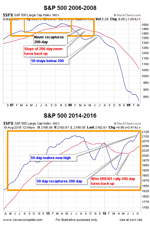
In the 2016 chart above, two favorable things from a trend perspective have happened recently that never occurred during the financial crisis bear market: (1) the slope of the S&P 500’s 200-day turned back up in a positive manner, and (2) the 50-day crossed back above the 200-day.
How Can These Charts Help Us?
No chart from any period, including 2016, can predict the future. However, charts and moving averages can help us better understand the “probability of bad things happening” vs. “the probability of good things happening”.
Right now, given the look of the 2016 charts above, the probability of good things happening today is much higher than it was in early 2001 and early 2008. Nothing says the 2016 market cannot breakdown and morph into a look similar to 2001 or 2008. However, that has not happened yet. Therefore, we will continue to hold positions in markets with positive trends, including U.S. stocks. The three charts below summarize the concepts presented above.
