Frisky Fed Hike-o-Matic
We haven’t commented on central bank policy for a while, mainly because it threatened to become repetitive; there just didn’t seem anything new to say. Things have recently changed a bit though. A little over a week ago we received an email from Brian Dowd of Focus Economics, who asked if we would care to comment on the efforts by the Fed and the ECB to exit unconventional monetary policy and whether they could do so without triggering upheaval in the markets and the economy**, so we are taking this opportunity to do just that.
First of all, the FOMC appears to have decided it will no longer be deterred by short term weakness in economic data and continue to implement its rate hike plans anyway. As we have pointed out several times, these baby step hikes in the Federal funds rate (modeled after Bernanke’s pre-crash rate hike campaign in 2004-2007) are in some sense actually meaningless.
That is mainly due to the fact that interbank lending of reserves is essentially dead, as banks continue to hold massive excess reserves as a result of QE. The FF rate is therefore no longer really a “monetary policy tool”, since the traditional method of keeping it on target by adding or draining reserves has become moot. The only way to keep the federal funds rate within the Fed’s target corridor (note they use a range these days instead of a precise target rate) is to pay interest on reserves (IOR).
So IOR is actually the most important policy rate in the US. As long as it is kept a the upper end of the FF rate range, commercial banks have no incentive to use their excess reserves as the basis for credit creation of Weimaresque proportions (there are other disincentives to this as well, which range from more stringent capital adequacy requirements to common sense; the latter undoubtedly remains a scarce commodity).
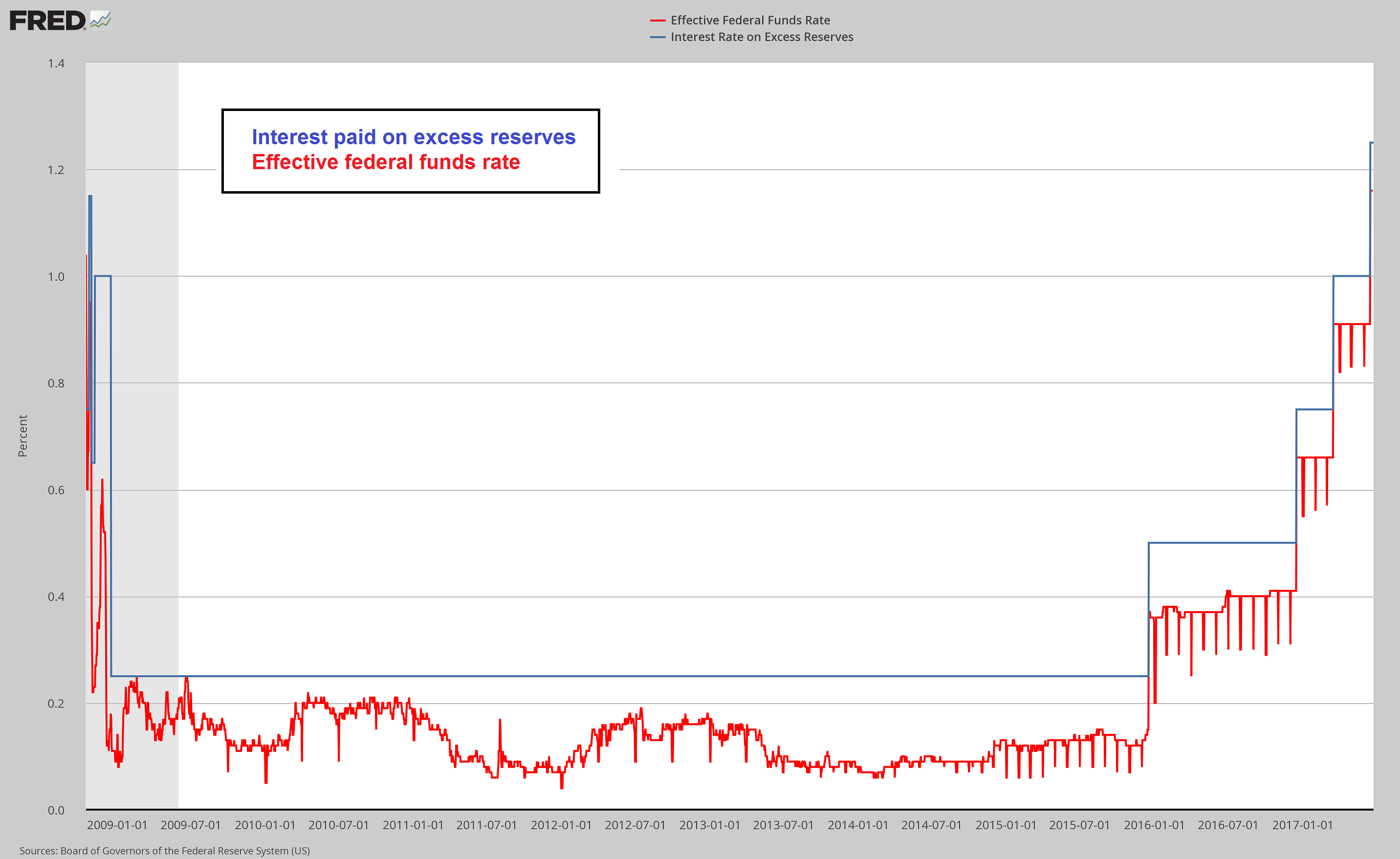
Interest paid on excess reserves vs. the Federal funds rate (the former allows the target range of the latter to be maintained despite the enormous amount of excess reserves maintained at the Fed).
Another point worth mentioning in the context of the FF rate is that although there is a feedback loop between gross market rates and Fed activity, most of the time the Fed is simply following the lead of the T-bill rate. That is fairly obvious when looking at a comparison chart. Every rate hike in the current cycle was preceded by a surge in the three month T-bill discount rate from below to above the effective FF rate.
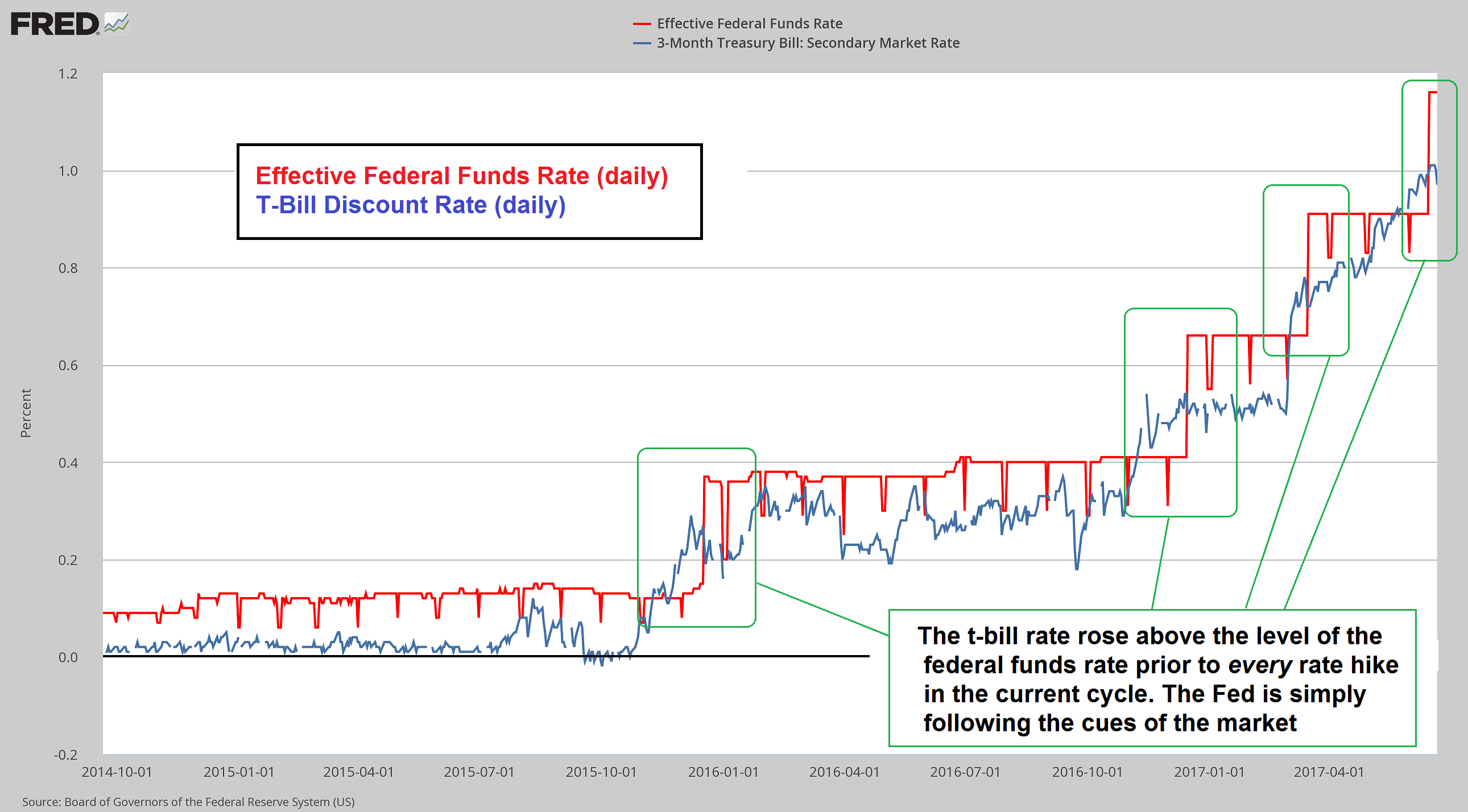
Fed rate hikes have followed moves in the t-bill rate. The latter is of course partly driven by expectations about coming rate hikes, so the chicken and egg question is not definitively answered by this chart.
The FOMC could save a lot of time, ink and bandwidth by skipping its meetings, and instead of issuing a verbose statement that uses around 650 words to essentially say “we have no clue what is going to happen, and neither has anyone else”, it could simply state “T-bill rates have gone up, so we hiked”. From there it would only be a small step to the insight that the Fed is actually surplus to requirements and should abolish itself. Just saying :)
Note: without QE, and a relatively low growth rate in inflationary credit creation by commercial banks, gross market rates will tend to move closer toward levels that reflect actual economy-wide time preferences. Numerous processes that were set into motion due to credit expansion will eventually reverse once that happens.
Reversing QE?
This brings us to the June FOMC statement – as the WSJ statement tracker reveals, it by and large contained the usual boilerplate published over the past 18 months or so, with minor variations. Needless to say, with the FF rate at 1% to 1.25%, monetary policy can hardly be described as “tight”, although it is definitely tighter than when QE was still in train and the FF rate was stuck near zero. Even after the recent rate hike, the theoretical “real” FF rate (simply measured as the difference between the FF rate and CPI) remains in negative territory though:
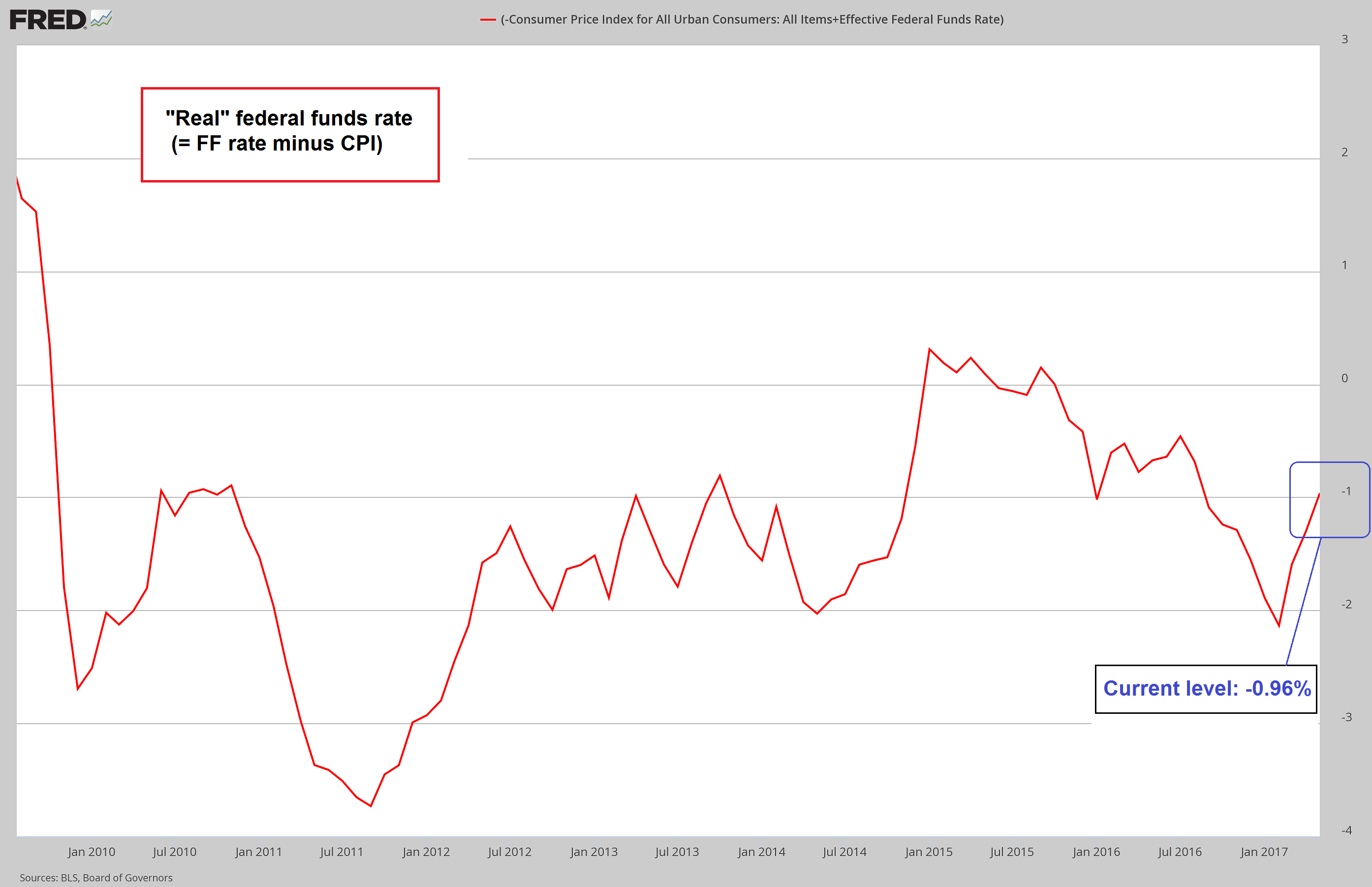
The “real” Federal funds rate remains in negative territory by roughly 100 basis points.
However, there was one very interesting new passage in the FOMC statement:
“The Committee currently expects to begin implementing a balance sheet normalization program this year, provided that the economy evolves broadly as anticipated. This program, which would gradually reduce the Federal Reserve’s securities holdings by decreasing reinvestment of principal payments from those securities, is described in the accompanying addendum to the Committee’s Policy Normalization Principles and Plans.”
The “accompanying addendum” mentioned in this excerpt can be accessed here. The planned partial reversal of QE is supposed to begin only after the current rate hike campaign is “well underway”, whatever that is supposed to mean. We would actually be inclined to argue that it means “never”. We believe one reason why the Fed is suddenly so confident it can continue to hike rates even if economic data are a mixed bag at best and inflation expectations are tanking again, is that financial markets are so remarkably bubbly and resilient (we are referring to risk assets such as stocks and junk bonds here).
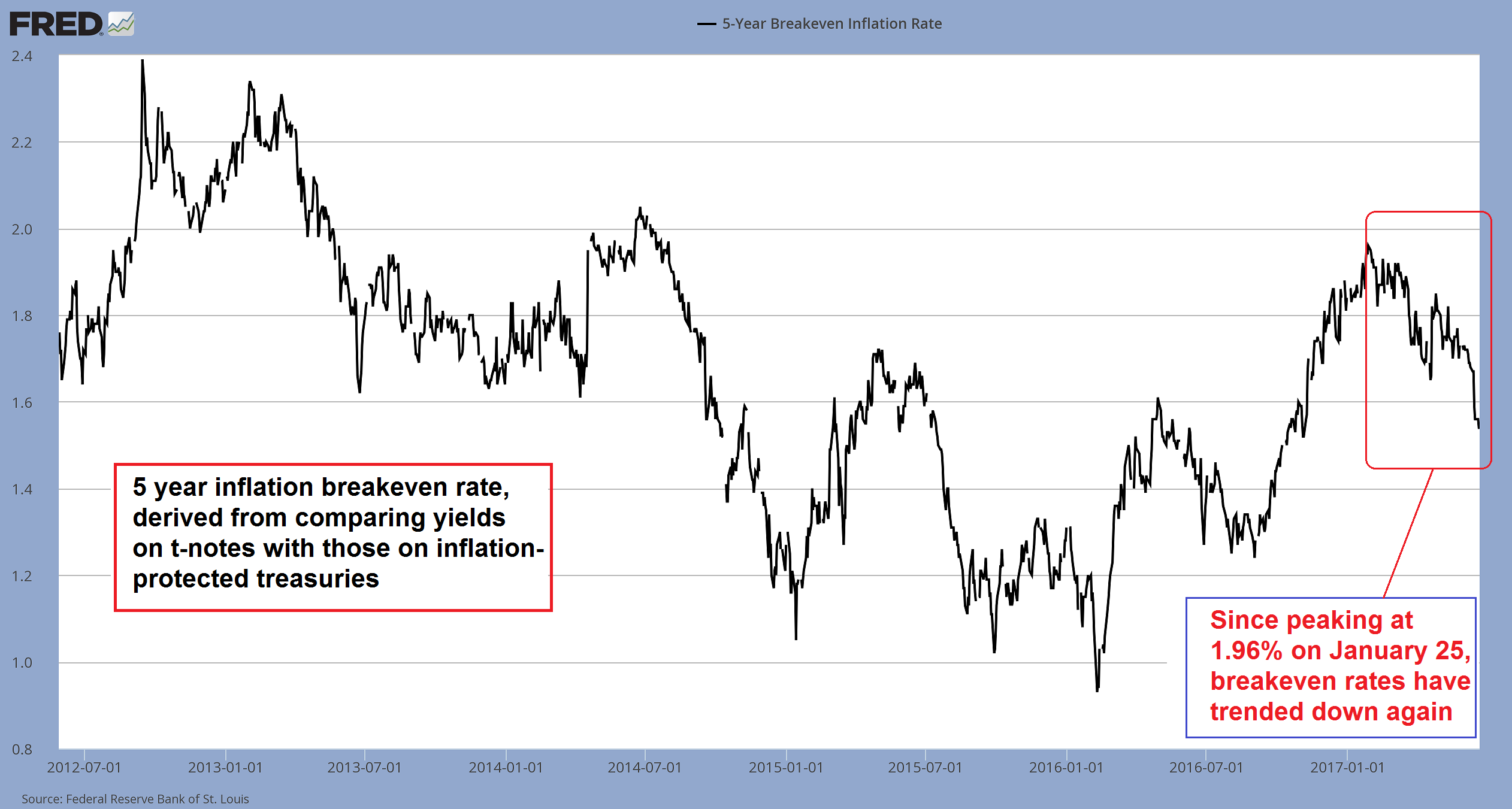
The 5 year inflation breakeven rate has entered a fairly sharp downtrend since late January.
We believe the main aim of these rate hikes is to gather “ammunition” for when the bubble that has been blown over the past few years bursts again. That seems likely to happen well before they reach the “well underway” portion of the current rate hike campaign. In terms of the dual mandate, Fed members can certainly justify rate hikes at present, since the U3 jobless rate indicates “full employment” and headline consumer price inflation is at about 1.9% y/y as of May (in fact, in terms of these data points, the Fed is still way “behind the curve” as the saying goes).
Also, even if many recent economic data did not look particularly convincing, a number of data that were quite weak in 2015/16 (such as industrial production and capital goods orders) have recovered smartly since then. As these data points have recovered, others have weakened in turn, but overall there is no sign yet that a recession is imminent.
How do we know that? There are three major data series that have so far an unblemished track record in changing direction fairly shortly before a recession begins: real gross private domestic investment turns from rising to falling; initial unemployment claims begin to turn up; and the yield curve reverses course from flattening to steepening. None of these reversals have happened as of yet.
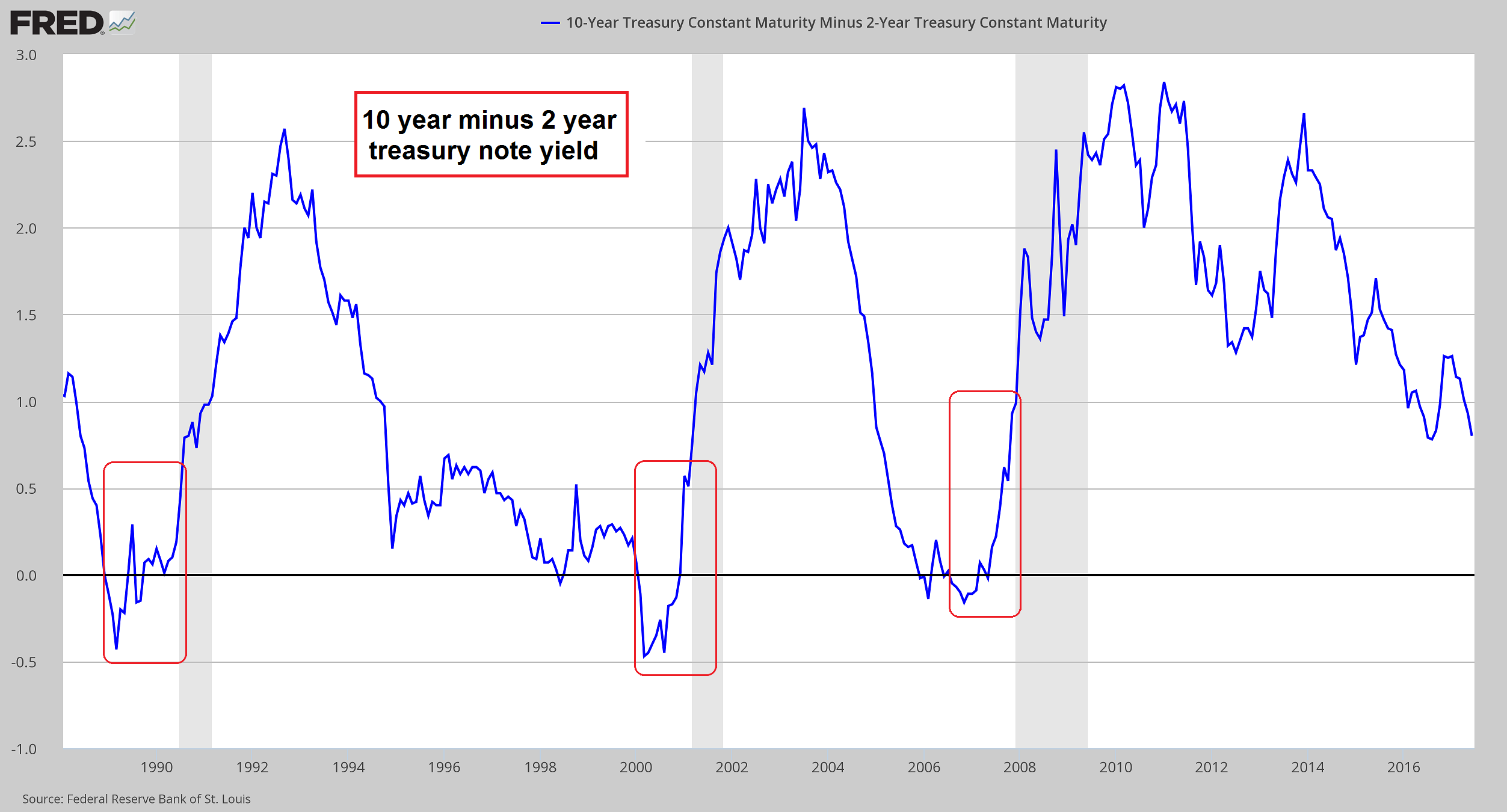
One of the three data points mentioned above: currently the yield curve is still flattening, it is only when that trend ends and it suddenly begins to steepen sharply that a recession is usually imminent. Note: coming out of a ZIRP regime, a yield curve inversion is not necessarily going to occur prior to a recession. That is likewise a purely empirical observation based on what has happened in Japan since the 1989 bubble peak.
Assuming they do get to the point where they decide to begin with a reduction of their securities holdings, it should be noted that historically, decreases in assets held by the Fed were strictly temporary affairs and never amounted to more than tiny dips – even after e.g. rising about 25-fold in the 15 years from 1930 to 1945. Dips in the Fed’s holdings of assets have usually precipitated recessions, hence they were quickly reversed every time.
Achilles Heel
The decisive points of the plan read as follows:
“The Committee intends to gradually reduce the Federal Reserve’s securities holdings by decreasing its reinvestment of the principal payments it receives from securities held in the System Open Market Account. Specifically, such payments will be reinvested only to the extent that they exceed gradually rising caps.
- For payments of principal that the Federal Reserve receives from maturing Treasury securities, the Committee anticipates that the cap will be $6 billion per month initially and will increase in steps of $6 billion at three-month intervals over 12 months until it reaches $30 billion per month.
- For payments of principal that the Federal Reserve receives from its holdings of agency debt and mortgage-backed securities, the Committee anticipates that the cap will be $4 billion per month initially and will increase in steps of $4 billion at three-month intervals over 12 months until it reaches $20 billion per month.
The Committee also anticipates that the caps will remain in place once they reach their respective maximums so that the Federal Reserve’s securities holdings will continue to decline in a gradual and predictable manner until the Committee judges that the Federal Reserve is holding no more securities than necessary to implement monetary policy efficiently and effectively.
(emphasis added)
Adding all of this up, the caps will start at a combined $10 billion per month, and gradually rise to $50 billion per month. This is the QE “tapering” method in reverse, followed by a kind of regular QE reversal, until the level of reserve balances is judged adequate as the Fed states. Here is a historical chart that shows the Fed’s holdings of securities from 1930 to 1968:
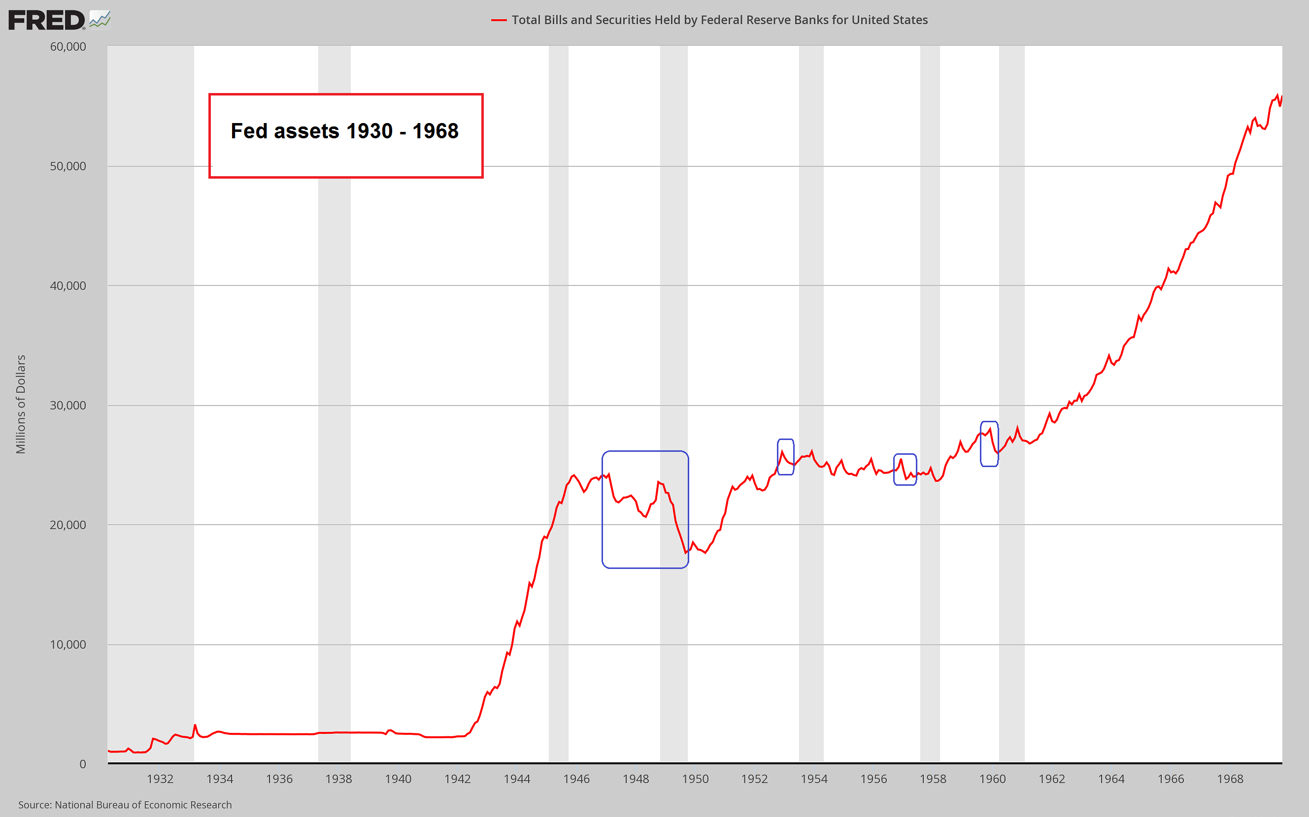
Historically, decreases in the level of assets held by the Fed are rare, tiny, often happen prior to recessions and are usually reversed again at warp speed. Note: the first and fourth dip on the chart were accompanied by a decline in demand deposits and currency; on the other two occasions, growth in demand deposits and currency had slowed and leveled out for a while.
It is worth noting that the money supply is not mentioned even once in the Fed’s addendum describing its balance sheet normalization plan. However, QE has not only increased reserve balances. If that were the case, shrinking the Fed’s balance sheet would not pose much of a problem. Readers may want to catch up on the mechanics of QE in this context, which we described in two previous articles: “Can the Fed Print Money?” and “QE Explained”.
The important point is that every securities purchase from non-banks increases deposit money to the same extent as bank reserves. That is why money supply growth soared in 2008-2010, even while bank credit growth went deeply negative at the same time. It is also the reason why the true broad money supply is up by more than 140% since January of 2008.
Keep in mind that the connection between reserves, assets held by the Fed and the money supply is in some ways quite loose – after all, commercial banks can and do create deposit money ex nihilo, and “required” reserves have been a joke ever since the introduction of sweeps in the mid 1990s. But it is clear that money that was created by means of asset purchases from non-banks (which constitute the majority of such purchases) will effectively disappear back into thin air if the Fed goes through with its plan.
The vast increase in the money supply since 2008 has brought about a huge distortion in relative prices in the economy. While consumer price increases remained fairly tame, the prices of titles to capital such as stocks have soared into the stratosphere; real estate prices are also back at the highs recorded at the peak of the last bubble (note that the geographical distribution of the price increases is farmore uneven though).
Reversing the money creation process should have the opposite effect. In fact, all that was needed on past occasions to bring down an extremely overvalued stock market was a slowdown in money supply growth.
Below is a very recent update of money AMS (the “adjusted money supply” measure calculated by Dr. Frank Shostak of Applied Austrian School Economics). This is essentially the “narrow” Austrian money supply; the main difference to the broad measure TMS-2 we usually show (a recent chart of the growth rate of TMS-2 and C&I lending growth can be seen here) is that savings deposits are not included; there are other differences as well, but their effect is barely perceptible.
In that sense, AMS can be thought of as the “transactional” money supply – the part of the money supply that is mainly used for regular payment transactions. It is more volatile than TMS-2, as savings deposits are relatively inert. As the chart shows, the y/y growth rate of AMS (which tends to lead TMS-2) has recently plunged to 1.5%, which is a new post GFC low. The main reason for this is that in the absence of QE, growth in bank lending is the only source of money supply growth and credit expansion by commercial banks has slowed rather dramatically.
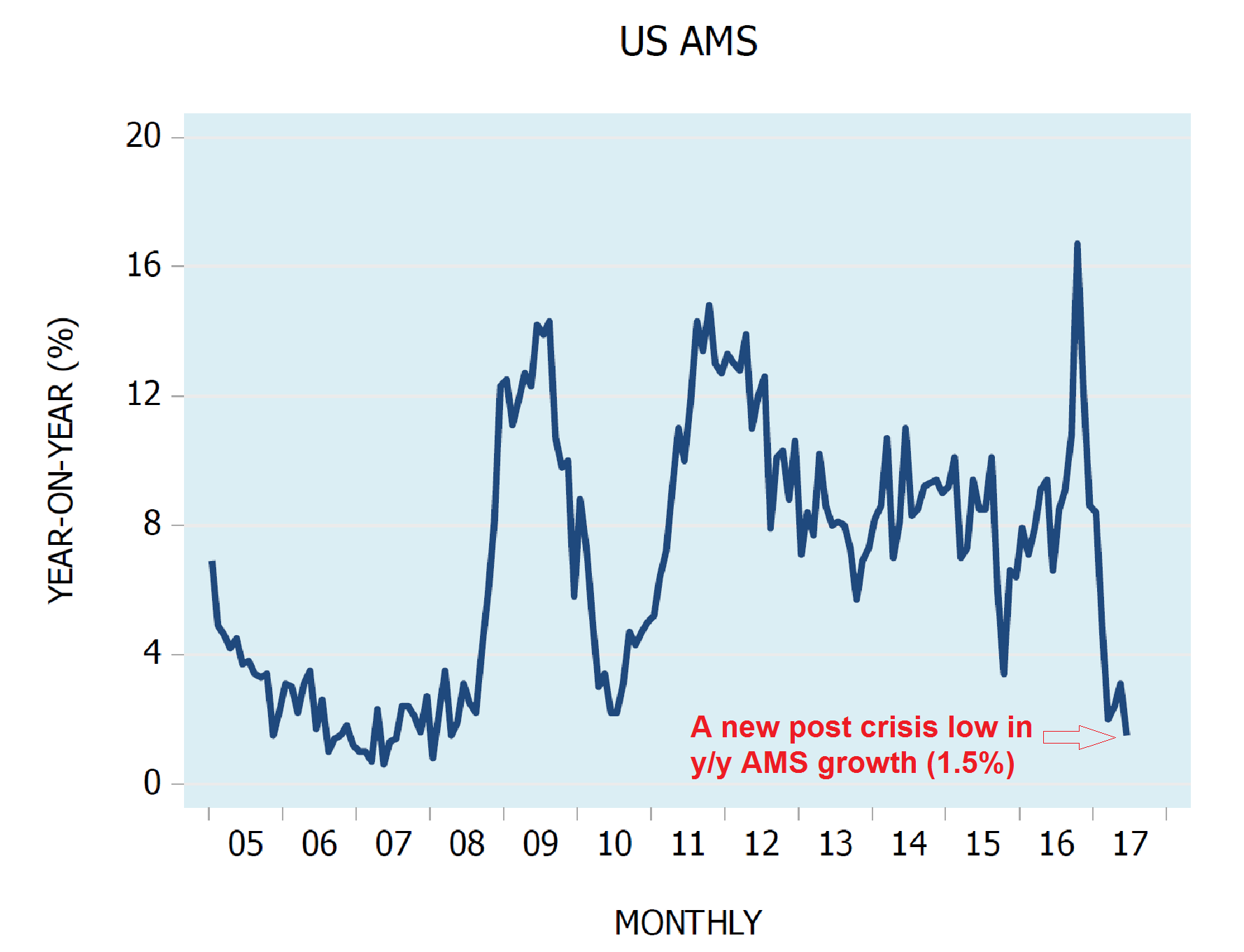
The y/y growth rate of AMS has slowed to a new post crisis low of 1.5%. Note that prior to the crisis that started in 2007 (we date the beginning of the crisis back to the bankruptcy of sub-prime lender Nova-Star in February of 2007), money supply growth was at a similarly low level for an extended time period. The full effect of both rising and falling money supply growth rates on economic activity and securities prices are subject to a lag that is not always of the same duration, but at the very least tends to be measured in months. If a sharp dip in AMS growth is quickly reversed again as happened in 2010, it may not have much of an effect at all.
In the long run there are only two ways in which nominal share prices can rise in the aggregate: Either people allocate a larger proportion of their savings and income to the purchase of securities, or the money supply increases, making more money available to “chase” securities. The latter has been the main driver of nominal share price increases for a very long time. It follows that “reverse QE” is highly likely to put pressure on stock prices. Along similar lines, it is going to put pressure on all economic activities that have sprung up solely on the back of credit expansion and the suppression of interest rates.
As an aside to this, in real terms stock prices increased a lot more prior to the fiat money era than since its beginning. Priced in gold, stocks are nowadays trading at a lower level than at the 1929 peak. In other words, when stock prices were mainly driven by allocation decisions rather than money supply growth, far greater and more durable gains were achieved (the same applies to real economic growth, which was a good sight stronger as well).
Conclusion
It seems to us that the plan to reduce the size of the Fed’s balance sheet isn’t likely to go very far, if it is implemented at all. A fairly recent example was provided by the BoJ which decreased the monetary base by about 25% in 2006. Due to its slightly different modus operandi (apparently it purchased far fewer assets from non-banks) this had a more subdued effect on the money supply than similar action by the Fed is likely to have – and yet, it didn’t take long for a complete reversal, which was later followed by a truly stunning expansion in QE.
Obviously, we don’t believe for a second that the Fed is going to stand idly by while the prices of stocks, real estate and corporate bonds decline rapidly.
Lastly, a word on the indicators of recession we discussed above: one always has to approach empirical indicators of this sort with caution. What has seemingly always worked in the past may not work next time. Every slice of economic history is characterized by different contingent circumstances – there is always a multitude of factors influencing actual events. The current era is certainly unique in many ways, so one must be prepared for surprises.
One thing that never seems to change though is human nature. Credit growth truly is “suspicion asleep” as the next chart illustrates. In this context experience indicates that the longer it is asleep, the more rude the awakening is likely to be.
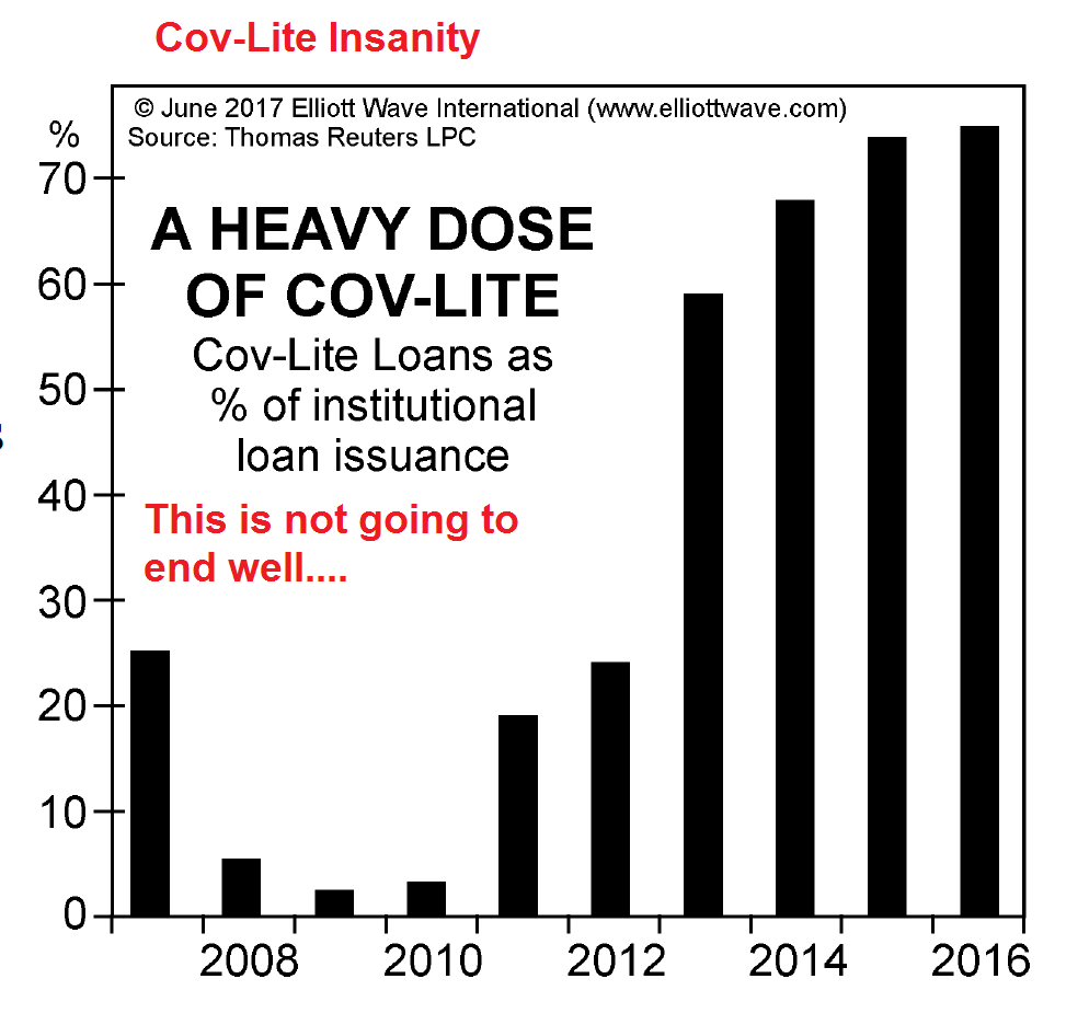
The percentage of institutional loans issued with de minimis protections for creditors (“covenant-lite”), from a recent issue of the Elliott Wave Financial Forecast. Let us just note that a slowdown in money supply and credit growth is not likely to create a friendly environment for these types of loans either – regardless of how sophisticated investors in this space are, they will be faced with serious upheaval.
Footnotes:
- * Specifically, Brian asked the following questions:
- How do you think the Fed will unwind its multi-trillion dollar balance sheet resulting from its stimulus program without severely upsetting the bond and equity markets?
- And how will the ECB, which is still stuck in a quantitative easing cycle, be able to bring it to an end without plunging Eurozone countries into yet another financial crisis?
- We intend to discuss the ECB’s dilemma shortly in a separate post (there are many similarities but it is different in some aspects).
Charts by: St. Louis Fed, AASE, Elliott Wave International
