Below is my weekly S&P 500 #ChartStorm in which I pick out 10 charts on the S&P 500 to tweet. Typically I'll pick a couple of themes to explore with the charts, but sometimes it's just a selection of charts that will add to your perspective and help inform your own view - whether its bearish, bullish or something else!
The purpose of this note is to add some extra context and color. It's worth noting that the aim of the #ChartStorm isn't necessarily to arrive at a certain view but to highlight charts and themes worth paying attention to. But inevitably if you keep an eye on the charts they tend to help tell the story:
1. Happy New Month
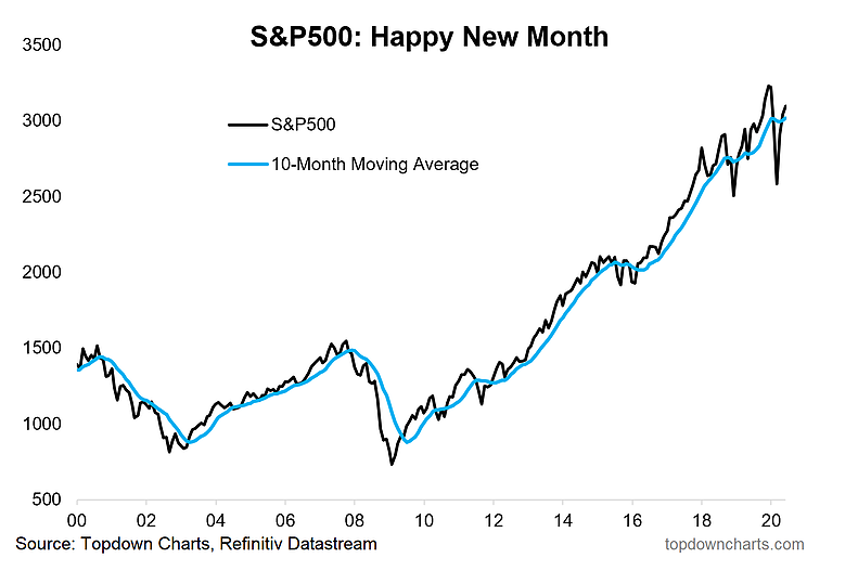
The S&P 500 climbed a modest 1.8% to build on gains from April and May. The index remains above the 10-month moving average after falling sharply beneath it following March’s major decline. Every consolidation is different, and the current choppiness on the monthly chart is more hectic than what was seen in 2014-2016 when the stock market held below its highs for many months (at least on a monthly closing basis). The current sideways trade has featured fresh all-time highs, only to leave the bulls disappointed with harsh setbacks (i.e. Q4 2018 and Q1 2020). Nevertheless, US large caps have beaten just about anything in the last two and a half years. Mega cap tech, the hallmark of the US stock market, has been the leading style.
Bottom line: The bulls should feel pretty happy with how June turned out. The first few days of the month felt very much like a melt-up – and then a 6% loss on June 11 looked like it could be the start of something very bearish. Maybe it will prove to be, but that huge distribution day was actually the low of the month. You can attempt to draw a bullish or bearish narrative, but the S&P 500 traded flat from the June 11 close to finish the first half with a small loss.
2. Previous Laggards Gained Ground In June
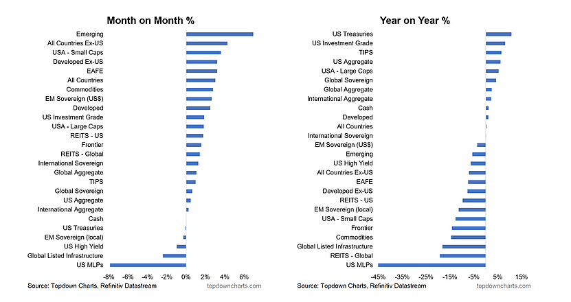
Don’t call it a comeback, but foreign stocks performed well on an absolute and relative basis with the US dollar showing signs of fragility. Small caps also beat the big guys. So for once a little diversification across the equity spectrum wasn’t a bad thing. Any technician will tell you that it takes more than one period to make a trend, however. At the bottom of the month-on-month column you will find energy and infrastructure plays which had done well from the start of the rally in late March, so it too reversed-course despite oil and other commodities performing well. US crude oil approached $40 per barrel, then pulled back to the mid-high $30s. Spot oil and energy equities don’t always move in lock-step.
Like the S&P 500, bonds were ho-hum in their total return for June as interest rates were stable. Some interesting market action was the 10-year yield rising above resistance early in the month only to fake-out the bond bears. Credit-risky fixed income was a mixed bag with junk debt down modestly and emerging market debt (in dollars) up 3%.
Bottom line: The bulls will accept a little consolidation and modest intra-market reversals of the trends set in place from the March 23 low. If anything, better participation from the US extended market as well as overseas equities helps to broaden the move.
3. Quarterly Picture...
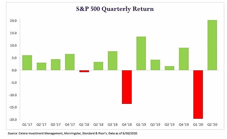
Thanks to @ceteraIM for this quarterly view of S&P 500 returns dating back to Q1 2017. As mentioned earlier, the nature of this consolidation in the last couple of years is that of whippy-ness (that term may or may not be in the CMT curriculum). We spoke of a near-term ‘crab market’ during April and early May when the S&P consolidated, and the quarterly moves have been similar in that we are making ground in some instances, only to give it back in a rather hard and fast manner. Call it three or four baby steps up, then a big ole step-down. The weak bulls get shaken out, the bears get excited (as in late 2018 and February-March 2020), and then the market comes rip-roaring back. And here we are at the start of Q3 2020 having come off the best quarter since 1998.
As you might imagine, the VIX has turned elevated. Sure it has settled back into the mid-20s from the high 80s, but the long-term average is just below the 20% level. It seems like ages ago when it was in the low teens – simpler times!
Bottom line: Technicians call a topping pattern in a stock or market in which prices make new lows and then new highs a ‘broadening top’ – indicative of rather ‘out of control’ price action. It happened on the Dow during the late 90s and early 2000s. The current S&P move is not exactly a broadening formation, but the US large-cap index is getting quite whippy of late.
4. Clearly Q2 Was A Strong Quarter
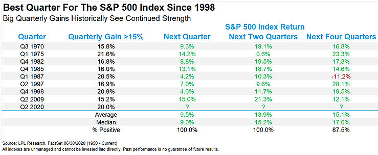
Interestingly as @RyanDetrick shows: strong quarters tend to be followed by strong quarters... Just how good was Q2 2020? It was the best since Q4 1998. Take a look at what tends to happen AFTER a great quarter for US stocks – more green. As Ryan often shows us with clarity, historical data can be rather definitive sometimes. When the S&P 500 gains 15% or more (since 1950), the usual move during the following quarter is to the upside in a massive way. Q2 2020 returned an even 20.0%. Returns are then abnormally strong-looking ahead another quarter and through the entire next four quarters. Only one year, 1987, featured negative returns in the ensuing 12 months after a major quarterly advance.
Bottom line: Strong quarters beget strong quarters. When the bulls dominate, they tend to keep winning. It’s easy to call for consolidation or a pullback after a huge quarterly gain, but you would be fighting history. Call it ‘climbing the wall of worry’ or the en vogue ‘most hated bull market in history’ .. call it whatever you want. Price history & performance statistics are often a better guide than the media narrative.
5. Performance Stats: 5 Best Days
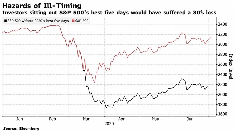
@Schuldensuehners provides this exercise in staying in the game. Missing the best days costs you dearly – so timing the market on your ‘gut instinct’ can be a dangerous venture. Financial advisors, with their hearts in the right place, often roll out a similar chart to this to encourage clients not to try to time the market. Of course, you never know, you might also be successful, and miss the 5 worst days too, right?
2020 has thrown some silly days at us – to the upside and downside. 5%+ daily changes were standard fare during March. A VIX above 80% will do that. Had an investor been caught on the wrong side of a few market timing wagers, returns year-to-date would be ugly. To the tune of -30% versus -4% for the S&P Total Return Index through June 30.
Bottom line: It’s easy to get shaken out when times get rough if you don’t have a plan of attack. It’s also easy to get greedy (when you think you are being prudent), and sell after a big accumulation day during which stocks climb 3%, 4%, 5% or more. Once you’re out, it can be hard to get back in. I’m sure very few investors actually missed the 5 best days while participating during the entirety of the February-June period, but this chart shows us how just a few days can make or break a couple quarters.
6. Financials Vs S&P 500: Make Or Break Moments
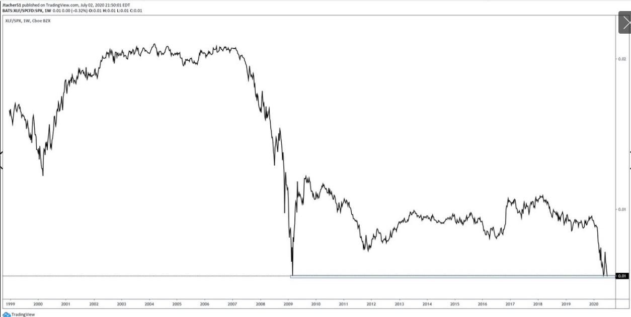
@alphacharts365 brings us this ratio chart of financial stocks versus the S&P 500 since Q4 1998. We are retesting the lows from 2009 right now. The chart actually held that support level just a few weeks ago, then bounced sharply, but we are back down now. Technicians like to say there are no such things as triple bottoms, so that could imply bad things for financials. Will it bust through support this time around or continue to hold on? It’s a make-or-break moment.
You’ll recall that value stocks had a little comeback during late May and early June – but (I’ll say it again) don’t call it a comeback. What will it take fundamentally to get financials off the ground (relative to the broader market)? Maybe interest rates need to start going higher with vigor. The 10-year Treasury yield did break above resistance a month ago, only to get slammed back into its range from April and May. XLF just can’t catch a break right now.
Bottom line: Financials are on the brink as mega tech growth keeps on shining. Some things never seem to change. The ratio of financials to the S&P 500 is a precarious chart right now with the initial hold of the 2009 lows being challenged. Technicians and Intermarket traders should bookmark this chart – it will have major implications for market trends should it breakdown.
7. US Equities Medium-Longer Term' Real Expected Returns
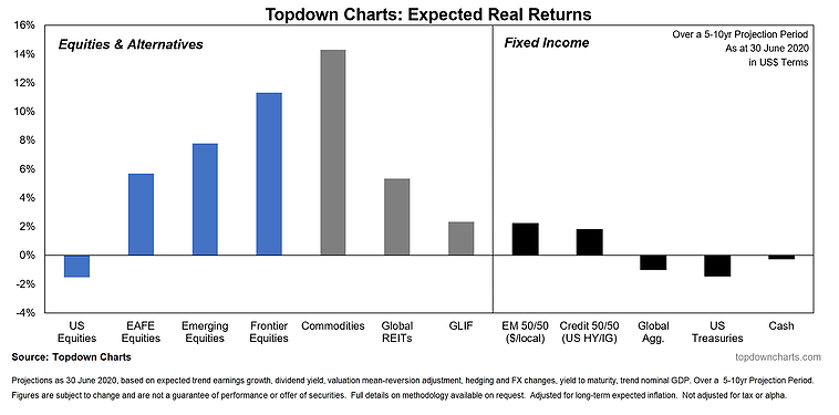
These real expected returns gone into the negatives (after the big rebound rally). A 20% up-move over the course of three months will bring about changes to expected returns going forward. We’ve written on the now rich valuation of large cap US stocks recently, and we expect the S&P 500 to be a poor place to be invested – both on an absolute and relative basis over the medium/longer term. But that should also give global investors hope. There will be opportunities elsewhere – though recency bias is tough to fight for investors. And the ‘home bias’ is almost impossible to overcome for retail US investors.
We anticipate returns in the more risky parts of the world to have a strong ensuing 5-10 years. We also look for commodities to rebound from an awful bear market since middle 2008. Fixed income may be a tough place to be no matter where you go. Real returns will be under pressure since starting yields are so low – even on higher risk credit. Expect negative real returns on aggregate bond indexes both in the US and in overseas markets current yields are below inflation expectations.
Bottom line: Our updated capital market assumptions point to better returns in foreign equity markets. It can be tough to pull capital away from large cap growth US stocks (which is basically the S&P 500 at this point), and then put it to areas of the world that have performed poorly, but valuations suggest that is the wise play looking ahead 5-10 years.
8. US Vs Rest Of The World: Relative Performance Line
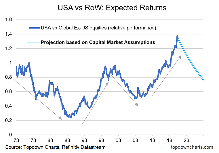
The relative performance tends to go through 10-15 year cycles. It looks like a new cycle could begin soon. Let’s take a step back and look long-term to help us see what may be in the future. USA equities versus global stocks ebb and flow. One outperforms another for a period, only to reverse-course – much to the surprise of many experts when it happens. Global ex-US stocks beat USA equities from the mid-1970s through the entire 1980s – leading up to the Japanese stock market bubble bursting.
Then the 1990s was the decade of Michael Jordan, Jerry Seinfeld, and the US stock market. Relative strength of the US markets culminated in the NASDAQ bubble finally popping in March 2000, then a double-top was confirmed in late 2002. Then it was foreign markets’ time to shine once again – up until early 2008 (when commodities had their heyday).
Even Robinhood traders can tell you that the S&P 500 has been awesome in the last many years. But this bull market versus the Rest of World index may be getting long-in-the-tooth. We expect the RoW market to beat USA stocks – and here is what it would look like on the relative chart.
Bottom line: Relative performance trends can last 10-15 years according to history. So we could be right near an inflection point on USA stocks versus the Rest of World index.
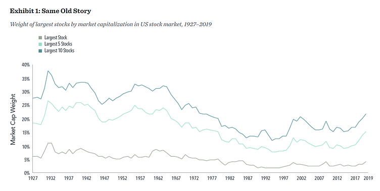
9. Weight Of Largest Stocks By Market Capitalization In US Stock Market
Now let’s get really long-term: 1927–2019. Since the 1920s, concentration in the largest handful of US stocks almost always seems higher than what it should be (at least from the perspective of our comfort level). Putting numbers to that, today’s roughly 22% weight of the ten biggest US stocks within the entire US stock market is actually near normal. Normal versus the 90+ year average, but it is high relative to just the most recent 40 years. The same goes for the five biggest market caps and single biggest stock. Sure the term ‘trillion-dollar company’ gets headlines, but a trillion dollars isn’t what it used to be.
And the market has changed since the first half of the 20th century as some firms were borderline monopolies then – recall how AT&T (NYSE:T) had to be broken up in the early 1980s. Automakers and railroads were huge before that, too. So perhaps there is some validity in the argument that the highest market cap firms are getting too far ahead.
Bottom line: It's the same old story though – the few biggest companies in the US command a seemingly high amount of market cap share. It makes for a potentially scary narrative that only a handful of companies are supporting the stock market’s advance, but that narrative just doesn’t hold water when looking at history and data.
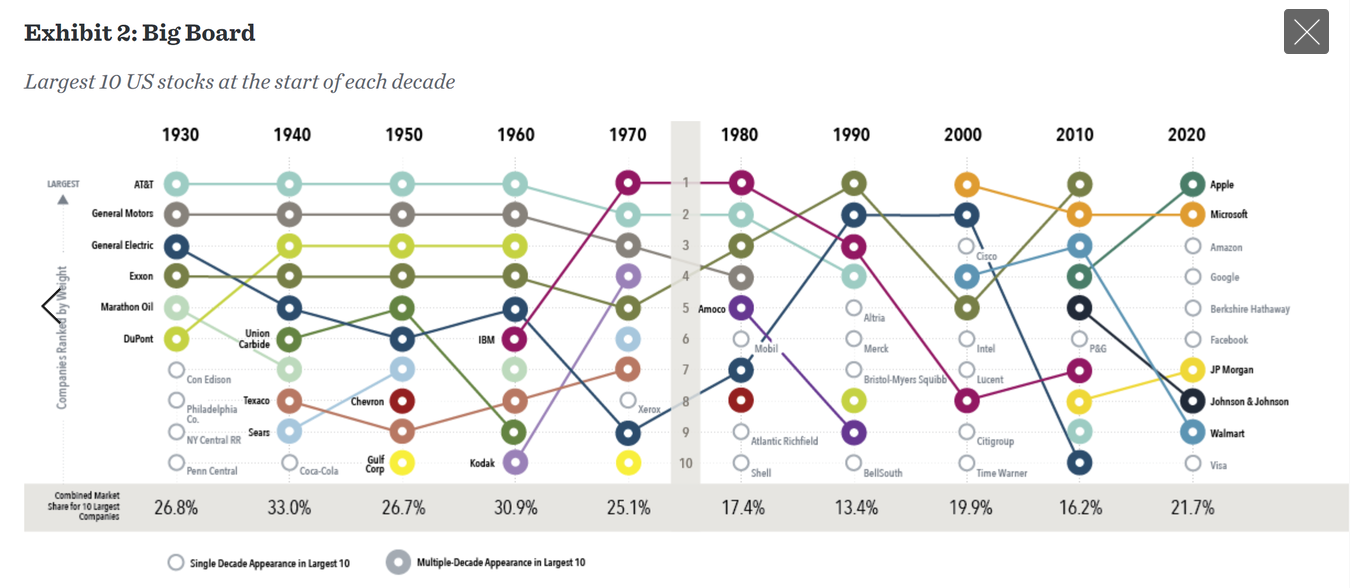
10. 10 Largest Stocks By Decade
Concentration among the 10 biggest stocks has ranged from 13% in 1990 to 33% in 1940. We are smack-dab in the middle of that range today. It’s interesting to visualize how the market shifts under our feet – which is good! New leaders emerge through the business cycle and old ones transform or even die.
In general, tech stocks are usually near the pole positions among the biggest US firms. From AT&T during the middle of the 20th century, then to IBM (NYSE:IBM), now the FAANGM stock of the day tops the list. Major kudos to Exxon (NYSE:XOM) for bucking the tech dominance, but now even Tesla (NASDAQ:TSLA) is bigger than XOM. The tech trend has helped the US market dominate the rest of the world since the Information Technology sector is such a huge weight domestically versus the global markets.
Bottom line: The market is always moving and shaking. Concentration has occasionally been much higher when looking through history than what it is today – though tech stocks dominate the mix now. What’s fascinating is that you don’t have to look back very far to find an era during which today’s dominant firms did not even exist. Who knows what the makeup of the US business landscape will be in 20 years.
So where does all this leave us?
1. Recent performance & some historical perspectives.
It’s been a whippy market over the last few years as large stock market advances were hit by two sharp downturns that were concluded in just a matter of weeks. The nearly 20% pullback in late 2018 and the fast bear market of 2020 (which may or may not be over) were followed by very strong up-moves. Q2 2020 returned a tidy 20% for the S&P 500. More near-term, June featured relative strength among some niches that had been underperformers year-to-date like emerging market stocks and even USA small caps, while energy equities lagged and US high yield debt was down fractionally. For the year though, US bonds have performed quite well while the S&P 500 is slightly in the red. Ryan Detrick of LPL Financial (NASDAQ:LPLA) put Q2 2020 into historical perspective – the data suggests strong quarterly returns beget further stock market gains. The bulls have a lot to live up to versus history. Finally, a key intramarket chart right now is financials versus the S&P 500 – we are once again testing the lows here. Another leg lower likely means more glory for the FAANGM stocks and more cruddy returns for the value style.
2. Expected returns.
A major market rally from March 23 through June 30 means forward returns are not nearly as attractive as we projected at end of Q1. In fact, we anticipate US equities to offer negative total returns after inflation during the next 5-10 years. Where should investors look to invest? Some overseas markets even other niches – we offer extensive research in these areas. The Rest of World index looks attractive from a valuation point of view as well as from a long-term technical trend perspective. USA vs. RoW relative outperformances comes and goes in 10-15 year cycles – we are now in that window for a potential reversal in favor of international equities.
3. The largest stocks through time.
Those looking to really cast doubt on the US stock market’s valuation will often dish out a chart of the concentration among the top five or ten biggest stocks by market cap compared to the rest of the US market. Spoiler alert – it’s always been seemingly very concentrated. In fact, the concentration was much greater during the first half of the 20th century, through the 1960s – a time when the US stock market often performed quite well. We could get really into the weeds and pull some The Herfindahl-Hirschman Index data, but we’ll spare you. Finally, the market is always changing though – it’s not a bad or scary thing. The business cycle fosters new winners over time.
Summary
The first half of 2020 was eventful. We had a 35.4% drawdown, then finished H1 with just a 4% decline on the S&P 500. Under the surface though, some areas of the market got totally wrecked. Small cap value stocks were still down more than 20% year-to-date despite the major advance off the March 23 low. Bonds have worked well – particularly US Treasuries as rates have moved lower. We now look ahead to the back-half of the year with significant policy and health uncertainty ahead of an election. More volatility is likely on the way, and the market will have to grapple with major changes rather quickly.
