Those that follow my personal account on Twitter will be familiar with my weekly S&P 500 #ChartStorm in which I pick out 10 charts on the S&P 500 to tweet. Typically I'll pick a couple of themes and hammer them home with the charts, but sometimes it's just a selection of charts that will add to your perspective and help inform your own view - whether its bearish, bullish, or something else!
The purpose of this note is to add some extra context beyond the 140 characters of Twitter. It's worth noting that the aim of the #ChartStorm isn't necessarily to arrive at a certain view but to highlight charts and themes worth paying attention to.
So here's the another S&P 500 #ChartStorm write-up!
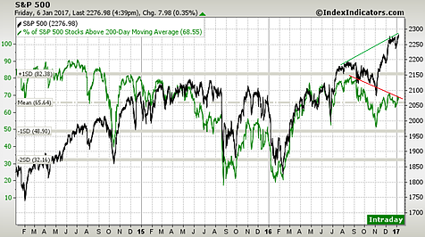
1. 200-day Moving Average Breadth: First up is a check-in on the market's level and breadth. Last week brought another new all-time high for the S&P 500, but what it didn't bring was a new high on market breadth. 200day moving average breadth (% of stocks in the index trading above their respective 200 day moving averages) has been making lower highs and lower lows against the index's higher highs and higher lows. We call this bearish divergence and it can be a warning sign of a correction. Bearish divergences can and do resolve without a major correction, but it is certainly a risk flag to keep in mind.
Bottom line: The S&P 500 is seeing bearish divergence on 200 day moving average breadth.
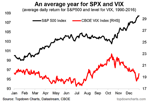
2. Seasonality Map: This is your seasonality map for 2017 for the S&P 500 and VIX. It shows the average daily change in the S&P 500 across the year over the period 1990-2016 and the average level by day of the VIX. On average, after a slightly choppy start to the year you see a compression in the VIX and a rally in the S&P 500 through much of the first half of the year, so if seasonality works, you'd have a slight bullish bias (but remember it can be choppy at the start of the year). The caveat of course is that seasonality can and does break down at times.
Bottom line: The opening months of the year can still be choppy before the H1 positive seasonality kicks in.
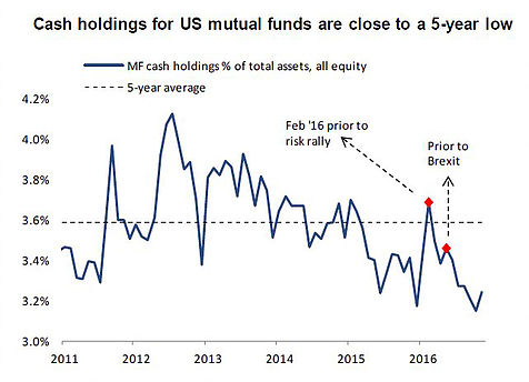
3. Mutual fund cash holdings: A number of factors influence mutual funds' holding of cash including liquidity management, interest rates, and of course the desire to add alpha by scaling up and down the cash level (higher in anticipation of a correction, lower to get maximum exposure in an up market). So when you see a chart showing the average cash holdings of US mutual funds dropping towards a 5-year low it makes you think the smart money is confident in the market. This may be well placed confidence, or a sign of an increasingly bullish or even overly bullish crowd - which can be a warning sign.
Bottom line: US mutual funds appear confident given lower than usual cash holdings.
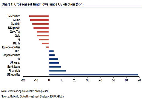
4. Cross-asset fund flows: The below chart shows fund flows across asset classes since the US election and the key standout is US equities - there has been a tidal wave of flows following the election of Donald Trump as President of the United States of America. A lot of this stems from anticipation of tax cuts, infrastructure spending, and a more business friendly government (e.g. so far Trump's team has the most business experience of any previous president's team) and improved regulatory environment. Time will tell whether these expectations are met, but the stakes are increasingly high for Trump to deliver, and confidence has been roused.
Bottom line: There has been a tidal wave of flows into US equities following the election of Trump.
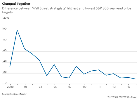
5. Wall Street strategists forecasts: I don't know many investors (hmm, not sure I know any actually) who rely on point-forecasts of stock indexes in their investment process, but still forecasting the market remains a popular pastime for Wall Street and a reliable talking point for the media. We should all know the folly of forecasting by now, and the overwhelming tendency for most, if not all, to get it wrong (and often spectacularly wrong), but the below chart is an interesting one. The chart from SentimenTrader posted in the Wall Street Journal shows the difference between the most optimistic and most pessimistic forecasts and interestingly enough the gap is the smallest on record—maybe these guys are spending too much time together! In any case, some will probably look at the chart and remark that 2007 was the last time it drove down to low levels, which was the peak of the previous cycle.
Bottom line: There is a record amount of "group think" in the 2017 round of Wall Street's market forecasts.
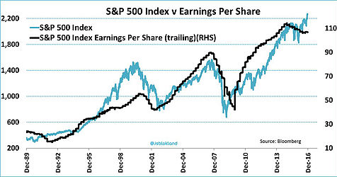
6. Price vs earnings: After a brief period of falling or at least sideways prices and falling earnings, there has been a surge in prices and what appears to be at least a stabilization in earnings. The chart shows the movement in the market and earnings across the past couple of decades. It's also a good reminder that we have actually just been through an earnings recession - but more on that in number 8.
Bottom line: Price is on a tear but so far earnings are lagging behind.
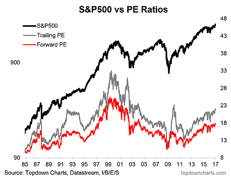
7. P/E ratios: A logical flow-on from the previous chart, the result of higher prices and constant earnings is of course a higher P/E ratio, and we've seen just that on the trailing P/E ratio. The forward P/E ratio however has not really moved that much from the range of the past couple of years. On both counts the P/E ratio is relatively high vs the last couple of decades and while P/E ratios are not great for market timing, particularly in the short term, it does show how expectations are high.
Bottom line: Increasingly lofty valuations for the S&P 500 indicate high expectations.
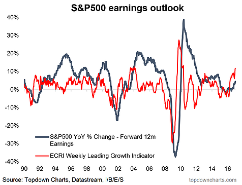
8. Earnings outlook: All these expectations about higher earnings could yet get met as the ECRI's Weekly Leading Indicator continues to tick higher. Historically an upturn in this indicator has been a good leading indicator of a turnaround in earnings momentum, and we've started to see this coming through. So it would be reasonable to expect improving earnings. An improving economy more broadly is a key reason (e.g. the PMIs turning up from the lows), and a rebound in commodity prices will be supportive for the energy and materials sectors. Likewise higher bond yields are a boon for financials. The US dollar will pose some risk if it really surges from here, but other than that the earnings outlook seems fine.
Bottom line: A turnaround in US economic indicators has coincided with improving earnings momentum, thus high expectations for future earnings could yet get met.
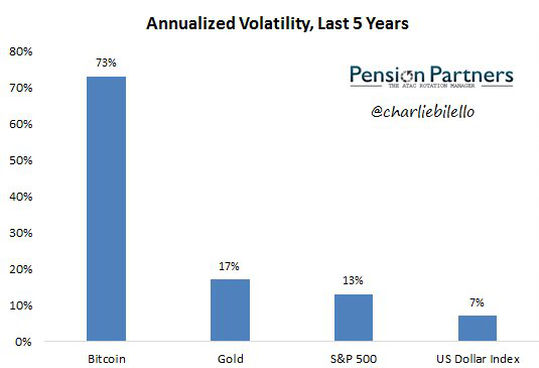
9. Historical volatility: And now for something completely different... the below chart shows annualized volatility for the last 5-years for a couple of key assets. It should be no surprise that Bitcoin is the most volatile - next in line (far behind) is the old shiny rock itself, gold—supposably a safe asset, it has proven to be more volatile than equities (and in hindsight quite destructive to portfolios). More of an interesting passing observation than anything else.
Bottom line: The S&P 500 has been much less volatile than Bitcoin and even less volatile than gold.
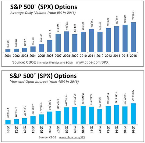
10. Keep your options open: 2016 was an all time record high for options trading on the S&P 500. It's somewhat unsurprising as options are valuable instruments for altering the payoff profile of portfolios in terms of hedging risk and obtaining exposure. Indeed, it may well be that much of the rise in options trading of recent years reflects increasing use of tail risk hedging - something that has become popular since the 2008 financial crisis.
Bottom line: Options trading on the S&P 500 hit a new all time high in 2016.
So where does all this leave us?
This week there's probably 2 categories of interest:
1. Bullish
The ones arguably fitting into the bullish camp would be the earnings outlook chart which points to improving earnings. The seasonality chart shows a generally bullish patch drawing near. While some of the charts like the flows and cash holdings could be interpreted as strong confidence and optimism - this mood can feed on itself; recall, Keynes' "animal spirits".
2. Bearish
On the bearish side is clearly chart number 1 which shows a warning sign in the form of bearish breadth divergence. Likewise, the seasonality chart actually shows the start of the year can be a choppy period. Taking the other side of the coin on those flows and cash level charts, you could argue there is growing bullishness and expensive valuations—which are conditions often found close to a market top.
Summary
Overall, we're left with a mix of charts which evoke bullish and bearish thoughts. The simplest way to reconcile it is that we could easily see a correction early this year before the market heads higher in Q2 (on seasonality and a likely improvement in earnings). Just one potential scenario of many, but one that seems to make sense on the charts in this edition of the weekly S&P 500 #ChartStorm, and certainly something for investors to think about.
