
Summary- The corporate bond market is performing very well; there are no signs of financial stress.
- The corporate bond market has risen with the broader increase in Treasury yields.
- The GDI numbers also point to a solid pace of economic growth.
The purpose of the Turning Points newsletter is to analyze the long-leading, leading, and coincidental indicators to determine if the economy has changed from a position of expansion to contraction; i.e. a "Turning Point".
Next week, a slew of key data is released: retail sales, industrial production, and housing permits. So today, I want to look at corporate spreads and gross domestic income data. The latter is discussed far too infrequently in the financial press, which I hope to remedy modestly today.
Leading Indicators: corporate rates

Higher rated credits (the Aaa on the left and Baa on the right) are very tight relative to the 10-year Treasury. In fact, both are near lows of the last five years. The Aaa/10-year spread tightened sharply over the latter half of 2017, falling 60 basis points on an absolute basis. The Baa/10-year spread came in nearly as much (notice the different scale on the left side of the chart).
This is occurring as absolute corporate yields have been rising with the increase in the Treasury markets:

The 1-3 year (upper left), 3-5 year (upper right), 5-7 year (lower left), and 7-10 year (lower right) sections of the corporate market have all risen recently, all by at least 100 basis points. That's a very sharp increase. Regardless, this tightness in corporate spreads (see the first two charts in the article) indicates that traders are bidding up the corporate market at a faster rate than the rise in the 10-year yields.
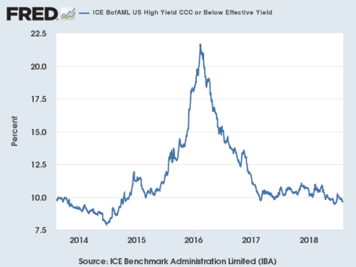
Junk bonds (CCC) are actually near some of their lowest rates since the oil market collapse blew out yields starting in mid-2015.
Conclusion: There is nothing in the corporate market indicating we should expect any type of contraction in the next 6-12 months.
Coincidental Indicators
As I noted above, today's column will focus on national income amounts. Conceptually, these show how much various economic actors are paid, which is a good indicator of how much they can spend on transactions.
Let's start with total national income:
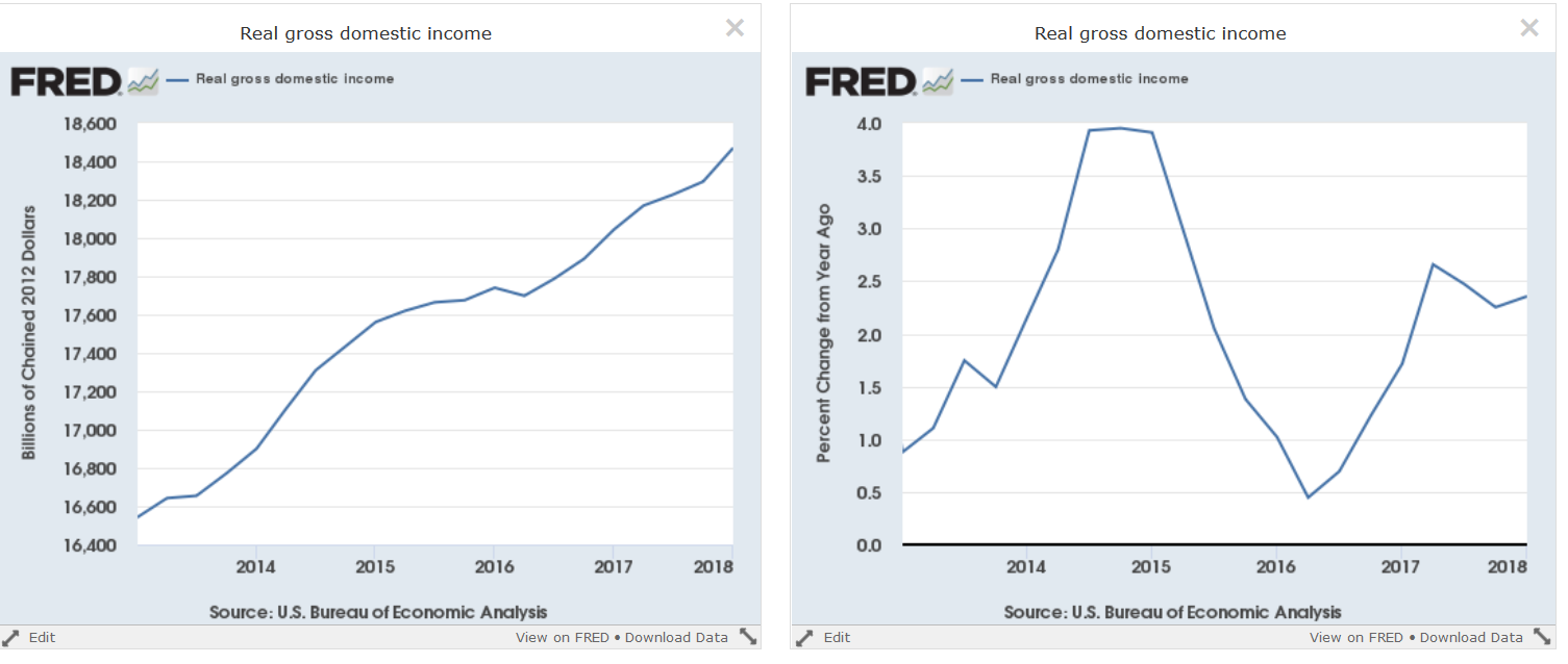
Total real gross domestic income is the flip side of gross domestic product. These are the funds that various entities use to make purchases. This is the total macro number. The left chart shows the real (inflation-adjusted) level while the right figure shows the Y/Y percentage change in that number. For the last few quarters, total real income has increased right around 2.5% Y/Y.
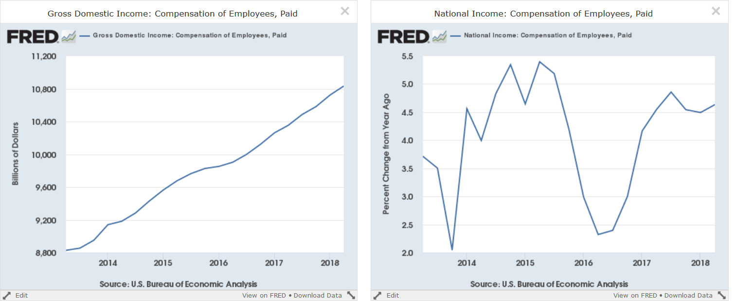
Personal income is by far the largest component of real gross domestic income. The left chart shows that this figure has continually increased over the last five years. The right chart shows that the Y/Y growth rate was right around 4.5% over the last four quarters.
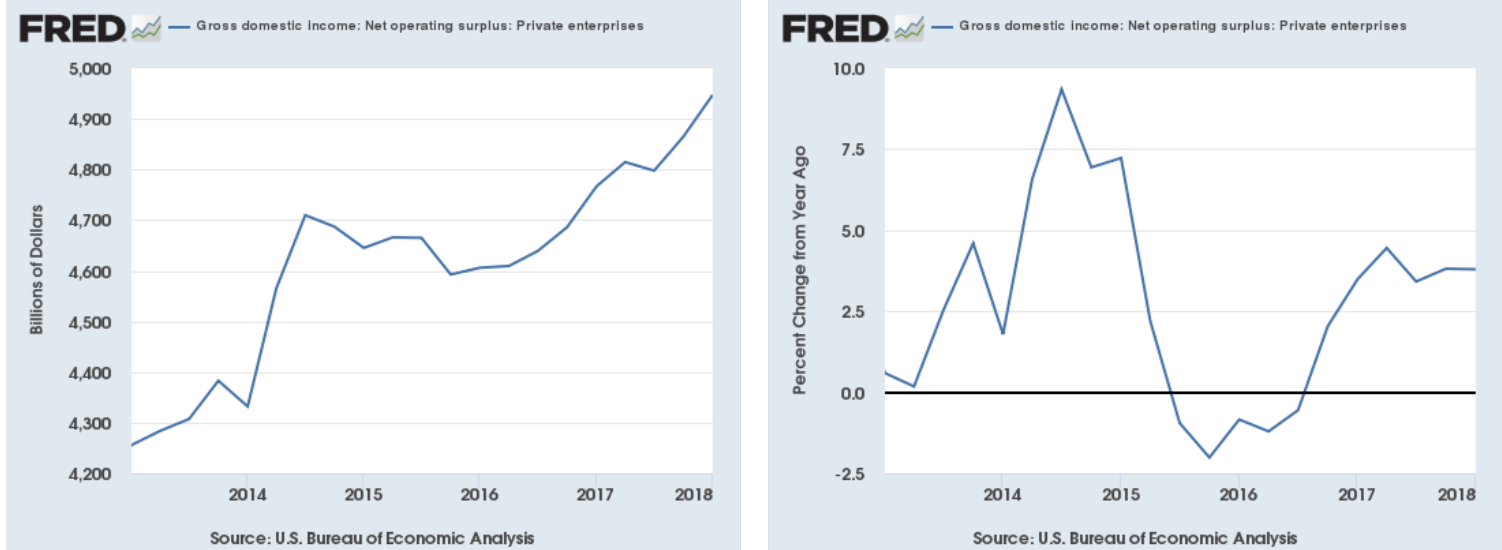
Private enterprise income is basically income for entrepreneurs. This figure has had a more difficult path; it actually trended slightly lower from mid-2014 to early 2016 when it started to rise again. The Y/Y figure contracted in mid-2015-mid-2016 as a result. It has since risen to stronger Y/Y numbers.
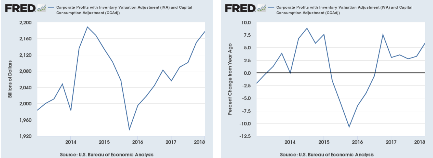
Finally, we have corporate profits, which decreased from mid-2014 to late-2015 due to the oil market collapse. But profits have been rising since. The right chart shows a strong Y/Y growth rate over the last six quarters.
The GDI numbers are growing strongly and show that the economy is in good shape.
Disclosure: I/we have no positions in any stocks mentioned, and no plans to initiate any positions within the next 72 hours.
I wrote this article myself, and it expresses my own opinions. I am not receiving compensation for it (other than from Seeking Alpha). I have no business relationship with any company whose stock is mentioned in this article.