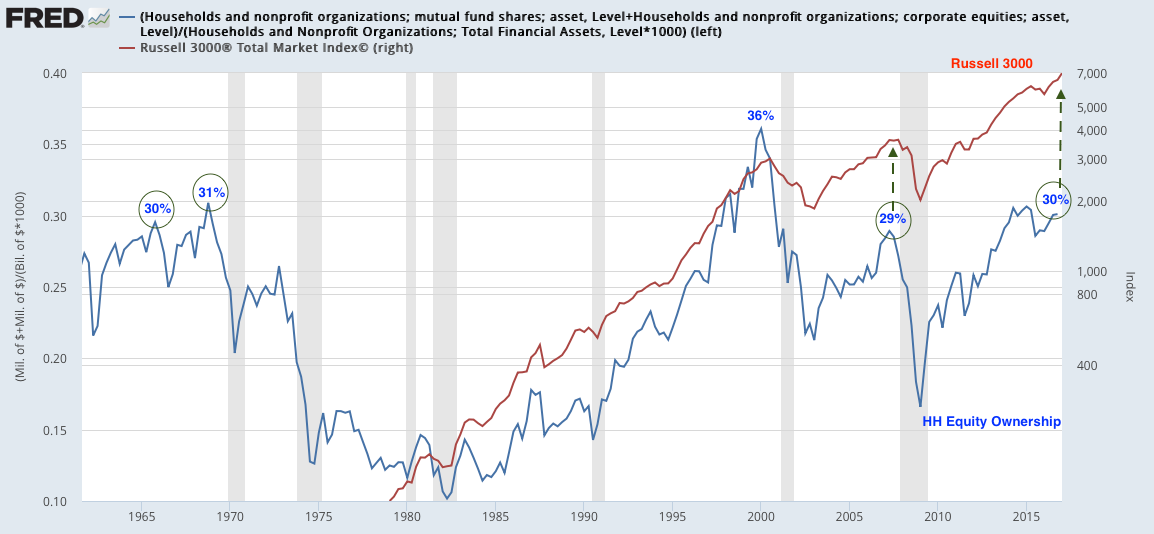
Summary: Households have 30% of their financial assets in equities, the same proportion as they held at bull market peaks in the 1960s and in 2007. Does this mean another bear market is imminent? No. Two of the last three times the purportedly significant 30% level has been reached, stocks gained another 40-60%. The level is statistical noise.
Households' equity ownership proportion mostly reflects the appreciation in the stock market: their equity proportion fell almost in half in the last bear market yet during this time, investors actually added new money to equity funds. The level of households' assets in equities seems to closely predict high and lows in the stock market because they both measure the exact same thing: the level of the stock market.
There are better ways to measure investor sentiment and valuations, both of which, like the equity proportion, rise during bull markets and fall during bear markets.
Chances are you have seen a chart like the one below. It shows US households' equity ownership as a proportion of total household financial assets (blue line) versus the stock market (red line). The message is usually this: US households now own more equity than at the stock market peak in 2007. It's a sign that another bear market is imminent.
Is it a sign the bull market is at an end? The short answer is no.
It's true that households' "equity proportion" of their financial assets equalled 29% in June 2007 and that it is now 30%. It's also true that bull market peaks in both early 1966 and late 1968 corresponded to the equity proportion reaching 30% and 31%, respectively. Aside from the 1998-2000 tech bubble blow off top, that 30% area has seemed to be where bull markets have died.
But there are two problems with this line of thinking.
The first is empirical. In the past 50 years, the equity proportion has reached this level only 5 times. It was a bull market peak three times (1966, 1968 and 2007) and it was nothing two times (1998 and 2013). A small sample size with a success rate close to a coin toss is statistical noise.
The 29% equity proportion level was reached in late 1997; between 1998 and 2000, SPX gained another 60% (total return basis). The 29% equity proportion was also reached in December 2013. Since then, SPX has gained another 40%. Foregoing an equity return of 40-60% in order to avoid a loss of 22-36% (1966 and 1968 bear markets, respectively) makes this measure of risk even less useful.
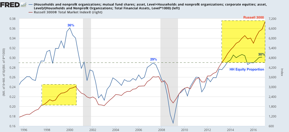
Moreover, two of the biggest bear markets in the past 50 years started when the equity proportion was well below 29%. In late 1973, the equity proportion was only 23%; SPX fell almost 50% in the next 11 months. The 1987 crash occurred when the equity proportion was just 18%.
So to summarize, bear markets have started when the equity proportion was much lower than now and strong bull markets have continued much higher over a period of years from the current level. This makes this measurement effectively useless at predicting turns in the stock market.
The second, and bigger, problem with the equity proportion is that it doesn't represent what its proponents believe it represents. The explicit interpretation of this chart is that investors' appetite for stocks is saturated when their equity ownership reaches 30% of their total financial assets. With no fuel left to propel the market higher, investors then sell stock into a bear market. And when their equity ownership reaches an exhaustive low, equities bottom and then begin a new bull market.
To believe this rationale, you have to believe that investors are highly rational and have impeccable market timing. You would have to believe that at tops, investors immediately start to reduce their shareholdings; and at bottoms, they immediately start to re-accumulate shares. These curves fit so tightly together, buying and selling correspond almost perfectly with the indices' movements up and down.
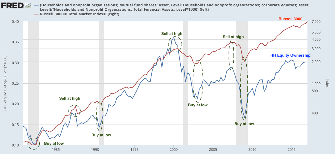
But all available research shows the opposite to be true, that the average investor has terrible market timing, buying too much near tops and refusing to buy near bottoms. This is the main reason why the average investor so dramatically underperforms the indices over time (data from Black Rock).
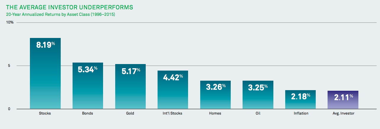
So why do these curves seem to follow each other so closely? Because they are both measuring the same thing.
Households' equity ownership is a function of the market value of their holdings plus their net purchases. As the indices rise, so does the value of their equity ownership. As markets plummet, so does the value of households' equity ownership. The chart below compares the value of their equity holdings (which is the numerator in the "equity proportion"; blue line) to the Russell 3000 (red line). It's nearly a perfect match because these two curves are measuring the same thing: the value of the stock market.

If the value of households' equity ownership were mostly driven by buying and selling stocks, then we should have seen massive selling of equity mutual funds and ETFs from late 2007 to early 2009. We didn't.
Between September 2007 (SPX peaked in October 2007) and February 2009 (SPX bottomed in March 2009), investors actually added $35b in new money to equity funds. During those 17 months, more months had inflows (9) than outflows (8).
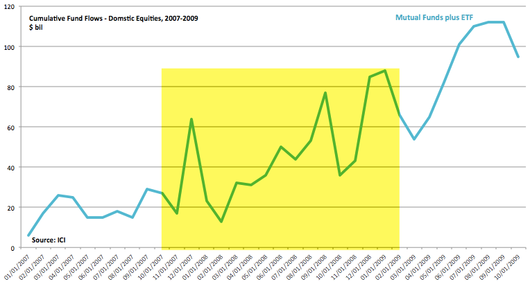
During this period, money continued to flow into index mutual funds and ETFs. Actively managed mutual funds lost funds, but the total amount added to equity funds rose (data from ICI).
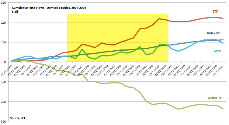
This is significant. The theory is that investors are too exuberant when the equity proportion reaches 30%, that they have effectively used up all of their risk appetite and thus the fuel needed to propel the market higher. But that is clearly not the case. Investors continued to add to equity funds even after the 30% level had been reached. The proportion only fell because the value of their existing holdings fell.
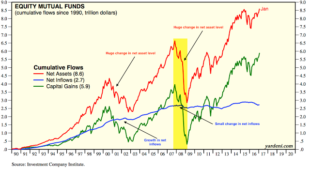
The importance of the stock market itself in determining the value of households' equity ownership (net assets) is apparent in the next two charts. On a net basis, investors added new money to funds but the net asset value plummeted as the bear market unfolded. Net assets have since rebounded much more strongly than fund inflows would imply (data from Yardeni).
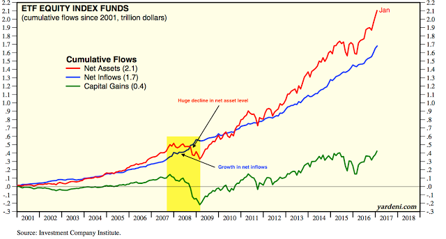
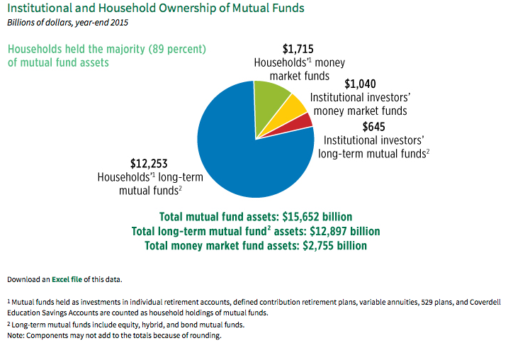
It's true that (1) more than just households buy these equity funds and (2) households also own individual stocks, not just funds. But the importance of these funds is clear. Households own 89% of total mutual fund assets. While ETFs are growing rapidly, mutual fund assets were still about 85% of total fund assets in 2015 (data from ICI).
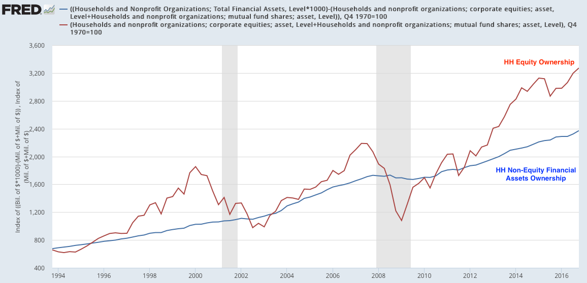
Households' equity proportion of their financial assets oscillates up in bull markets and then down in bear markets almost exclusively due to the value of their equities, driven overwhelmingly by the value of the indices themselves. Households' other financial assets (primarily fixed income and cash equivalents, which form the denominator in the "equity proportion") have risen fairly steadily over time (blue line). This causes the equity proportion to rise over 30% and then fall under 15%.
None of this is to say that investors today are not bullish or that stock valuations are not high. There is good data to support both of these conclusions. There is also good reason to suspect that longer term equity returns are lower when equity valuations and sentiment are high (read our take on this here).
The equity proportion of households' financial assets adds little to this: it's measuring the same thing as the appreciation of the stock market itself. You would expect the equity proportion to be high after an 8-year bull market and low after a bear market. That equity bull markets in the past 50-years have historically ended when the equity proportion was 18%, 23%, 30% and 36% - and that equities have gained another 40-60% after the purportedly significant 30% level has been reached - tells you how little value this measure adds.
A final point: it might seem strange that equity fund flows can be positive during a bear market. But we have seen something like this throughout the past decade.
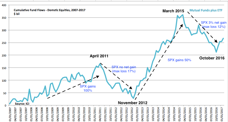
Since 2009, the best equity market performance has taken place when fund flows are strongly positive. That can be seen in the chart below: strong inflows in 2009-11 and 2013-14 coincided with gains of 100% and 50% in SPX, respectively.
Fund outflows between April 2011 and November 2012 coincided with the indices producing no net gains and suffering a near bear market in August 2011. The same happened between March 2015 and October 2016: almost no net gains and several large drawdowns of more than 10%. The strong rally in the SPX since the election coincides with $65b in net inflows (data from ICI).
