Throughout the big rally investors have been bombarded for reasons not to join in. It is very profitable to play upon fears. You then sell page views and advertising, conferences, gold, annuities, or fancy structured products.
I have taken a much less popular path – trying to educate investors. Even though the issues at hand are the most important, much more significant that individual stock selection, it is not “actionable investor advice.”
I disagree! Investors should act, and they should fight fear.
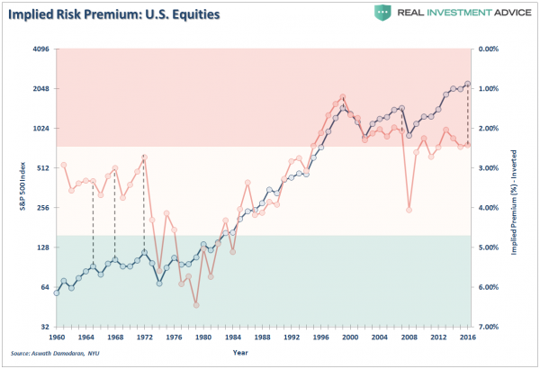
As an example, one of many I see each week, let’s take a look at this chart:

Let us start with a few simple questions:
- What is the red line? Presumably the blue line is the S&P 500, although the chart does not have a legend. It is apparently some measure of equity risk premium, but there is no description of how it is calculated.
- What is the meaning of the gap between the lines, highlighted by the dotted lines? Is a big gap bad? A warning? That is clearly the message of the article.
- Aswath Damodaran, NYU professor and valuation authority, is cited as the source. Does this chart actually appear in his work, or did the author massage it? What is Professor Damodaran’s current viewpoint on market valuation?
These questions should have been answered in the article. The article, warning about the market, is using the technical term “equity risk premium” to frighten people.
Conclusion
I will do the best I can with the incomplete information in the post.
The last time the gap was this wide was in 2008-09, the best time in decades to buy stocks. Why is it now bad news?
It is definitely NOT Prof. Damodaran’s conclusion. Concerning Prof Shiller, he writes:
Of all of his creations, I find CAPE to be not only the least compelling but also potentially the most dangerous, in terms of how often it can lead investors astray. So, at the risk of angering those of you who are CAPE followers, here is my case against putting too much faith in this measure, with much of it representing updates of my post from two years ago.
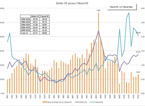
He also provides his own version of our subject chart, described by Alex Barrow.
The following chart is from NYU finance professor Aswath Damodaran. In this, he charts the P/E of bonds (blue line), the Shiller P/E for stocks (purple line) and the ratio or spread between the two (orange bars). The lower the orange bars, the greater the risk-premium spread between bonds and stocks meaning the more attractive (cheap) stocks are relative to bonds or cash.

If you think of the orange bars as the equivalent of the dotted lines in the original chart, you will see that they are the same. This chart, of course, has a legend explaining each of the lines and bars. The interpretation – high equity risk premium makes stocks more attractive – is clearly stated.
This is a disturbing example of how writers “on a mission” see whatever they want in charts, provide only partial information, and prey upon the unsuspecting. The original article is from a very popular source and is republished widely.
