Those that follow my personal account on Twitter and StockTwits will be familiar with my weekly S&P 500 #ChartStorm in which I pick out 10 charts on the S&P 500 to tweet. Typically I’ll pick a couple of themes and hammer them home with the charts, but sometimes it’s just a selection of charts that will add to your perspective and help inform your own view – whether its bearish, bullish, or something else!
The purpose of this note is to add some extra context beyond the 140 characters of Twitter. It’s worth noting that the aim of the #ChartStorm isn’t necessarily to arrive at a certain view but to highlight charts and themes worth paying attention to.
So here’s the another S&P 500 #ChartStorm write-up
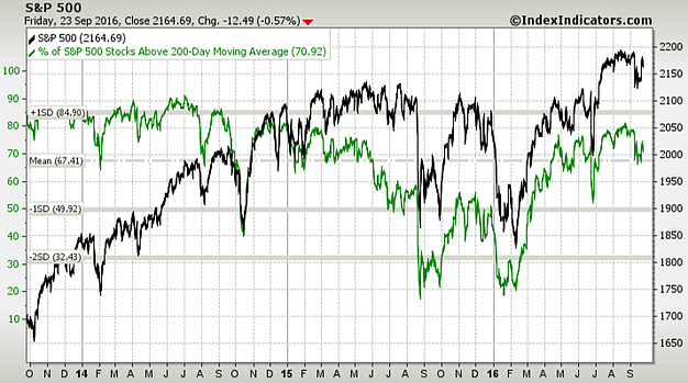
1. 200 day moving average breadth: With 70.92% of S&P500 companies trading above their 200 day moving average one synopsis of the market is that the majority of issues are still in an uptrend, despite the brief period of indigestion. At the worst point it barely moved the dial on this indicator. Also worth noting is that there has been a series of higher lows (ignoring the Brexit blip), so overall positive signs from this one, no signs of bearish divergence, and scope for further upside.
Bottom line: Most of the market remains in an uptrend.
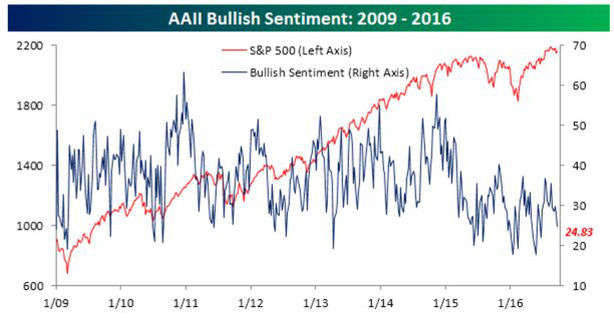
2. AAII bullish sentiment: AAII bullish sentiment remains relatively low, basically around the bottom end of the range. Thus again, there is plenty of scope for this one to move higher. Also, the typical pattern on the chart is that when the below happens, you’re usually at a short-term market bottom, and it sure seems that way so far.
Bottom line: AAII bullish sentiment implies scope for further upside.
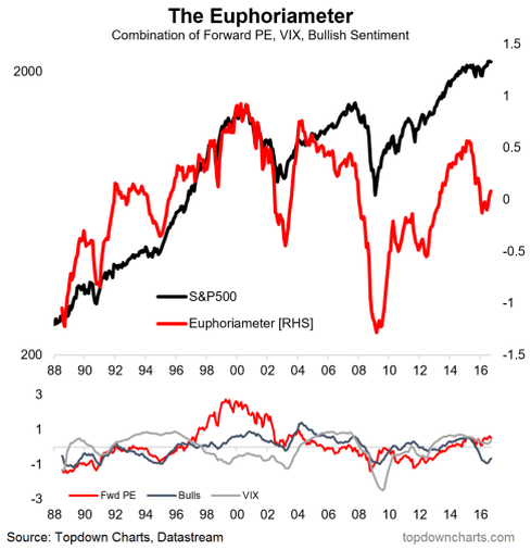
3. The Euphoriameter: This indicator combines the forward PE ratio, VIX, and bullish sentiment to provide a gauge of how euphoric or otherwise the market is. At the moment the indicator has gone from Euphoric back down to fairly neutral or depressed levels following the mini-bear-market of 2015/16. This will be an indicator to watch as the market heads higher…
Bottom line: The market is not euphoric.
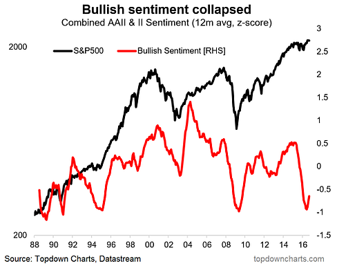
4. Bullish sentiment: This one is actually a component of the previous chart; a longer term view of bullish sentiment (combined AAII & II, 12-month smoothing). What’s remarkable is the collapse in bullish sentiment that was triggered by the mini-bear-market of 2015/16. This is not the type of move you see at a top, it is the type of move you see at a major market bottom.
Bottom line: Bullish sentiment collapsed like it did at previous major market bottoms.
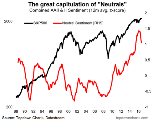
5. Neutral sentiment: Following on from the previous graph, the same methodology applied to neutral sentiment shows a veritable bull market or even a bubble in neutral sentiment. More importantly it shows the beginning of what looks like a great capitulation of the neutrals. Again this is another element that suggests the bull market probably will go on. But then again, the market outlook will be quite different depending where the neutrals migrate to (bulls vs bears). The historical pattern is when you have a capitulation of neutrals it’s usually a bullish continuation or the start of a new bull market.
Bottom line: The bubble in neutral sentiment is bursting, and that might be a good thing.
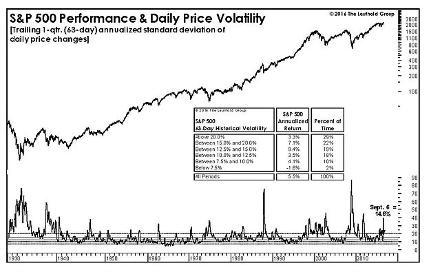
6. Volatility: This chart from The Leuthold Group shows an alternative view of volatility (trailing 63-day annualized standard deviation of daily price change). By this measure volatility is certainly not low, and when volatility rises this much, historically it has been a good sign for short-term forward returns.
Bottom line: Volatility is not low, this can be a good thing.
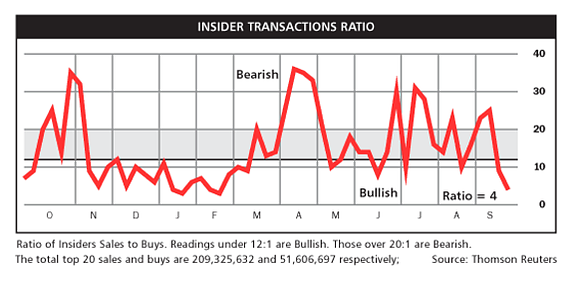
7. Insider transactions ratio: This indicator from Barron’s shows the ratio of buy vs sell transactions by corporate insiders. The rule of thumb is when the indicator is low (more buying vs selling) the message is bullish as insiders are usually more informed about their company and thus are more likely to buy the dip or buy when they perceive mispricing. Likewise when they are selling more than usual it’s usually a short-term top. At the moment this indicator is the bullish it’s been since around the global market low in February.
Bottom line: The insider transactions ratio is sending bullish signals at the moment.
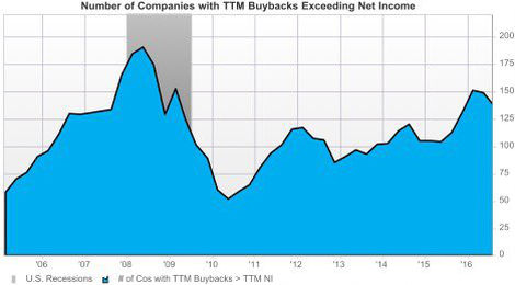
8. Buybacks vs earnings: This chart shows the number of companies with buybacks exceeding earnings – what’s notable is the steady rise, back towards pre-GFC levels. To my mind this reflects the low interest rate environment as shareholders force company directors and management to return more cash to yield hungry investors rather than into growing the business through capex of acquisitions. Ultimately this is unsustainable, and either a surge in growth or a recession will put an end to this trend.
Bottom line: There are as many companies with buybacks exceeding earnings as there was in the pre-GFC period.
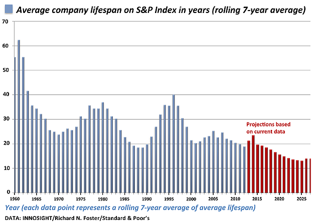
9. S&P500 average company lifespan on the S&P500 index: One of those interesting longer term trend charts, this one tracks the average lifespan of S&P500 companies which has gone from over 60 years to less than 20 years now. A number of forces are likely driving this such as technology and disruption, mergers and acquisitions, and cyclically recessions also make a dent in it. While this trend could be nearing its natural limits, the theme of disruption and creative destruction is here to stay.
Bottom line: The average lifespan of S&P500 companies has fallen dramatically.
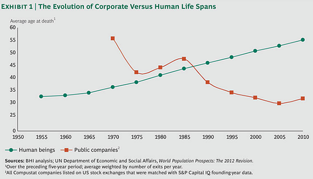
10. Corporate vs human lifespans: A follow on from the previous graph, this one compares the average lifespan of public companies to that of human beings. This is another good example of technology and progress in action. It perhaps calls into question the idea of buying and holding individual names, but other than that is certainly an intriguing trend.
Bottom line: Corporate lifespans have decline while human lifespans have increased.
So where does all this leave us?
There’s probably 3 main themes that came out of this week’s charts:
1. Market upside
The majority of the charts in this week’s edition point to scope for further upside. Longer term breadth measures are positive and have room to move on the upside. Short-term sentiment measures are bullish (due to the lack of bullishness). While a couple of longer term measures of sentiment are putting in patterns consistent with either a major bullish continuation or a major market bottom – the start of a bull market phase rather than the end. While these are just one lens on the market it does make you think about the potential upside that could come, and provides a series of important indicators to monitor if that upside does come through.
2. Creative destruction
The final two charts (of average lifespan of companies on the S&P500 index and overall average lifespans of public companies) spoke to the notion of creative destruction, technology and disruption. It seems as if the pace of disruption is proceeding at a faster rate. While this has important implications for individual names and sectors, it’s also important at a macro/index level as over time the composition and drivers will too likely also change. It also speaks to short-termism, and in a way justifies a degree of short-termism a if the average company lifespan is lower it means in order to achieve the same returns it would need to grow faster and produce more shareholder value in a more limited space of time.
Summary
This week’s ChartStorm, aside from highlighting a couple of interesting longer term trends around shrinking company lifespans, presented a number of charts pointing to short-term and medium term market upside. The longer term measures of sentiment suggest there could be some way to go before the next bear market rolls around.
