Inflection Point: An inflection point on a chart is an area where the price action can break either up or down. It’s an area of confusion that makes investors go nuts. You know a strong move is coming but you aren’t sure what direction the move will go.
I believe this is where the precious metals complex is right now. One can make a clear bullish or bearish case for the direction of the PM markets showing just a few chart patterns. In this report I want to look at the PM complex without any bias in mind, just using the charts with no additional fundamental reasons why the PM complex has to go either up or down.
Having an unbiased opinion in any market is hard. We are bombarded each and every day by countless scenarios that can play out. We may think we’re unbiased but the truth is it’s virtually impossible to have an unbiased opinion unless you live on a different planet. Just watching the news or talking to your neighbor can give you the impression that everything is just fine and dandy, or the world as we know it is coming to an end.
We tend to look for articles that match what we think is going to happen as the herd can’t be wrong. In a strong bull or bear market the herd can be right during an impulse move when everyone is on the same side validating your views. Then you get the correction or consolidation phase which then makes you question your original thesis.
Impulse moves are much easier to trade than a consolidation, topping or bottoming phase of any stock or stock market move. A stock can trade sideways, building out a consolidation pattern, topping pattern or bottoming pattern roughly 75% of the time while only trading in the sweet spot, or impulse move, 25% of the time. This is one reason why it’s so hard to hold on to profits that were made during the impulse move.
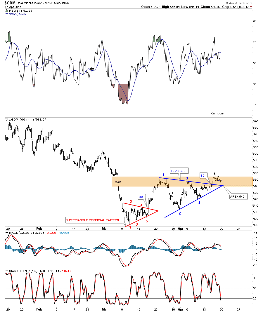
Let's start by looking at a 60-minute chart for the ARCA Gold Miners Index (GDM) that we’ve been following which shows a possible bullish, blue triangle consolidation pattern that has broken out to the upside, after completing four reversal points. The red 5 point triangle was a reversal pattern which was built at the March low that reversed the downtrend which had been in place since the first of the year. When just looking at this 60-minute chart it looks like a bullish setup is taking place.
What’s not to like about this chart below? As long as the apex of the blue triangle can hold support, the bulls will have their way. If it fails then the bears will be taking charge of the inflection point.
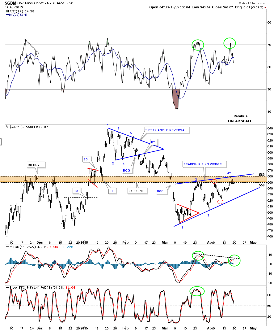
Below is another look at the price action since the March low which shows a possible blue bearish rising wedge developing that is still incomplete. The rising wedge won’t be complete until the bottom rail is touched, completing the fourth reversal point.
Keep in mind, we are trying to look into the future in an unbiased way. All options are open for debate. Some of you may remember the brown shaded support and resistance zone that has been playing its role since the November low in the PM complex. One reason why I think it’s possible that the rising wedge may be in play is because of the two red circles that show the failure of the price action to reach the top and bottom rails by an equal amount.
This is just speculation at this point, as a strong rally above the brown shaded S&R zone and the top rail of the possible blue rising wedge can blow this scenario out of the water in a heartbeat. The main thing is to be aware of the possible bearish rising wedge and follow the price action, which will give us clues as to how to proceed. Confirming the 4th reversal point is always the hardest thing to do because there is no confirmation until the actual breakout occurs.
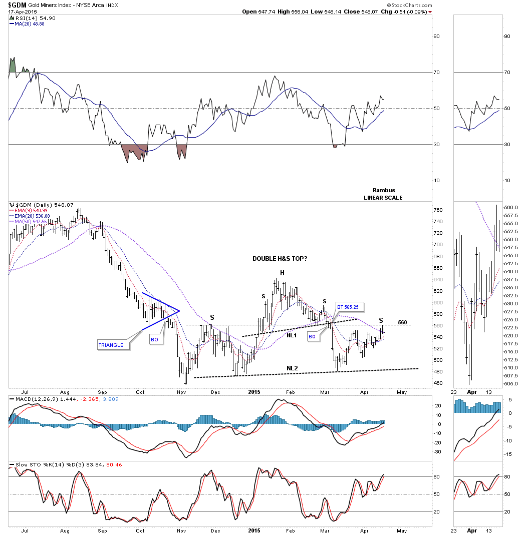
Some of you may begin to see a bigger chart pattern forming when you look at the chart above. If you’re seeing a possible H&S pattern forming, your hunch maybe right.
On the daily chart below, the possible H&S consolidation pattern is starting to look the part. The first thing you need to see happen, to even think about a H&S pattern, is the decline from the head. Normally the left shoulder high should hold support on the initial decline. If a H&S pattern is developing, then you’ll see support fail at the left shoulder high and the decline will end up going much lower, ending somewhere around the previous low. From that low you’ll see a counter-trend rally that builds out the right shoulder.
On the daily chart below, there is a smaller H&S too which I’ve labeled #1. The potential right shoulder high was formed after touching the horizontal line from the much bigger left shoulder high, at 560. Sometimes the angle of the neckline, added to the left shoulder high, may give you the high for the right shoulder which I call the neckline symmetry line.
Here a horizontal line may be showing us the high for the right shoulder at 560 or so. The 50 dma is also showing up at the possible right shoulder high of the bigger H&S, at #2. Again, a strong rally from this point would blow the double H&S pattern out of the water. The indicators are still showing a bullish setup taking place, the inflection point.
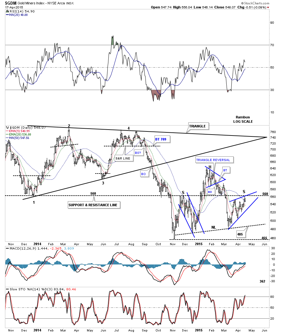
Next I would like to show a 19 month daily chart for GDM which shows the big black triangle consolidation that led to the last impulse move down. It lasted just about ten weeks or so before bottoming at the November low.
You can now see the potential H&S consolidation pattern is made up of three individual chart patterns. The left shoulder is a falling wedge, the head is a five point triangle reversal pattern and the right shoulder is our bearish rising wedge which we discussed on the 2-hour chart above.
The reason I’m calling this a potential H&S consolidation pattern is because it’s forming below the triangle consolidation pattern within the downtrend. Also note the black dashed horizontal support and resistance line that comes in at—you guessed it—560, that goes all the way back to the bottom made in December of 2013.
The blue rising wedge will give us the clues we need as to the next important move the GDM will make. If GDM can rally up strongly above the 560 area, the bulls will be in charge. On the other hand, if we see the bottom rail broken to the downside then the bears will be in charge.
Either way we’ll know something fairly soon as the rising wedge is contracting. It’s possible we may see a fifth and sixth reversal point within the blue rising wedge before it shows its hand. The bottom line is it has to show us sooner or later of its intentions. One last point on the chart below. IF the H&S consolidation pattern plays out and the GDM breaks down through the neckline, the minimum price objective would be around the 362 area.
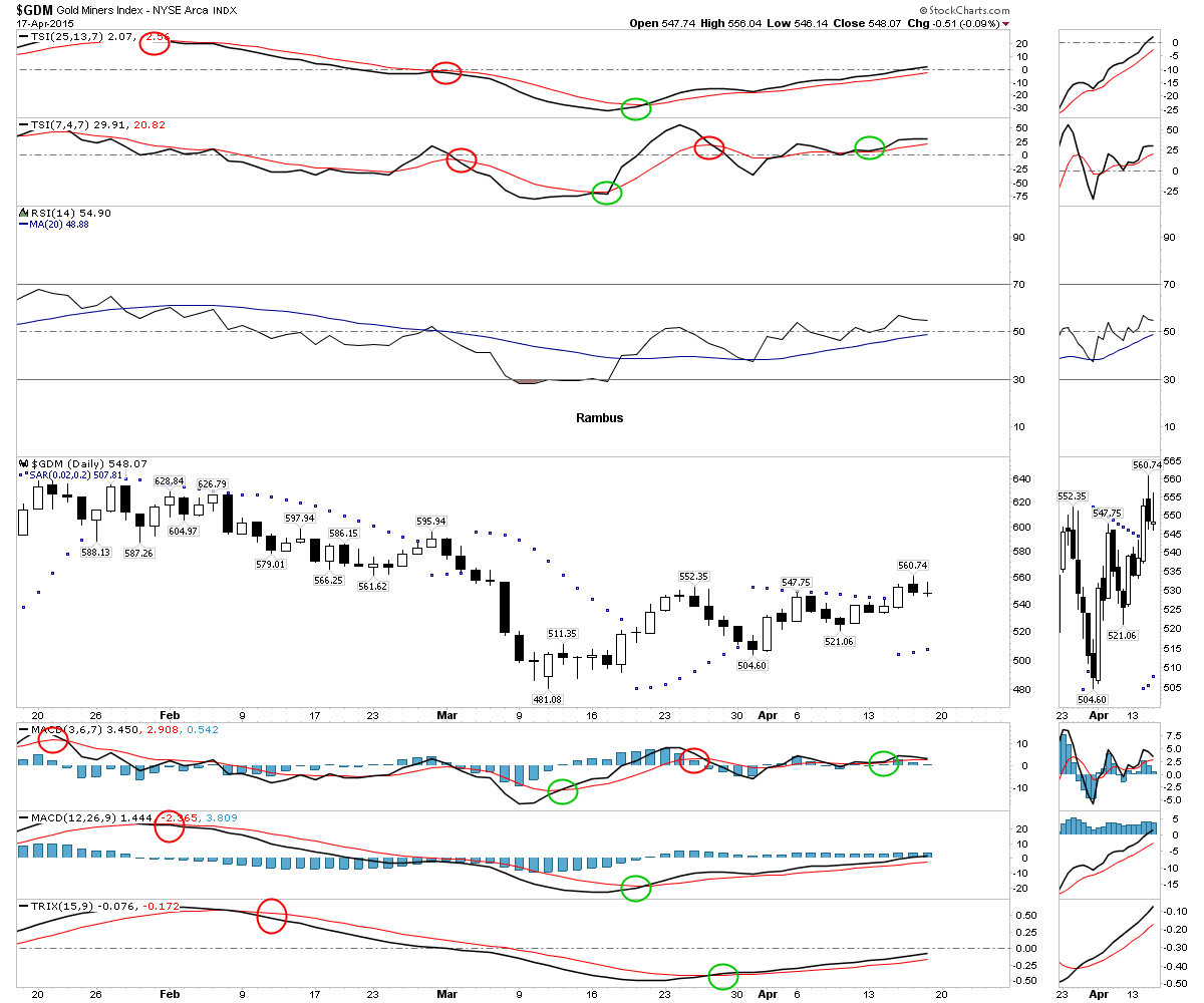
The four horsemen and the PSAR are strongly suggesting one should be long the GDM as all the indicators are bullish.
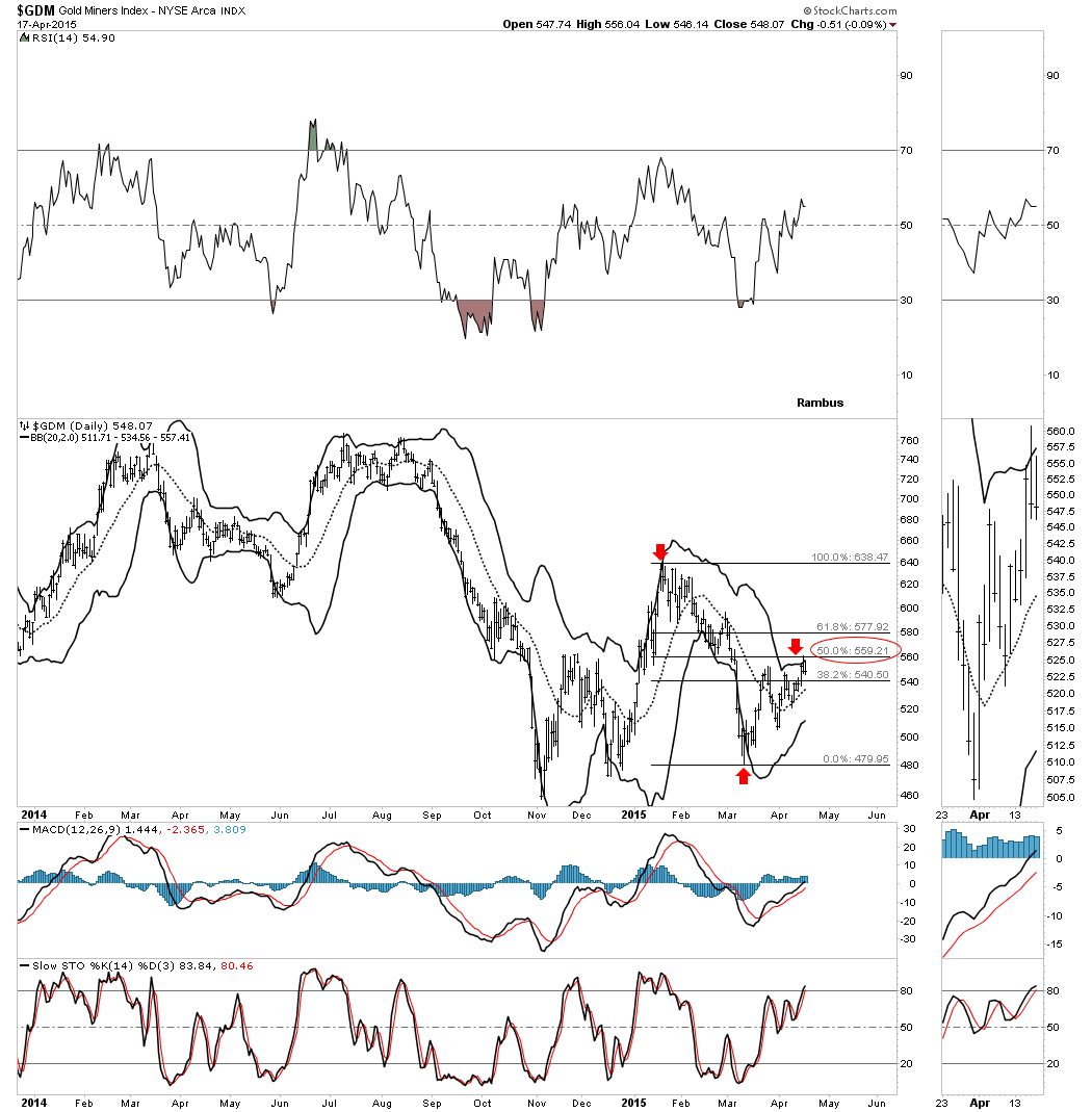
This next chart shows the GDM trading up to the top BB® which coincides with the 50% retracement of the latest decline, at the red arrows.
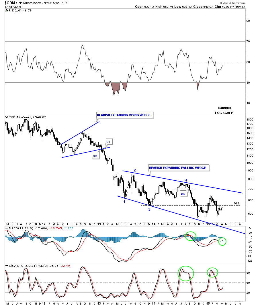
Looking at the four year weekly chart for the GDM there is still that 22 month, bearish, expanding falling wedge which is still in play.
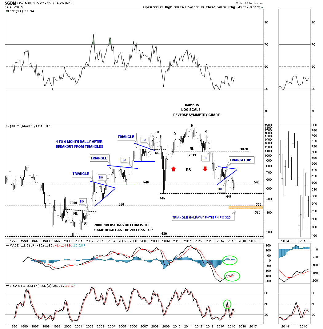
Let's look at one last chart for the GDM, a long term monthly look that shows almost all of the history for this PM stock index. First you can see the inverse H&S bottom that formed back in 2000 which launched the 10 year bull market. That bull market formed three beautiful, blue triangle consolidation patterns where the impulse moves lasted roughly 4 to 6 months once the breakout took place.
An interesting side note is that the 2000 inverse H&S bottom and the massive 2011 H&S top are almost exactly the same height. When the massive H&S top broke down below the neckline, the first place it found real support was at the bottom of the blue triangle that formed back in 2005. From that low, GDM built out the blue triangle and broke down to the 2008 crash low at 445 or so.
There is another price objective we can use, based on the breakout from the massive H&S top to the first reversal point in the blue triangle. Using the breakout-to-breakout method, we get a price objective down to the 320 area which is about 30 points lower than the bottom of the 2003 triangle at 350. If you recall, the H&S consolidation pattern on the daily chart that we looked at earlier had the price objective down to the 362 area. If this bear market is to continue, then whenever this next impulse move begins in earnest , we should expect a move down to the brown shaded area between 320 and 360 where we may see another consolidation pattern start to develop, or a bottom of some kind start building out.
If a potential bottom is in the cards, I could see the bottom of the blue triangle being the left shoulder. The head would be whereever this next decline ends. Then a rally back up above the bottom of the blue triangle towards the top rail or apex. Then one last decline back down to the bottom of the blue triangle area which would then be the bottom for the right shoulder.
Again, this is only speculation at this time, but most important bottoms take time to build out and most are of the inverse H&S or double bottom formation. You can see this on the chart below.
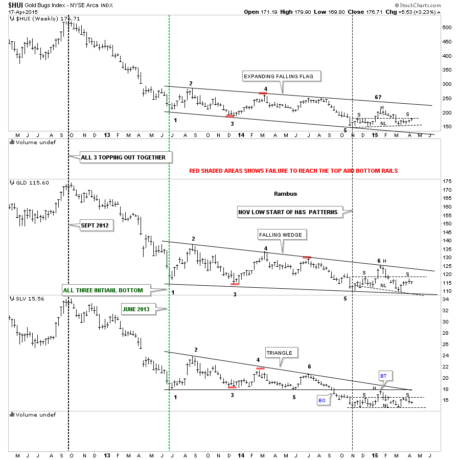
Next I would like to show a combo chart that has the Gold Bugs Index (HUI) on top, SPDR Gold Shares ETF (ARCA:GLD) in the middle and iShares Silver ETF (ARCA:SLV) on the bottom. This combo chart shows you how all three tend to trade together, breaking out and bottoming at the same time as shown by the vertical dashed lines.
I would like to focus your attention to the right side of the chart which shows the price action since the November low of last year. You can see that all three are potentially building out H&S consolidation patterns. The necklines are all sloped differently, but I’ve put on a horizontal dashed line taken off of the left shoulder which may show the high for the right shoulder.
I did the same thing on the GDM H&S consolidation pattern above, if you recall. You can see the HUI is right at its horizontal left shoulder line. So far, GLD (in the middle) has failed to reach its right shoulder high while SLV touched its horizontal left shoulder high and has begun to decline. It is the weakest of the three.
At this point in time, the price action since the November low of last year has been nothing but a H&S consolidation pattern if indeed it plays out. Again, we have something concrete to watch that could offer clues for the next directional move in the PM complex.
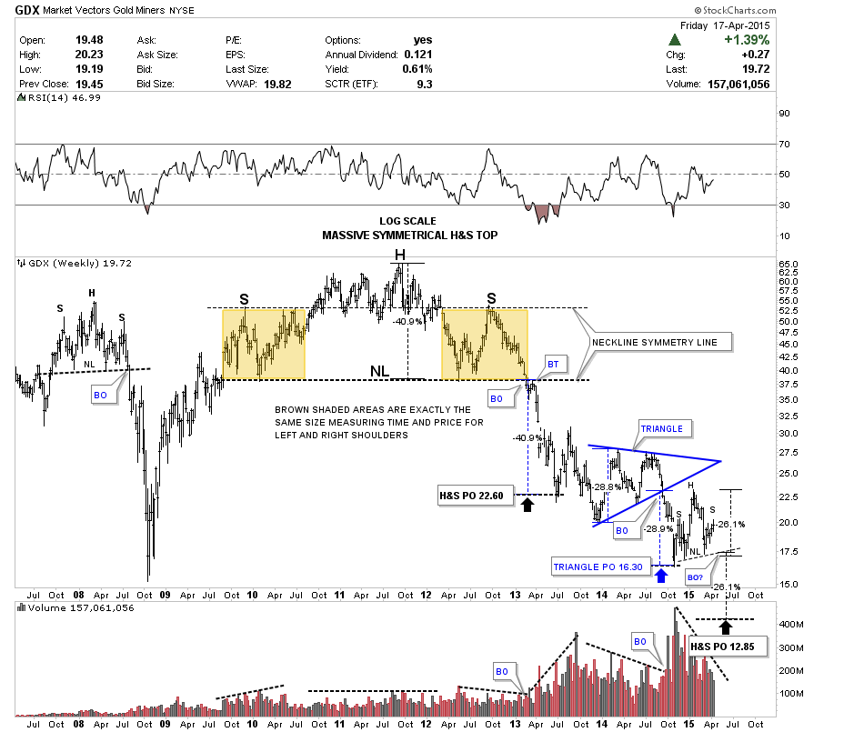
This last chart is a long term weekly look at the Market Vectors Gold Miners eTF (ARCA:GDX). This log scale chart shows the massive symmetrical H&S top.
What do I mean by symmetrical? The two brown shaded squares that measure time and price are exactly the same size. As you can see, the left and right shoulders are exactly the same height.
Now we can measure the price objective of that massive H&S top, calculating down from the top of the head to the neckline which is 40.9%. We then take that distance and add it to the breakout of the neckline which gives us a price objective down to 22.60 which is where we got the initial bounce, at the black arrow.
As I’ve mentioned many times in the past, hindsight is always 20/20. I originally measured the impulse move down from the breakout of the big H&S top neckline to the first reversal point in the blue triangle. That measurement gave me a lower price objective than what we got just now.
In hindsight, going back over this chart I can now see how our all-important November low was achieved. Sometimes the width of a rectangle or triangle will be all the impulse move you’ll get.
The width of the blue triangle is 28.8%. When I add that distance to the breakout point of the blue triangle, I get a price objective down to the November low at 16.30, blue arrow. Now let's take it one step further. IF, the H&S consolidation pattern plays out, the price objective for the GDX should be around the 12.85 area. I measured the potential H&S consolidation pattern on the GDM chart earlier which gave us a price objective down to the 362 area.
Bottom Line: We have something concrete to watch for using the clues the chart gives us to find in what direction the next move may go. If the PM complex breaks up then we’ll have a different animal on our hands. If the price action begins to decline, first breaking below the bottom rail of the blue rising wedge I showed you earlier, then we can follow the price action I’ve laid out in this report until something changes.
This is as unbiased a report as I can put together based on the Chartology that is present. As it is not possible to see the future. All we can do is look at what has worked in the past and try to extrapolate that into the future. This inflection point has caused many good chartists and traders a lot of angst and many have simply given up. The reward will go to those who manage to be on board the right train when it finally leaves the station.