Some years ago when I wrote that it was only a matter of time before economic growth in China slowed and commodities prices fell, the mainstream media in Australia at that time were obsessed with the commodities super cycle and the Chinese “miracle” economy. However now there is widespread acceptance that the commodities boom is over and that the Chinese economy isn’t bulletproof after all. Indeed, it now seems difficult for many to accept that as a consequence of those two realities the Australian Economy is poised for some years of limited growth…at best.
Although many agree with the view that the Australian economy will struggle in the years ahead, it wasn’t that long ago that an assortment of economists, analysts and columnists were convinced that the Chinese economy would go from strength to strength and take the Australian economy along for the ride.
But as I wrote in the middle of last year, the commodities boom was over (see The End of the Commodities Boom) and it was likely that the Australian economy was going to find the next few years to be quite a challenge.
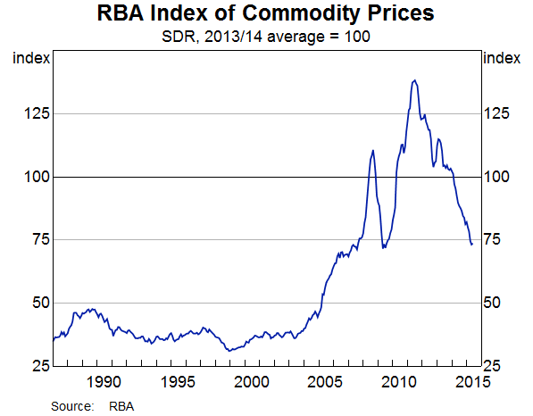
As the chart below highlights, commodities prices have slumped back down to their GFC lows and unlike back then, there is no massive Chinese economic stimulus coming to rescue them again. As with all economic and asset class cycles, a period of high growth has given way to a downturn and we are left guessing where prices will bottom out.
Even before the fall in commodities prices, the Australian economy was unbalanced and had many structural problems, but quite amazingly these problems have been pushed aside over the last few years and the illusion of sound economic growth has been maintained. But eventually these unbalances will cause significant problems and dampen GDP growth for years to come.
For example, home prices and activity in the real estate sector (including construction) are now one of the main drivers behind GDP growth. That worries me because the growth in home prices in Australia is no longer sustainable at current levels, in my opinion.
However, as the chart below shows, Household “net worth” has almost recovered (as a percentage of annual household disposal income) to the pre-GFC level and many would see that as being a positive indicator.
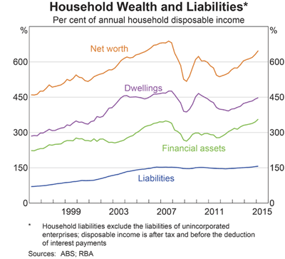
But the above chart can be misleading because annual household disposable incomes (in AUD terms) may also not be sustainable. Remember that low interest rates are effectively creating more disposable income, but how long will that last and what will this chart look like when interest rates rise?
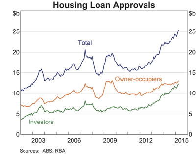
Another worrying trend is the surge in Housing Loan Approvals after the GFC, especially since the RBA started to cut interest rates. Also, as the above chart shows, the surge in loans has mainly been for investors, which I would suggest is another worrying trend. How well, for example, are these investors prepared to deal with higher interest rates and a property market correction?
Now let’s look at Australian GDP growth since 1993. What is pretty clear is that the long term trend is downhill:
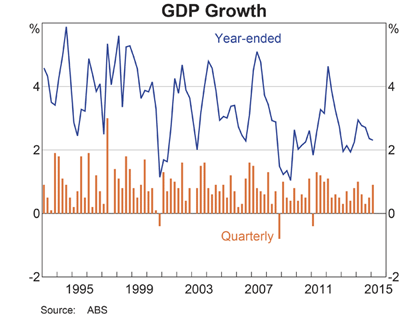
Clearly, the peaks above 4% are becoming a lot rarer and GDP growth is drifting down towards 2%. Meanwhile, loan approvals for investors are surging, which I would suggest is largely because of the RBA’s rate cut moves, which in turn is making the economy even more unbalanced.
But on a brighter note, there are signs that the Australian stock market may fare better over the next couple of years.
ASX All Ordinaries Index Long Term Chart
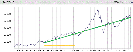
On the above chart I have drawn a 20-year trend line in green, plus underlined each major bull market phase with an orange line. I have also underlined the period I call the GFC phase with a red line.
The first observation I will make is that the recent correction has simply returned the ASX All Ordinaries to the long term trend line. Yes there were a lot of excitable headlines in the media as usual, but looking at long term charts helps us keep things in perspective.
Second, it appears to me that a bull market is starting to establish itself. I’m not quite ready to make a bull market call just yet as there are plenty of drags on the market at the moment, however I am now less bearish in regards to my outlook towards the Australian stock market.
Lastly, although the long term chart of the ASX All Ords, above, is very interesting, it cannot be relied on alone to predict the future movement of the market. Remember the trend is your friend only until it turns and bites you! Yes, the market may rise more or less in line with the long term trend for a few years, or it could suddenly reverse and a major correction take hold.
My view at this stage is that despite a sometimes bumpy ride ahead, the All Ordinaries Index will finish the year close to the long term trend, helped along by a low interest rate environment and a weakened Australian dollar, (which makes the Australian stock market relatively good value for foreign investors).
So the outlook for the Australian economy may not be good, but it’s quite possible that for the next couple of years the stock market will edge higher and move towards 6500 again.
