One of my stock-market pet peeves is the current earnings fetish which would have little value in predicting valuation trends if the casino wasn’t rigged. Few people today can recall why Charles Dow actually began compiling his stock averages back in 1885: to use trends in stock price to predict future business conditions and sales trends, not earnings trends for stock-market speculators.
Barron’s (a Dow Jones publication) didn’t begin publishing Dow Jones earnings until the late 1930s. My 1929-39 earnings data came from a rarely published stacked-bar chart illustrating Dow Jones earnings by quarters and years. Yet Barron’s began publishing weekly dividend payout data for the Dow Jones in 1925, so I assume earnings data was available in the 1920s had the editors desired to publish it. In the charts that follow we’ll see an excellent reason why they didn’t: predicting trends in valuation via earnings is hazardous. It wasn’t until the mid-1990s that the financial media (CNBC’s quarterly high-tech earnings extravaganza) made changing trends in earnings news worthy.
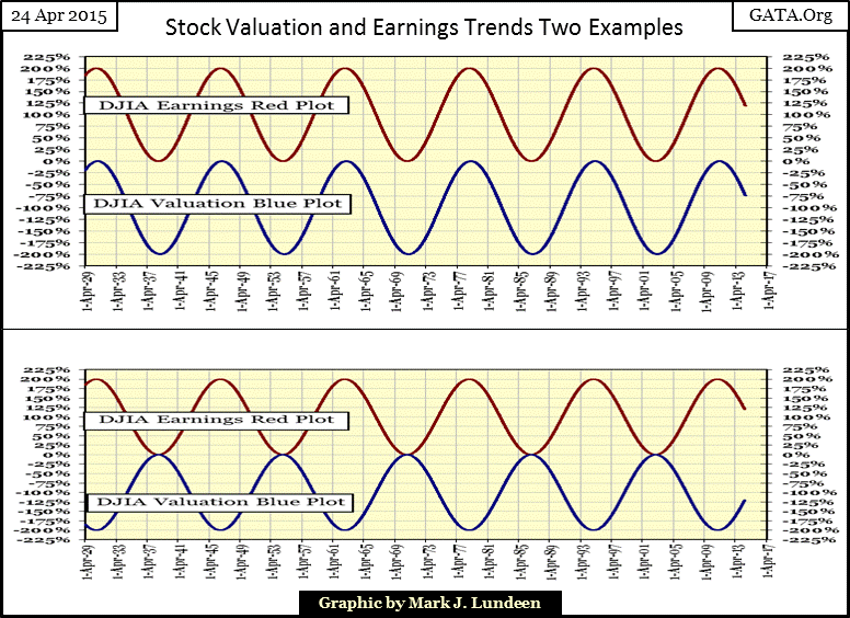
Below we see two examples of earnings and valuation trends; the one on top as people today believe them to be, with earnings and valuation trends in lock step. Historically there have been plenty of examples of earnings and valuations trending together. However the bottom example, where at times these trends diverge for years, (at critical moments for investors) has occurred frequently since 1929 in both bull markets and bear.
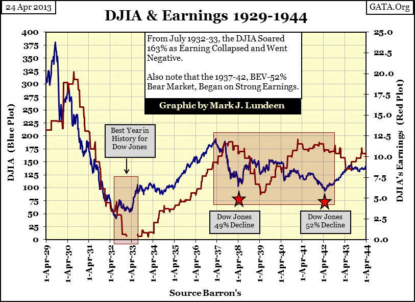
The best example of the hazards of predicting valuation trends with earnings is seen from 1929 to 1942 (chart below). The Great Depression market crash (Blue Plot) began on rising earnings (Red Plot) which didn’t peak until the third quarter of 1930, nearly a year later with the Dow Jones 50% below its 1929 top. After July 1930 the Dow Jones valuation and earnings trends were back in synch until July 1932 as the Dow Jones declined 89%. The year of the Dow’s best performance in history (July 1932-1933) actually began with its earnings turning negative! The Dow Jones experienced a one year gain of 163% before its earnings once again turned positive. For the next fifteen months earnings increased substantially while the Dow Jones average did nothing. Then, from April 1935 to March 1937, once again earnings and valuation trends linked. After the March 1937 market top, however, following earnings proved futile in predicting the two devastating bear market bottoms which followed.
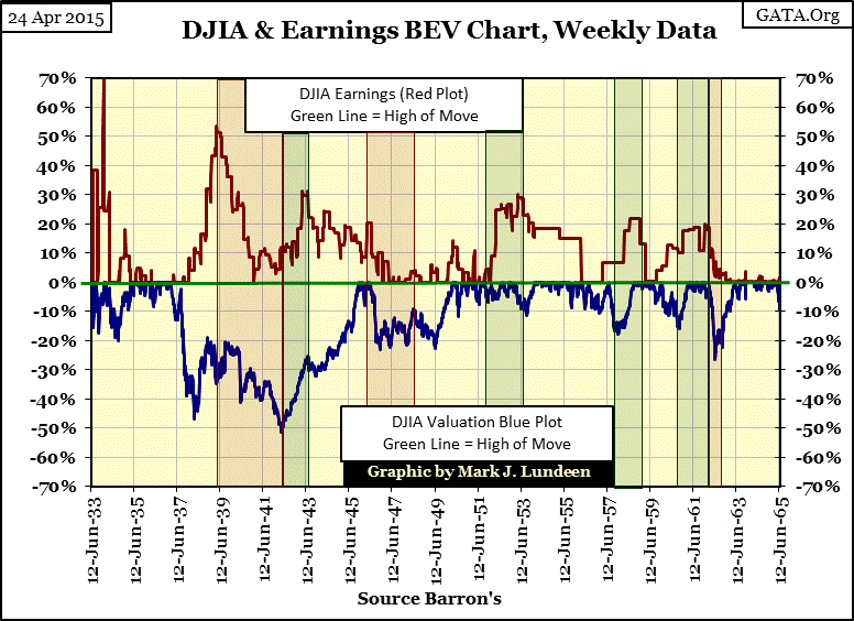
What we see above isn’t unique in the history of the stock market. Below, using the same price and earnings data seen above plus to 1965, I show the Dow Jones (Blue Plot) with its earnings (Red Plot) in a Bear’s Eye View format. However the earnings shown by the red plot’s BEV values have been converted into positive percentages to better illustrate their relationship with the Dow Jones. Just remember that when they hit the Green Zero % Line both the red and blue plots are at new highs for the move; as they move away from the green line they are declining. The red boxes highlight the most obvious instances when the valuation of the Dow Jones declined on rising earnings and the green boxes when the valuation of the Dow Jones increased on declining earnings.
Let’s begin in June 1935 with both the Dow Jones valuation (Blue Plot) and earnings (Red Plot) resting on the Green BEV Zero line until 1937 when both plots began declining towards their 50% BEV lines. Both Dow earnings and price ultimately dropped in half. “Market experts” would have us believe is that is normally how the stock market works. But then came 1939 with a red box spanning through 1942, where Dow Jones earningsincrease by 100% as the Dow Jones crashed 52%. The green box after the 1942 bottom shows the Dow Jones experiencing a nice recovery while its earnings declined 30%. From 1933 to 1965 divergences between the Dow Jones and its earnings were common. Timing entry and exit points, and even deciding whether to hold in one’s position using earnings as a guide was hazardous.
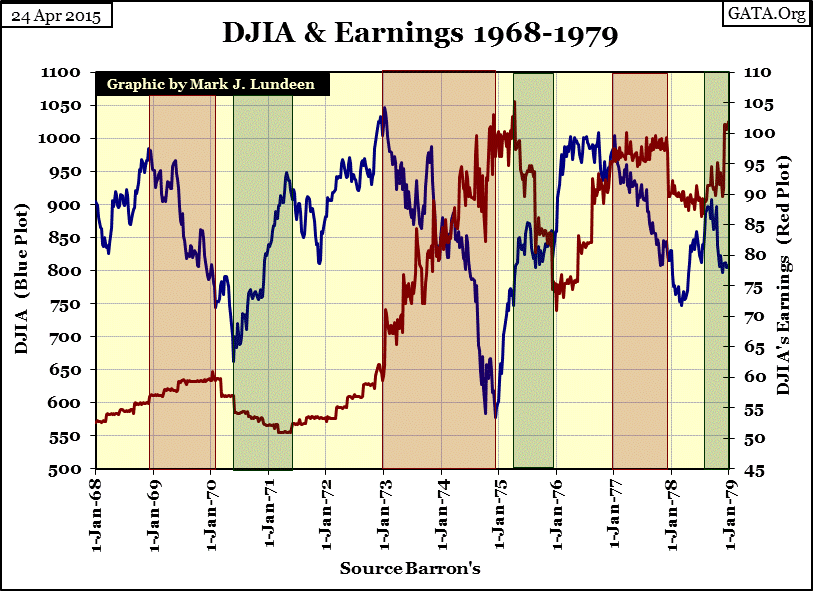
The next chart plots the Dow Jones against its earnings from 1968 to 1979. Just as we saw from the 1930s through the 60s, trends in Dow Jones earnings had little value in predicting future price trends. The predictive value in the 1970s proved to be even worse as the trends seldom aligned. The 1973-74 market decline was the Dow Jones first 40% bear market since 1942 and it occurred as earnings exploded. As expected, soon after the Dow Jones reversed to the upside in 1975, its earnings began to decline (30%).
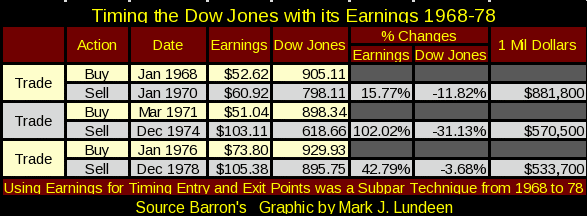
The following table uses the earnings figures from the chart above to mechanically time buy and sell points in the Dow Jones; a million dollars in January 1968 became $533,700 just eleven years later. Had there been a way of investing directly to the Dow Jones earnings the million dollars would have grown to $3.34 million. Unfortunately, then as now, capital gains are based on trends in share prices, not earnings.
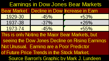
Here we see another table showing the performances of the Dow Jones’ valuation and earnings during three significant 20th century bear markets. Note that the table only includes the first year of the Great Depression crash. You can go to my first chart to see exactly the point I’m making; when investors should have been exiting the market, following the trends in earnings would have kept them in.
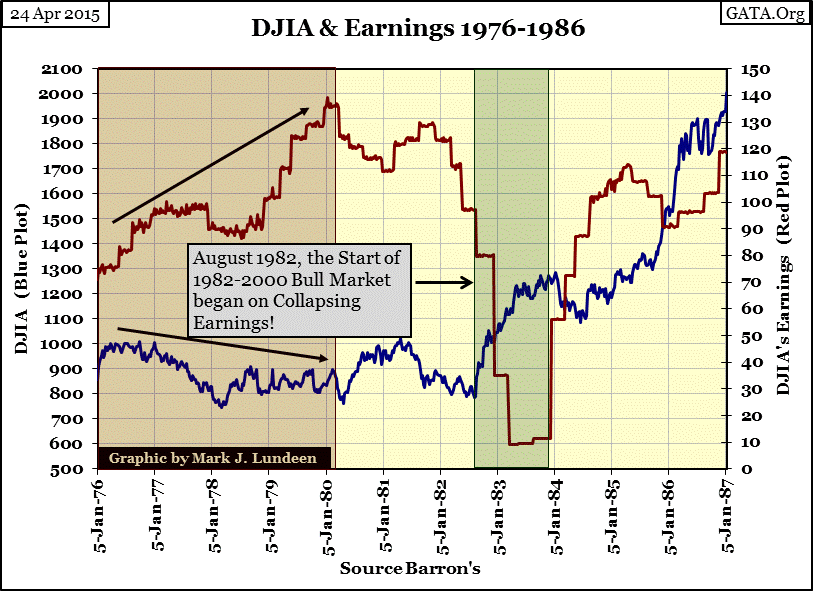
Here’s a continuation of the chart above for the 1980s. Earnings almost doubled from 1976 to 1980 as the Dow Jones’ valuation drifted downwards. It may sound improbable today, but the 1982-2000 bull market began during a 90% collapse in Dow Jones earnings. Note too that the initial surge in the bull market terminated on an earnings recovery.
Below is my second dual-BEV chart for the Dow Jones and its earnings to complete the series from 1933 to present. Notice that before April 1992 it wasn’t unusual for the Dow Jones to rise on declining earnings (Green Boxes) and vice versa (Red Boxes). After 1992, the two plots became mirror images of each other rising and falling together in relation to the green BEV Zero line, a significant historical change in the Dow Jones relationship with its earnings.
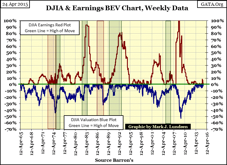
From the 1930s through 1992 the Dow Jones was remarkably indifferent to double-digit percentage collapses in its earnings; which certainly hasn’t been true after 1999. Above we see the 1982-2000 bull market began as the Dow Jones’ earning was collapsing 90%. Also the 1989-92 80% collapse in earnings didn’t prevent the Dow Jones from making many new all-time highs.
This article’s third chart shows this was frequently true from 1933 to 1965, though three earnings declines since 1980 have been on a scale not seen since the Great Depression (1930-32). The first two 80% plus declines had no impact on the valuation of the Dow Jones itself. This changed after 1999, first with the tech-wreck and again with the sub-prime mortgage bear markets when declining earnings went hand in hand with declining valuations, and market recoveries sprang from recovering earnings.
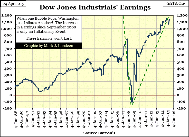
This is just my opinion, but reviewing the history in these charts shows something very odd happening in the stock market today. The current leg in the Dow Jones’ bull market has seen a whopping increase in earnings; an increase that’s too good to be trueconsidering the lousy economy we’ve endured since the credit crisis bottom of March 2009.
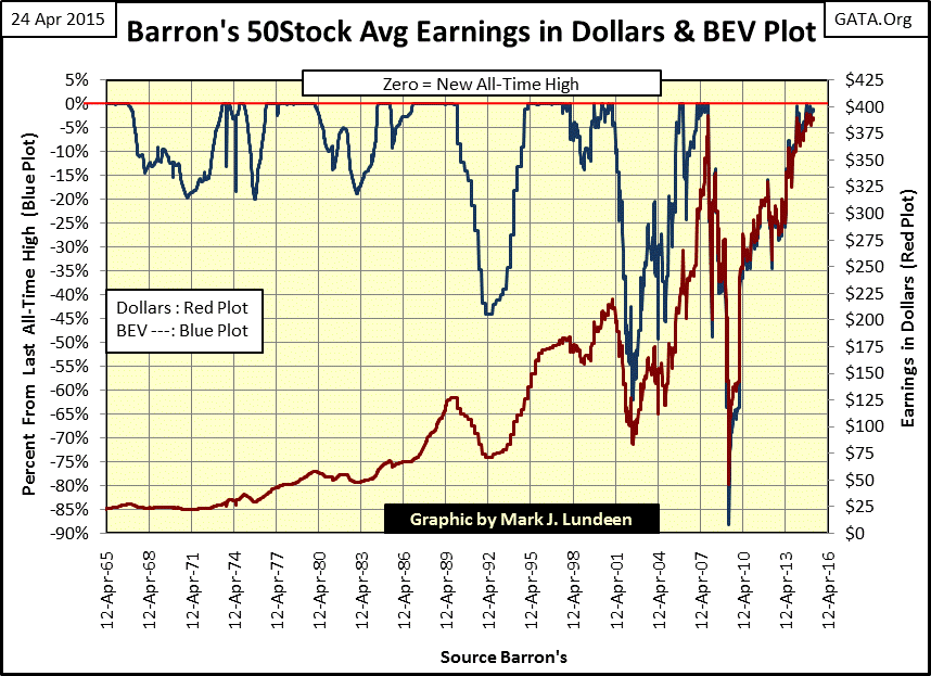
Keep in mind that we are only looking at the Dow Jones, an index containing just thirty large blue-chip stocks. So let’s look at some otherearnings series; first the Barron’s 50 Stock Average, a weekly data series published since 1938. The chart plots both the earnings in dollars (Red Plot) and in BEV format (Blue Plot), and we see a clear difference with the Dow Jones. The two 80% plus declines in Dow Jones earnings in the early 1980s and early 1990s are missing. The point though is that corporate earnings for the Barron’s 50 were declining by double-digit percentages at these times with the Dow Jones’ earnings, as both stock indexes were making money for investors. The Barron’s 50 Stock Average saw a larger decrease during the high-tech wreck than the Dow Jones, and the Barron’s 50’s earnings decreased 90% during the credit crisis. Note too that since the credit crisis bottom the Barron’s 50 has also seen an amazing rebound in its earnings.
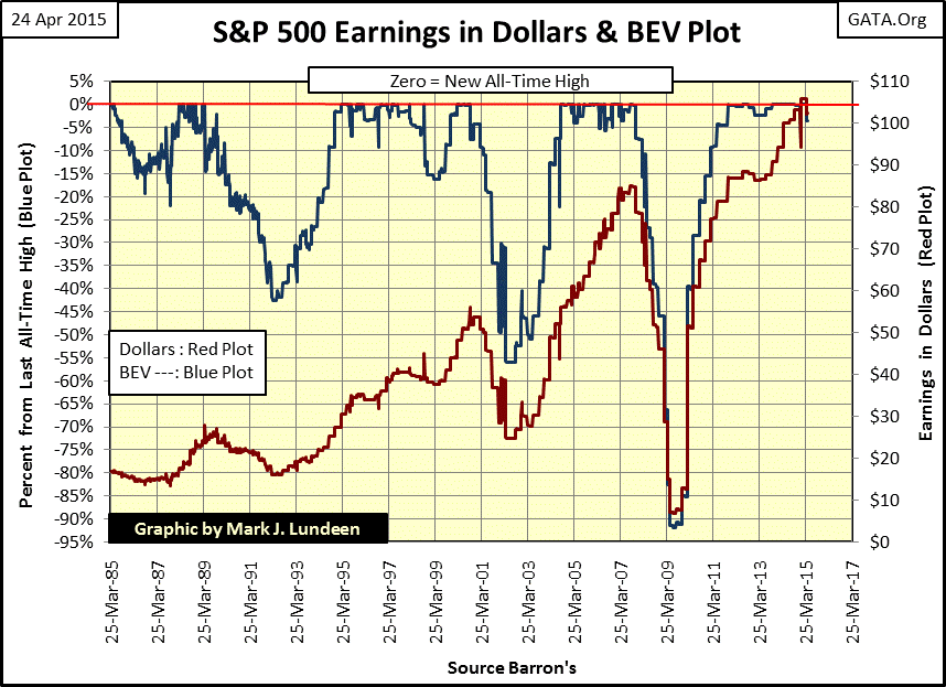
Here are the earnings for the S&P 500 going back to 1985. Just as with the Dow Jones and Barron’s 50, earnings for the S&P 500 declined significantly during the early 1990s, as well as during the tech wreck and the credit crisis. The S&P 500 earnings during the poor economic conditions following the credit crisis recovery are simply too good to believe.
Keep in mind that the numbers we see in all these indexes are on a per-share basis. If corporate America management wasn’t selling bonds (issuing debt) to buy back shares, I’m sure we’d see a major difference: fewer per-share dollars in earnings. But even so, the post March 2009 rebound in earnings seen in all three data series is still remarkable, and I think a big-red flag most market commentators are completely missing. I wouldn’t be surprised if in a few years this increase in earnings will become another accounting scandal, exactly like Enron and Arthur Andersen a decade ago.
So what should we make of all this? The purpose of the stock market has changed greatly since 1929. The stock exchange was once the market’s mechanism for allocating scarce capital to companies who could best use it in providing goods and services to satisfy market demand. But four decades after the US Government took the dollar off the gold standard capital can no longer be described as scarce. So what’s the stock market doing for the economy these days? It continues to go up to preserve the appearance of solvency for pension funds and insurance companies as well as individual retirement accounts. This is no conspiracy theory but a matter of public record as reported by ABC News’ George Stephanopoulos, a former Clinton Administration insider.
"Well, what I just want to talk about for a few minutes is the various efforts that are going on in public and behind the scenes by the Fed and other government officials to guard against a free-fall in the markets...perhaps most important, there's been--the Fed in 1989 created what is called a * PLUNGE PROTECTION TEAM *, which is the Federal Reserve, big major banks, representatives of the New York Stock Exchange and the other exchanges, and there--they have been meeting informally so far, and they have kind of an informal agreement among major banks to come in and start to buy stock if there appears to be a problem. They have, in the past, acted more formally"
- George Stephanopoulos, former Clinton administration adviser
Let me paraphrase this: the stock market is going up because the government and Wall Street refuse to let it go down – but why? Because there would be many very unhappy voters and Wall-Street executives should the stock market find its actual free market level!
Here’s what a former member of the PPT thinks of markets today.
"Governments impose price on markets; there is no price discovery anymore."
- Dr Pippa Malmgren in a MATTERHORN INTERVIEW. Dr Malmgren is a US financial advisor and policy expert based in London and has been a member of the U.S. President’s Working Group on Financial Markets (a.k.a. the "Plunge Protection Team").
And here’s what a former Fed governor said about today’s markets:
"Now that I am out of government, I can tell you what I really believe.
- Central banks are now so heavily influencing asset prices that investors are unable to ascertain market values. This influence is especially evident, with the Fed's purchase of government bonds, which has made it impossible for investors to use bond prices to learn anything about markets.
- The government-sponsored housing entities remain sources of vulnerability to the U.S. economy, and repeated ad-hoc attempts to push Fannie Mae and Freddie Mac to take greater risks at taxpayer expense are deeply counterproductive. Such efforts have not succeeded”
- Kevin M. Warsh: Former Federal Reserve Governor. Comments made to the Stanford University Institute for Economic Policy Research, 25 Jan 2012.
The PPT have been dictating prices on the stock market since 1989, as per George Stephanopoulos,but since 1992 (to make it believable) apparently they’ve decided to use stock earningsas a prop in the kabuki theatre now playing daily in global financial markets. CNBC, always a stalwart supporter of “policy”, jumped on the band wagon in the 1990s with their infamous quarterly focus on corporate earnings, a market statistic that 20thcentury market commentators paid scant attention to for decades, with good reason. It would be a mistake to believe the current record earnings in the Dow Jones and S&P 500 are an indication of stability in the stock market; they’re not.
