It’s been a few weeks since I’ve done a Technical Market Outlook, so let’s get into it…
Trend
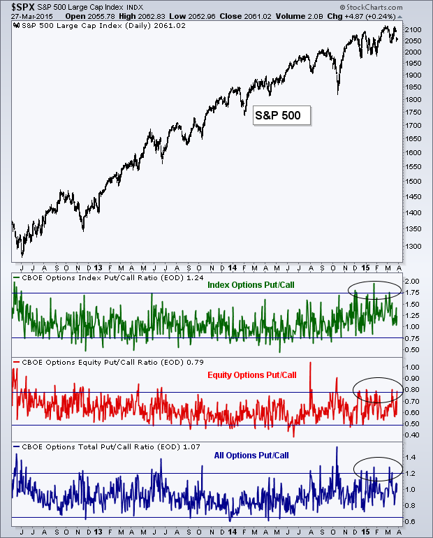
While the equity market goes back and forth, from being positive to negative in performance for 2015, the up-trend appears to still be intact. We have continued to see a series of higher lows in the S&P 500 (SPX) and price has found support at the 100-day Moving Average on nearly every dip over the last several months.
Breadth
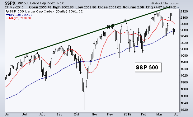
As the S&P made a run back to its 2015 high earlier this month, many traders had their fingers crossed that the Advance-Decline Line would also set a new high. Unfortunately, while breadth was able to reach its prior peak, price was not as lucky. We still have the A-D Line making higher lows and reflecting the long-term bullish trend in the equity market.
The Percentage of Stocks Above Their 200-day Moving Average also has been putting in a series of higher lows but still remains in a down trend as it’s unable to make any higher highs. However, it is nice to see some improvement being made in this breadth measure, one that’s been struggling for over a year.
Options Activity
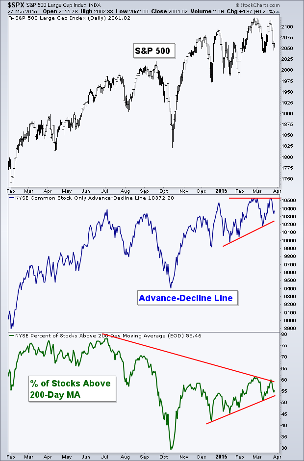
With much discussion over the historically high valuations of the U.S. equity market, it seems traders are getting a little trigger happy within the options market. Below is a chart of the S&P 500 in the top panel along with three measures of Put/Call Ratios: Index Put/Call, Equity Put/Call, and All Put/Call. I’ve put horizontal lines on each measurement to show levels that have previously been high points for each Put/Call ratio. When the market declines we often see these indicators begin to spike, but it’s not often we see them all spike at the same time. For example, in June 2013 we saw Equity and All Put/Call spike near the short-term low in price but the Index indicator did not.
What’s interesting is that for the last three months we’ve been getting spikes in all three Put/Call Ratios with the S&P 500 dipping just a couple of percentage points at a time. Looking at the last couple of years, these option measurements stay fairly ‘calm’ even when the market turns lower. This is likely due to traders believing that they are just short-term drops that can probably be bought, leaving little reason to buy protection or make directional bets on things heading even lower. But this year that seems to have changed. It hasn’t taken much to get option traders to push their bets towards Puts, sending the ratios to abnormally high levels.
Could this be due to the changes that many are expecting the Fed to take this year, causing traders to get nervous with each tick higher in volatility? I don’t know but it does seem like the environment has changed.
Momentum
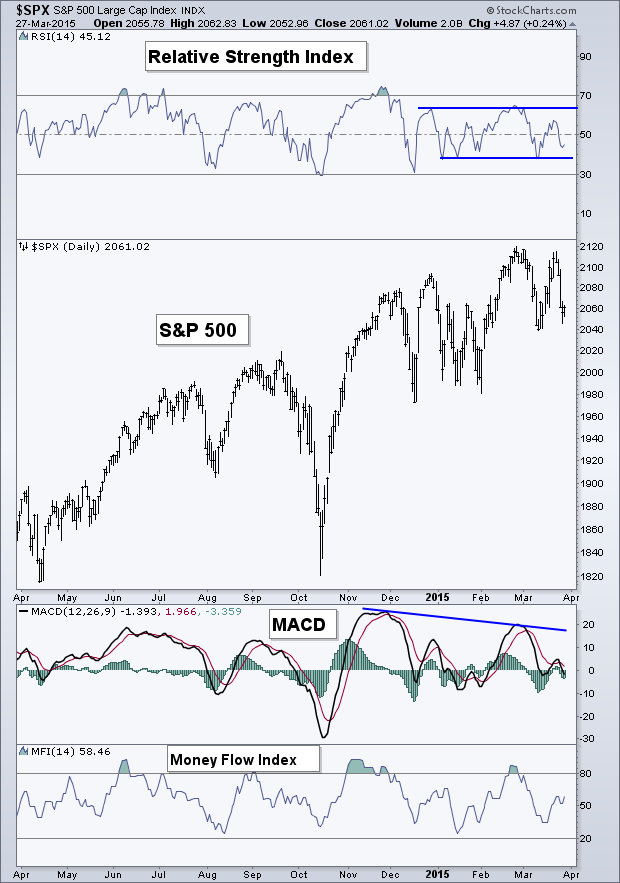
The daily chart of the S&P 500 and three momentum indicators has seen a period of consolidation. The Relative Strength Index (RSI) has been unable to break above 65 this year but it’s also staying above its bullish range support, as bearish traders have not been able to push this indicator into ‘oversold’ territory. The MACD indicator on the other handed has continued to diverge, making lower highs since last November.
On March 12th I wrote a post called The U.S. Equity Chart I’m Watching. In it I wrote about the weekly S&P chart and the levels of support I was watching in price as well as momentum. The bearish divergences that are taking place on the weekly chart are still present but support continues to hold. While breadth (as discussed earlier) has remained in a bullish up-trend, reflecting the positive moves in price, momentum has continued to weaken. That chart I wrote about on March 12th continues to be one I keep a close eye on each week, and is a chart I think will provide key insight when/if things turn bearish for equities.
Stock-Bond Ratio
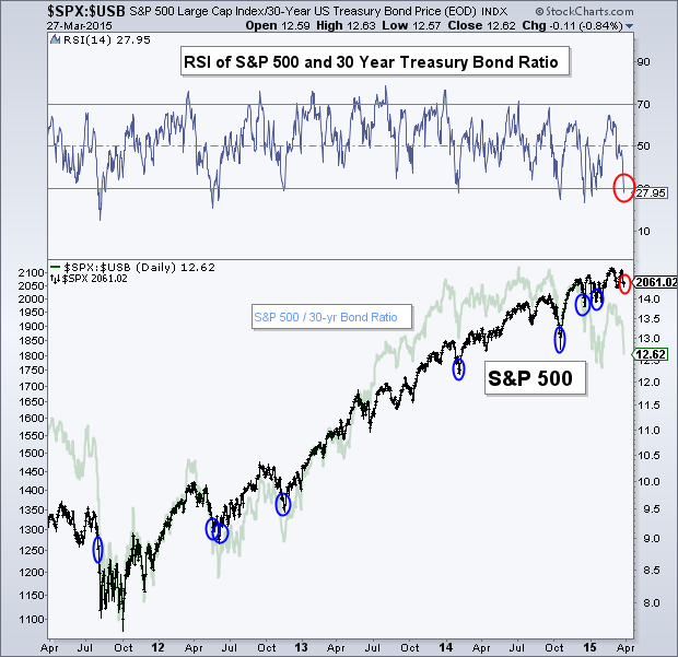
I often show the Relative Strength Index (RSI) for varies asset classes and securities and how it can be used to find interesting setups on charts, but it can also be used to show potential turning points for other markets. Below is a chart of the S&P 500 (black line) and the ratio between the S&P 500 and 30-year Treasury bonds (light blue line) and the RSI line for the S&P and 30-year. I’ve put blue circles on the S&P 500 when the momentum indicator has gotten below 30, signaling a possible trend change in relative performance from bonds to stocks.
While this hasn’t marked every low point in stocks, it has done a fairly good job at finding places where the S&P soon turns higher. And we are seeing one of those moments now, with the RSI currently at 27.95 for the ratio b/w the S&P and 30-year Treasury’s. From a momentum perspective, it seems we may see a bounce in stocks soon if traders begin shifting their focus from bonds back to equities.
Relative Rotation Graph
Below is a Relative Rotation Graph for the nine S&P sectors. This graph shows the relationship between relative performance of the sectors to the major index and the momentum of that trend in relative performance. Over time, the nine sectors have historically gone in a circle as they lose/gain momentum of relative performance as well as lose/gain in the trend of that relative performance.
Currently, the Energy sector (via SPDR Energy Select Sector Fund (ARCA:XLE)) has been making strong improvements, as has Materials (SPDR Materials Select Sector (ARCA:XLB)). Meanwhile, Utilities (SPDR Select Sector - Utilities (NYSE:XLU)) has weakened substantially over the last eight weeks in momentum of the trend in relative performance. Consumer Discretionary (SPDR Consumer Discr. Select Sector (ARCA:XLY)) and Technology (SPDR Select Sector - Technology (NYSE:XLK)) are the only sectors that remain in the ‘leading’ quadrant.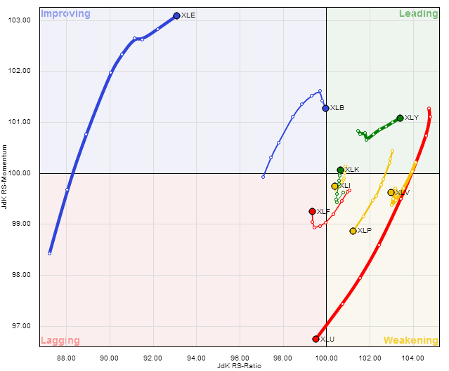
Year-to-Date Sector Performance
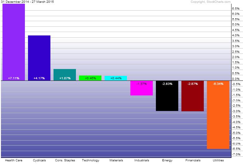
As we get close to finishing out the first quarter of 2015, Health Care (ARCA:XLV) and Consumer Discretionary are the leading sectors YTD. Utilities, Financials (ARCA:XLF), Energy, and Industrials (ARCA:XLI) all are in the red for the first three months, with Utilities being the worst performing sector of ’15.
Disclaimer: Do not construe anything written in this post or this blog in its entirety as a recommendation, research, or an offer to buy or sell any securities. Everything in this post is meant for educational and entertainment purposes only. I or my affiliates may hold positions in securities mentioned in the blog. Please see my Disclosure page for full disclaimer.

