The financial media reported the Dow Jones made market history Monday when the Dow moved 1,089 points on an intraday basis from the previous day’s close. After a brutal day, “a new historic record” like that sounds pretty darned impressive. However, this history-making event was largely an inflationary illusion, although the media and most retail investors would never see it that way. Yes, during the 1930s, the Dow Jones never saw an intraday move of a thousand points. Of course not. How could it when at the absolute top of the Roaring 20s bull market, the Dow Jones reached a peak of only 381.17 (03 September 1929)? But can there be any doubt that investors endured worse days during the Great Depression crash than we saw on Monday?
In the past ninety-five years, the Federal Reserve (created by our own Congress), has issued over 300 dollars for each dollar already in circulation in January 1920. In effect, “monetary policy” has eroded 99% of the purchasing power of the 1920 dollar. This horrendous inflation makes historical comparisons in nominal dollars nonsensical. Therefore, comparisons of historical market events separated by decades are best done using percentages.
The following chart shows all the days with a 5% intraday swing (or greater) on the Dow Jones since October 1928. Some of these days the Dow Jones declined, others it advanced, but they are all rare market events. In the past eighty-seven years, there have been only 346 such days. The largest percentage swing occurred on 19 Oct 1987, when the Dow moved from a daily high of 2,164 to a low of 1,677. That was a point swing of only 487 points, less than half of Monday’s 1,089. But when we do the math, it’s apparent that Monday’s 1,089 point swing from its daily high to low resulted in only a 7.08% intraday move, while on 19 October 1987, actual history was made with a 29% percentage intraday swing.
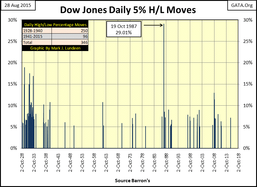
The table below shows the details of four of these daily-volatility spikes. On 29 October 1929, a mere 40.05 point move from a daily high to low produced the 18.86% intraday move seen above. Those 40 Dow points constituted the worst one day drop of the Great Depression crash and caused sufficient despair that some leveraged speculators actually committed suicide by jumping out of windows on Wall Street. Compare what happened in October 1929 with what happened this past Monday in the table below: Monday’s “historic” intraday move of 1,089 points produced a mere 7.09% intraday swing with no suicides on Wall St to my knowledge.

The pointof all this is that inflation, courtesy of the Federal Reserve, has been the single greatest contributor to “economic growth” in the Dow Jones since 1932. The move up from Dow Jones 41.22 in July 1932 to its recent high of 18,312.39 this past May has been largely an illusion, which does not represent a significant increase in purchasing power for those holding Dow shares. Still, the capital gains taxes paid to the government on these inflationary gains are a real expense investors must bear.
This point is made clear below looking at the indexed values for CinC (Blue Plot) and the Dow Jones (Red Plot). From January 1920 through the Dow Jones last all-time high in May 2015, CinC has increased by a factor of 304, while the Dow Jones only increased by a factor of 168. Significantly, ever since January 2000, the gap between CinC and the Dow Jones’ market highs and lows has been widening. Since 2000, the “policy makers” may have twice pulled the stock market out of the fire by “injecting” sufficient “liquidity” into the financial system, but they’re obviously playing a game of diminishing returns.
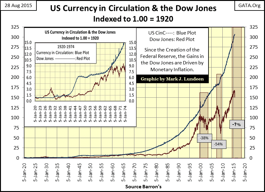
The chart above is actually quite alarming. On the next significant market downturn, will the “policy makers” be able to “inject” sufficient “liquidity” into the financial system to forestall a bear market without destroying the dollar as an asset in its own right? We’ll soon find out. However, before Mr Bear is finished with us, the dollar will be a mere shadow of its former self because all the “policy makers” know how to do is continue injecting ever greater doses of “liquidity” into a deflating market. This is exactly what we should expect from know-it-all professors of economics who believe they can somehow circumvent the law of supply and demand with monetary inflation.
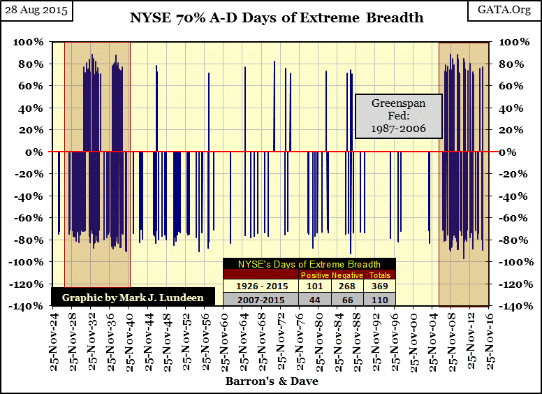
So, are we heading into the third market decline since January 2000? My recent studies of 52Wk Highs and Lows suggest we are. And now the stock market has once again begun seeing Days of Extreme Breadth and Volatility – positive indication of bear activity. In the chart below, we see two clusters of days of extreme market breadth; one forming during the depressing 1930s, the other beginning in February 2007 that has continued to this day. This is significant because it indicates that, since February 2007, the stock market never regained the stability it had previous to the credit crisis.
Days of Extreme Breadth occur when:
NYSE Net Advancing –Declining / issues trading that day
is greater than (+/-) 69.999% (call it a 70% day). In the chart below NYSE 70% A-D days appear to be frequent market events. But in the 23,700 NYSE trading sessions plotted below, there have only been 369 such days of extreme market breadth, with many occurring in a cluster during the 1930s. Seeing frequent 70% days are indication that Mr Bear is active. A second cluster of extreme market breadth began to form in February 2007, exactly when cracks began to form in the sub-prime mortgage market. What followed over the next two years, the second deepest Dow Jones bear market since 1885, proves that was no coincidence.
The next chart plots NYSE 70% days from 1970 to present, and it’s interesting to note that during the Greenspan Fed, an era of inflationary market bubbles (aka bull markets), the NYSE saw only fourteen 70% A-D days. This made Doctor Bernanke’s tenure as Fed Chairman one of wrestling with deflating bubbles, and the NYSE saw many days of extreme market breadth, just as during the depressing 1930s.
Since Janet Yellen assumed the duties of Fed Chairwoman in February 2014, the Dow has already seen six days of extreme market breadth (70% days) over the past eighteen months. Looking at the chart below, it becomes obvious that Janet won’t be raising interest rates anytime soon. She knows that Mr Bear would be feasting on market valuations soon after she did.
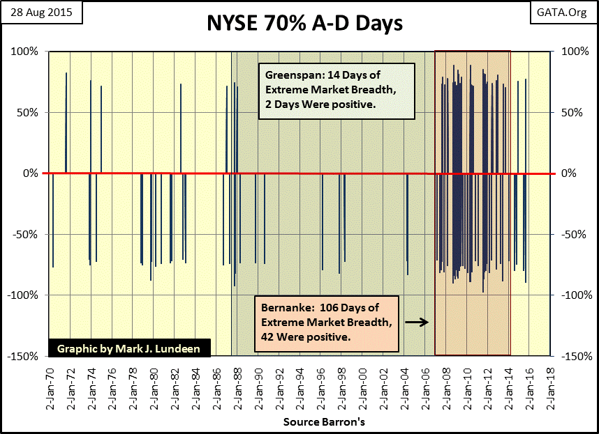
The interesting thing about these clusters of extreme days during deflationary bear markets is that so many of them are positive. There’s a good reason for that. After abusing the market longs, Mr Bear frequently comes back and gives the shorts some grief a few days later.
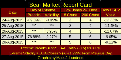
Here’s the Bear Market’s Report Card, something I began publishing during the sub-prime market crash of 2008 until the market stopped producing frequent extreme days in 2009. This week, Mr Bear was a very bad bear. He generated five extreme days; two for breadth and three for volatility. Most of these extreme days were positive, typical of what happened during the Great Depression and Sub-Prime bear markets. Positive extreme days from 1929 to 1932, and 2007 to 2009 gave gullible investors hope that the worst was over and of better things to come. That forlorn hope of better things to come in a bear market only provides Mr Bear with another opportunity to maul anyone who cares to risk dancing with him. I expect the same will prove true for the remainder of 2015 into 2016 and beyond.
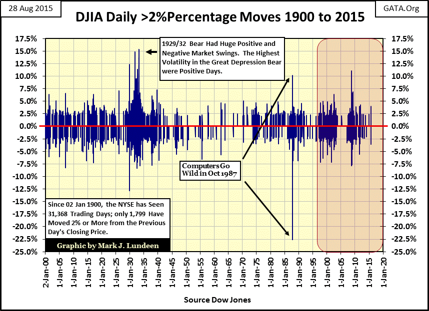
Here’s the chart for extreme days of volatility, when the Dow Jones moves 2% or more from a previous day’s close. As with NYSE extreme days of market breadth, extreme days of market volatility appear as common market events in the chart below. But of the 31,368 NYSE trading sessions plotted only 1,800 saw the Dow Jones move more than (+/-) 2% from a previous day’s close. Also, as with days of extreme market breadth, days of extreme market volatility tend to cluster during bear markets. Note that the biggest Dow Jones daily advances occurred during massive-deflationary bear markets when Mr Bear does his best to bait the unwary back into the market.
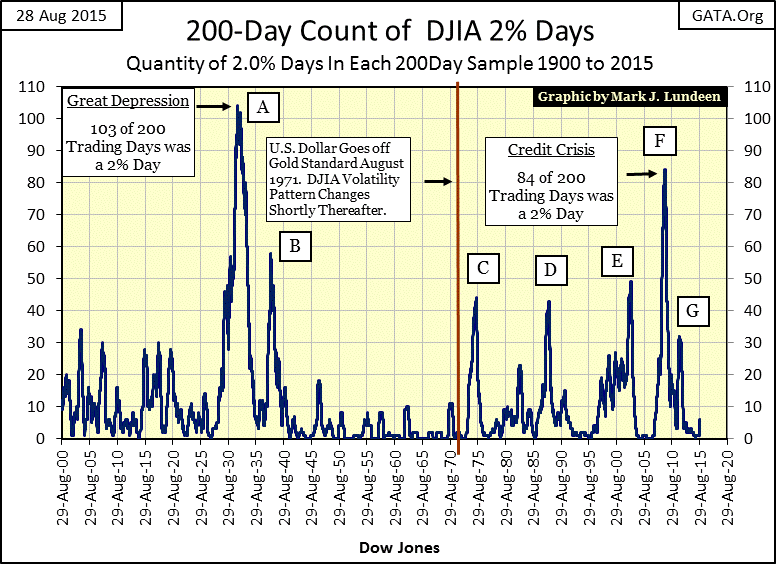
To make better sense of the data plotted above, I have a running 200 day count (200 count) of Dow Jones 2% days plotted below. It’s a historical fact that every major spike in days of extreme volatility seen below occurred AFTER the creation of the Federal Reserve in 1913.
Almost without fail, whenever the Dow Jones’ 200 count rises up above 10 in the chart below, a bear market has already begun. The only real exception to this was the April 1942 bear market bottom. After two massive bear markets during the 1930s and five months after entering WWII, few Americans still gave a damn about the stock market in April 1942.
Currently the 200 count is only at 6. But if market history is any guide, seeing the 200 count at 6 virtually guarantees it will soon be above 10 and that’s never good for the bulls.
Note the red line marking the termination of the Bretton Woods $35 an ounce gold peg. Once freed from the discipline of the gold standard, it didn’t take long for the “policy makers” to begin inflating bubbles in the stock market, which always attracts the attention of Mr Bear.
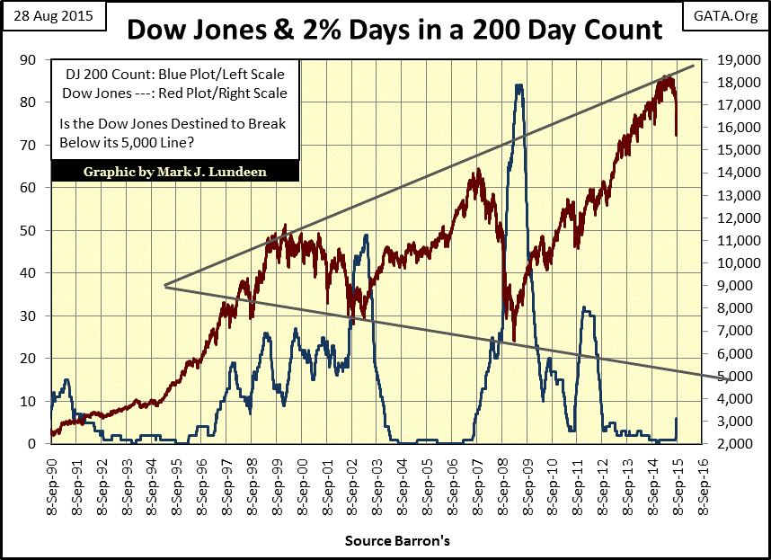
I plotted the Dow Jones (Red Plot) along with its 200 count (Blue Plot) below. The point this chart makes is that whenever the Dow Jones begins to see frequent days of extreme volatility (moves of 2% or more from a previous day’s close, UP or DOWN), the market has entered a period of deflation. Looking at the trend lines I placed on the Dow Jones, we shouldn’t discount the possibility the Dow Jones will drop below 5000 before the Dow’s 200 count ultimately peaks.
I also track a running 8 day count of Dow Jones days of extreme volatility (Red Plot), which I’ve charted along with a Dow Jones BEV plot in the chart below. Currently the 8 count is at five. Looking over the past two decades in the charts above and below, we should anticipate more Dow Jones 2% days piling up in the 8 and 200 counts as the market continues to see deeper market declines.
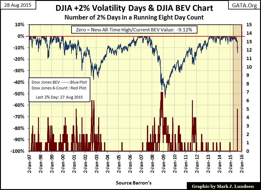
The point we should take from studying days of extreme market breadth (NYSE 70% A-D Days) and days of extreme market volatility (Dow Jones 2% Days) is that when they occur in bull markets, they are isolated events sometimes separated by many years. Look at the chart above. From June 2003 to July 2007, the Dow Jones enjoyed a remarkable recovery from its October 2002 38% bear market bottom, as we see just three Dow Jones 2% days during this bullish four year period. In August 2007, when the market once again began seeing frequent days of extreme volatility (Dow Jones 2% Days), it was because Mr Bear had returned.
After the credit crisis bear market bottom, the market once again began to advance as the 8 count stayed low. We should note the spike in the 8 count, which occurred during August / September 2011 on news of the pending Greek default. But Greece has been going bankrupt for five years now; and since October 2011, the 8 count has rarely risen above zero as the Dow Jones continued on from one new all-time high to the next. But in the past seven trading sessions, the Dow Jones saw five 2% days, leaving the 8 count at 5 at the close of this week. We should also note that it was in these same seven trading sessions that saw the Dow Jones see its first double-digit correction since 2011.
The Dow Jones made two new 52Wk Lows this week on Monday and Tuesday (chart below). Historically, that’s not a good sign. As you can see, whenever the Dow Jones reverses it's primary trend and begins making either new 52Wk Highs or Lows, it continues doing so for a few years. Assuming the Dow Jones continues making new 52Wk Lows, how far must the Dow Jones go down, and for how many years before it once again begins making new 52Wk Highs?
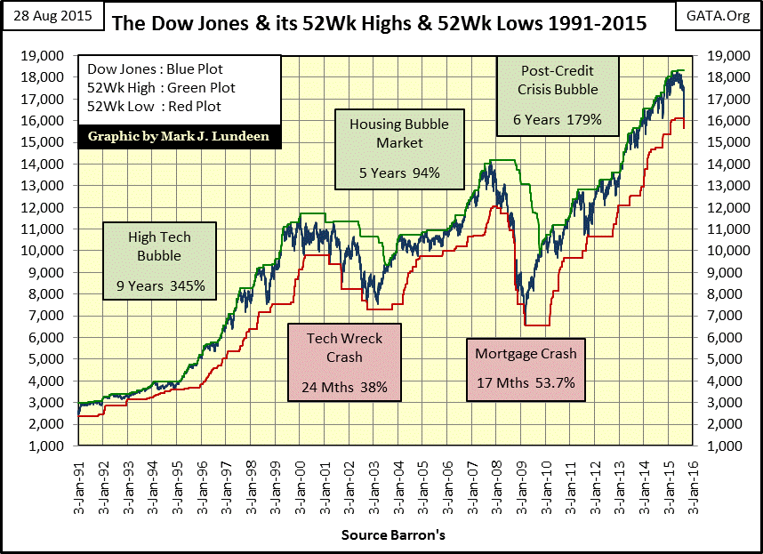
Looking at all the data I’ve presented in this article, I’d say the odds are that for the stock market, the worst is still to come. How much worse I can’t say. But when we consider the mess the markets and the economy are in after decades of abuse by our elected officials and their academic toadies managing “monetary policy,” I expect the Dow Jones will break below the lows of the sub-prime mortgage bear market.
The first week of September 2015 appears to be an excellent time to exit the stock market and acquire a big position in the old monetary metals, while there are still some available for purchase, before the entire precious metals market goes “no offer.” A $20 United States gold coin minted in 1933 (or 1850) still buys the same amount of goods, or will fetch more than $1000 paper dollars today at any coin dealer, even if in such poor condition it needs to be melted down. A paper $20 bill issued in 1933 will buy no more than 1% of the goods it would when first printed. Investing in gold and silver bullion is the simple and time tested way to protect yourself from the inflationary excesses of runaway money printing by greedy governments.
One of the largest bullion dealers in the country, one of only 27 licensed to buy directly from the US Treasury, reports that they are nearly out of silver and expect to run out of gold by mid September. Delays to purchase bullion at the US mints are already running one to two months.
