As already explained in previous posts, industrial and precious metals have been huge underperformers this year. But it is not only 2013 that has been an average year for metals. Let's look at the overall sector more closely.
Chart 1: Year To Date Performance Of Various Metals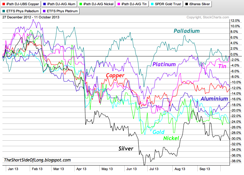
The chart above shows various metals and their year to date performance. It is not as clear cut as saying precious metals have outperformed industrial metals or visa versa. The truth is, within the precious metals sector, we have the joint best performer (Palladium is flat for the year tied with Tin) and the worst performer (Silver is down 30% for the year). Within the base metals sector, we have the other half of the tied best performer (Tin is also flat for the year). Platinum, Copper, Aluminium, Nickel and Gold are all down in double digits this year, with the last two (Gold and Nickel) down almost 25%. As a side note: Silver was down almost 40% this year and almost 65% from the May 2011 peak.
Chart 2: The Bear Market In Industrial and Precious Metals
Now, let us focus on the bigger picture. Commodities have been in a downtrend since May 2011 and the metals sector has been one of the major culprits. As a matter of fact, apart from Gold, the majority of the metals actually peaked in early 2011 and have lead the decline. Aluminium, Nickel and Silver have been the worst losers in the last two and half years. Palladium has really outperformed the whole sector by mainly moving sideways.
- English (UK)
- English (India)
- English (Canada)
- English (Australia)
- English (South Africa)
- English (Philippines)
- English (Nigeria)
- Deutsch
- Español (España)
- Español (México)
- Français
- Italiano
- Nederlands
- Português (Portugal)
- Polski
- Português (Brasil)
- Русский
- Türkçe
- العربية
- Ελληνικά
- Svenska
- Suomi
- עברית
- 日本語
- 한국어
- 简体中文
- 繁體中文
- Bahasa Indonesia
- Bahasa Melayu
- ไทย
- Tiếng Việt
- हिंदी
Metals Continue To Underperform
Published 10/13/2013, 02:55 AM
Updated 07/09/2023, 06:31 AM
Metals Continue To Underperform

Tiho Brkan
3rd party Ad. Not an offer or recommendation by Investing.com. See disclosure here or
remove ads
.
Latest comments
Install Our App
Risk Disclosure: Trading in financial instruments and/or cryptocurrencies involves high risks including the risk of losing some, or all, of your investment amount, and may not be suitable for all investors. Prices of cryptocurrencies are extremely volatile and may be affected by external factors such as financial, regulatory or political events. Trading on margin increases the financial risks.
Before deciding to trade in financial instrument or cryptocurrencies you should be fully informed of the risks and costs associated with trading the financial markets, carefully consider your investment objectives, level of experience, and risk appetite, and seek professional advice where needed.
Fusion Media would like to remind you that the data contained in this website is not necessarily real-time nor accurate. The data and prices on the website are not necessarily provided by any market or exchange, but may be provided by market makers, and so prices may not be accurate and may differ from the actual price at any given market, meaning prices are indicative and not appropriate for trading purposes. Fusion Media and any provider of the data contained in this website will not accept liability for any loss or damage as a result of your trading, or your reliance on the information contained within this website.
It is prohibited to use, store, reproduce, display, modify, transmit or distribute the data contained in this website without the explicit prior written permission of Fusion Media and/or the data provider. All intellectual property rights are reserved by the providers and/or the exchange providing the data contained in this website.
Fusion Media may be compensated by the advertisers that appear on the website, based on your interaction with the advertisements or advertisers.
© 2007-2024 - Fusion Media Limited. All Rights Reserved.