Charts Provide An Unbiased Reference Point
One of the great things about stock charts is they allow us to track the markets using reference points from the past. For example, we may have drawn a trendline three weeks ago, then three weeks later the market rallies back to the trendline and reverses. Therefore, in today’s post we are going to republish a previous post, but with updated charts as of February 3, 2016. The updated charts allow us to ask:
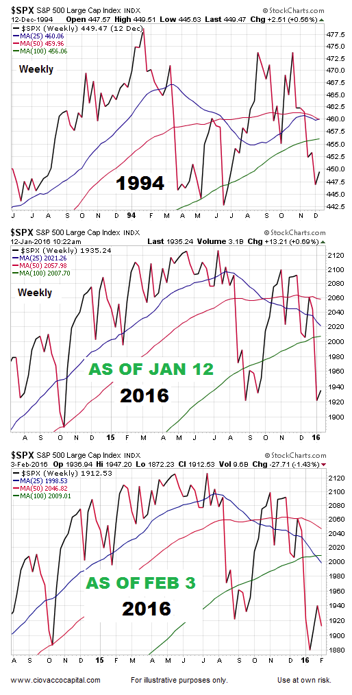
Have the charts improved in terms of looking more like the bullish turn in 1994?
The original post, “Do The Bulls Have Any Reason For Hope?”, was dated Jan 12, 2016. The same post appears below with updated charts.
Flexibility: An Ally In Markets
We recently outlined numerous concerns about the sustainability of the current bull market in stocks. Experience tells us that thinking we know what the future looks like is a big mistake. If you are skeptical about the previous statement, look at the track record for economic and market forecasts; it is not good. Therefore, under our approach we allocate our portfolios based on facts.
Since market profiles can improve when new facts come to light (see March 2009), it is important for us to keep an open mind about all future outcomes (bullish and bearish).
Markets Are Always Dealing With Good And Bad News
Markets and charts always reflect the net balance between good news and bad news. Bear markets start when the net balance shifts to the bad side of the ledger. The previous statements can be applied to any year with any mix of good and bad news.
Historical “Open Mind” Case
Given the 2016 market profile is concerning, it is logical to ask:
Have stocks ever rallied from a similar good news vs. bad news profile?
The answer is yes, in 1994-1995. Before you say, but today is different, keep in mind the market was dealing with good and bad news in 1994, just as it is today. The charts in 1994 reflected the net interpretation of all the good news and all the bad news.
Trends Reflect The Net Aggregate Opinion
One way to keep an eye on the market’s net interpretation is to look at market trends. When trends are bullish, it tells us the net interpretation is positive relative to future expectations. When trends are bearish, it tells us the net interpretation is indicative of concerns about future outcomes. The two weekly charts below show trends (the net interpretation of all fundamental data) in late 1994 are similar to trends in early 2016. There is nothing magical about the 25, 50, or 100-week moving average; we could have used the 50-day and 200-day or any number of technical methods.

From A Similar Profile, Some Improvement Took Place
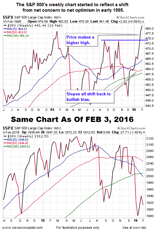
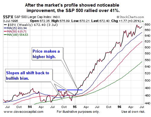
In 1995, when good things started to happen, the improvement started to show up on the chart (see below). Notice how the slopes of the 25-week (blue) and 50-week (red) flipped from negative to positive. In 2016, the slopes of the 25-week and 50-week remain negative. If the S&P 500 rallies in 2016 and the slopes of the 25-week and 50-week turn back up, it will improve the odds of good things happening.

What Happened Next In 1995?
Stocks did very well tacking on an additional 41% of gains between early 1995 and mid-1996.

Important Point: No Improvement Yet In 2016
For the 1994 analogy to remain alive, the 2016 S&P 500 chart needs to show improvement; something that has not happened yet. The present day profile continues to reflect a net concern about future outcomes, similar to periods in 2007-2008 and 2000-2001.
The Historical Cases Can Help Either Way
Can the 1994 case help us with bearish odds? Yes. If the 2016 chart starts to deviate from the 1994 analogy, it speaks to increasing bearish odds. For example, the 2011 analogy worked very well in 2015, as clearly demonstrated here. However, the 2011 analogy appears to be breaking down in 2016 (as outlined here), which speaks to increasing odds of bad things happening. The keys in 2016:
- Current profile is concerning.
- The bullish case needs things to improve.
- Improvement can begin at any time as it did in 1995.
Our purpose here is not to say the market’s profile will or will not improve in 2016, but rather to point out that history says things can improve from a similar net aggregate interpretation of all the good news and all the bad news. The bulls are on the ropes, but the ten count has not been given yet.
Is The Third Market Myth About To Be Exposed?
This week’s stock market video looks at three investing myths. Two of the myths have been taken off the table; the third remains. What could happen when the third market myth falls?
