Trend Model signal summary
Trend Model signal: Risk-off
Direction of last change: Negative
The actual historical (not back-tested) buy and sell signals of the Trend Model are shown in the chart below:
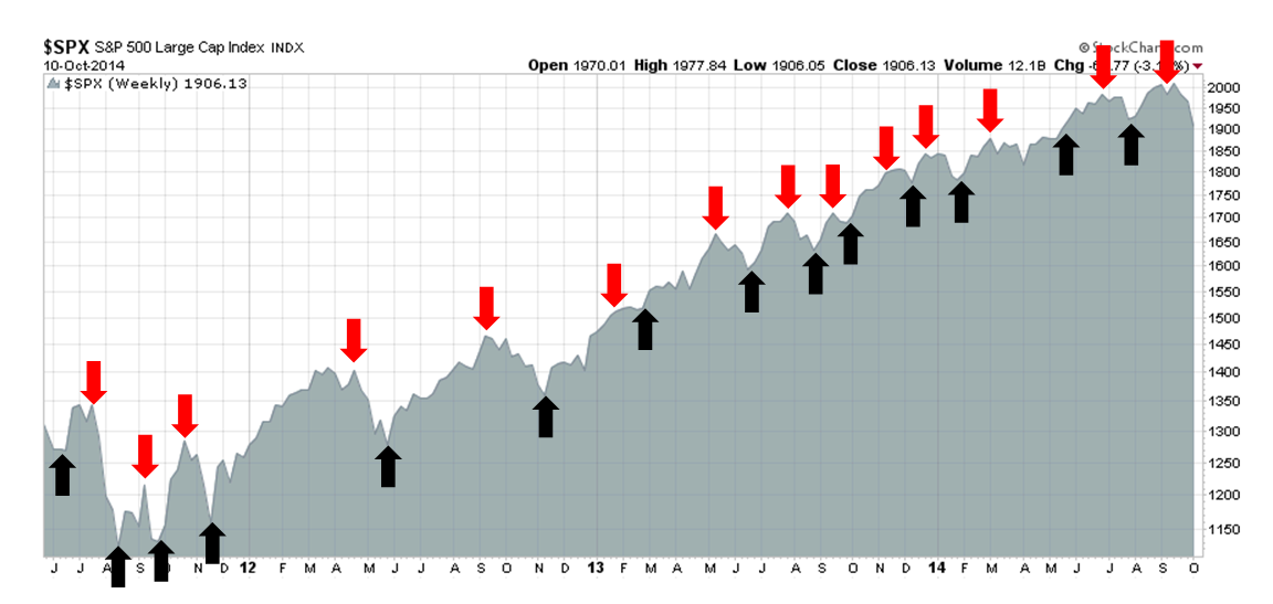
Update schedule: I generally update Trend Model readings on this blog on weekends and tweet any changes during the week at @humblestudent. In addition, I have been trading an account based on the signals of the Trend Model. The last report card of that account can be found here.
Don't panic, it's only a correction
Last week, I wrote that the market action did not have me convinced that we had seen THE BOTTOM, but I was unsure and remained nervously bearish.
Sure enough, US equities continued to fall in the week just past. We saw a major bearish signal as the SPX violated a major uptrend line that began in late 2011. On the other hand, the market descent moved the index to a rare oversold condition of closing the week below the weekly Bollinger® Band, which has generally been a useful signal for a reflex rally in the past (see circles, below).
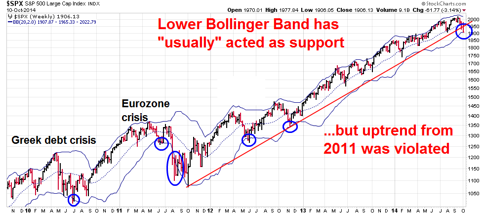
I interpret these readings as an oversold condition within the context of a deeper market correction. The medium term path of least resistance is down, but the market is ripe for a short-term bounce.
Broad signs of global weakness
I come to my conclusion that we are entering a deeper corrective period based on signs of broad market weakness and anxiety. Too much damage has been done to the equity outlook for stocks to carry on and grind higher as they have in the last couple of years.
To my mind, the greatest damage to the global equity outlook has nothing to do with any technical indicator. Rather, it was signaled by the single sentence warning by Microchip Technology (NASDAQ:MCHP) about a likely semi-conductor inventory correction, which exemplified the picture of slowing global growth. The warning sent shock waves throughout the semi conductor stocks as the HOLDRS Merrill Lynch Semiconductor ETF (NYSE:SMH) cratered by 6.6% on the day:
We believe that another industry correction has begun and that this correction will be seen more broadly across the industry in the near future,
The picture of global weakness is shown by the relative performance of my CapEx Index against the SPX. As regular readers are aware, I have been concerned about the lack of broad based capital expenditures during the current mid-cycle phase of the US expansion. I therefore started monitoring the relative performance of a CapEx Index, consisting of an equal weighted index of cap-weighted Industrial stocks (Industrial Sector SPDR Trust (ARCA:XLI)), equal-weighted Industrial stocks (Rydex S&P Equal Weight Industrials (NYSE:RGI)), because I wanted to measure Industrial performance without the dominance of heavyweight General Electric (NYSE:GE), and semiconductor stocks (SMH), as they are represent a key component of the highly cyclically sensitive capital goods business, relative to the S&P 500.
Even before the MCHP warning, the relative performance of the CapEx Index had lagged. But the MCHP announcement was the shocker that made the story of slowing global growth that much more real. Moreover, it highlights the transmission mechanism of how slowing non-US growth can affect US companies.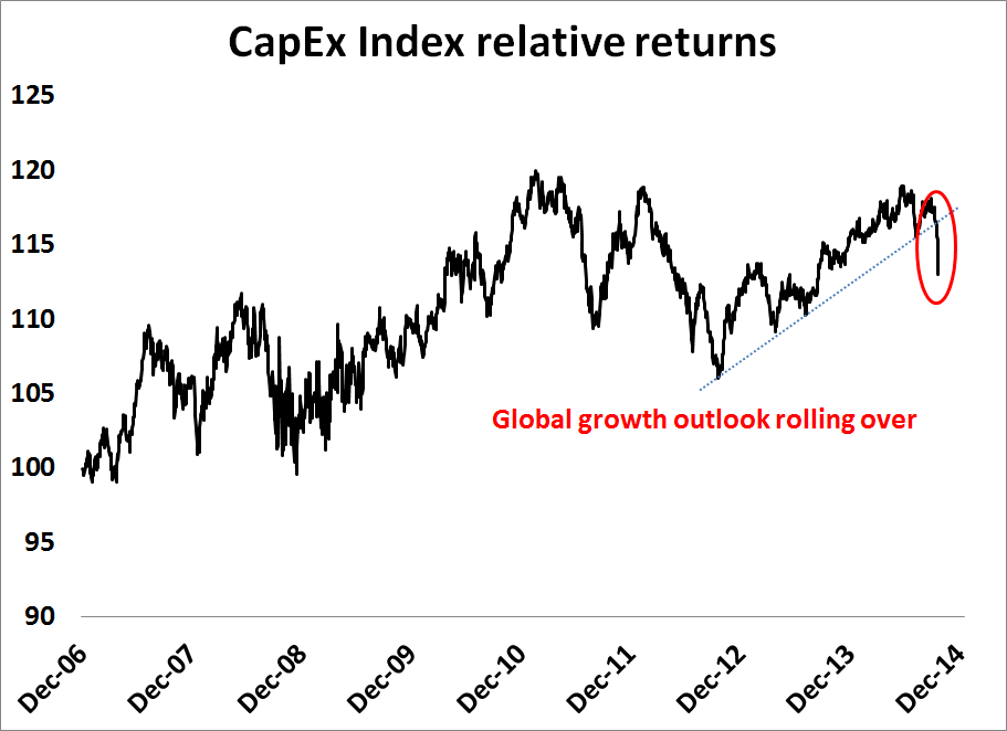
Moreover, the pattern of weakness in the shares of capital goods companies is not just restricted to the US. The chart below shows the relative returns of European Industrials (they're called "engineering companies" over there) against DJ Europe in the top panel and equal-weighted Industrial stocks vs. the SPX in the bottom panel. Note how the patterns of relative weakness parallel each other, which signals a broad based weakness in this sector.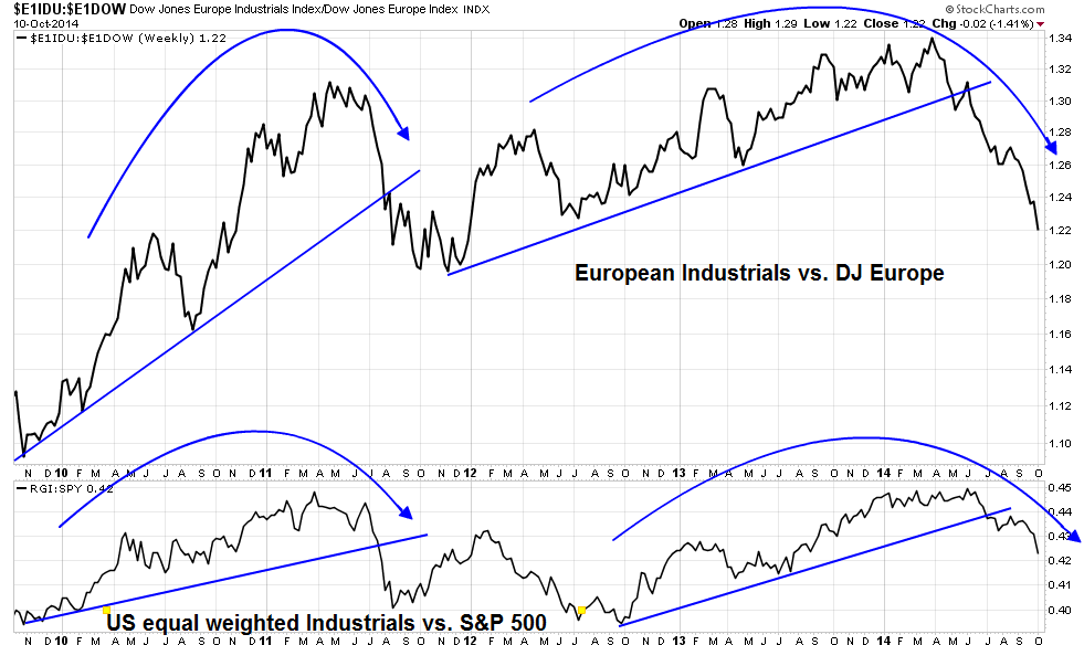
Technical weakness and anxiety everywhere
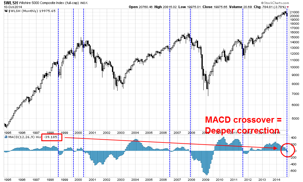
From a technical viewpoint, there are signs of market weakness and anxiety everywhere I look. As an example, the chart below shows the monthly chart of the Wilshire 5000, the broadest measure of US equities. The key indicator of further market weakness is the MACD crossover, shown in the bottom panel. Past instances of MACD crossovers in the last 20 years have been fairly rare, but they have always signaled either corrections or bear markets.
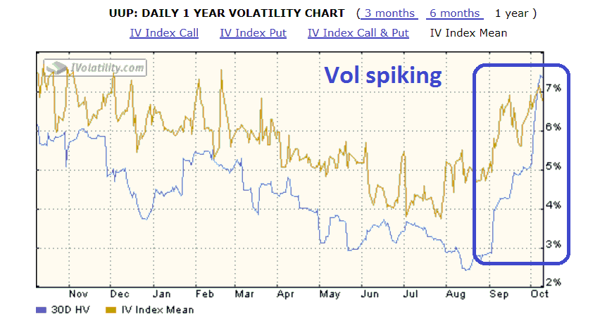
I am also seeing other signs of rising anxiety in other asset classes. Both the implied volatility (in orange) and realized volatility (in blue) have spiked for currencies, as exemplified by the volume profile of the US Dollar Index (via PowerShares db USD Index Bullish (NYSE:UUP)):
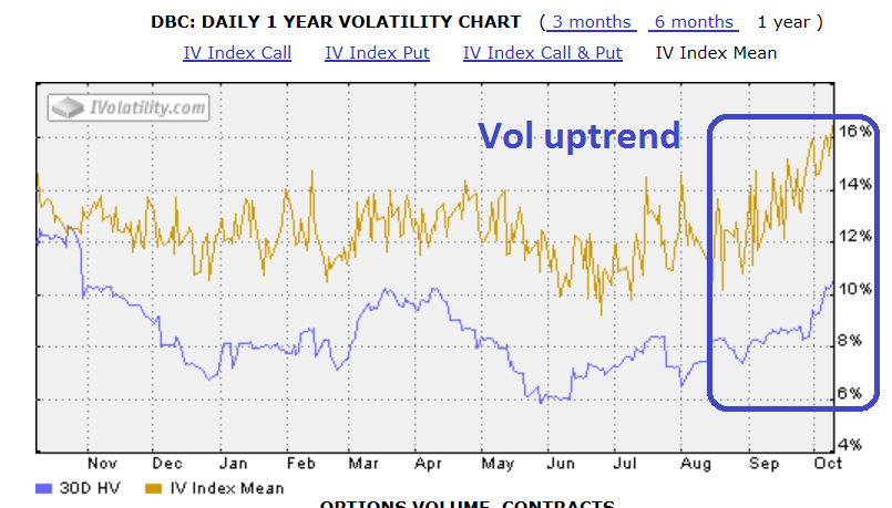
Commodities (via PowerShares DB Commodity Index (ARCA:DBC)) have also seen a pattern of a volatility uptrend in the past few weeks:
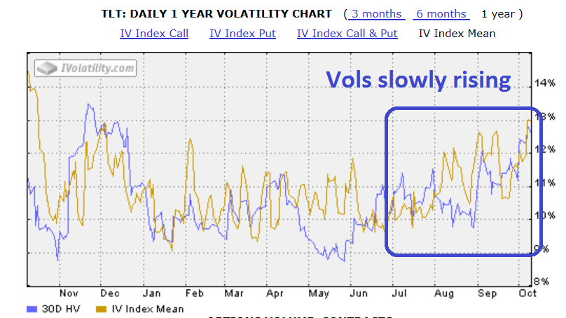
Here is the volatility profile of the US long Treasury bond (via iShares Barclays 20+ Year Treasury ETF (ARCA:TLT)):
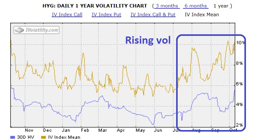
...and junk bonds (via iShares H/Y Corporate Bond ETF (ARCA:HYG)):
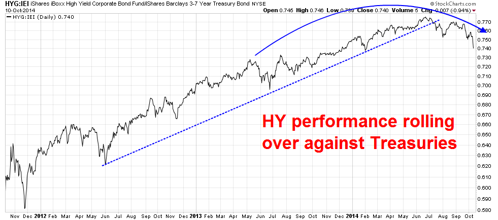
This pattern of rising anxiety has manifested itself in rising risk aversion, as junk bond price performance have rolled over against Treasuries (via iShares Barclays 3-7 Year Treasury Bond ETF (ARCA:IEI)):
Global equity weakness
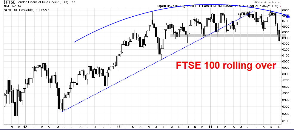
The Trend Model is flashing signs of global risk aversion and technical damage. In addition to the weakness seen in US equities, the UK equity market, as measured by the FTSE 100, is struggling. As the UK is slightly ahead of the US in its interest rate cycle, the FTSE 100 will be an important index to watch:
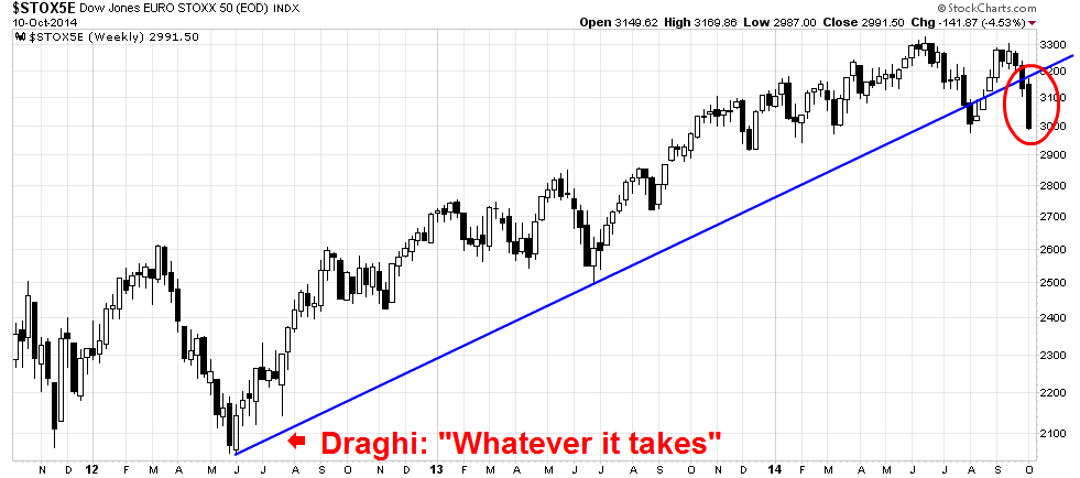
Eurozone equities are showing a similar pattern of the violation of a long uptrend. In view of a visible disagreement between the ECB and Germany over fiscal stimulus, the Draghi "whatever it takes" rally seems to be over (via (DJ Euro Stoxx 50).
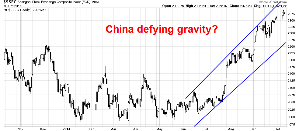
Market based indications of Chinese growth are also looking iffy. The Shanghai Composite has staged a robust rally, but this index seems to be an anomaly as it defies gravity when compared to my other China indicators.
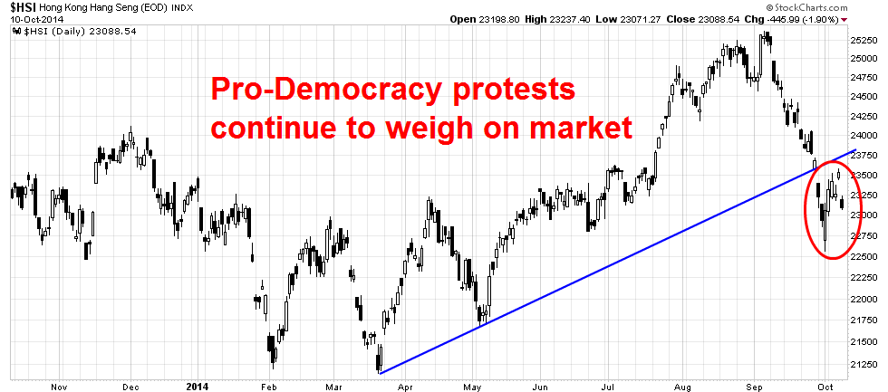
The stock indices of Chinese major regional trading partners do not show the similar bullish pattern. Here is Hong Kong's Hang Seng, which has been negatively affected by the Occupy Central pro-democracy protests:
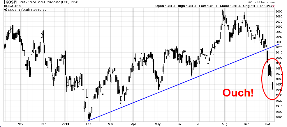
The South Korean KOSPI is showing a similar pattern of uptrend violation:
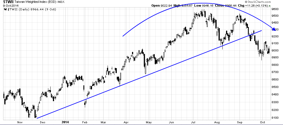
So is the Taiwanese stock market (Taiwan Weighted):
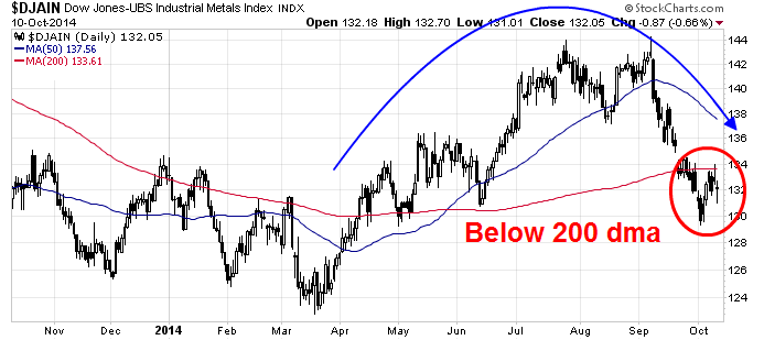
Aside from the stock indices of China`s trading partners, another all-important, real-time market based indicator of Chinese growth, industrial commodity prices, looks weak:
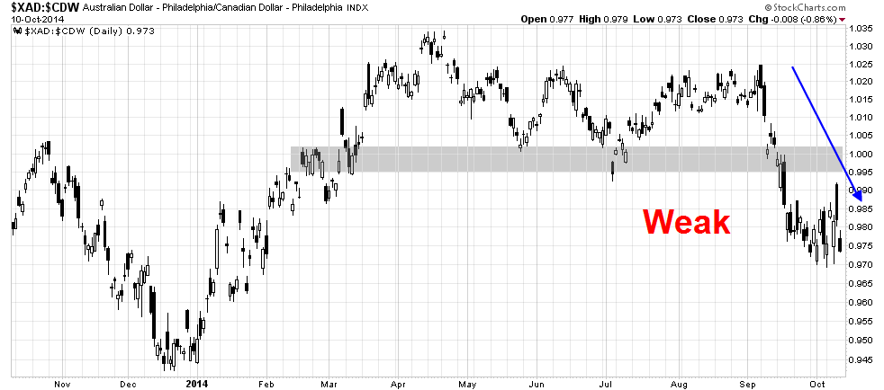
So does the AUD/CAD exchange rate, which is important because both Australia and Canada are major commodity producing countries, but Australia is more sensitive to Chinese growth while Canada is more sensitive to American growth.
When I put it all together, there is no escaping the fact that the message from global markets and cross-asset analysis is one of rising anxiety about weakening growth.
Looking for the bottom
Past corrective episodes in the last five years have seen fundamental triggers, such as the Greek default crisis of 2010, the eurozone crisis and Washington budget impasse of 2011. This time, there appears to be no broad based consensus of a fundamental reason for the market weakness. That leads me to believe that we are seeing a correction in risk appetite, which is generally not the pre-condition for a bear market or even a major correction. Most likely, the magnitude of this pullback will be of the 5-10% variety.
With that scenario in mind, I tried to look for indicators that may give us a better idea of how to time the bottom in the current bout of stock market weakness.
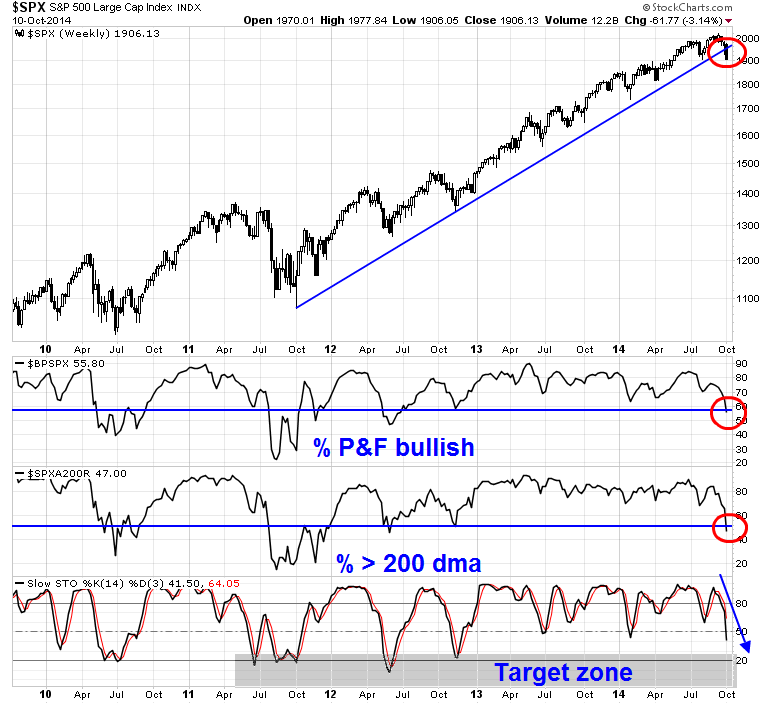
Even though a number of indicators are flashing oversold conditions, I do not believe that we have seen the bottom yet. The chart below shows the SPX in the top panel and a variety of technical indicators in the other panels. These indicators include: the % of stocks on a point and figure buy in the SPX in the second, % of stocks over the 200 day moving average in the third and a slow overbought-oversold stochastic indicator in the bottom.
The top three charts all indicate that the US stock market has undergone a regime change. We are no longer in the steady uptrend that we have undergone in the last 2-3 years. The SPX trend line has been violated and both the % bullish and % above 200 dma readings have descended to pre-2012 levels, which was before the current bull run began. These conditions suggest that the slow stochastic needs to show a deeper oversold reading before the current bout of weakness is over.
Here is another take on the current market conditions. The chart below shows Rydex bear and money market fund flows as a % of total fund flows. When the line is high, it indicates excessive bearishness and when it is low, excessive bullishness. On the one hand, fund flow readings are consistent with levels seen in recent interim bottoms of the last 5 years. On the other hand, we saw increasing bullishness as the market declined on Thursday and Friday, indicating that Rydex investors were buying into weakness. Since sentiment indicators are not precise market timing indicators, I interpret these conditions as the stock market getting near a bottom, but not just yet.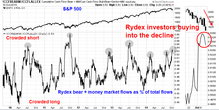
In addition, my trifecta of bottom calling indicators (see A tradable bottom?) are closer than last week to flashing a buy signal, but not yet. These are:
- An inversion in the VIX term structure AND TRIN more than 2
- My favorite overbought-oversold indicator moving below 0.5 (oversold) and then mean reverting above that level
As the chart below shows, the VIX term structure inverted on Friday, but TRIN is only 1.44 and the OBOS indicator is only approaching an oversold reading at 0.58, but still above the critical 0.50 threshold. I have marked with blue vertical lines when all three indicators have been satisfied and in pink when only two of the three have met my conditions. In each of the cases, they have been excellent signals of short-term market bottoms.
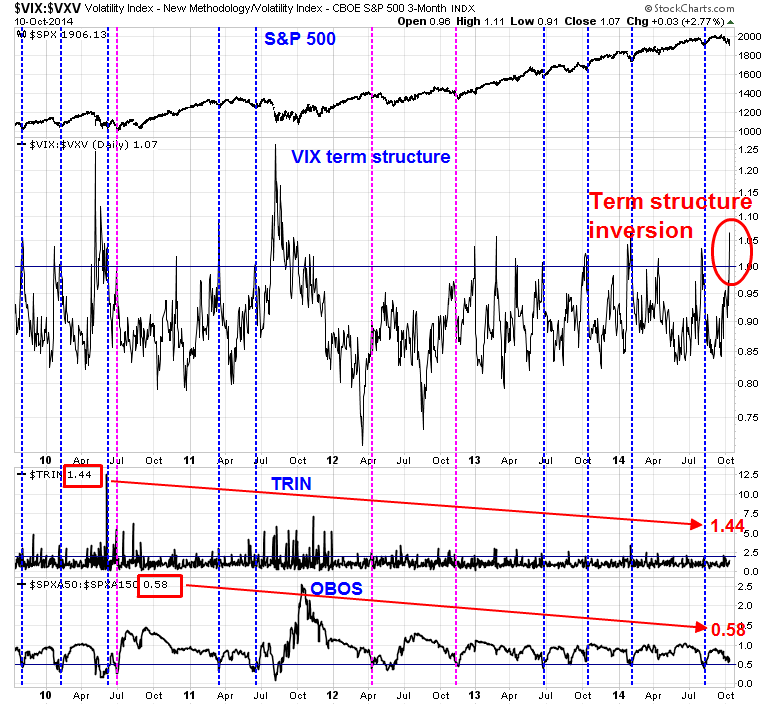
Bottom line: We are getting close to a bottom, but not yet.
Ripe for a bounce
In the meantime, short-term technical conditions are screaming "bounce"! As an example, the ISEE equity only call-put ratio of opening option transactions is showing signs of excessive bearishness, which is contrarian bullish: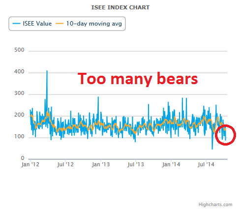
The SPX is also testing various levels of key support and showing short-term positive divergences. I already indicated that the index is now at the lower weekly Bollinger® Band, which usually acts as support. As well, it closed Friday just above its 200 day moving average, which is a support level closely watched by many technicians. At the same time, it is showing positive divergences on short-term indicators such as the 5-day RSI and the NYSE McClellan Oscillator.
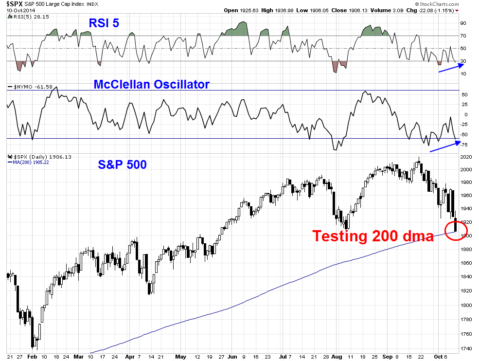
My base case scenario calls for a short-term rally in the coming week, with the market then weakening into a final bottom shortly thereafter. In effect, we are in the seventh inning of a market correction.
In light of the short-term oversold conditions, my inner trader tactically took advantage of last week`s market weakness to reduce his short positions. He anticipates that he will be able to re-enter his bearish positions at higher levels.
My inner investor remains relatively unperturbed at these market gyrations. He believes that investors should be prepared for 20% drawdowns as part of the risk of equity ownership and there is not reason to panic. This is only a correction.
Disclosure: Long SPXU
Cam Hui is a portfolio manager at Qwest Investment Fund Management Ltd. ("Qwest"). This article is prepared by Mr. Hui as an outside business activity. As such, Qwest does not review or approve materials presented herein. The opinions and any recommendations expressed in this blog are those of the author and do not reflect the opinions or recommendations of Qwest.
None of the information or opinions expressed in this blog constitutes a solicitation for the purchase or sale of any security or other instrument. Nothing in this article constitutes investment advice and any recommendations that may be contained herein have not been based upon a consideration of the investment objectives, financial situation or particular needs of any specific recipient. Any purchase or sale activity in any securities or other instrument should be based upon your own analysis and conclusions. Past performance is not indicative of future results. Either Qwest or Mr. Hui may hold or control long or short positions in the securities or instruments mentioned.
