The general election campaign is in full swing in Britain, and it seems it’s all about austerity. From London, The New York Times reports that the campaign revolves around a single issue: the economy, and whether its rebound is the result of an austerity policy championed by the Conservative-led government of David Cameron, or in spite of it.
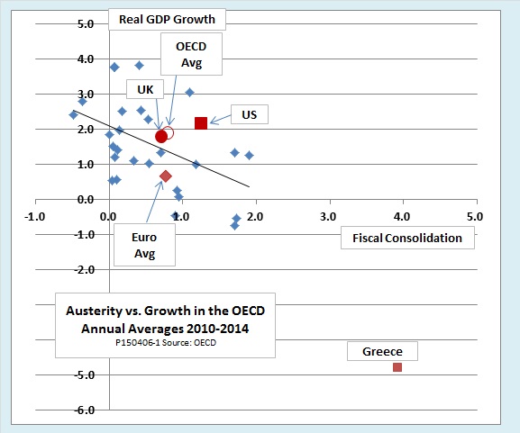
When in doubt, we should let the facts speak for themselves. This chart tells it all:

The points in the chart represent thirty of the high-income democracies that comprise the OECD. It covers the years 2010-2014, the Cameron government’s term in office. The vertical axis shows the average annual rate of growth during the period. The horizontal axis shows the degree of austerity, or fiscal consolidation, as economists prefer to call it, applied in each country. The UK is right in the middle, just slightly below average in terms both of austerity and growth.
Some technicalities: The horizontal axis shows the annual change in what the OECD calls the government’s underlying primary balance, also known as the structural or cyclically adjusted primary balance. This measure of the stance of fiscal policy differs from the more commonly reported current budget surplus or deficit in four ways:
- First, it shows what the surplus or deficit would be if the economy were operating at its potential real output, or “full employment,” to use the popular term. The current surplus or deficit can change from year to year either because of changes in tax and spending policy, or because a change in GDP triggers so-called automatic stabilizers, for example, lower tax receipts and higher unemployment benefits when the economy enters a recession. The structural balance thus isolates the part of the current budget balance that we can attribute to policy rather than the state of the business cycle.
- Second, it we call it the “primary” deficit because it omits interest payments on government debt. The intention, as with the adjustment for cyclical factors, is to make it a better measure of policy changes that policy makers can actually control. A government has considerable freedom to change taxes and current spending programs from one year to the next, but short of default or negotiated restructuring of its debt, there is little it can do to affect interest payments.
- Third, the OECD data cover all levels of government. Doing so allows us to compare countries like the United States, where people often focus on the federal budget, even though it only accounts for 60 percent of all government spending, with countries like France or the UK, where taxes and spending are much more centralized.
- Fourth, the underlying balance also eliminates the effect of one-off fiscal measures like privatization revenues or transfers from the central bank to the government budget. Eliminating one-offs helps comparison both among countries and over time, since they vary greatly from country to country and year to year.
In case you didn’t really want to know all of the above, just take it on faith that the horizontal axis measures the degree of austerity. Any point to the right of the vertical axis means the government is using tax increases or spending cuts to tighten fiscal policy from one year to the next. The farther to the right, the more austere.
The bottom line
So how does this chart help us understand the election debate?
Most importantly, at least for OECD countries in the period we are looking at, it is simply untrue that austerity is good for growth. On average, as the trendline shows, tightening the budget by one percent of GDP cuts about half a percentage point off the growth rate. That finding, by the way, omits the influence of Greece. Greece has undergone extreme austerity and its growth has been abysmal, so including it would make the growth-austerity relationship even more negative.
We also see that the relationship between austerity and growth is not very tight. Fiscal policy is simply not the whole story. The United States, for example, underwent more fiscal consolidation than the UK in 2010-2014, but it also had better growth. On the other hand, the countries of the Eurozone, on average, grew more slowly than the OECD average despite a similar average level of austerity.
In short, it is much easier to argue that the British economy has recovered despite austerity than because of it. Its strengths lie in other growth-friendly policies—good trade relations with the United States, which has itself enjoyed a stronger-than-average recovery; a business-friendly legal and regulatory environment (ranking eighth on the World Bank’s Ease of Doing Business index, just behind the US); and the good sense to stay out of the euro.
On the other hand, the chart makes it hard to understand why politicians, the press, and the public see this election as being all about austerity. After all, the UK is right smack in the middle of the chart. It has had neither an exceptional amount of fiscal consolidation nor exceptional growth performance. So what is all the fuss about?
