
Taking a look at the technical structure of the major averages, most if not all look to be in pretty stable and solid up trends and returns across the board this year and the previous five years have been stellar. However in the interest of full disclosure I felt compelled to put together a quick post to highlight some potential technical headwinds going forward. Doesn't mean it will play out as such but it is always best to be prepared.
Over the past few years I have been pretty bullish over all. The second post above was created in June of 2012 and the S+P 500 is some 40% higher since. However as I have expressed in my weekly market summaries for awhile now, I remain cautious in regards to the downside potential in the near term. And I want to caution investors going forward.
This chart above tracks the price action in the S+P 500 since the 2009 lows. This current rally off the 2011 lows has now reached the same size (in terms of points) as the one preceding measured from the 2009 lows to the 2011 high before a 20% decline took hold. 
Next we have a chart of the S+P 100 (OEX) which consists of the 100 largest cap, and most important, stocks on the US market. As the S+P 500 and Dow continue to make new all time highs the OEX is still below it's year 2000 high but nearing it. From it's most recent highs made two weeks ago, the all time high for this major average is around 3-4% away.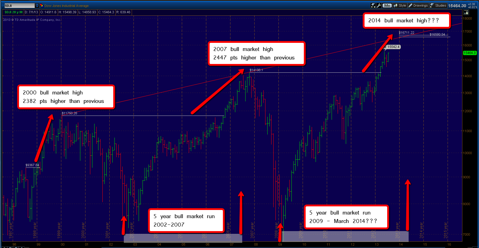
Perhaps the most significant is the Dow Jones Industrial Average. Above is the chart going back over 15 years. I posted this on the blog a long time ago as a major upside target. There are many patterns here signaling a potential top in 2014 around the 16,600 level. As every time over the last 15 years the Dow became this overextended above it's previous bull market high it found some significant resistance. 
Here is the updated version of the previous chart.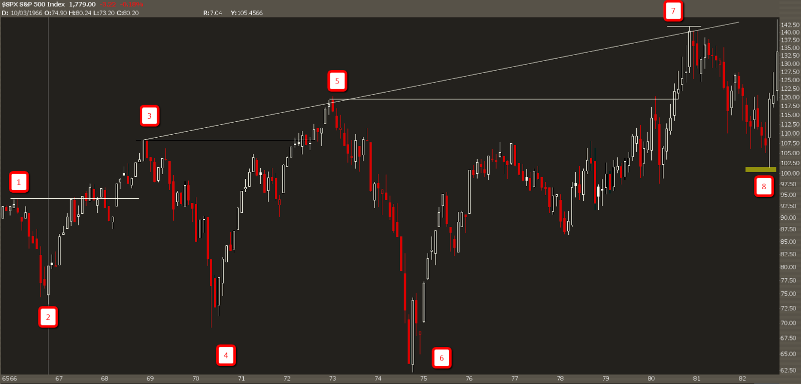
Now I follow historical market technical patterns and those of you who follow know I love to compare this current long term trading range to the one that occurred during the time period of 1966-1982. Though not perfect, it's amazing how closely the two charts have been playing out so far.
The above chart is the long term trading range of 1966-1982 and if things continue to move in unison we may well be at the tail end of wave number 7 up. At that time what proceeded was a 28.5% drop in the S+P 500 from 1980-1982 (141.96 to 101.44) before finding support for the one of the biggest and best bull market runs of all time into the year 2000.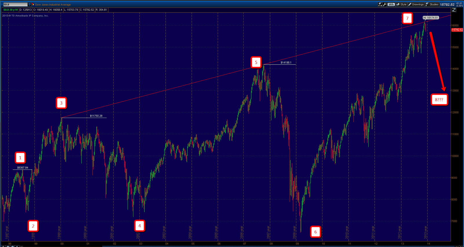
I have thrown up another current Dow chart with wave counts to compare the technical structure of this current formation to the one that developed in 1966-1982. 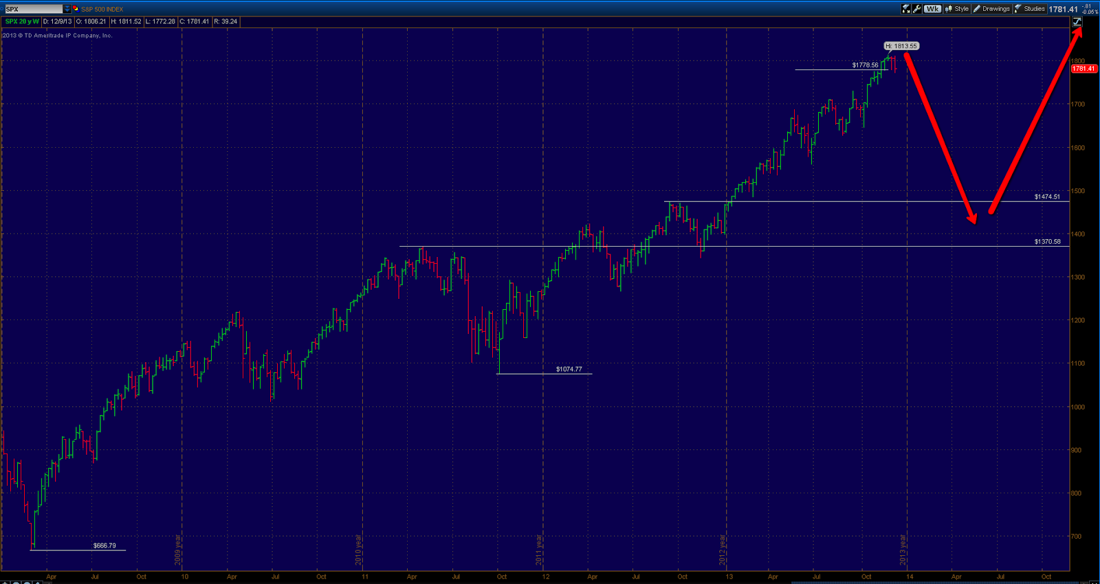
So if in the case solid resistance is found sometime in the near future and we do indeed break the momentum of the uptrend the expectation for me would be a drop into long term support below, which for me is defined between the QE 3 announcement high of 1474.51 and the May 2011 highs before the major averages shed roughly 20% on Euro-Zone concerns.
This would roughly match the 28.5% correction size experienced in 1980-1982 and may very setup for another major move to the upside over the next decade on more. Only time will tell on that.
Of course this doesn't mean that these patterns must continue forever. The only purpose of this post is to highlight some potential technical headwinds going forward. I believe I have made a case for the potential upside in the near term to be limited and the risk to reward at these current levels potentially not being ideal. Investors should be cautious but also cautiously optimistic in the long term in the hopes that things will continue to improve.
- English (UK)
- English (India)
- English (Canada)
- English (Australia)
- English (South Africa)
- English (Philippines)
- English (Nigeria)
- Deutsch
- Español (España)
- Español (México)
- Français
- Italiano
- Nederlands
- Português (Portugal)
- Polski
- Português (Brasil)
- Русский
- Türkçe
- العربية
- Ελληνικά
- Svenska
- Suomi
- עברית
- 日本語
- 한국어
- 简体中文
- 繁體中文
- Bahasa Indonesia
- Bahasa Melayu
- ไทย
- Tiếng Việt
- हिंदी
Buyer Beware: A Look At The Downside Potential
Published 12/13/2013, 02:23 AM
Updated 07/09/2023, 06:31 AM
Buyer Beware: A Look At The Downside Potential
3rd party Ad. Not an offer or recommendation by Investing.com. See disclosure here or
remove ads
.
Latest comments
Install Our App
Risk Disclosure: Trading in financial instruments and/or cryptocurrencies involves high risks including the risk of losing some, or all, of your investment amount, and may not be suitable for all investors. Prices of cryptocurrencies are extremely volatile and may be affected by external factors such as financial, regulatory or political events. Trading on margin increases the financial risks.
Before deciding to trade in financial instrument or cryptocurrencies you should be fully informed of the risks and costs associated with trading the financial markets, carefully consider your investment objectives, level of experience, and risk appetite, and seek professional advice where needed.
Fusion Media would like to remind you that the data contained in this website is not necessarily real-time nor accurate. The data and prices on the website are not necessarily provided by any market or exchange, but may be provided by market makers, and so prices may not be accurate and may differ from the actual price at any given market, meaning prices are indicative and not appropriate for trading purposes. Fusion Media and any provider of the data contained in this website will not accept liability for any loss or damage as a result of your trading, or your reliance on the information contained within this website.
It is prohibited to use, store, reproduce, display, modify, transmit or distribute the data contained in this website without the explicit prior written permission of Fusion Media and/or the data provider. All intellectual property rights are reserved by the providers and/or the exchange providing the data contained in this website.
Fusion Media may be compensated by the advertisers that appear on the website, based on your interaction with the advertisements or advertisers.
© 2007-2024 - Fusion Media Limited. All Rights Reserved.